

Hello and happy St Pats Day,
Today I am sharing the last two layouts I made using Janet Madison’s RTS 4 for 4 series  technique. You can view all of Janet’s videos for the series on her YouTube channel, RTS (Record the Story) Scrapbooking. As usual, I made some changes along the way, something Janet promotes…there is no one way, make it your own!
You can see the collection of papers I started with on my last post, I chose very feminine papers from my March Counterfeit Kit Challenge. Using the 4 for 4 series you end up making 4 layouts using 5 patterned 12×12 pieces of paper cut to different sizes and then working on a cardstock background. The leftover scraps are used to make cards with, something which I haven’t tried yet. Years ago, when I first ventured into papercraft, cards were my main focus. I even sold them through several businesses, was commissioned to create them, taught classes on stamping and cardmaking, and had tutorials published. Now, I just can’t get enthusiastic about making cards, though I do ooh and aah over all the new stamp releases. However, I agree with Janet that we should all be making our own gift cards, we have the skills and loads of scraps to use up!
Layout #9 (for CKC, #3 for RTS-4 for 4)
For this layout, I selected a very light, shell pink cardstock for the background. You can see the patterned papers cut to Janet’s specified sizes, I used a mix of old and new papers. A lovely raspberry pink floral, a text (a recent purchase, Jilliebean – Reap the Grain) and a strip of mint, criss-cross kisses. The butterfly and flowers die cuts are from Tim Holtz’s idea-ology salvaged elements, and I chose a few tags to include from my stash.


I put the background together first. I had an issue with the text paper, it probably wouldn’t have bothered most people but I do suffer a little from perfectionism. If you read the text you can see that there are some words and quotes which don’t fit with my photo. My photo is a 4×4 of my daughter by herself and several parts of the text refer to more than one person…see how picky I am. There is the terms: You & Me, Family, and together. I couldn’t work with this and needed to find ways to cover up these terms. The first thing I did was add the mint criss-cross strip across the term ‘& Me’, it didn’t quite cover it all, so I add a strip of gold, glitter washi tape. Problem solved!

Next, I needed to deal with the large words, ‘Family’and ‘together’, on the right-hand side. Fortunately, my photo would cover this area, but it did mean that the placement was different from Janet’s recommendation.


I then thought the photo needed to stand out more from the background and added a white cardstock border. I wanted to include my handmade gold frames in this layout and mounted them on some scrap pink checked paper. They would do a good job at covering up the text on the left of the layout, and be substituted for the absence of photos. Janet’s #3 layout uses 3 photos and I only had one.

I had wanted to use the teal glitter Thickers from my CKC kit and thought I needed to get some teal colour on the page, as my papers did not include this colour. So, out came some distress ink and a cheap stencil. I focused on stencilling over the areas with the inappropriate (for me) text.


Next, I went to work adding the embellishments strategically placing them to cover up those annoying words. This took me quite a lot of time, I moved things around a lot and it just wasn’t working for me. I also stamped on some distress raspberry pink, little foliage images to try and pull it all together, around the clusters. A few tiny punched out red hearts and flowers were also added.


I’m not completely happy with the end result, but as Janet always tells us ‘the friends and family looking through the albums will not notice’. It is us that is far too critical of our own work. We need to learn to…let it be, let it be!

Layout #10 (for CKC, #4 for RTS-4 for 4)
So, this layout starts out with me scanning and enlarging the photo I want to use. Like my previous layouts, it is an old photo of my daughter which was once framed and hung on our hallway wall. The papers used are the same as Layout #9, except for a little strip of the large flower print (used in Layouts 7 & 8). I chose a few tags and a daisy die cut from my CKC kit and decided to work on white cardstock so I could splash around some ink.


I pulled out my favourite oxide ink, Mustard Seed, it creates an amazing golden yellow, and I used the plastic bag technique, activating the ink with water, to create a vibrant background.


Next, I wanted to include some stencilling on the background, picking up a few of the colours form the ‘LOVE’ tag. I put a few washi tape strips along the base of the page and then got busy stencilling on some simple shaped flowers using a range of distress ink colours. They blended beautifully, creating an almost rainbow coloured effect. I also stencilled a strip of white cardstock to use for some embellishments.


Time to fussy cut out those flowers.


Now, I needed to create some frames from scraps to cover the rough edges and bits of white left around my trimmed down photo. As, previously, I used the old Creative Memories cutting system, it was a quick and easy option.
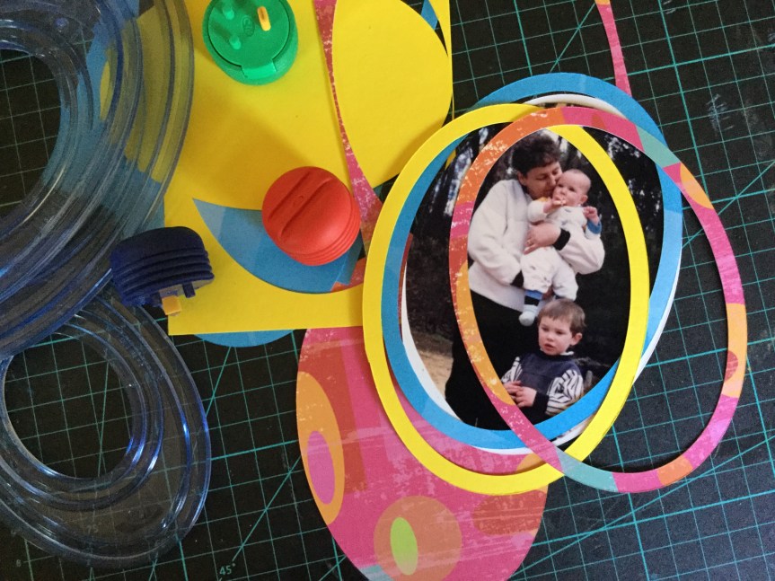
Then, I mounted the photo and frames onto the layout using foam tape.

Time to build up the layers of embellishments, both handmade (stamped & stencilled) and purchased. A mix of flowers, tags and enamel dots. Then some Thickers for the title.


The end result is a very, bright, colourful layout, a lot more intense than I envisaged. Another layout in the album, happy scrapping everyone.


Leanne: these layouts are splendid!!!! And I love how you go through the processes for creating these complex masterpieces!!! Both are outstanding! The top layout’s frame embellishments are genius!!!! And I’m loving the oval frames that you’ve used again in the bottom layout! Well done!!!
LikeLike
Fabulous and very inspiring.
LikeLike
I totally love how you go through your process of creating the page with step by step so that we can see how the page comes together! Such colourful, fun layouts using precious photos. Great job!
LikeLike
These are both beautiful in different ways. I love the first layout and how you strategically placed the strip across.On the second layout your mask and paints provide a perfect background.
LikeLike
Ooo such colorful layouts – well done you!
LikeLike