Making a scrapbook layout using my Spectrum Sherbet inspired background!

Hello all, I hope everyone is well and getting some crafty time.

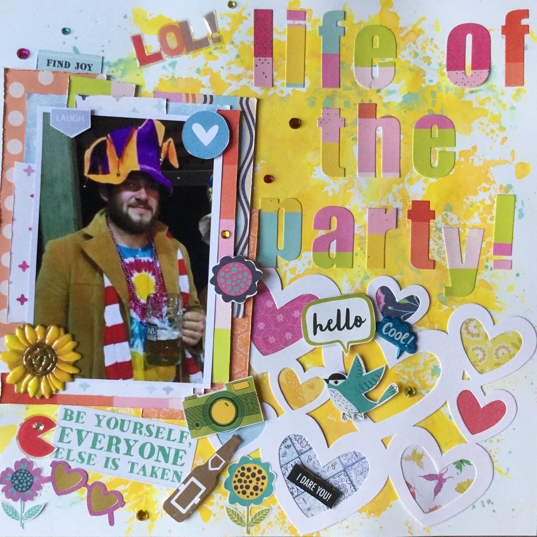
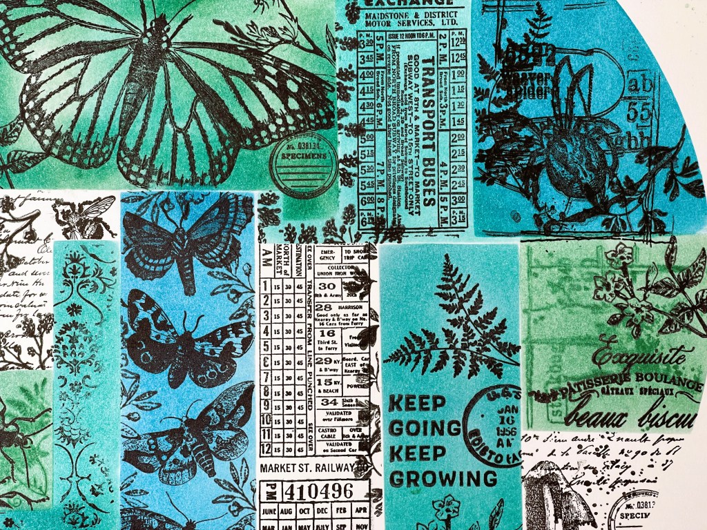
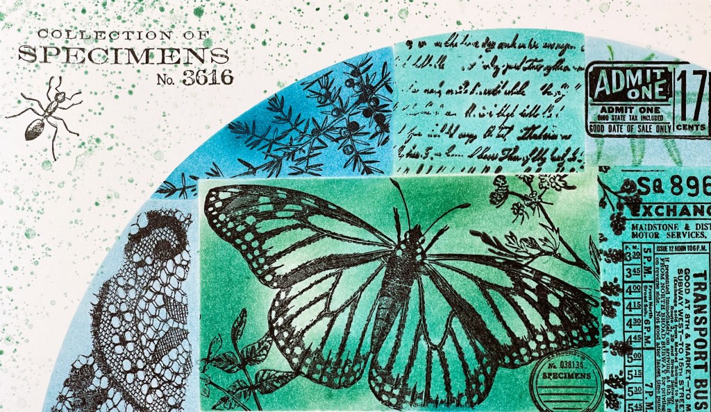
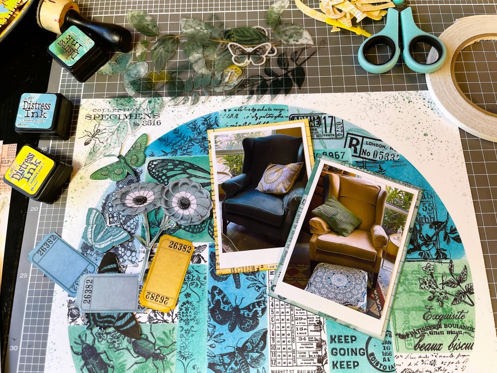
I have had a few requests regarding the stamped Spectrum Sherbet inspired 12×12 background that I created, shared on my blog, filmed and put on my YouTube channel. Some people were interested in seeing how I would use this background paper and others were keen to know which Tim Holtz inks I used. So, yesterday I created the layout, using more Tim Holtz distress ink and the 49 and Market-Spectrum Sherbet acetate embellishments (these are drool-worthy, love them). I love how it has turned out, the acetate embellishments really make a statement. The translucency of these allows for parts of the background to show through if you are using white or light cardstock, for instance, my ink splatters show through. However, some of the embellishments are opaque which is necessary in order for them to stand out on your page if you are using a heavily patterned background like I have. So, the acetate embellishments are pretty versatile, and a credit to the designer, they really thought about a crafter’s needs.

If you haven’t watched the ‘Make your own Spectrum Sherbet inspired scrapbook backgrounds’ video you can view it here. Later today my new video will come out showing how I assembled the layout and what products I used. I noted in the description the main products I used if you are interested. I have not included where to purchase any of the products, as I’m not affiliated with any companies, and I’m a big believer in encouraging you to shop local when possible or stay loyal to your favourite online store. Having said that, the 49 and Market, Spectrum Sherbet collection has been very popular worldwide and many stores sold out quickly, so you may have to search for stock.

Anyway, here’s what I did with it, in constructing the layout.

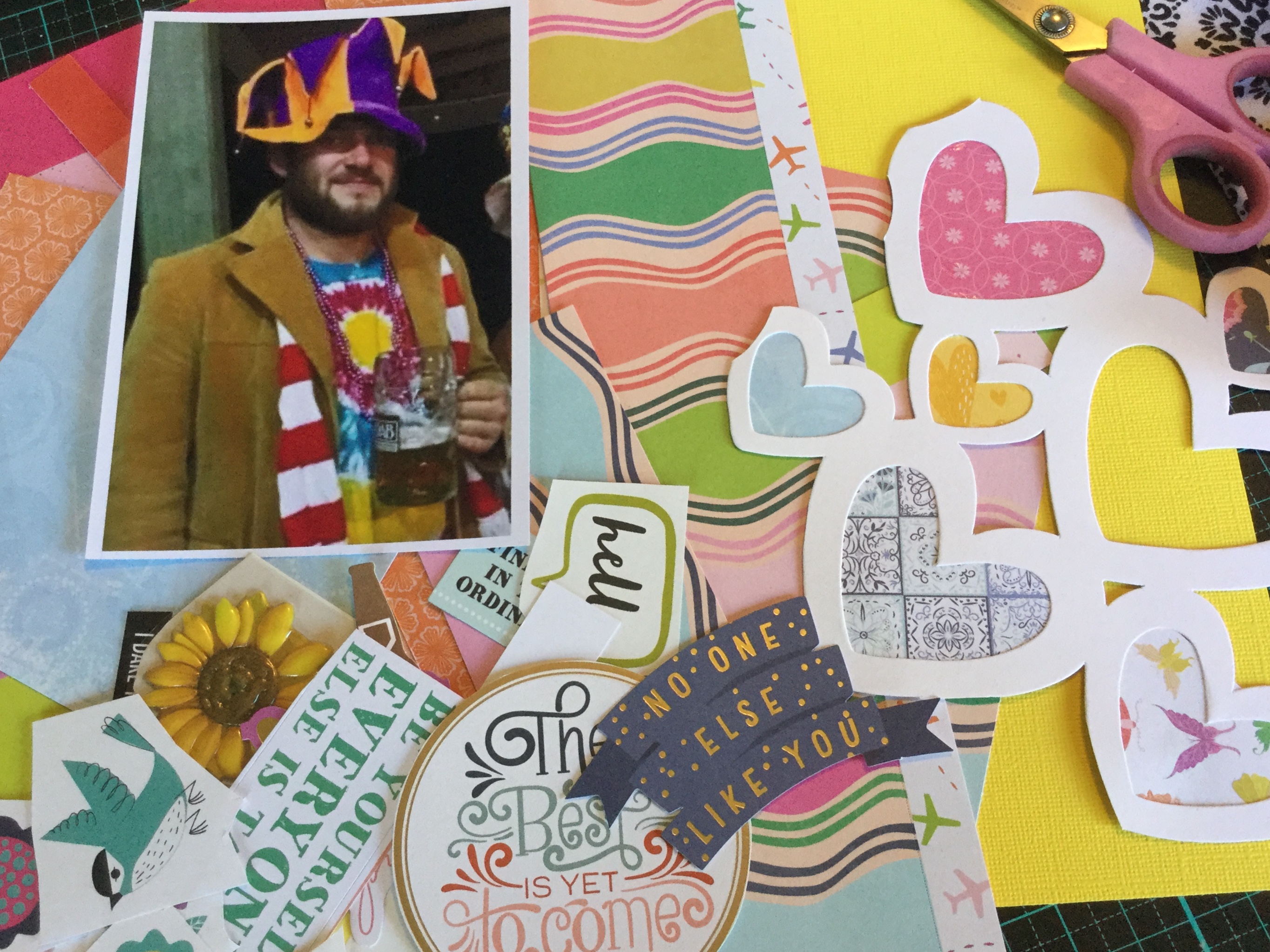
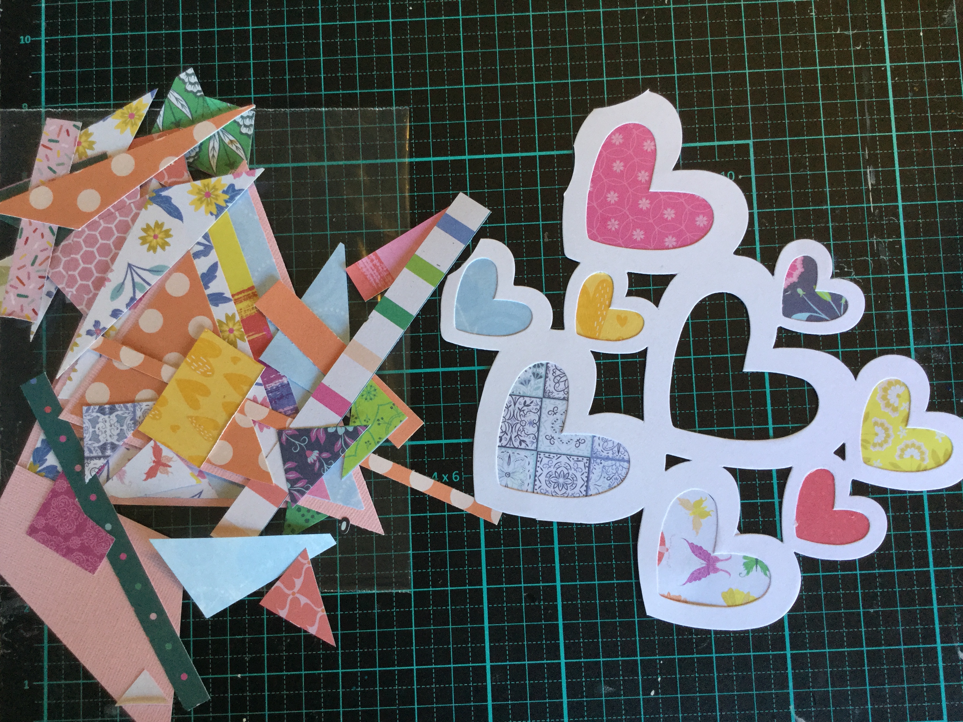
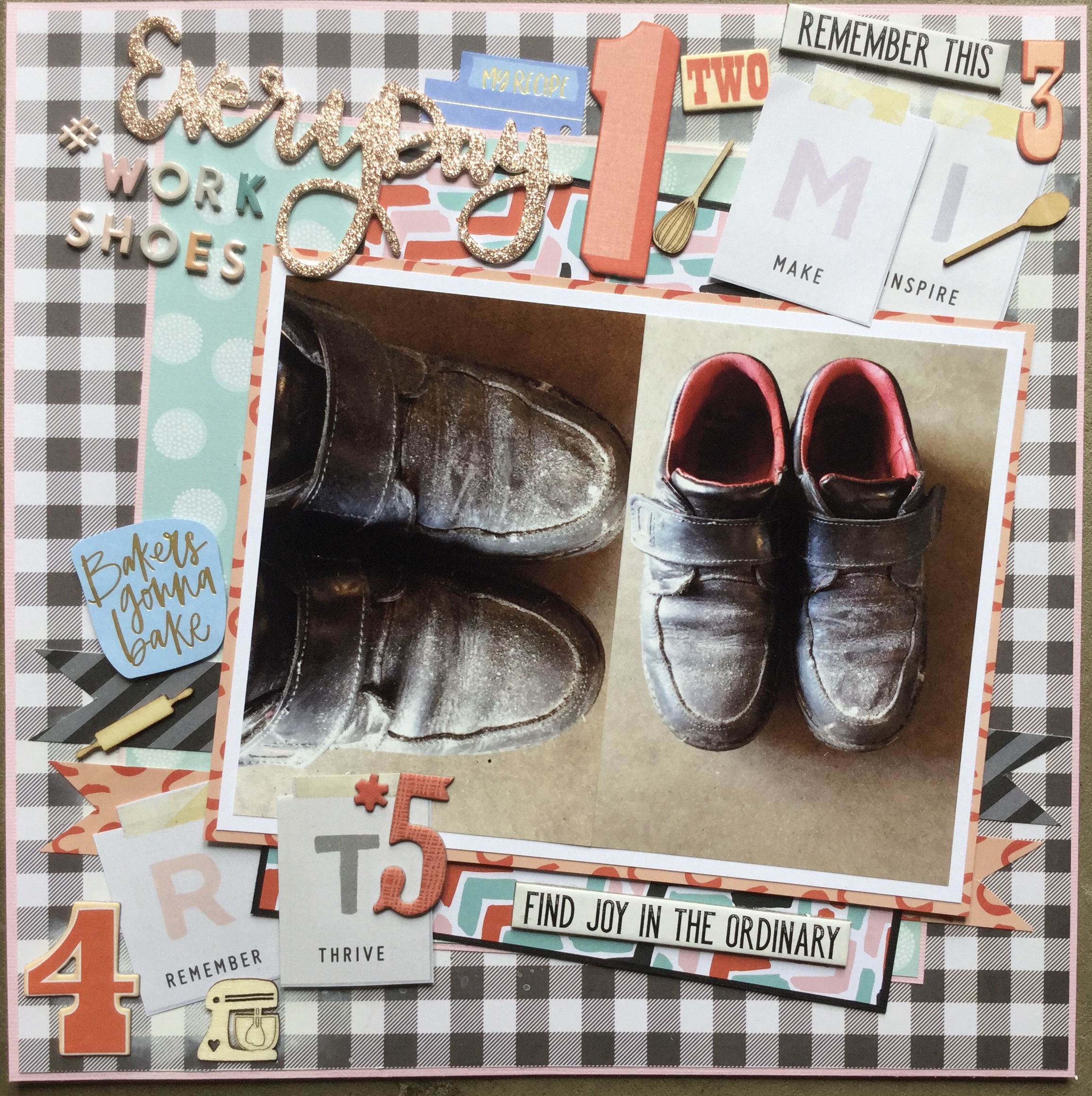
I used the embellishment sheet which comes with the collection. I needed some pieces which would pick up the colours on my stamped background and the colours in my photos. The photos which I’m using are of furniture, the latest to enter our house last month. I went to a local charity auction on my birthday and couldn’t quite believe it when no one was bidding on these two very lovely wingbacked chairs. The auctioneer was so desperate to sell them, with no bids happening, that he said $5! Well, then I couldn’t not bid, I raised my auction card knowing that others would then start bidding, only they didn’t and so, I ended up winning the bid. I am now the very happy owner of two wingback chairs that only cost me $5 for both! Did I need any chairs…no! We are now contemplating which lounge to get rid of, as things are a little tight in the living room.

Next, I double-matted my photos using some white cardstock and some of the 49 and Market-Spectrum Sherbet-Classics papers. Then, I made my title using some Paper Roses alpha dies, the Spectrum Sherbet-Classics-Brumbleberry paper (B-side) and some adhesive foam to give the title some dimension.

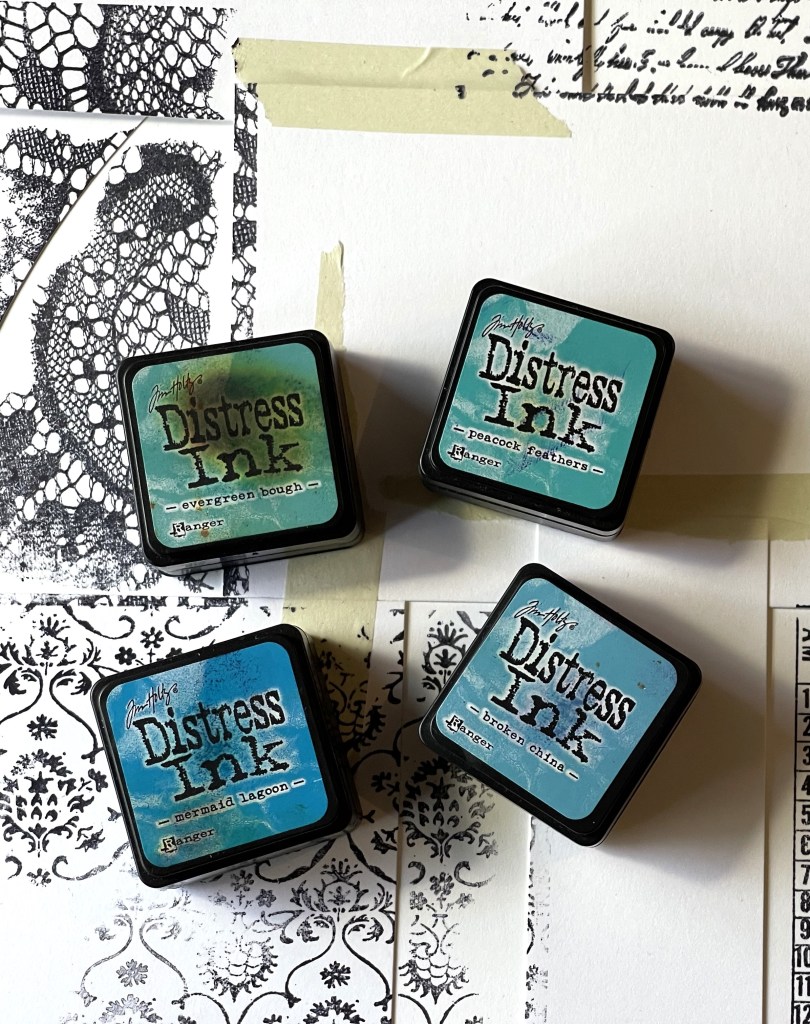
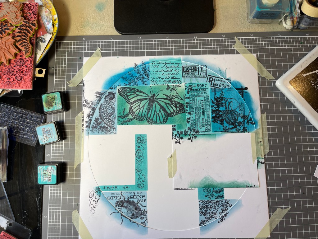
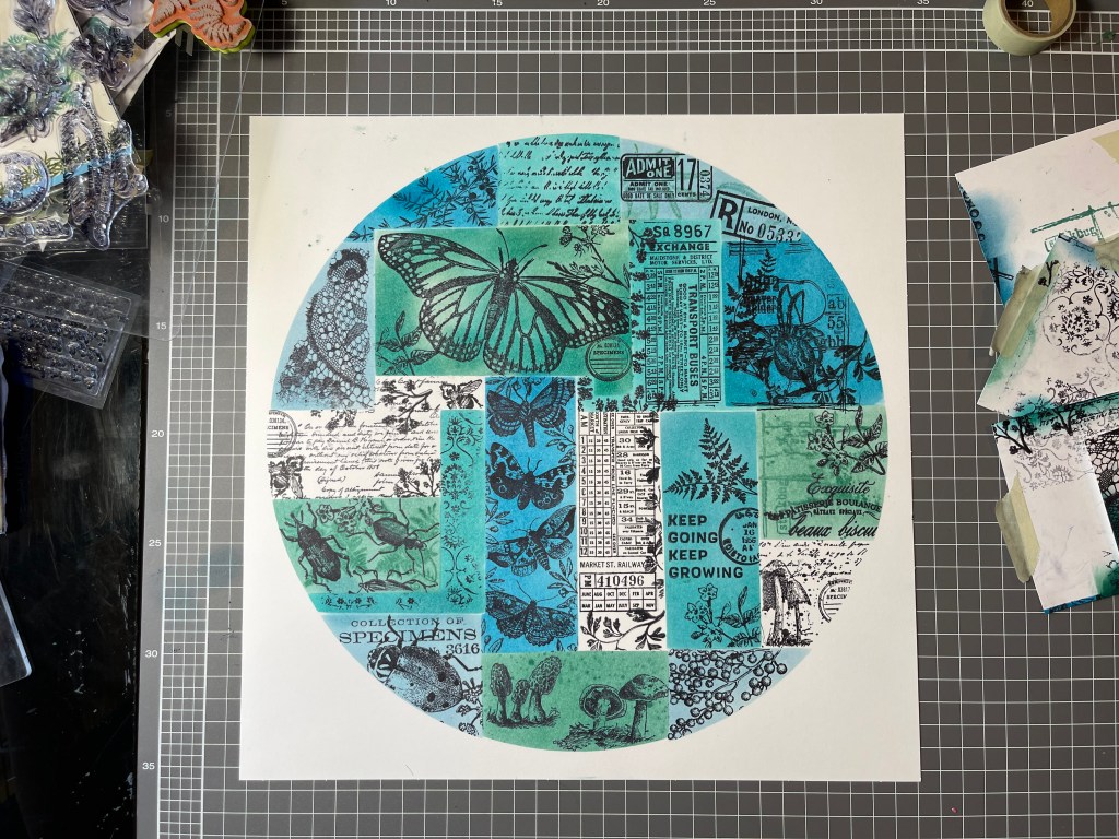
I inked the edges of my photo mats and my cut-apart embellishments. The inks I used were Tim Holtz distress inks – Broken China, Peacock Feathers, Mermaid Lagoon, Evergreen Bough and Mustard Seed (my favourite yellow).

Time to put it all together, it was just a matter of layering the embellishments. I use wet glue, Mono Aqua Liquid Glue, and double-sided tape to adhere everything. The Mono Aqua Liquid Glue worked really well to adhere the acetate embellishments, as it’s a clear glue.

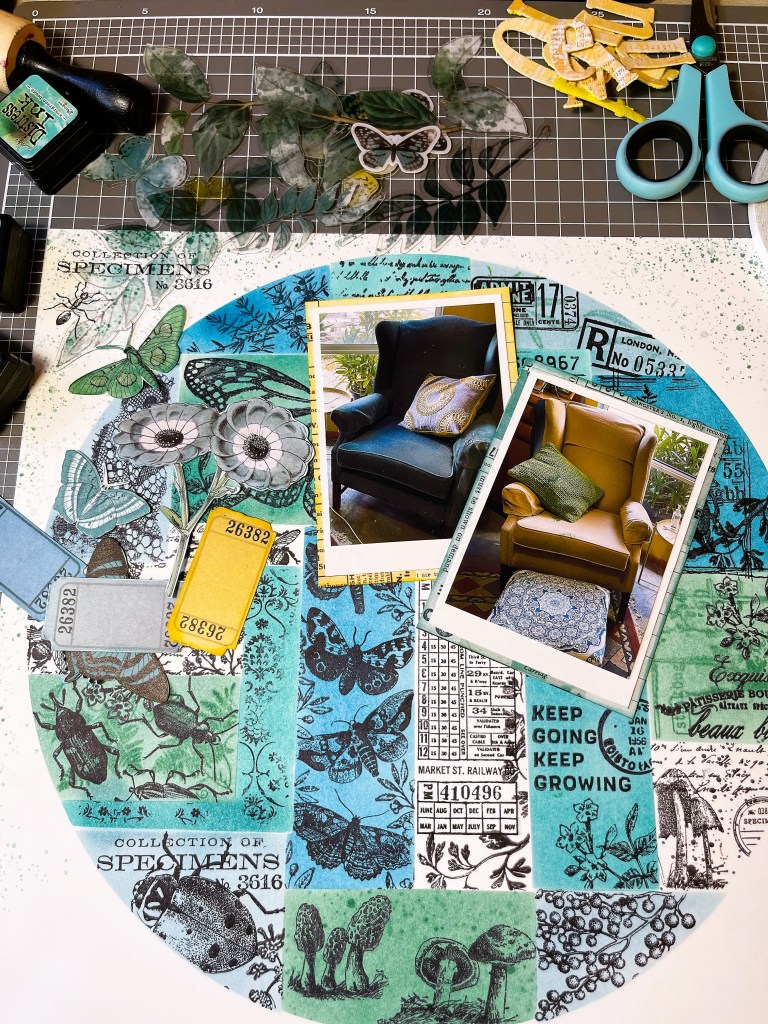
Overall, I am very pleased with how it looks.

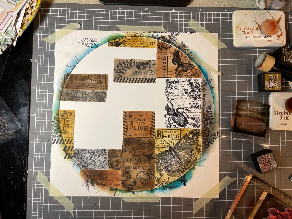
My next layout share will be working with the brown/grey stamped background I created, also inspired by the collaged effect found on the B-side papers from the 49 and Market-Spectrum Sherbet Classics pack. You can view images of this stamped background in my last blog post, scroll right to the bottom to view them.

To view the process video click here.

To view how to make the stamped background click here.

Making Spectrum Sherbet inspired backgrounds!

Hello, old friends!

Here I am back again playing after a very loooonnnngggg break. Life last year got completely crazy for me and time to blog was just beyond me. I was overwhelmed with going back to University to study for the third time, what was I thinking? Well, really it was studying, and upgrading my qualifications or losing the chance to further employment. Anyway, I qualified with flying colours and life is a lot more mellow. So, I have been loving having the opportunity to scrap and paint when I’m not working.

Anyway, let’s scrap! Like half the scrapbook community I have fallen completely in love with the 49 and Market, Spectrum Sherbet collection. A scrapbook collection with the most amazing colours, textures and patterns. I wanted to buy it all but unfortunately, my finances couldn’t stretch to buying the whole collection, plus I already have so many supplies to use up, that I held back and just purchased the one classic pack and two packets of the acetate leaves. Both products are absolutely beautiful.

So, beautiful that I don’t want to use the paper as I only have one of each! Being two-sided sheets, with gorgeous designs on both sides makes it even more difficult. How can I possibly choose which side to use? Well, my creative mind had an epiphany when I realised that I could try and make some of my own papers in the same style as these beauties.

So, make I did, and it was a wonderful experience. Yes, it took me a few hours but who cares about time when one is creating. I stepped back in time and used an old stamping technique, masking, which worked really well to create that collaged look. I chose to work with Tim Holtz Distress inks (for my first attempt) and chose to try and create a teal blue and green background.

I really stepped out of my comfort zone and even filmed the process. Yes, people, I have made my first ever scrapbook video. Something that I have been planning to do for years but have not been brave enough, nor had the time. It’s pretty basic, so be kind. If you are interested in watching it, you can view it on my YouTube channel here. I would appreciate any feedback, so please do leave a constructive comment and like the video. With some motivation and support from other crafters, I hope to continue to develop my video production skills.

Right, so let’s look at stamping and masking. First I selected a heap of stamps which could blend to create a similar nature theme. I also selected some travel stamps for fun, which I used on the second background. I chose to use some Vicki Boutin foundation mixed media cardstock for the first layout, it’s a good quality cardstock made to take wet media, so should easily handle a bit of ink. I also use some thinner Poppy Craft cardstock which I used for the masking shapes and for making a template.

Template? Yes, I decided to not directly copy the Spectrum Sherbet design making a 12×12 sheet but used the collage look within a circle template design. I masked off different sections of the circle and stamped on my images, colouring each section with the distress inks. It was a pretty easy process but a bit fiddly and time-consuming. I really like how it looks in a circle design. I ended up adding a little stamped splash around the edges where I accidentally got some ink smudges. overall, I’m pretty happy with how it turned out.

So happy that I made a second background, working with grey and brown inks and adding some travel stamped images. Not at all a sherbet colour, but I love it anyway.

Unique Possibilities

Hey all,

I have just had a lovely four-day crafty weekend of painting and scrapping. It started off with my best friend arriving to spend the day watercolour painting with me and ended with me sorting old family photos with my darling mum.

The watercolour painting is a new obsession after I went to a workshop at Summer School. The workshop was for botanical watercolour painting and I must say I was a little worried at my ability to paint flora to a scientific standard. Turns out that it wasn’t that strict and I did alright. So, my friend and I have become very keen to keep up with the watercolour painting and now spend every free Friday we have painting! Nothing better than painting with good company, a gourmet lunch and wine 🙂

Here’s what I painted on Friday, fruit and foliage from our fig tree.

Onto the scrapbooking…

This weekend I worked on using my subscription kit from Uniquely Creative. For those of you who haven’t heard of them, Uniquely Creative is an Australian company who sell both cardmaking and scrapbooking products, they offer a few different subscription kits each month. This months scrapbook kit features their new collection called ‘Urban Garden’. It is a gorgeous collection filled with floral and geometric designs in purples and greens. Each kit comes with a detailed booklet of scrapbook layout and card designs for you to create. I decided to try a few layouts from the booklet and get creative making my own layouts using the kit supplies.

I tried Kylie Kingham’s ‘Inspirational Layout’,  not going to lie but this was a lot of work! This particular layout in the booklet doesn’t have instructions, it justs states which kit supplies you need. I was able to work out how it was constructed just by studying the photograph, well, I guessed how she had created it. A few people have asked me how I made the heart like in Kylie’s original layout. So, here is my version and what I used…

The background of the layout is made from three layers (see pic above), I used a darker purple patterned paper from my stash for the second layer, instead of the lighter paper Kylie used.

I think perhaps Kylie used an electronic die cutting machine to cut out the heart shape from the background but as you know, I don’t own one. So, I did it the old school style and cut it by hand. Here’s how…

I freestyle drew a heart on a scrap piece of card, the easiest way to do this is to cut the card to the size you need and then fold the card in half. Draw half a heart on the folded card, then measure an inch in around the inside of your heart and draw a second inner half heart. Keeping the card folded in half, cut around both of your heart line drawings, when you unfold the card you will have a heart template (see photo with pencil).

Flip the paper/cardstock layout background that you will cut the heart from over to the reverse side, use washi tape to hold the template in place and carefully trace around the inner of the template. Remove the washi tape and using scissors carefully punch a hole into the centre of the drawn heart, then cut around the drawn heart line neatly. Hurray, you now have a heart hole in your paper! You then need to secure the striped paper behind the heart cutout.

Next, use a ruler and pencil to measure and mark the stitch holes around the heart. Then pierce each hole ready for hand stitching.

Use embroidery thread and a needle to stitch around the heart. The rest of the process is fussy cutting out flowers and embellishments, and building them up into layers around your photo. I also added a touch of purple glitter(from the kit) to some of the circle designs on the background paper, if you try this do it before you add your embellishments and make sure you let it dry. I then added a title cut out to my layout which was from a previous UC kit.

2020-02-23 12.08.41-1

I love Kylie’s design and was pleased with how mine turned out. I may even have another go making a second layout with the heart feature, though the stitching nearly did me in! I’ll share the other layouts I made in another post soon.

Keep on scrapping 🙂

Ahoy! Old Techniques!

Ahoy, me hearties! I am finally sharing the process photos for these very nautical layouts. Both layouts include papers from the ‘Hey Sailor’ DCWV paper pad. The papers in this pad are all glossy and some have gold foil, the patterns/designs are mostly cream, navy and black. There is everything nautical included, ships, anchors, whales, etc., and I bought it thinking that it would be great for scrapping our many holiday trips to the Albany, Whale Station.

These layouts are the first I have made with the papers and they are nothing to do with a whaling station! The first layout is of my son-in-law who works at the Black Anchor Tattoo Studio, see the connection? Anchors! This paper had the perfect design, mood and feel for scrapping this photo of him, taken at work for marketing purposes. I selected five papers for this layout, a cut apart sheet, some black with gold anchors, a cream with navy anchors, a stripe which is lengths of rope and a framed design to use for the background.

The photo I had available was quite distant and I wanted to have a close up of his face included in the layout, so I cropped and enlarged the photo. This turned out a little grainy and not to the quality I wanted, so I used an old technique to enhance the photo, putting a layer of vellum over the photo. The vellum reduces the graininess of the image. I stitched it roughly together using my sewing machine, I wasn’t precious about it, wanting it rough and ready to work with the look I was going for.

Next, I stepped back in time with another old technique…sanding! The glossy surface didn’t appeal to me for my background and I grunged it up with a sandpaper pad. I got some lovely texture with the sanding, as I worked on my cutting board and all the cuts and nicks on the board were picked up in the sanding process.

Next, I built up layers mounting my photos on the patterned papers and using some of the cut apart embellishments. Then I added several wooden embellishments leaving some plain and inking others black. The last touch was adding some Tim Holtz chipboard quotes. 

I love how this one turned out, the papers and sanding really captured the mood I was going for. By the way, as a proud mother-in-law, I just want to say that the photographer did a great job taking Dane’s portrait but he did make him look quite stern and serious. Dane is the sweetest, nicest young man, and a very talented artist who works very hard, and is always ready with a smile and a joke. I’ve rarely seen him looking this stern.

2020-02-08 17.45.08-1

For the second nautical layout, I used an AB Studio paper for the background called ‘Rustical Journey‘, some scraps from an AB Studio paper called ‘Diary, sheet 7‘, and a few DCWV leftover scraps from the layout above. The chosen background paper worked beautifully with the photos of my daughter and son in law dressed up for a Halloween work event.

The first step was using some old nautical stamps to make some tag embellishments. The wooden stamps have been sitting unused for many years!

I used Ranger Archival Ink in Jet Black to stamp the images and then used some Tim Holtz Distress Oxide inks to add some colour. To add a little bling, I mounted one tag on gold foil cardstock.

Next, I worked on building up some texture on my background paper using stencils and distress inks. The green stencils are from Kaisercraft and the white from a Uniquely Creative kit. *Note: Did you know that Uniquely Creative are now producing their own papers/collections? Oh my, they are awesome, with the same quality as the AB Studio collections. The papers are thick cardstock and each collection has cut apart sheets for those of us who love to fussy cut. Great to see an Australian company doing so well, check them out on their website. I will be posting soon about using one of the latest kits, their third collection, the gorgeous ‘Urban Garden’ collection. Not affiliated with the company, just a subscriber and big fan of their products.

The last stencil I used was a beautiful lace image, I lightly inked the image by swiping the ink across the stencil to create a soft grey, rather than the harsh black of the inkpad. I also lightly stamped in the pirate and his treasure chest, making sure it was slightly washed out to give an old-worldly effect.

The tag edges were inked and some recycled (from a gift) twine added.

I used some gold enamel dots which have a look of what you might see on the sides of a treasure chest, the bolts, just to add some bling. These are from the local cheap shop, about $2AU. Then I popped on some quotes, inking the edges and added some gold glitter chipboard Thickers for the title.

Another successful nautical layout with mood and feel. How beautiful is my daughter, so lovely?

2020-02-08 13.11.08-1

I hope you are all getting some scrappy time, I’m off to scrap with my Uniquely Creative monthly subscription kit. Have a scrappy weekend 🙂

2020…First Layouts of the New Decade!

Happy New Year to all, hope that you all had a lovely time celebrating with family and friends. My New Year celebrations were spent with my girlfriends who help me get through every year with love, laughter and support. None of them are scrapbookers and they don’t really get it, but they are artists and we try to spend arty times together throughout the year. 2019, was a little lacking on our normal arty events with us all dealing with busy lives. I hope to make more effort this year in keeping our creative catch-ups happening with a few arty outings throughout the year.

Anyhow, to kick off my 2020 scrapping, I chose to do a scraplift. The problem I have is 2020-01-02 09.13.09
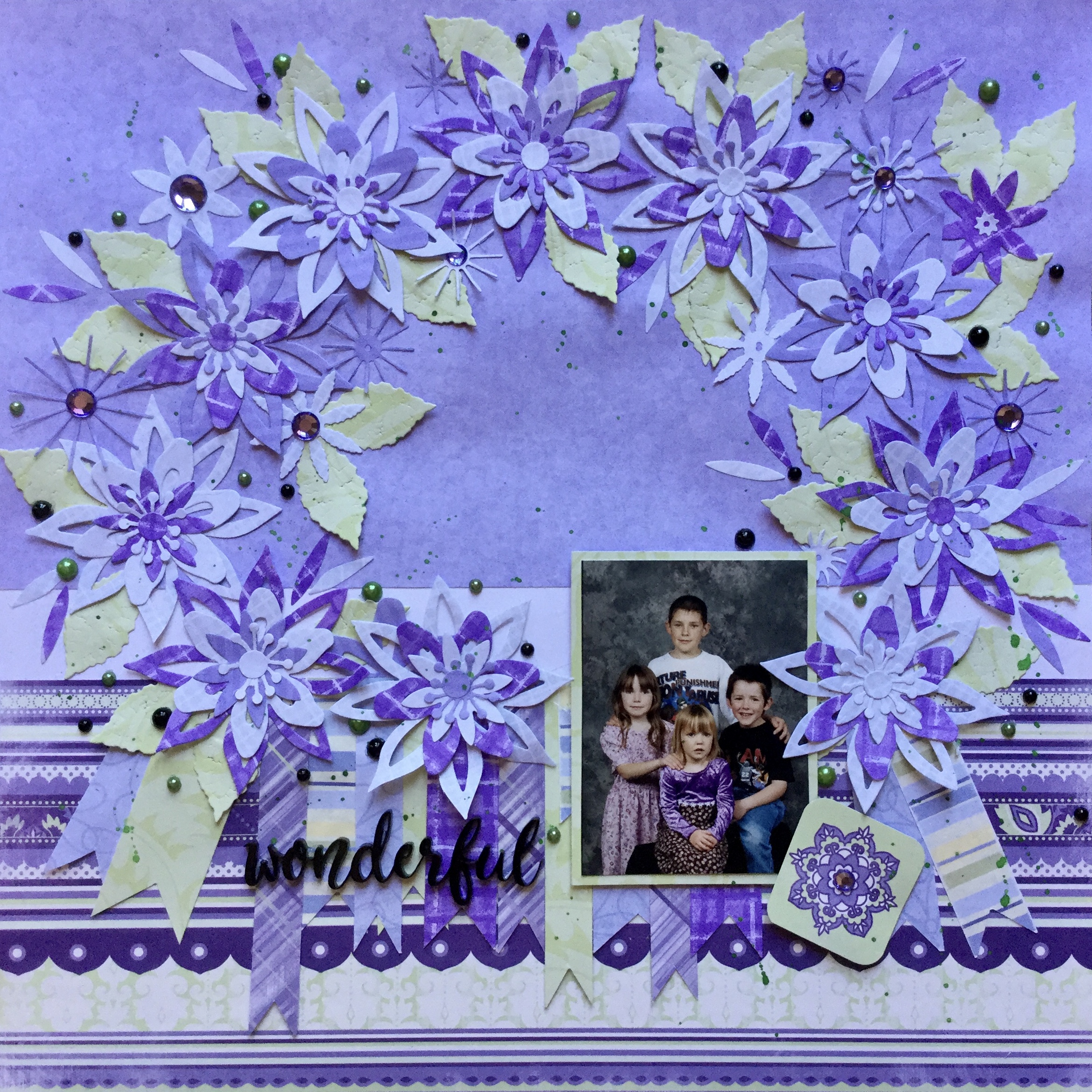
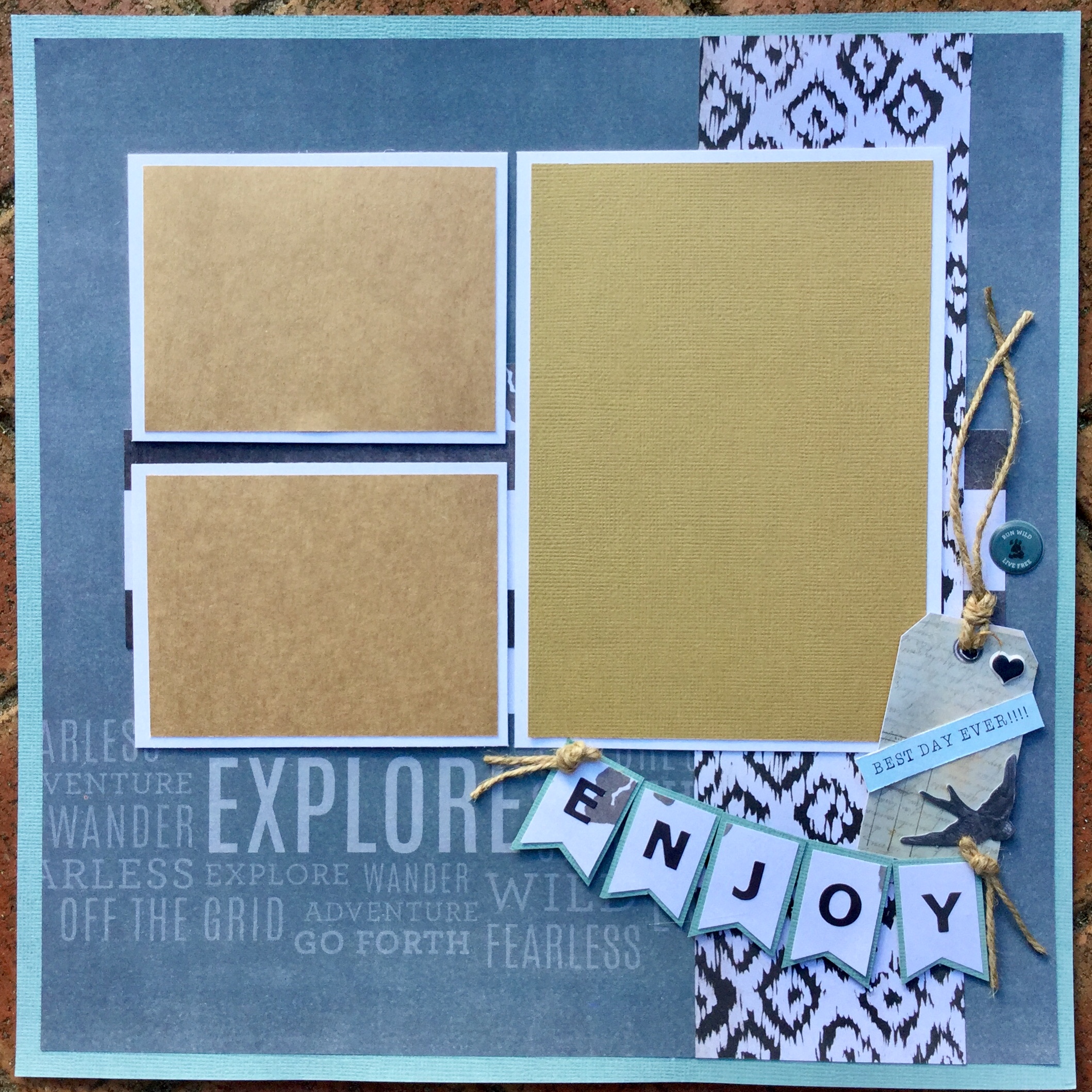
that I don’t know who created the original layout, I tried Google image search and had no luck…they linked it to artificial flowers! I wonder why? Haha. So, if you know whose layout this is please let me know, I would like to credit them? What I loved about this layout was the negative space and the layering on both sides of the layout.

My attempt started with building up some background using gesso and a stencil. The main reason I did this was that I didn’t really have a whole heap of embellishments to use with my photos, plus it gave me time to get messy and really play. I wanted to use some new supplies from Santa, the papers, plus use up some neglected products, the ribbon and frames.

I blended out the gesso edges, rubbing it with my fingers. Then, I sponged on some oxide distress ink, as the white gesso was a bit too stark.

Next, I mounted and built up the layers behind the photos and used the same papers to begin the corner embellishment cluster.

I then, layered up my embellishments with some found old Sizzix cut die cuts, wood veneers and die-cut alphas for the title. The last touch was adding some Nuvo Crystal Drops to create enamel dots. I’m slowly getting better at applying the Nuvo drops, though some are trickier than others due to how thick the mix is.

The finished layout is pleasing but I do need to add some journaling about why we have to do this for every new tree planted, one word…kangaroos! They devastate pretty much anything new, if they can reach it they will eat it and the tree guards can not be removed until the tree is well established.2020-01-02 08.51.33-1

The second layout for 2020 is about my husband’s shoes, not a topic that most people would scrap. The reason I wanted to capture this memory is that he is finishing up his baking career, he did his last shift two days ago. No more flour-dusted shoes and night shift, it will be a change for us all having him home in the evenings and not having him arrive home while I am drinking my morning cup of tea.

2020-01-02 09.54.03

The papers I used were from Santa, a mix pulled from several paper pads, including this gorgeous alpha sheet from Maggie Holmes’s Bloom collection. I fussy cut this sheet to use as embellishments and selected four of the alpha cards for this layout.

I smeared some white gesso onto two opposite corners on my background to try and get a floury texture and sprinkled on some white ink for spots of flour. In the end, most of this got covered by embellishments and is hard to see in the finished layout photo.

Then, I went to town mounting and layering papers, adding the photos, embellishments and titles. I quite like how it turned out and think it just needs a thin journal strip at the base outlining the story.

2020-01-02 12.14.02-1

The last two layouts I completed are of my grandson, I tried to add some bling to both and use up some sequins. The top layout is made with a Vicki Boutin, mixed media, printed cardstock. Yep, Santa thought that I needed some time off from creating my own mixed media backgrounds and bought me the paper pad. I couldn’t resist adding a touch of colour and stencilled around the edges using a Uniquely Creative stencil and some TH distress inks. Both layouts have some Maggie Holmes and Shimelle papers/embellishments, and the bottom layout has some more Nuvo drops (don’t look too closely, some of the dots are not round…haha).

2020-01-03 07.47.44-1

2020-01-03 07.49.07-1

I hope you all are getting some time to scrap and have a fabulous crafty year. For some of our Australian friends and crafters, life is tough at the moment with the extreme fires burning across our country. Many have lost homes and loved ones, if you can support them in some way, please do? It may be just in prayers, offering accommodation, food and supplies, or donating cash to one of the many collection funds which have been set up across Australia and the World. Every little bit will help in this intense time of need. Thank you to all our emergency services and volunteers across the country who are working at full capacity, and to the USA firefighters who are coming to help us out. Let us all hope that rain will arrive soon and help quench the flames, it is really the only thing that will stop this firestorm.


Happy scrapping everyone  🙂

Please leave a comment below or share with other creatives, remember you need to open the post by clicking on the title to access the comment box if you are on the home page.


RTS…Heritage Inspiration

Good morning,

Back in November, Janet from RTS Scrapbooking released her 4for4 Series – Heritage Round. It is a great series with many tips and tricks for creating heritage layouts. Now, I’m not a fan of making heritage layouts and I think generally this is because most people use very dull coloured papers with old fashioned flowery/object prints. I’m more a bright colour girl and so, I thought I would challenge myself and have a go. Around the same time, in the Love RTS FB group, there was a post suggesting you sort and collect up papers which challenged you, the ugly, the old, dated and ‘the untouchables’ and make them into kits. Now, I have a stack of papers that don’t appeal to my tastes, so these were the papers I decided to use for my heritage layouts. Some Love RTS members loved the papers which I detested, we all have different tastes and for me, purple is yucky, as are flower prints which remind me of my Nanna’s wallpaper!

Here are my ‘untouchables’, papers I don’t like…

I started off with the pink and green patterned and floral papers, using a photo of my grandfather. Now, flowers and men usually don’t mix but the story behind the photo is quite romantic and I thought I would get away using these girly papers. This is the photo that my grandfather had taken to send to his sweetheart, my Nanna, during the war. On the bottom right corner, you can see the sweet message he scribed to her.

2019-11-30-12.11.16.jpg

2019-11-30 11.40.12

Janet’s layout features a diagonal patterned paper format and I followed the same process. You can watch Janet’s video here.  As my grandfather was in his motorcycle uniform I found some images related to his job in the war and printed them out to use as embellishments. A tip when using home-printed embellishments, they can sometimes look a little flat in colour, but you can achieve a more polished finish 81Bd+w4oVAL._SY550_
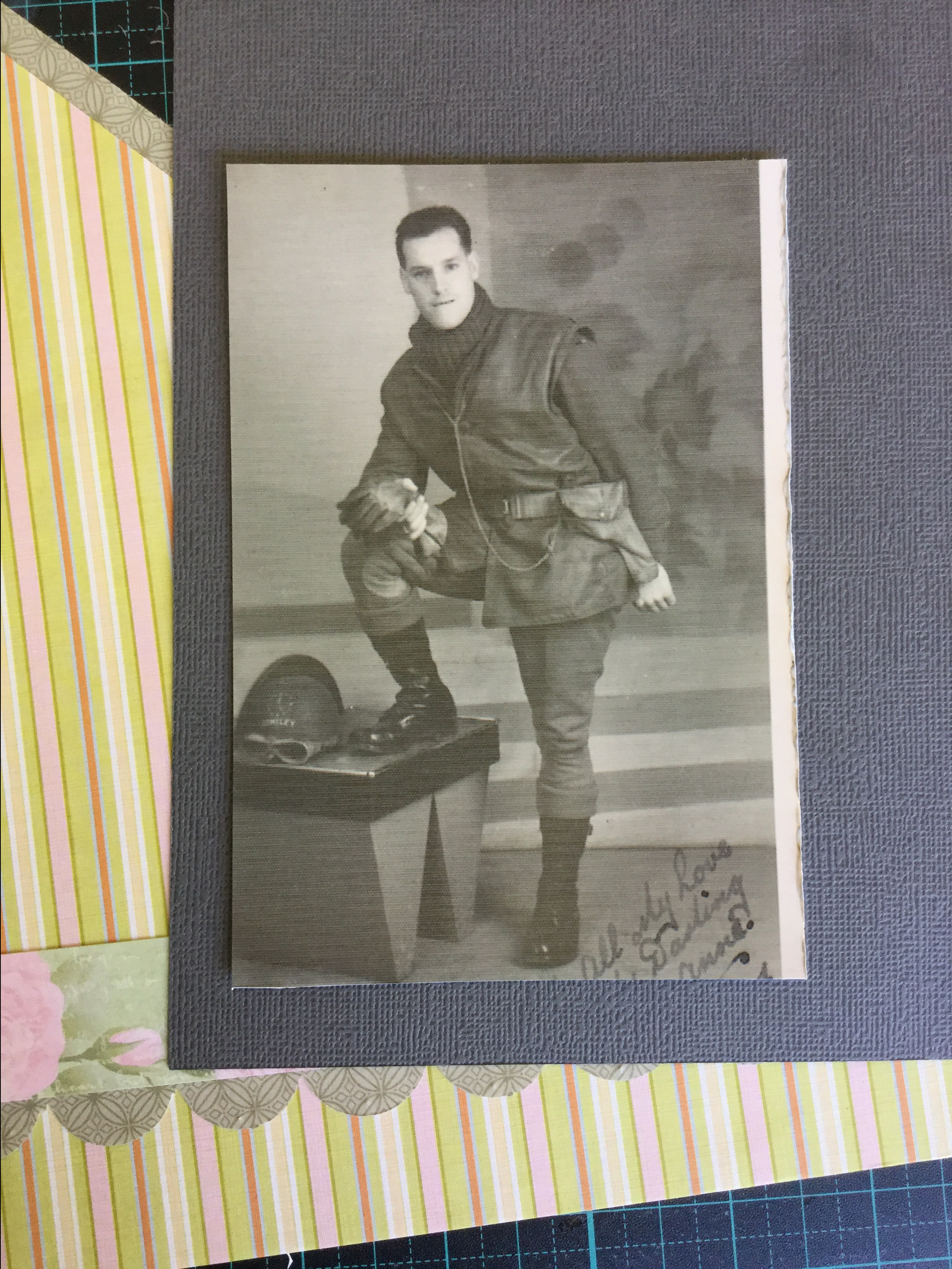
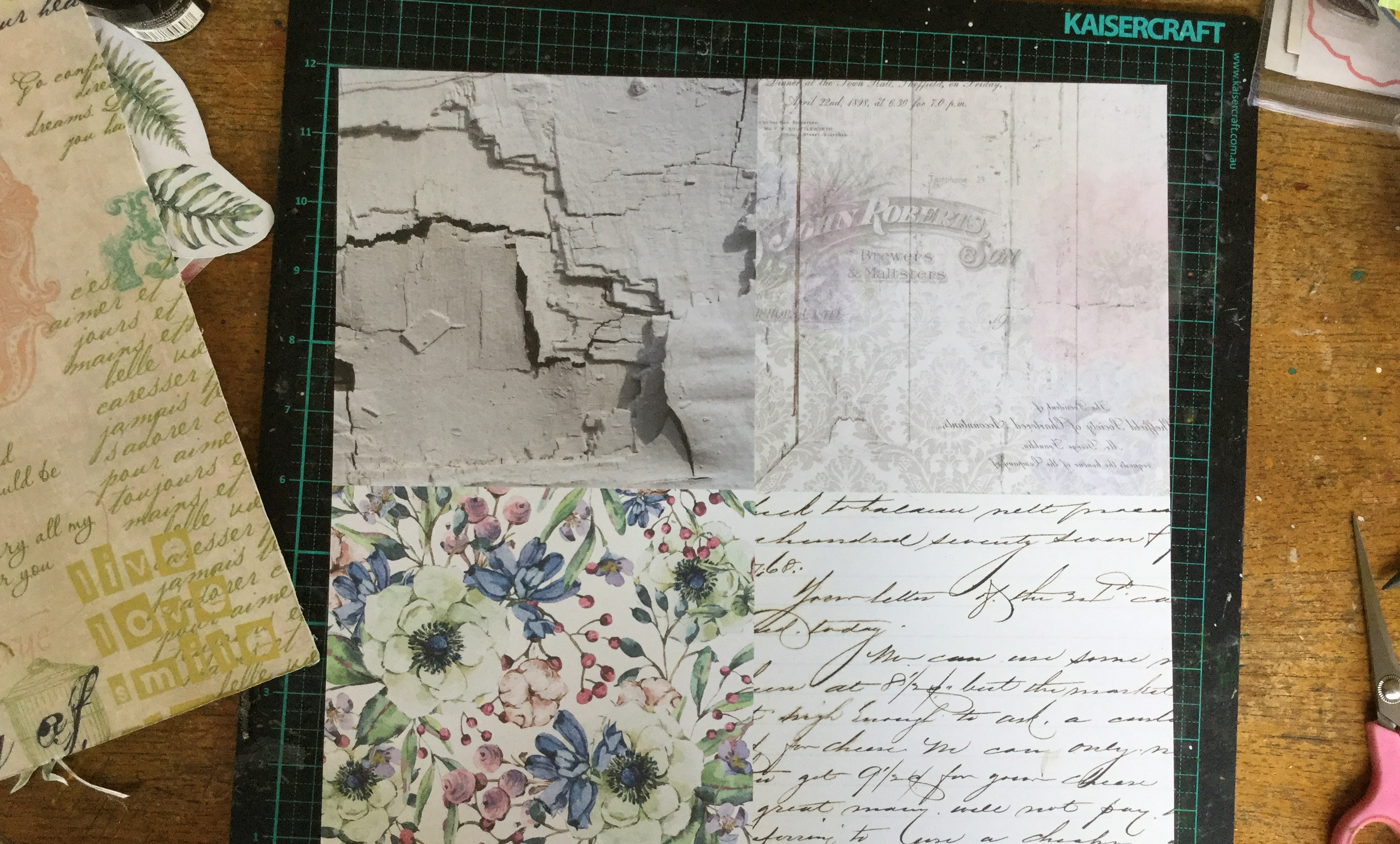
by rubbing each image with a little Tim Holtz Distress Micro Glaze. It just makes the colour pop a little more and looks like a bought die cut. I also printed a heritage document from the website recommended on RTS, https://olddesignshop.com/.

The finished layout turned out quite dashing with just a touch of floral.

2019-11-30 13.59.20-1

My next layout is of my Nanna, the photo she had taken to send to my grandfather. I used one of the purple ‘untouchable’ papers for the background. For this layout, I wanted to use some embossing folders which I had recently purchased secondhand on FB Marketplace, they had come with a whole heap of steel dies I got cheap. I have hardly used embossing folders in my craft life, they fall into my old fashioned, untouchable category. So, this was the perfect time to try them out. I made embossed papers to use for mounts and layering behind the photo.

It is a simple process of inking one side of the plate before adding your paper/cardstock and running it through my Sizzix Bigshot.

The results are quite stunning and really did remind me of the old embossed wallpaper and brocade furniture in my Nanna’s house.

2019-12-14 13.46.12-1

The next photo, I believe to be of them both on their wedding day. It was wartime, so times were tough and for them, there was no white wedding. For this layout, I used the rest of the green and pink untouchable papers. Amongst these papers was a rose floral which was just calling to be fussy cut, fussy cut I did! I also used more printable embellishments from the Old Design website, and it gave me an opportunity to use up some ribbon bows.

2019-12-15 08.01.08-1

It was a fun experience creating heritage layouts and I didn’t mind the end results, however, I did lose interest and moved on to other challenges. One day, I will have another go and finish scrapping the small pile of heritage family photos that I have.

What I did have a go at was getting rid of some more of the purple ‘untouchable’ papers and scrapping some old family photos from the ’90s. I’m not sure I pulled it off, the papers were pretty ugly and gaudy, but I gave it my best shot. Anyway, more layouts in albums…the ultimate goal.

2019-12-15 10.28.31-1

2019-12-15 17.04.59-1

2019-12-15 11.26.28-1

Keep on scrapping! 🙂

Don’t forget to post a comment or share with other creatives, remember you need to open the post by clicking on the title to access the comment box if you are on the home page.

RTS 6×6 SG Challenge Layouts

Hey all,

I am playing catch up and only just sharing these layouts from several weeks ago!  I had a lot of fun joining in with Janet Maden’s challenge from RTS which focuses on using 6×6 paper pads with scrapbook sketches from Allison Davis at Scrapbook Generations.

It has felt like a step back in time, using double page sketches, as I tend to focus on single layouts with a matching pocket page these days unless it is for a challenge. When I do use a double layout format it seems to be all or nothing, I make a stack of them in one week, then none for months and months. I do have have a few on my blog from last year which I will share links too at the end of the page.

So, here we go, my seven layouts from the RTS 6×6 Challenge

I mostly followed the Allison Davis sketches whilst watching Janet’s RTS 6 x 6 series, Janet always has a different slant on how to use your cut pieces in multiple ways. My first layout is of my grandson after he took to himself with a permanent marker! I’m pretty sure he will end up with real tattoos when he is old enough, he is influenced by his parents who both have tattoos and he has an uncle who is an apprentice tattooist.

Layout #1. Cool Tatts, homemade! Lots of ink splashed around here and some stamping, every layout has mixed media in this bunch. I used some old TLC rubons and a mix of quote embellishments.

2019-10-27 11.55.37-1

Layout #2. Big Blow Up! A blower vac war between my hubby and grandson. Ink and stencils this time, some of the new Vicki Boutin honey stencils and a Kaisercraft floral stencil.


2019-10-27-07.40.46-copy.jpg

Layout #3. First Train Ride. Some more splashed around Oxide ink and lots of stamping to make the craft stock background. The patterned papers and die cut embellishments are from Kaisercraft.


2019-10-29 14.16.21-1

Layout #4. Round We Go, photos from a day at the Perth Zoo when we tried out the merry go round/carousal. Circle stamps to get that ‘mood and feel’, as Janet would say.


2019-11-03 10.59.22-1

Layout #5. more Zoo photos! Our zoo trip was not planned and we weren’t prepared for a day in the sun, so we bought very daggy zoo hats. Looking very fetching we just had to have a selfie taken.

At the Perth Zoo, there are many large, ancient, pine trees and I thought this cute decorative fake foliage, which I picked up for $2 from Spotlight, would make great pine trees on my layout.


2019-11-03 06.29.59-1

Layout #6. Lets Go Mumma, fun in a jeep at the zoo.

More splashing of ink and some stamping using a Uniquely creative metal die as a stamp.


2019-11-02 12.27.00-1

2019-11-02 12.27.06-1

2019-11-02 12.27.17-1

Layout #7. Amazing Hot Dogs. I think this one is my favourite, no mixed media. I like how the photos are laid out in a sequence of the event, cooking hot dogs on a campfire at home.

2019-10-29 19.22.54-1

And…that is where I stopped. I didn’t make the last layout, number 8, perhaps I’ll get to finish it during the summer holidays. Only three more sleeps and school’s out for me!

Here are some links to previous double layouts which I have shared…

Jan CKC 4 

CKC 2-3

CKC Always Enchant

Please leave a comment below or share with other creatives, remember you need to open the post by clicking on the title to access the comment box if you are on the home page.

Happy scrapping everyone  🙂


Flowers and AB Studio!

Good morning,

This weekend I am having fun playing with some AB Studio papers, I love all of their collections and recently purchased papers and sets from a few new ones. Two which I purchased are the ‘Breeze of the Forest’ and ‘Secret Wood’ set, both are very Winter snow and Christmas themed with beautiful illustrations of forest animals and snowy landscapes. Hmmm, those who know me may be asking why I would purchase these, given that I live where it never snows? Well, they are beautiful and many of the snowscapes have pine trees, which do surround our town. I hoped to be able to use them creatively for events and themes other than snowy weather and Christmas.

I also purchased some of the ‘Diary’ collection papers and the shabby  ‘Love Symphony’ papers, also beautiful papers with floral and heritage costume elements. So, a few weeks ago when I was up and about at 5am, I went around our garden taking photos of all the spring flowers blooming, these became my inspiration for creating with some of the AB Studio papers.

Layout #1,

I selected the ‘Memories’ paper from the Diary collection and the ‘First Rose’ cut apart element sheet. Plus, a few other bits and bobs from other companies to embellish the page, including some very old TLC chipboards buckles.

Then I decided to pull out an old Tim Holtz product, some grunge board, a giant @ symbol and used some oxide inks, water and colour sprays to add the right colour to match the background paper. I also added colour spray to the background, trying to not to form halo effects.

Then, it was simply a matter of adhering my photos, fussy cut roses and embellishments onto the dried background. Because my photos were of a climbing rose, I tried to make the rose embellishments climb around the photos. I also used some of the tags from the Diary collection cut apart sheet ‘Red is Bad’, some Kaisercraft paper roses (which I squashed to reduce the thickness) and some silver Thickers for the title.

The finished layout ended up over-embellished, taking up lots of space much like the rambling rose in our garden.

IMG_9953

Layout #2

For this layout, I selected another Diary collection paper for the background, ‘Your Own’, and the ‘4 Different Ways’ paper to fussy cut for embellishments, I only used one-quarter of the page. I had some old Kaisercraft door and quote diecuts and some more of those TLC buckles (which I didn’t end up using).

My photos of orchids had yellow and pink tones in the flowers and so I added some pink distress ink to the background, before adhering the photos into place.

Then, I adhered the fussy cut flowers and diecuts into place, with some of them I inked and distressed the edges first.  I love how this layout turned out, the subtle sepia brown flower diecuts enhance the photos.


IMG_9947

Layout #3

For this layout, I used the reverse of the ‘4 Different Ways’ paper (I purchased a few of this sheet)  which has a lovely black and white floral design and some stitching/costume elements. I also decided to use the leftover piece of the cut apart ‘First Rose’ sheet and fussy cut out the flowers for embellishments. There was also some leftover tags and quotes from the ‘Red is Bad’cut apart sheet.

This time my photos had a lot of green foliage in them and I decided to add green and pink to the background sheet. I lightly spritzed two shades of pink in the main area where my photos would be placed. I used a Kaisercraft stencil and after sampling different green inks went with Tim Holtz Oxide inks, they blend so beautifully and are thick and creamy. I wanted to create a halo of foliage around where my photos would sit and have the greenery travel across the page.

After mounting and adhering my photos into place, I added my fussy cut flowers, tucking the on and under the photos. When I ordered the AB Studio collections, etc., the lovely Bri from Anna’s Craftcupboard included a little freebie, 3 little silver glitter acrylic embellishments, so I added them to this layout. They are very cute and of good quality. Then I popped on some silver sparkle enamel dots and some little dots of Antique Silver Kindy Glitz. Here I am the anti glitter girl…adding sparkle!

2019-11-16 10.46.25-1

Layout #4

This time I used papers from the ‘Secret Wood’ and the ‘Breeze of the Forest’ Christmas/Snowy collections. Yep, snowy papers with rose hips, snow and winter foliage, with a few scraps from other companies, for a spring layout. The papers used are the bonus cut apart sheet, sheet #4, sheet #8 from the ‘Secret Wood’ and sheet #5 from the ‘Breeze of the Forest’.  I had six photos to include on this layout and decided to make a double page layout using a sketch map from a Scrapbook Generations travel ebook.

It was a pretty easy sketch to follow with good directions for selecting and cutting the papers. I grunged up the background by dragging some oxide ink across each page in a lovely soft yellow called Scattered Straw, before mounting and adhering my photos in place.

Then, I added some fussy cut flowers, some butterfly and quote die cuts, and some Nuvo Crystal Drops and rose gold Kindy Glitz. Plus, one of the TLC buckles with some organza ribbon. Overall, I am pretty happy with this layout, I doubt anyone would pick the papers as being Christmas themed.

2019-11-17 07.50.00-1

Please leave a comment below or share with other creatives, remember you need to open the post by clicking on the title to access the comment box if you are on the home page.

Happy scrapping everyone  🙂

CKC Oct. 2019 – Layout #3

Good morning,

A quick share of another layout using my CKC October kit. I used three papers from my kit, the navy and white polka dot, the yellow polka dot and the text dictionary print for the background.

I wanted to combine two challenges with this layout, my favourite online store, Annas Craft Cupboard,  and FB scrappy group had a mood board challenge for this month which I 72086680_10157321391587931_4661759538892898304_n (1).jpg
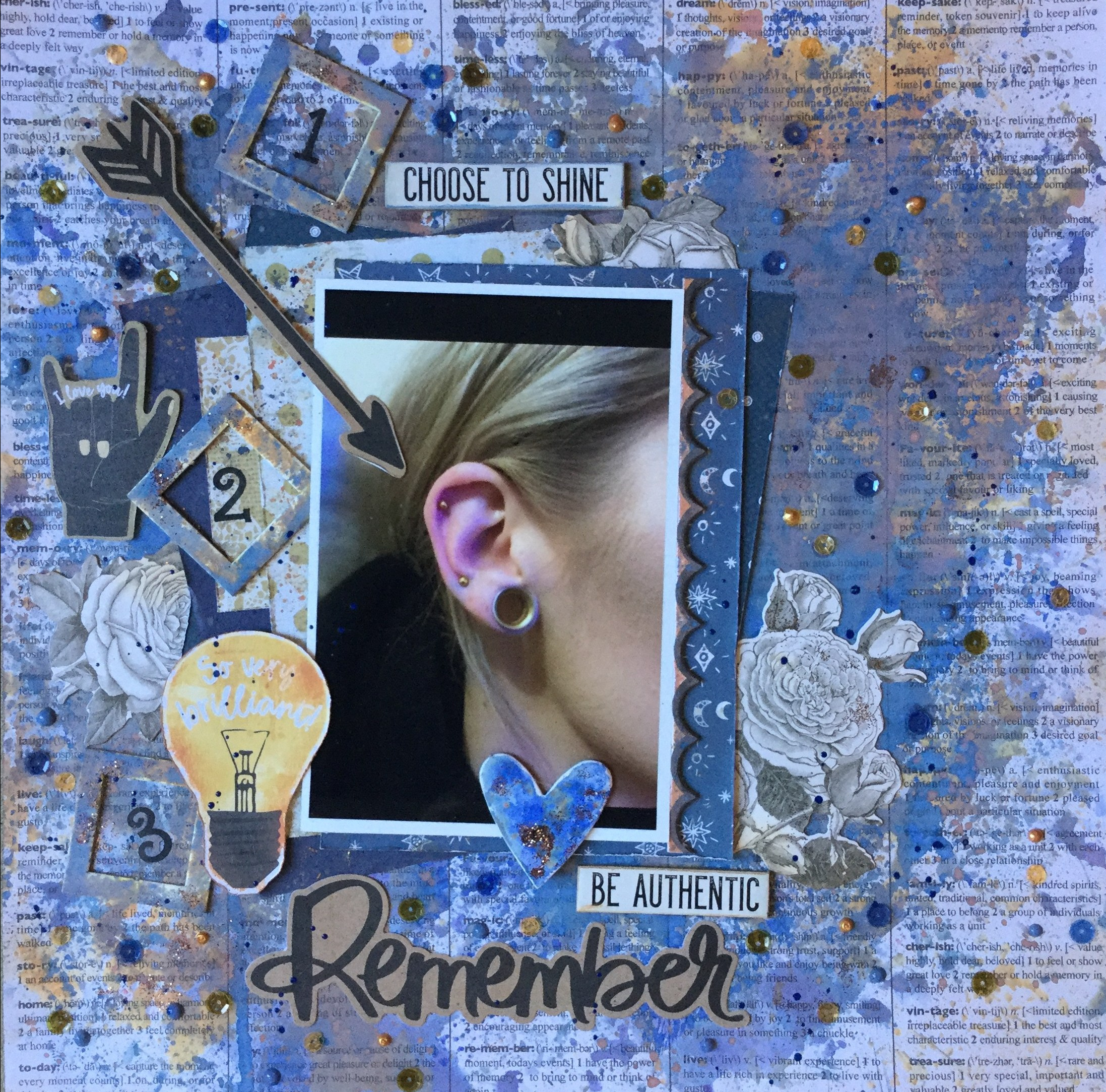
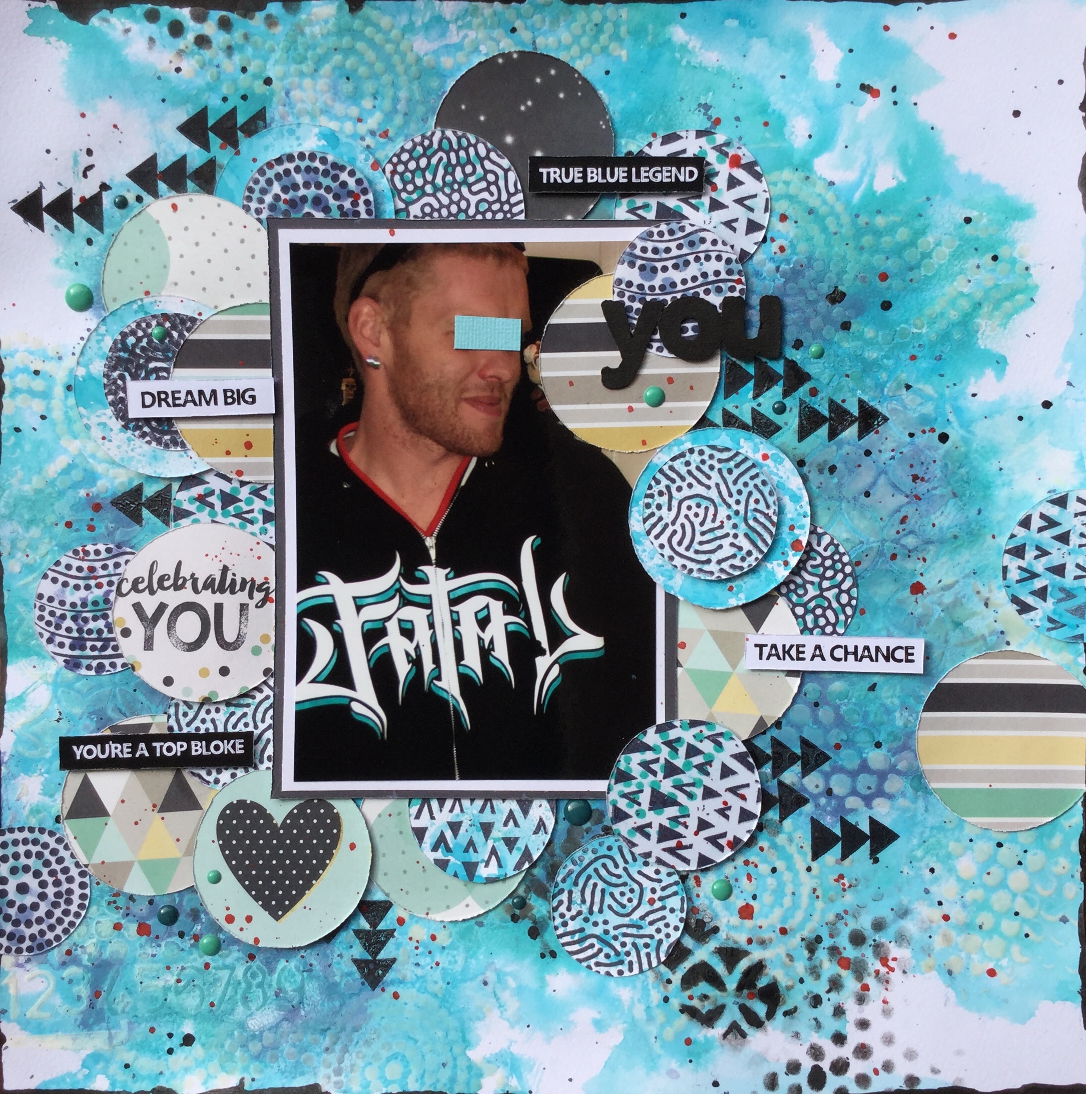
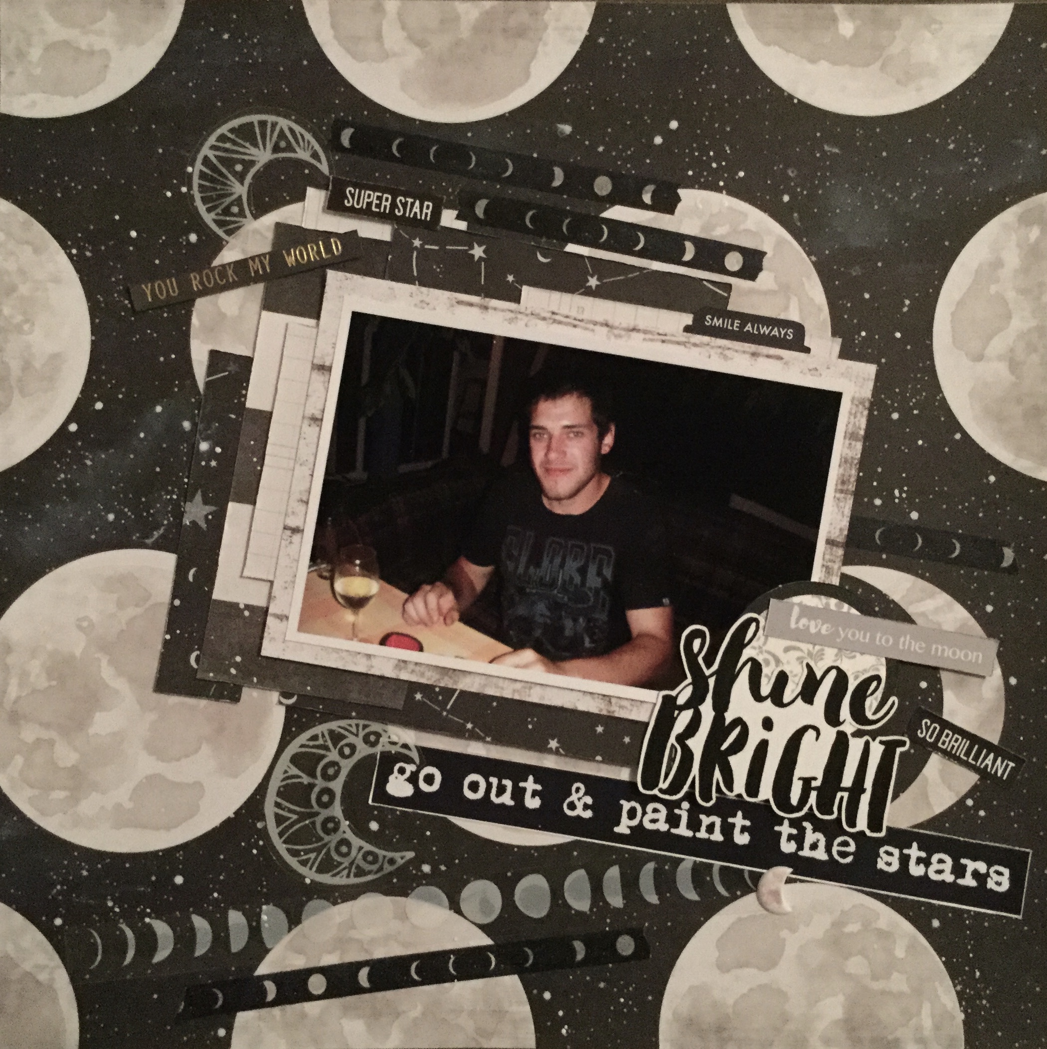
loved. The colours were perfect for my photo. There was a slight hint of blue in the background of the photo and some lovely creams and golds from my daughters, hair, skin and jewellery. I used three different Tim Holtz oxide inks to grunge up the background using the plastic bag technique, a very simple technique using just ink and water to create amazing layers of colour. 

Then I rummaged through my embellishment supplies in my kit and on my desk. I pulled out some very old chipboard frames and a heart, some new Vicki Boutin die cuts, a scrap scallop edge from a chipboard sheet, and some Tim Holtz chipboard quotes and rose die cuts. Also on my desk was some copper glitter and a bag of sequins waiting to be put away, so I decided to use these as well.

I distressed the edges of my matting papers which included a few scrap pieces and the polka dot papers from my kit. I roughly laid out where I would place the embellishments, paper matting and photo, at this stage, I take a photo and use it as a reference later when adhering things in place.

I needed to make some changes to the chipboard frames/shapes as they stood out too much being plain white and cream. I dunked them onto a mix of oxide ink and water (to activate the oxidisation) and create a little implied texture and colour. I added some little specks of glue to each, using my finger, and sprinkled each with glitter, then shook off the excess. Let me just say that I am not a glitter girl and it is rare for me to use it if I do use glitter it is usually on Christmas items. For me, a lot of glitter is gaudy, but a little can add some magic to a layout.

After I added the embellishments, some of that glitter made its way onto the background, once again a little smear of glue with my finger and a very light sprinkle of glitter. Then, I added some sequins and some Nuvo crystal drops ( a recent purchase). I am still trying to master adding Nuvo drops, some had little peaks which I squashed down when they were half dry. The blue Nuvo drops worked every time, the metallic did not!

Remember.jpg

I enjoyed putting this layout together, it is always fun to get messy playing with oxide inks. I think the layout came together well and I love how all the embellishments coordinated with the colours in the background.

Keep on scrapping everyone 🙂

*Note: if you are purchasing glitter, please only purchase the environmental type now available. We all now know how bad it is for the waterways and wildlife. When cleaning up your work surface, use a baby wipe, damp tissue/paper towel which will hold onto the glitter during the cleanup and try to dispose of it in a more eco-responsible way. As crafters, we all have a tonne of glitter in various forms, we need to try and do the right thing. Here are some links with advice on responsible use and disposal…

How to get rid of your plastic glitter

How to dispose of glitter

The eco-friendly guide to glitter

‘Go forth and sparkle responsibly’ 

Please leave a comment below or share with other creatives, remember you need to open the post by clicking on the title to access the comment box if you are on the home page.

Catching up with CKC Oct. 2019

Good morning,

I’m running behind with using my Counterfeit Kit for October, already it is the 19th and I have only made 3 layouts! This month is busy for me with starting a new teaching term, plus I have a whole different class again, nothing like being swapped around three times in a year.

Anyway, here is my kit and what I have managed to produce…

First, the inspiration for this month’s CKC is based on the ‘Summer of ‘69 Kit‘ from Studio Calico. It is a lovely summery kit with some cute elements that reminded me of my mum’s country kitchen. There are doilies and bunting with buttons and chevron. The main colours are red, orange, coral, soft pink and little pops of green and blue.

My kit was selected based mostly on pattern and colour, I also included a selection of B side papers similar to the ‘Summer of 69’ kit.

Ok, the first layout, though made with both papers and embellishments from my kit took on a completely different colour palette. Just before starting using my kit I did a tidy up, trying to get some organisation happening with my supplies and some space to work. When cleaning and sorting I came across several leftover kits with bits and pieces left in them and decided that it was easier to use some of the bits than have to put them away. So, glitter, diecuts, chipboard buckles, ribbon and other bits and bobs merged into my kit. On my desk, I also had some Vicki Boutin product and my usual supply of Tim Holtz inks, so what’s a girl to do but use those as well.

Anyhow, the colours in the photos spoke to me, some more strongly than others and my layout took on a lot more ruby red, singing with the theme of my layout…wine!

I toned down the bright red of my Kaisercraft sticker alphas by sanding them, added some glitter to the diecuts and inked up the doily.

2019-10-13 16.24.58-1

My next layout is using a sketch from Scrapbook Generation, it is from their travel ebook. Sometimes, you just want to scrap and not have to think too much about the detail, just get it done. A sketch can speed things up.

Layout two is made with the same patterned paper from my kit, as in layout one, but what a difference in the look. No mixed media and a gorgeous, jadeite green cardstock make the photos pop.

2019-10-19 07.55.21-1

Layout three is a completely different colour palette, I went all soft and dreamy trying to use the sky paper and get rid of some of those chipboard buckles. The photos are of my youngest son all packed and ready to move to a new location, and start a new job! He was super excited, who wouldn’t be going to work at a resort, on the beach with bars, restaurants, etc., and amazing wildlife? He is very lucky to be working at a major holiday destination in Western Australia, Monkey Mia Dolphin Resort! Yep, there are dolphins!

2019-10-19 07.55.41-1

*The little space in the bottom corner is for my journal writing which will be strip journalling.

I’m not sure that this layout works that well, I went a little crazy using the centres of the buckles as confetti embellishments and threw a lot of enamel dots and hearts onto the page. It’s happy and fun and a little crazy, I guess it captures the excitement we were feeling about this new adventure. At least I used those buckles, only about another 50 packets to use up!

Hope everyone is getting some scrappy time this weekend, keep on scrapping 🙂

Please leave a comment below or share with other creatives, remember you need to open the post by clicking on the title to access the comment box.


Beauty! Mix it up!

Hello,

Today is a quick share using some old and newish papers. When I was tidying through my patterned paper collection I came across a FREEBY paper which I had stashed away years ago. It was from one of the now defunct scrapbook magazines, I’m not sure which magazine, as it was so long ago, but back in the day, a free paper cut apart sheet was often included in the monthly edition.

Anyhow, today was the day to use it! It is an A4 size sheet, one half is a lovely patterned piece of paper with lots of antique style text and images and the other half of the sheet has some lovely rectangular embellishment to cut out. There are gorgeous pastel tones of colour with a hint of mustard.

2019-10-02-10.53.55.jpg

Now, I wasn’t sure what I was going to mix it up with, nor what photos I was going to use but over the long weekend (the Queen’s birthday holiday, thank you Queenie.) my beautiful eldest daughter and grandson came to visit and as usual, I took a plethora of photos. When printing them out, I loved these photos of my daughter, she was enjoying the warmth of the morning sun on the patio, bare feet and messy hair drying, a cheeky smile and happiness glowing from her at just being in this moment, of being home with family. She will hate these photos…no makeup, wet hair, bare feet, yikes!

Ok, photos selected, what contemporary papers would I use with my freeby sheet? Well, as usual, I am drawn to colour and mood when selecting supplies. In the photos, there is some blues, navy and cornflower blue, and some lovely greens from the garden in the background. So, what I selected was some beautiful papers from the AB Studio, Enchanted Flowers collection.  I love this companies paper collections, the quality of the paper is like cardstock and the designs are very unique with just the right amount of vintage and grunge. Each collection has a cut apart sheet, sometimes two, often one sheet is a set of tags, the other is objects to fussy cut. For this layout, I used two papers from the collection, the Past Forgotten and the Poisonous Flowers, both papers had hints of blue and green.


2019-10-02-10.53.44.jpg

Putting the layout together was a simple process of fussy cutting and layering the foliage 2019-10-02 10.41.51
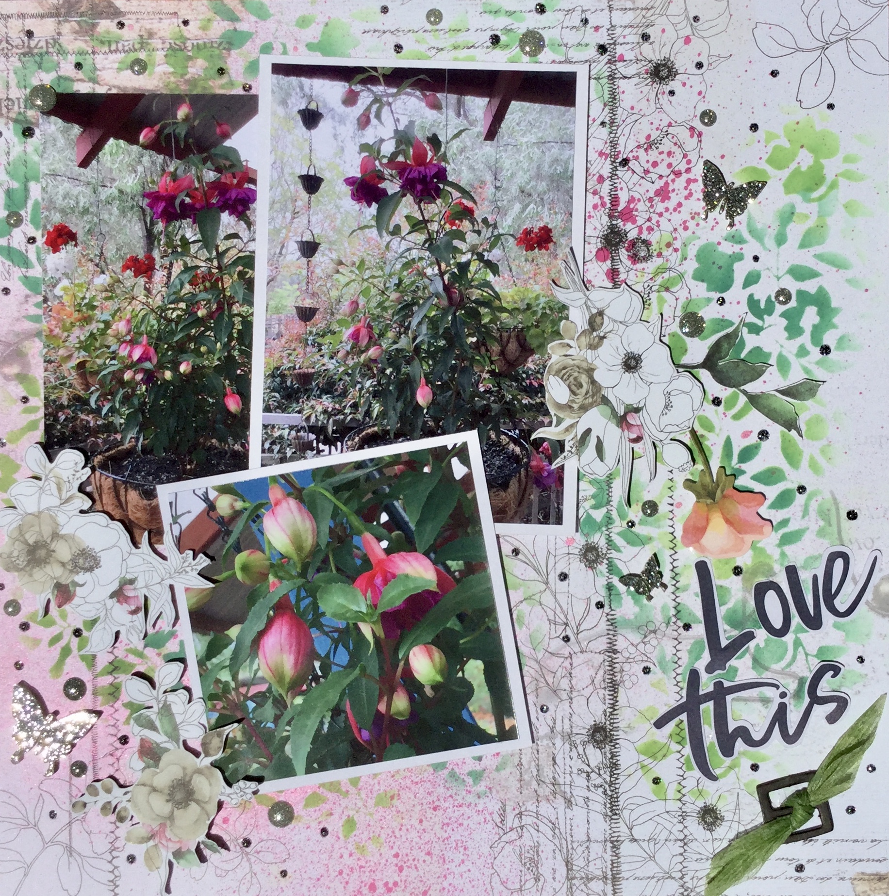
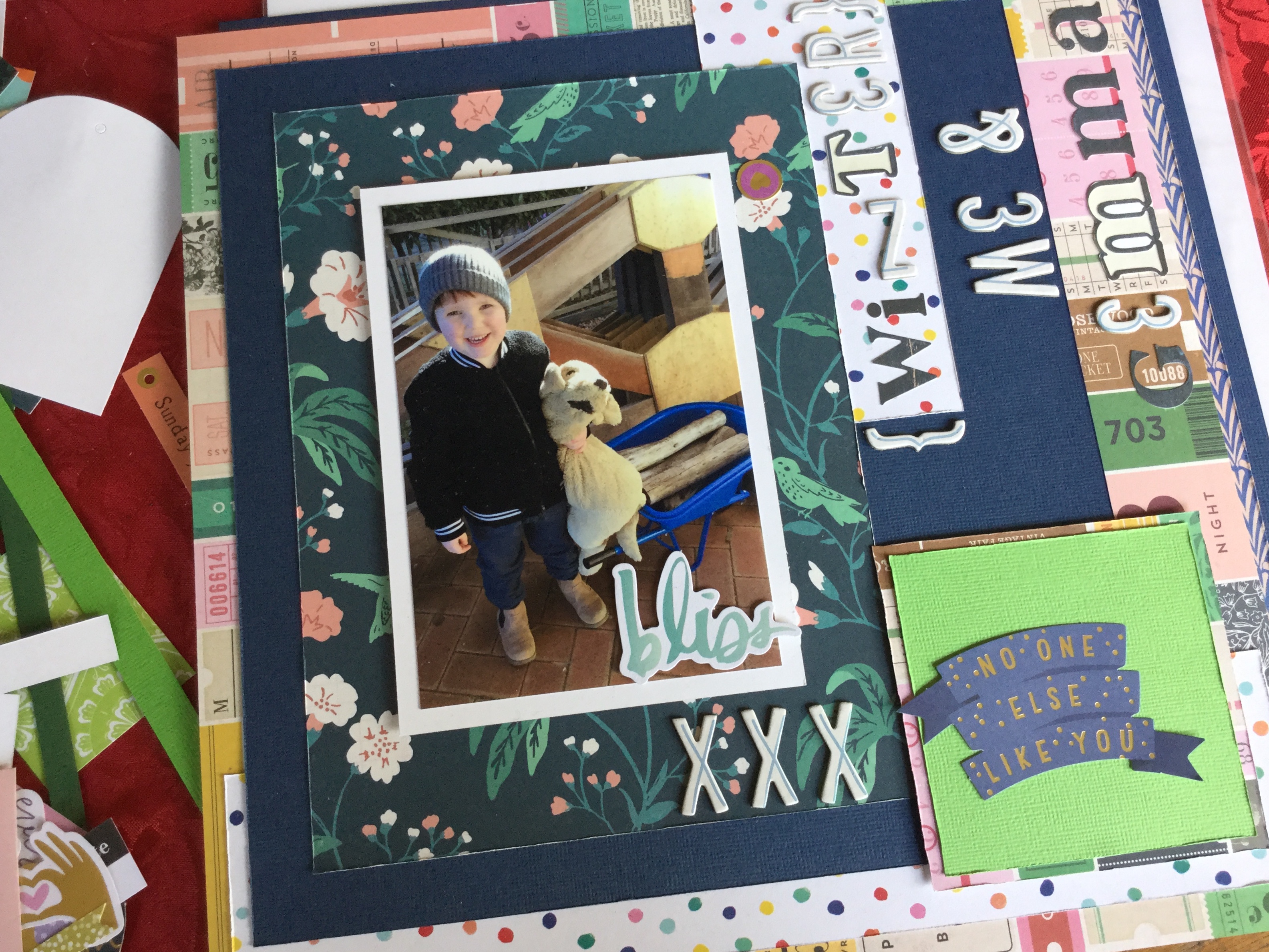
and flowers, creating some texture and depth. I also added some tags cut from the Botanical Beauty, DCWV paper pad and a few Kaisercraft butterflies. Some sprinkles and splatters of watercolour paint in magenta, navy and green finished off the layout.

2019-10-02-11.29.20.jpg

I like how the layout turned out, somehow even though the photos are very contemporary the vintage and botanical elements seem to work well together.

Happy scrapping everyone, I hope you are all getting some creative me time. Please leave a comment below or share with other creatives, remember you need to open the post by clicking on the title to access the comment box.


Lemon Tree…Very Pretty!

Morning,

Does anyone remember that old song where it goes ‘Lemon tree very pretty…’? When I looked at my photos of my citrus garden this song popped into my head and became the inspiration to my layout. This layout is all about pretty with lots of mixed media, flowers and foliage.

The background was fun to create with a layer of stencilling using a Kaisercraft stencil and texture gesso paste, some painting and splatter with Tim Holtz oxide inks and then sponging on some more ink using a Vicki Boutin leaf stencil.

2019-09-21 17.02.422019-09-21 17.02.472019-09-21 17.28.532019-09-21 17.29.052019-09-21 17.56.45

Next, to finish off the background, I stamped on some leaves using a Vicki Boutin stamp.

2019-09-21 18.09.49

Time to make some embellishments with more layers of oxide ink, Vicki Boutin stamps and some fussy cutting. It’s amazing what you can do with a scrap of white cardstock.

With my leaves cut, it was time to punch out some hearts. I pulled out a range of patterned paper scraps with different textures and patterns to keep things interesting, and even used the Vicki Boutin packaging!

Next, I dribbled some Heidi Swapp mustard color shine onto the background where I wanted my photo to be placed. I adhered my photo in place with some fun foam and glue and got to work adhering and layering my hearts and foliage embellishments. I added a Prima die cut and some stamped Vicki Boutin flowers. Then, finished off with some mustard coloured puffy hearts, a gold title of chipboard alphas and some white and yellow watercolour paint splatter.

I love how this turned out, it is so fresh with the mix of greens and yellows. A fun layout to create, though it was time-consuming…6 hours! I don’t usually spend this amount of time on a layout but I was chilling out and creating on a Friday night. Overall, time well spent!

2019-09-22 11.31.09-1

Fears! What spooks you?

Good morning,

It is a lovely spring morning here, the birds are tweeting, the golden sun is streaming low through the trees and I’m wishing that the school holidays were starting today! Unfortunately, we have one more week until I don’t have to set the alarm clock and will have the freedom to scrap every day if I feel like it. Who am I kidding, scrapping will be happening every day?

Anyhow, this layout share is about something completely different, no spring and no holidays. What I’m sharing is based on what I fear, with all the Halloween collections out now and the spooky paraphernalia in the stores, it got me thinking about spooks. For me, it is always the little creepy crawlies which do surprise attacks! For example, the other day I was outside enjoying and admiring the garden, the citrus trees are in blossom and hubby has been working on re fencing the orchard. I come back inside and I feel that creepy sensation of little feet crawling across the back of my neck! I do what any sensible adult does, I freeze. Then, I bravely try and flick the offender off my neck…really hoping that it is not a spider. Flicking success I think until I realise it’s on my arm! By now my heart is racing, I’m starting to panic, I’m telling it sternly to get off, it’s not doing that! Next, I’m screaming…it’s a baby pray mantis! I’m going to leave the story there, I’m pretty sure that you have an image in your head of what happens next, you know…the dancing and screaming!

So, back to scrapping. This layout is more like a story page, I have no images of the many times I have done the critter dance but I do have many stories I can tell about this insane reaction of mine to tiny insects (um…sometimes they are as big as my palm). I have left journal space to type up my story and add it in later, I may even add a tag/s with several SBC_sta-cms328_23365stories and slip them behind the journal mount.

Creating this layout gave me a great excuse to get messy with mix media and get out my favourite stamps from Tim Holtz, the Stampers Anonymous, Entomology set (CMS328). Ok, so now you will think I’m nuts, yep I said favourite. I love any papers, embellishments, dies and stamps which have insects, in fact, I kinda collect them. And…I have pet stick insects which I dote on, big suckers!

Let’s get down to the important stuff, scrapping. I started off creating my background using white cardstock and building up layers of Tim Holtz oxide distress ink. I’m trying to develop a grungy feel to my background, after all, I’m after spooky.

Next, some stencilling using a Kaisercraft 12×12 brick stencil. I’m going for a connection with house and home, so this was a perfect choice.

More stencilling, this stencil came in one of the Uniquely Creative kits. It creates a gritty, sandy, water like texture.

Now to add some details, I love this house plan stencil. It is quite intricate, including fine lines and text, so if you purchase it be gentle when applying the ink.

Next, some splodges! Nothing says grunge like paint splodges. I used a Kaisercraft stamp set and some purple oxide ink, purple speaks spooky to me and the Dusty Concord oxide ink has a lovely mottled, chalky effect. I overlapped the splodges to get more runs down the page.

Step 6! Wow, this background is taking some time. What spooky layout doesn’t need cobwebs? Another amazing stamp set from Tim Holtz, Stampers Anonymous, Tangled Web set (CMS346). This stamps beautifully, creating very fine, detailed lines.

The last step, grunging it up with a baby wipe. I mixed some texture gesso with some black Stazon ink (refill bottle), you could use any brand of black ink, I just grabbed what was handy on my desk. Use the baby wipe to smear on the gesso and wipe away excess. I love how this worked and had to stop myself from overdoing it.

After I dried off and ironed my background paper, I pulled out some patterned paper scraps to create embellishments. I had some AB Studio paper with text quotes which I cut apart to fit my fear theme. The quotes were actually about positives, never give up, fly high type of inspiration. I then used my new WRMK Clear Cut 2″ hexagon punch and punched a heap of PP hexagons. I distressed the edges of each but took ages adhering them to the page. I didn’t want to cover my lovely grunge which I had created…should I, shouldn’t I? In the end, most of it was covered.

I also pulled out some large Jillibean alphas (Farmhouse Stew collection), I love these, they are very versatile. It’s great to see that using large alphas and fonts is coming back in fashion, have you seen the gorgeous Ali Edwards ones? Devine. With these alphas, I inked the edges brown before foam adhering them in place.

2019-09-20 23.53.46

I needed a subtitle but didn’t want it too big or too small. I ended up using white glitter alpha Thickers which is on my bash (use it list), I am not really a glitter girl but seem to have a large collection of glitter Thickers. The white was too bright, so I applied some ink to tone them done to a subtle grey.

2019-09-20 23.34.03

Here come the critters!  Stamped, smudged with some distress ink and fussy cut (after I couldn’t find my matching die set which I own…grrr). I also stamped some critters straight onto my background.

Next, the final assembly adhering everything in place with double-sided tape, fun foam and tacky glue, adding my journal spots, quotes and critters. I love the end result, it was a lot of work, about 6hrs but it’s good for the soul messing around with ink and stamps. I do not usually spend this much time on a layout, it was a Friday night and I was home alone and just wanted to play with my supplies. No photos or sketches for inspiration, just all my creativity!

2019-09-21 10.56.47-1

Happy upcoming Halloween for those of you who celebrate it. I hope you are all creating Halloween pieces and layouts for the season, it looks so fun. For the rest of us who don’t celebrate, perhaps look at making a page about what you fear, it could help reduce the fear or phobia.

I would love to see what other spooky things you all create and welcome you to share your link in the comments. Remember if you are on the home page that you need to click on the title of the post to open the posting page to comment.

Keep on scrapping 🙂

Uniquely You!

Morning,

I have been getting messy with some mixed media and it has been so fun. It has been a while since I created a full-on mixed media layout, creating the background paper and the embellishments. Yes, it takes hours but who cares when you are getting messy, relaxing and taking some me time!

I had purchased this card kit from Uniquely Creative a couple of months ago and had broken my self imposed rule ‘ Everything new must be used ‘ rather than stashed. This Indigenous_Journey_Mini_Kit_-_Uniquely_Creative_2000x
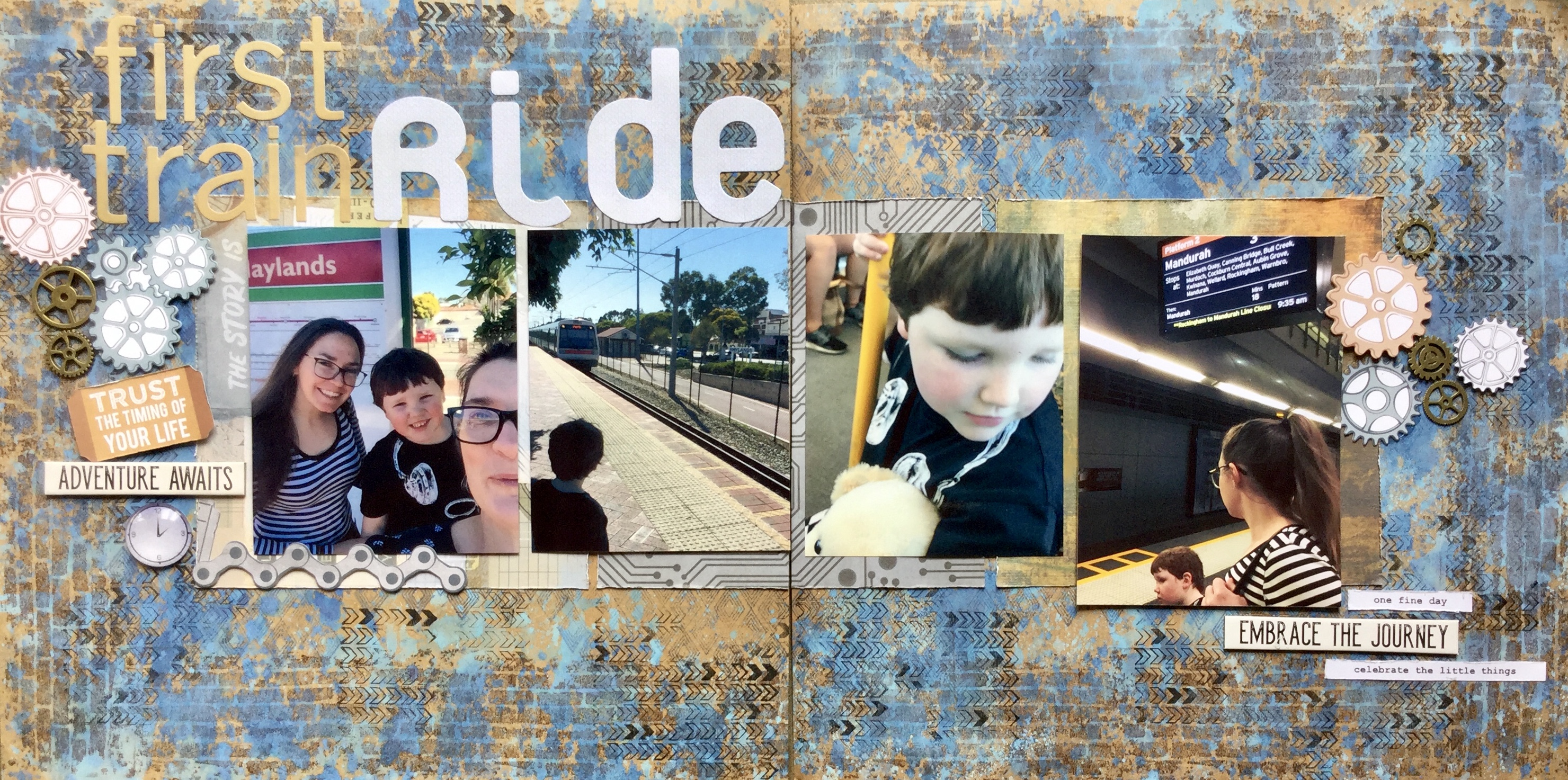
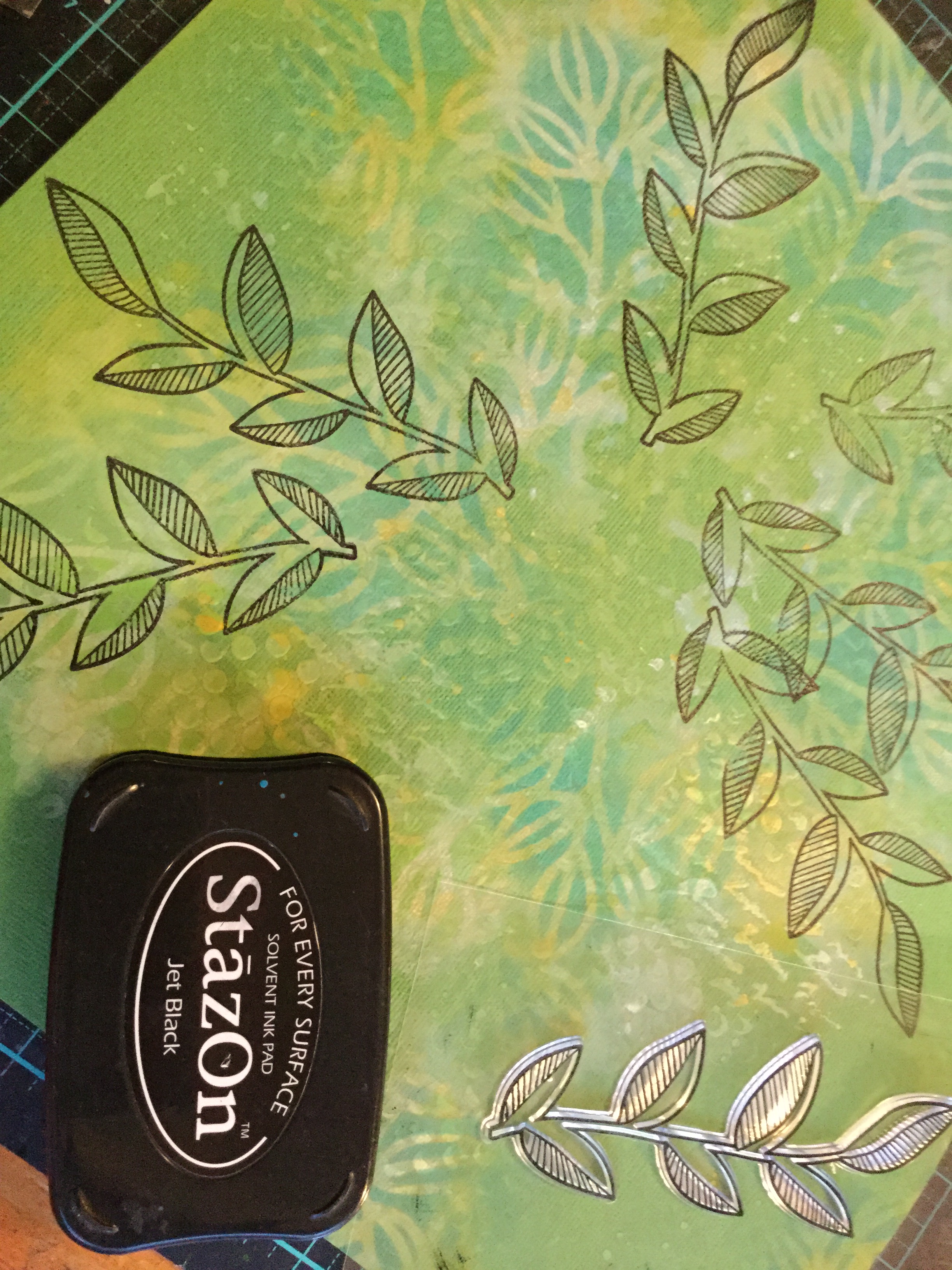
kit had been sitting on my desk, under a pile of supplies and when having a clean up I found the kit and broke it down, separating and sorting all the components. Now I don’t make cards but I loved the stamps and stencils in the kit, which is why I purchased it. The design of both is very Australian, using patterns similar to indigenous art. The booklet which came with the kit had a picture of a wonderful layout made by Tammy Klingner. The colours she had used just sparked and sent me running to find a photo which I knew would work well with both the stamps and stencils.

Here is what I used, I pulled in a couple more stencils to play with. The green stencil is a Kaisercraft but I’m not sure about the others, they may be WRMK. As usual, I’m pulling in some Tim Holtz Distress Oxide inks, love, love, love these. You can see Tammy’s layout in the first photo below which I am using as inspiration.

So, here is what I did…it was a long process. I started by using textured gesso paste and the stencils to create some texture on my background page.

While the gessoed background dried in front of the woodfire, I stamped out the circle embellishments onto white cardstock. Then I used the same stencils and some Tim Holtz Distress oxide inks to add some layers of colour and pattern onto each circle. A Little rub of Distress Glaze between layers fixes the ink in place.

Some blue oxide ink, a plastic bag and a splash of water and I have a lovely textural look to stamp more circles on and punch out.

I recently purchased some WRMK 2″ Clear Cut Punches, I had wanted some for ages but they are pretty expensive, close to $50 (AU) here. A 50% off sale happened and I couldn’t resist, snapping up the heart, hexagon and circle punches. It has taken me a while to master using them, at first I battled to get a clean cut and I ran some waxed paper through them to lubricate the mechanism. This seems to have helped, either that or I’m better at applying an equal weight distribution when punching. Anyway, I used some Simple Stories, Heart collection papers to punch the circle embellishments, the colours in this paper collection matched well with my photo.

With the gessoed background dried it was time to add some colour, more oxide inks were splashed around to build up layers of textural interest.

Some oxide Chipped Sapphire darkness to bring it all together. I love how the ink pools around the gesso and seeps into the previous inks. You may notice that some of the gesso took on a creamy yellow colour when dry, I was testing two different gessos. The yellowing didn’t bother me and worked to my advantage, as it matched in well with the Simple Stories papers.

Next, some stamping, more stencilling and a whole lot of fussy cutting! Those stamped circles took a while to cut, think I need to purchase some more circle punches.

Then, it was just a case of assembling, layering and adhering the circle embellishments. I used some fun foam and double-sided tape to create different layered heights. I added some black watercolour splatter and some small text quotes.

Even though I loved how it looked I felt it needed a little more punch and so I added some bright red watercolour splatter to pick up the thin red line in the hoodie from the photo. Then, a few enamel dots from the Simple Stories collection. The title came from the kit, a piece of wood veneer which I painted with watercolour paint.

IMG_9127

This was so much fun and I highly recommend the Uniquely Creative stamps and stencils, no connection, I just like their products. Do check out Tammy’s blog, I love her colourful style.

And, please do leave a comment, I would love to hear what you think about this layout…is it too much? Remember that you need to click on the title of the post to open the page to comment.

The next post will be another mixed media layout, stay tuned, I’m nearly finished creating it.

Keep on scrapping!


Catching up with CKC Aug. 2019

Hey all,

Life has been busy and I am battling to keep up with posting about what I have been working on, so…here is what I achieved with my attempt at the August CKC. I really loved the colours and patterns in the inspiration kit/s and had fun pulling out suitable papers to make my own kit.

The August CKC was based on the July Citrus Twist kit, there was also a July Citrus Add-on kit and this was the inspiration for my kit, I preferred the brighter colour scheme of the add on kit.

For my kit choices, I focused on colour, pattern and motif found in the Citrus kit. I had trouble finding similar blue-based papers and ended up with more greens, apricots and pinks.

Because things were busy and scrap time was reduced, I decided to get smart and makeup pages which I could use with a range of photos. I used the Simple Cut Creations tutorial (from YouTube) to whip up 6 quick layouts. This worked out well and I managed to get them made up in very little time. The trick to the Simple Cuts Creations is getting all your papers and cardstock precut and then you simply assemble the layouts.

2019-08-18 11.21.14


Layout #1. I used for some photos from a recent family cinema trip to see the new Lion King movie. I didn’t take photos at the cinema, so borrowed some media shots from online.

2019-08-12 09.08.04-1

Layout #2. Are photos of my hubby assembling my grandson’s new wheelbarrow, he had outgrown the last one. When making these layouts I was trying to use up some thicker alphas and often mixed up the fonts on titles.

2019-08-13 16.10.46-1

Layout #3. is my beautiful mum, celebrating her 70th birthday at work. Can you see how I used number seven alphas as substitutes for the letter ‘L’ in the title, pretty sneaky?

2019-08-13 09.54.01-1

Layout #4. By now, I had not many of the blue and white alpha Thickers left and had to get creative with the other sticker alphas which I was using. I cut around some of the sticker borders to create the letters I needed. *Sorry about the wobbly parenthesis, it moved and I did fix it later.

2019-08-18 11.19.12-1

Layout #5. With this layout, I ended up having to pull in another set of Thickers alphas to complete the titles. However, I was still determined to use up the blue and whites and flipped a ‘Z’ on its side to make an ‘N’, plus cut down two ‘J’s to form ‘i’s.2019-08-18 11.19.41-1

Layout #6. Mixing up those alphas again.

2019-08-18 11.21.54-1

Layout #7 & 8! Yes, I made two extra layouts based on the designs. This layout had me mixing up those alphas again and finding ways to complete my titles.

2019-08-18 11.20.29-1

I had this lovely floral paper which was asking to be fussy cut and added to a Simple Cut Creation layout! Gotta love fussy cutting 🙂

2019-08-17 14.12.26

Not a bad effort in getting some simple layouts completed and using up some old supplies. I used the rest of my kit for some travel pages which I am making for my Vietnam holiday album.

If you haven’t tried the Simple Cut Creations tutorials do try them out, it does speed up the scrapping process. You can see some other layouts I made using this system here.

Plus, I got a bit obsessed with this speedy production line approach and made more layouts with a collection which I didn’t like but thought would work for my Vietnam album. Over the weekend, I added the photos and embellishments…mission complete.

Happy scrapping 🙂

Last of the Wolf Pack!

2019-08-13 08.33.47-1

Hello everyone, as promised here are the last layouts I have made to bash (use up) my Heidi Swapp ‘Wolf Pack’ paper pad.  I finished these in August and have shared them on some of my FB groups, my apologies if you have already viewed them. I’m going, to be honest, I just wanted to get them done! So, I cheated and used inspiration from elsewhere, deciding to follow the layout instructions from the Simple Cut Creations YouTube channel.

Simple Cut Creations provides videos of quick and easy page construction for single and double-page layouts. I went with single pages, as I like to put a pocket page for my second layout to hold excess photos. The tutorial I followed was for creating layouts with the Carta Bella ‘Let it Snow’ collection. You end up with 6 layouts to which you add your own photos. There is a tutorial for using the Heidi Swapp ‘Wolf Pack’ Collection but it is for double-page layouts.

So, here is what I ended up with. I did add extra embellishments from my stash, these small bits and pieces are mostly from the Kaisercraft company. I still love the versatility of this collection, you can create layouts to meet almost any occasion, event or themed photo. I do have some scrap pieces left and two whole pages, so may make a couple more layouts in the future but for now, I’m calling it done!

2019-08-13 08.30.37-1

2019-08-13 08.30.59-1

2019-08-13 08.31.21-1

2019-08-13 08.31.47-1

2019-08-13 08.32.19-1

2019-08-13 08.33.03-1

*A little tip, if you are planning to have a go making some Simple Cut Creation layouts from the video tutorials. Watch it and pause it and take screenshots of each of the cutting diagrams. PDF instructions and cutting diagrams are not available. It’s also handy to screenshot the finished layouts for embellishment placement.

Happy Scrapping 🙂


RTS 4 for 4, Summer Challenge!

Hello again,

Just a quick share of my layouts I created when I participated in Janet Madison’s 4 for 4 Summer Series. For those of you who don’t know, Janet is a wonderful, experienced scrapbooker who loves to share her skills and knowledge with others. Janet has her own unnamedYouTube channel where she offers a huge range of videos based around the various needs of her followers. Some of the series she produces deal with the organisation of your supplies, making your own scrapbook kits, and scrapbook tips and tricks to speed up the scrapbook process.

The 4 for 4 series demonstrates how to create layouts using only 4 papers with some embellishments, and a few supplement papers (which are optional). You end up with 4 layouts, either single or double (you choose) and a set of cards. I tend to only make the layouts and never quite get to the cardmaking, using those paper pieces for more layouts. It’s a fun process to try and those participating often share what they create on the FB Love RTS group page.

This series was a summer theme and for us down under, in Australia, well we are dealing with winter, wet and cold days. I didn’t have any summer photos to scrap, so I went with gardening photos, more of a Spring and Autumn approach. Below is what I worked on, four double-page layouts of my garden.

I started by selecting my papers, a range of patterned papers and some coloured cardstock. The beautiful garden-themed papers are from the DCWV Botanical Beauty pad, it is one of those collections which you never want to cut into. Absolutely gorgeous botanical beauty DCWV
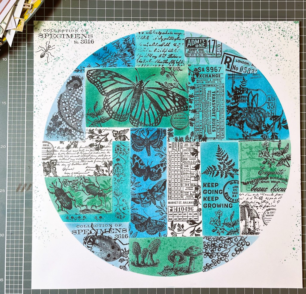
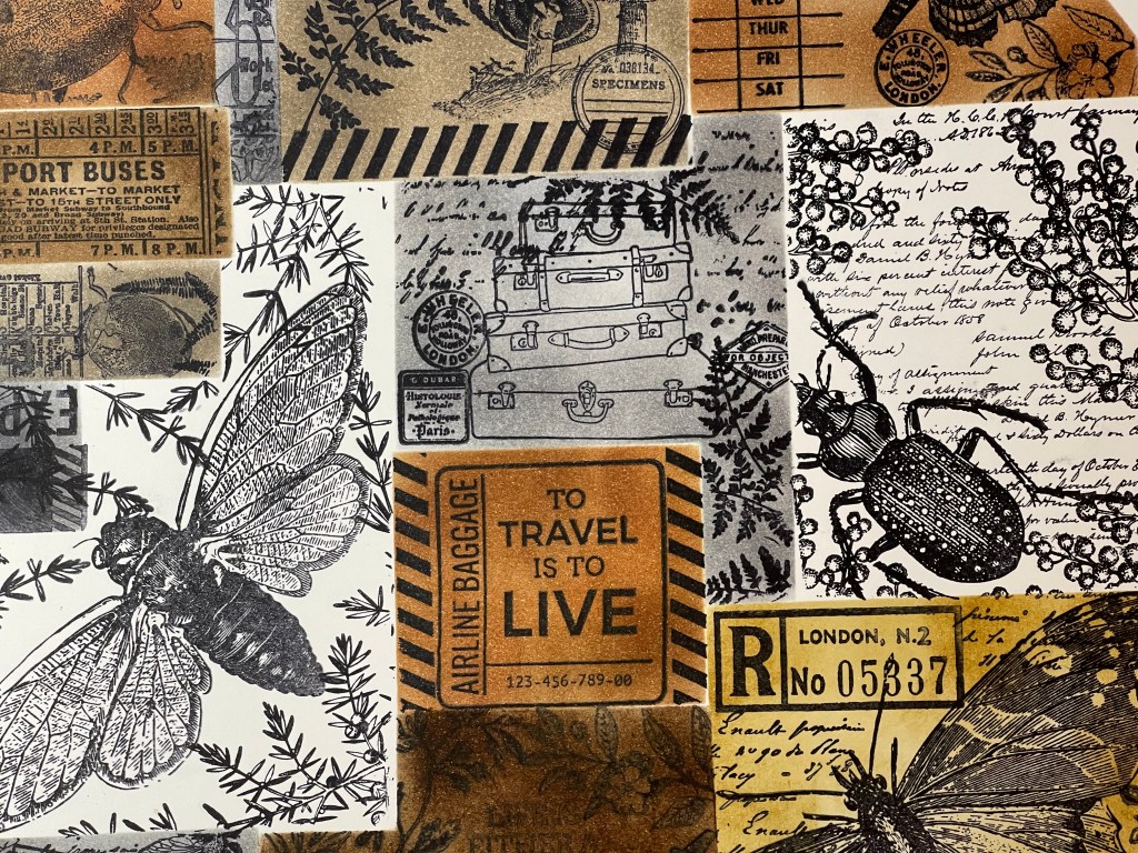
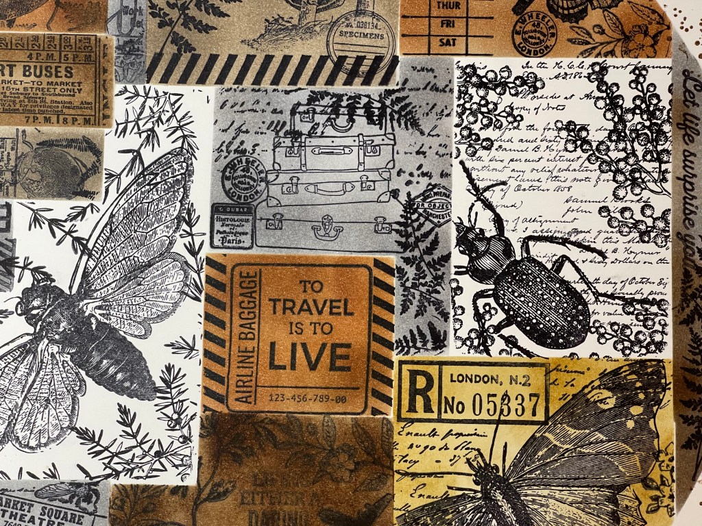
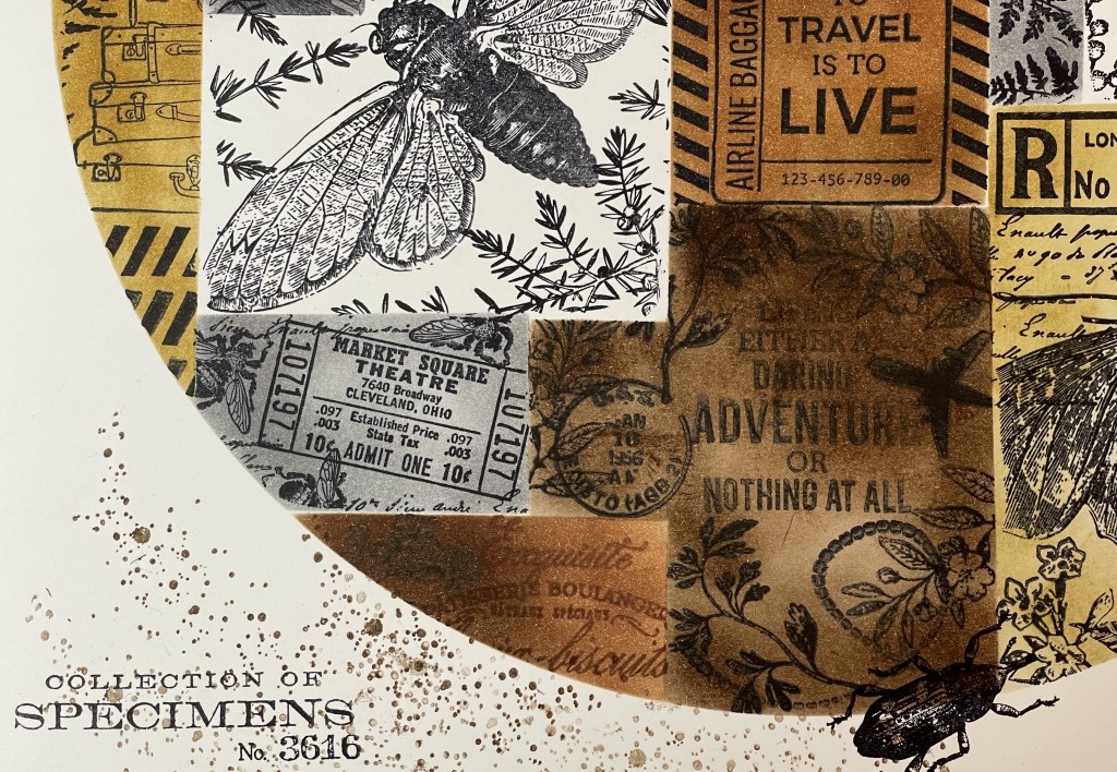
papers, and if I get the chance to buy a second pad I will snatch it up, it’s amazing. I ended up using very little of the cardstock or supplement papers, and just focused on using my main four papers and white cardstock. Mainly because I wanted to include some stamped images, some lovely insects from the Tim Holtz Entomology stamp set.

My embellishment selection ended up huge. I went through everything looking for anything that had a garden feel or went with my paper colour selection.

Janet’s instructions, putting together your kit.

The first part of the process has you cutting your 4 papers into pieces following Janet’s very clear advice in her video.

Janet releases the videos slowly, about a week apart for each layout. It can be agonising waiting for each video, as you are excited to get creating! The videos are worth the wait, her delivery is very friendly and down to earth, often you will find yourself laughing along with Janet who has a wicked sense of humour.

My Layout #1.

I used photos of Gazania flowers in our springtime garden, they are so colourful and cheery and worked beautifully with the paper I had selected. The black strips on the layout are actually copper metallic washi tape, it didn’t photo well, as it is reflective.

Janet’s instructions are here.

2019-06-29 10.07.45-1

My Layout #2.

This layout is of our vegetable garden just before our Spring planting. The garden beds have been weeded and prepped ready for new seeds and seedlings. Luckily for me, Hubby is a mad gardener and loves growing produce which helps cuts grocery costs and gives us a healthy diet. It was very useful when we had young children, now we produce far more than we can eat and pass it on to family and friends.

Janet’s instructions are here.

2019-06-29 10.06.42-1

My Layout #3.

This layout is some Autumn colour in our garden.

IMG_8410

Janet’s instructions are here.

My Layout #4.

My last layout is various shots of the garden and property in October, hubby likes to snap photos on his phone of what is happening in the garden each month. I used fewer photos than Janet, as my photos were larger.

IMG_8417

Janet’s instructions are here.

Well, that’s it! I have lots of bits and pieces left to complete some more garden layouts. If you are interested in making Janet’s cards here are the instructions.

Look into joining the Love RTS Facebook group and join in the fun, a great bunch of people who share and help each other with their crafting needs.

Keep on scrapping 🙂


Heidi Swapp, Wolf Pack, even more, Layouts!

Hello all,

Here are a few more layouts I completed using up the Heidi Swapp ‘Wolf Pack’ paper pad. I am finding this collection to be very versatile, though it is stretching my mind trying to come up with layout ideas using the bear papers. Hopefully, something will spark and I will conquer the bear!

The first layout is of my eldest son. The papers are from Wolf Pack, but I used a range of embellishments which I found in my stash.

2019-06-17 21.58.46-1

Next up, a layout of my Step-Dad who has been busy renovating the verandah on their 40yr old home (which he also built). A bit of stamping and splashing around some ink on this layout.

2019-06-22 15.15.16-1

Some simple layouts, a layout of hubbies bonsai plant after pruning and a layout about a pesky rat which moved into our home for the winter!

I have made up another 5 kits (with photos) using the Wolf Pack collection paper pad. I’m not sure when I will have time to scrap them, as I have several projects on the go at the moment, but I will share when I have managed to finish and kill this ‘Wolf Pack’ paper pad.


Happy scrapping everyone 🙂

Heidi Swapp-Wolf Pack, more Layouts!

Good Morning,

Today I am sharing a few more layouts using the Heidi Swapp, Wolf Pack collection. In June, when I first got this paper pad, one of the FB groups put out the challenge to use up a whole paper pad. Now, the idea was to use an old one which SBC_ac-314693_96233
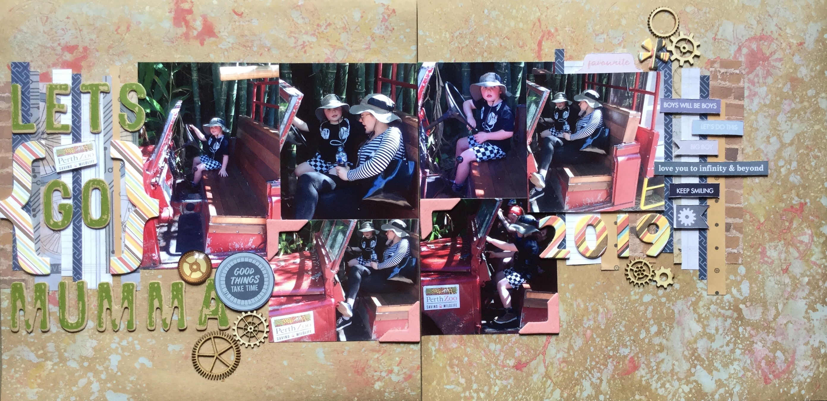
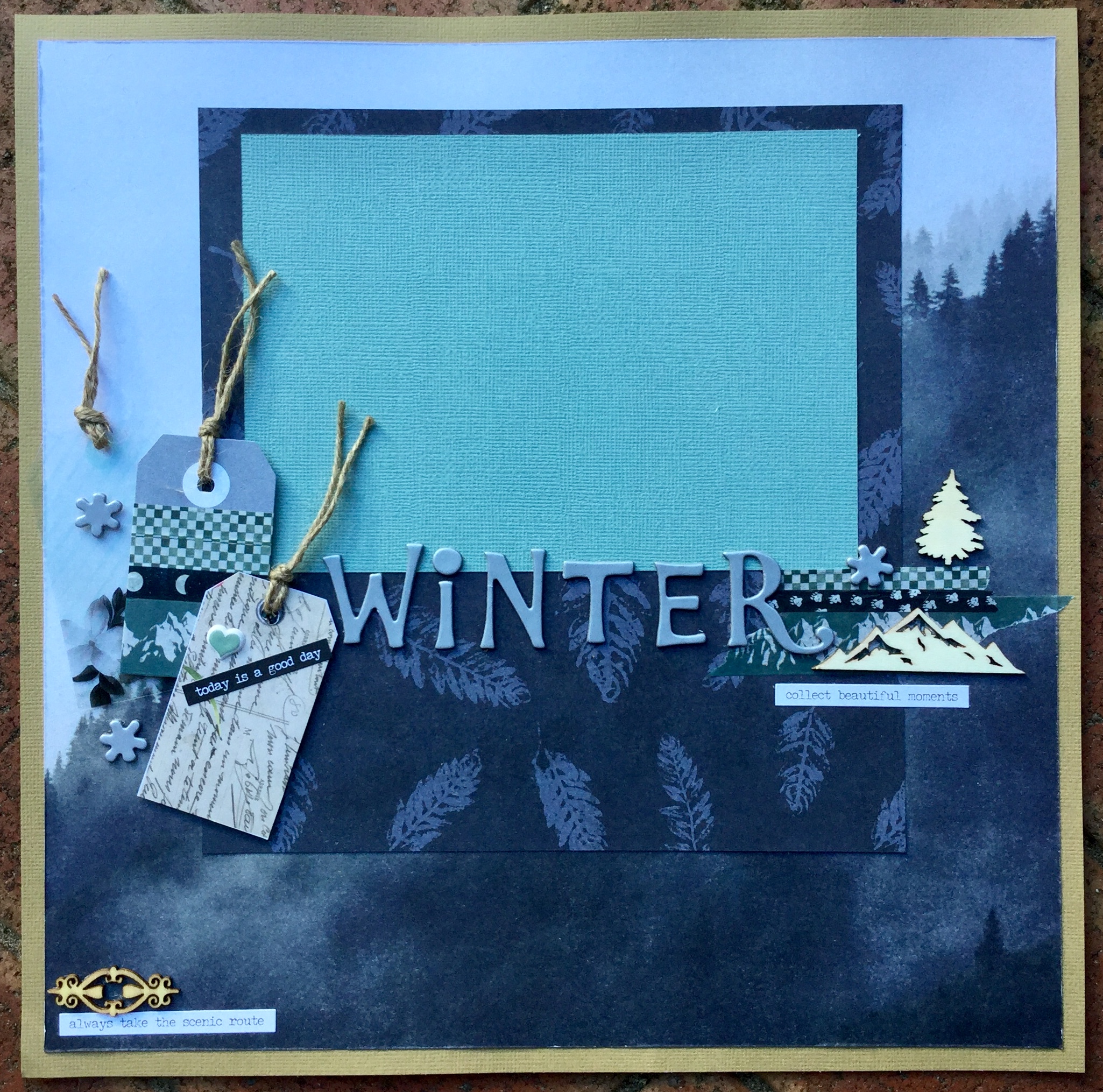
you have had sitting around for a few years, untouched! I did not have any untouched paper pads, only brand new ones (birthday/Mother’s Day gifts) which is why I decided to use this paper pad. I am doing well, getting through the pad with 14 papers left out of 36. The ones left are mostly pine trees, wolves and bear papers, given that I live in a country with no wolves and bears it is a challenge.

The first is Layout #3. I used the paper which looks like a starry night, it is the B side of the Tracks paper. On top of this, I stencilled white gesso using a Studio Light Grunge collection stencil. I blended the edges of the gesso to give it a milky way look. I then splattered white watercolour paint over the paper to increase the number of stars on the paper.

Once dry, I added different shades of blue Tim Holtz Oxide Inks which seeped into the gesso crevices (using water/brush) and blended into my starry night (using blending sponge).

Then, I mounted my photo onto scraps of the Wolf Pack collection papers and adhered it to the background.

Next, I used the stencil and oxide ink on white cardstock to create some embellishments. I cut this apart into little triangles and diamonds and layered them onto the page using foam and double-sided tape.

IMG_7829

The finished layout came together well with the addition of a title and a few acrylic stars.

IMG_8404


Next, Layout #4. This layout was very simple and quick, I used the map paper SBC_ac-314691_85259_200and added some colour across the page using the plastic bag smooshing technique. The Tim Holtz ‘Tumbled Glass’ oxide ink created a soft blue surface to work on, I then splattered some watercolour paint across the page in browns and blue.


Then, I worked on building layers with patterned paper from the Wolf Pack and assorted embellishments from my stash.

The final touch was adding the title.

2019-06-09 14.29.18-1


Layout #5. is my favourite so far. I wanted to find a way to use the wolf papers SBC_ac-314683_85243_200
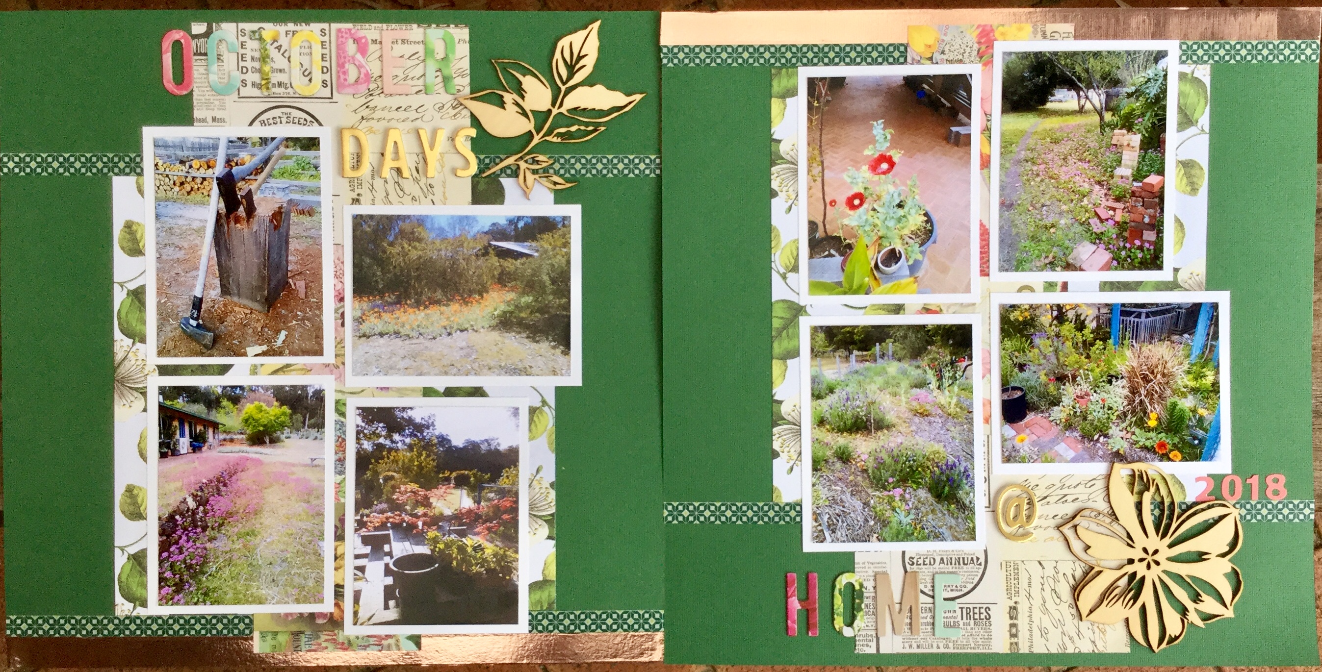
in the collection and finally come up with an idea when I came across some photos of my grandson eating some dessert.

I started by creating a framed background using two of the papers. Then I built up papers to mount my photos on and added the title ‘Wolf it Down’. No mixed media was used in this layout.

A subtitle was added using part of the cut apart sheet and then lots of text quote embellishments and some Wolf Pack puffy stickers.

The finished layout ended up just how I wanted it, messy and fun.

IMG_7927

June 2019 CKC, Layout #5.

Hello,

Today I am sharing another June Counterfeit Kit Challenge layout. This one is very bright and a little crazy. I am having fun using my kit and most layouts I am creating are very sunny. The photo used in this layout is an old one of my son at a dress up party, the photo is not the best quality but I did want to record this funny moment in time. My son is always a good sport and willing to dress up, at Christmas, he always turns up dressed as Santa Claus and adds to the fun.

I selected a mix of papers and scraps from my kit.

IMG_7937

To start with, a piece of the American Crafts heart cut file sheet to use up, I cut it in half and filled the hearts with scrap paper from my kit.

IMG_7936

Next, I worked on the background, inking up a piece of white cardstock using the plastic bag technique and some gorgeous ‘Mustard Seed’ Tim Holtz Oxide Distress Ink. This colour is still my favourite, it is so vibrant and can be used in many ways, becoming subtle when you add more water and less ink.

Because I had a clear vision in mind of how I wanted the layout set out I added the title first, I needed to make sure I had enough space to fit my photo along the side. The title was cut using an Altnew alpha die set and my Sizzix Big Shot, using the lovely striped paper from my kit.

IMG_7941

Next, I mounted my photo using scraps of patterned paper from my kit. I tried to pull in some colours similar to the clothes in the photo. Then, I adhered my cut file hearts and the mounted photo to the background and went to work adding embellishments. Many of the embellishments were fussy cut from the American Craft cut apart sheet and fixed in place with foam tape. I added some gems for some colour and glitz.

The finished layout turned out just how I had wanted it, colourful and fun!

IMG_7944

Make sure you check out what other scrappers have been creating with their June CKC kits on the Counterfeit Kit Challenge FB community or on their blog.

Keep on scrapping 🙂