Finish or Fix?

Hello,

Well, in my part of the World there has been very inclement weather, the type that makes you want to stay inside in front of the fire, and that is exactly what I have been IMG_7696doing. When I haven’t been working I’ve been snuggled up reading, scrapbooking or sorting. The sun has been beaming sometimes but it has been bitterly cold and so, I am more than happy to sort and clean spaces.

My studio (aka son’s old bedroom) was one of the areas targeted and I spent a lot of time going through some sets of shelves, looking for completed layouts (yes, I have been known to shove them into spaces to file on another day) and working out what exactly was in some of those pizza boxes. Do any of you have a pizza box problem? I have real dilemmas over keeping them or not keeping them. They are fabulous for storage (as long as you label and remember what the label means) and I have at least two dozen empty ones under my desk…someday I might need them. Not one of them has ever had pizza in them!

Anyway, I’m off track. I found a pizza box labelled ‘layouts to finish & file’. Great I thought, more completed layouts to pop into albums, I have been filing layouts this week.IMG_7602 Nope, there was three finished layouts and a dozen not finished! And…they were old! Not just a little old, big old, like 12-15 years old! So, I’m sitting on the floor looking at these layouts and I laughed at how terrible some of them were, and I cringed and questioned what was I thinking? They were terrible, there was no design thought, no embellishments on many, no style what so ever and certainly no mixed media. They were seriously old school and I could see why I hadn’t been interested in finishing them. Hmm… what they did have was photos, not all of them great either but still images of family history which needed to be rescued. So, after pondering on how far I had changed in scrapbooking technique and skill, plus attitude (Yep, at one stage in my life I did not like or see any benefit in scrapbooking, I even complained about having to do it (in my workplace), I was a stamper/artist. My husband loves to remind me about this, now that every spare minute is spent on scrapping.), anyhow,  I decided to finish or redo the layouts.

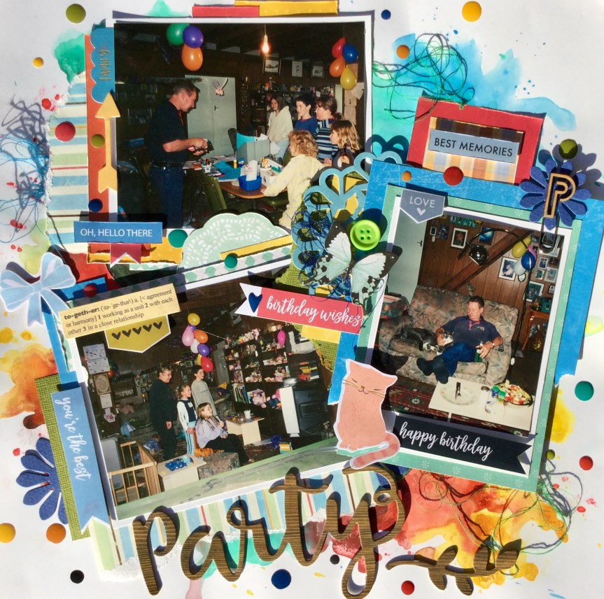
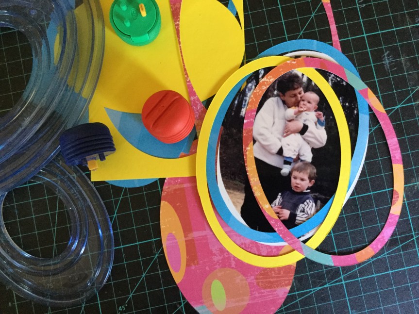
Here we go, with much shame, I present layout one out of the pizza box, unfinished and ugly. A creation with a very seventies colour scheme and very busy pictures filled with my family. You can see that it is so uninspiring, I think that olive green and brown was selected based on the seventies furniture and walls in the photos. It does have a nice frame on the main pic.

IMG_7591

So, here is what I changed and what I did. Basically, I took it apart, thinking that I would use some of the cardstock in the new format. I did use a little but not much. I must say that the double-sided tape used to adhere the photos were strong, it was hard work getting it apart. I wish I knew what brand tape I had used.


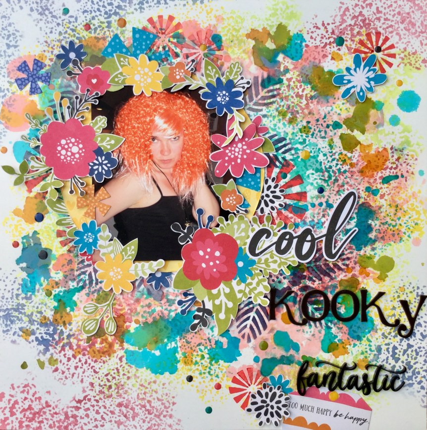
I started with some mixed media, I wanted to get some colour in the layout and used the party balloons pictured as inspiration. I was after a fun, chaotic, party feel. I applied watercolour paint to my white cardstock in a circular pattern, trying to create a border around my photos. Some of the paint was applied with a brush and some was flicked onto the cardstock. I ended up having to extend the colour further around the edges, so it was peeking outside the photo edges.

Then,  I worked on each photo, matting them and building up layers of patterned paper (scraps from previous layouts) and adding some embellishments.

IMG_7594

I have been binging on YouTube and watching the HipKit Club team whilst I am cleaning and scrapping and decided to add some thread to my page.

The finished layout is messy, fun and bright and over-embellished. Some may think the simple, clean line which was in the original version was better, I like the fun messy look. Most importantly, I had lots of fun creating it and this layout will finally be put in the family album.

IMG_7698

One finished and eleven more to go.

Happy scrapping 🙂

Just for Fun! Layout Share.

Good morning all,

Just popping in to share a few layouts after my Mother’s Day and birthday splurge. It’s hard not to buy a product when the sales are on and splurge I did. There are so many lovely scrapbook and stamp collections being released at the moment, for those of you not in Australia you may have had them in your hot little hands for a while, but us Aussies have to count many sleeps until they arrive in the stores here.

So, let’s look at what I bought and how I have been using some of it. Following my self imposed challenge to use the new product that comes through the door and mix it up with old products, I have been busy.

#Smile layout

The background paper is part of the Mintay Berrylicious collection, I purchased the 12 x 12 paper collection because of the beautiful woodgrains in the collection. There is also some paper in the collection with frames which I just had to have, plus some gorgeous florals. I didn’t really have any interest in the cutesy berry and cat motifs in the collection.

The other papers used for the layering came from two 6×6 pads which I have had for quite a while, the Jen Hadfield, Warm and Cosy collection and a TLC paper Stackz wedding collection (this is years old). The embellishments and titles are a mix up of product, sorry I can’t supply brands/collections.

IMG_7569

What Choc?

For this layout, I used four of the Mintay Berrylicious papers, a red and white polka dot, the lovely white/grey woodgrain, a pink floral and that frame paper which is perfect for 3×4 photos. I had some fun splashing around watercolour paint and smooshing it on using the plastic bag technique.

IMG_7562

Beautiful Happiness

This layout background is from the Mintay Wilderness collection, can you see a theme going here? Yep, I am in a woodgrain obsession, I love it in every grain and colour. The B side of this paper is a cut apart style print of wolves, pine trees, and backpacks. I bought a few of this page, so I can fussy cut those images and use them with my son’s hiking/backpacking layouts. There is a whole lot of embellishments happening here, using up my stash. The layering papers are from another very old, 6×6 TLC Stackz.

IMG_7573

Bedtime Chuckles

This background paper is from the gorgeous themed Echo Park, Lost in Neverland collection. I loved most of this collection but only bought 6 different papers and the sticker sheet. I did buy 3 sheets of this night sky paper called Straight on ’til morning, as I thought it was really useful for those lovely sleeping babes layouts. I have splattered on some extra stars here, using white watercolour paint. The star and feather paper quote are also from the collection. This old photo of my son and I makes my heart sing, he is about to turn 31, but I still remember his cheeky chuckle.

IMG_7559

Together

Look, more woodgrain! Plus, check out that photo, my son is so muddy and dirty he doesn’t look like he belongs to me, haha. So, very cute, they had spent several hours making mud pies and they also stamped their handprints in mud on the outside fibro wall of the house. Those handprints never washed off and had to be painted over when we moved out of the rental.

The background paper is from the Carta Bella, Welcome Home collection. the layered papers are again a mix of the TLC Stackz and Jen Hadfield, Warm and Cosy 6×6 pad.

IMG_7556

Tick, Tock!

The next one has very little new product but uses up a mix of older products. I did use the JillibeanSoup Rainbow Roux Expoxy Stickers, cute hearts, which I had bought. These photos make me smile, last year when our grandson needed to stay with us for a few days my son had to babysit him one night when we had to attend an event. We came home to this, my son asleep on the floor, squashed between the lounge and coffee table, and our grandson asleep on the lounge. My son said “He wouldn’t go to sleep. I just wanted him to sleep so I could watch a movie.” No movie happened for either of them!

IMG_7548

The last one,

Thanks Dad, uses a new stencil I purchased, it is a Kaiser Craft 6×6 stencil called Distressed Dots. I like how grungy it is, it will be very versatile and I will use it a lot. I love investing money on products when I know I will get my money’s worth.

IMG_7545

Well, that is it for today. On another note, how fun is it scrapping old photos? Gosh, I have been enjoying looking back and reflecting on how things have changed, and not just the people but our culture itself, how we live and what the expectations are. For many of us, my age, you fell in love, you found somewhere to live and you had the bare basics. When I look at some of these photos above I notice the terrible furniture and the make do with what you can find or have. We had very little, zilch, we threw away our jobs and took a chance on moving to a better place for our son. We borrowed, begged and sourced what we could from the local Op shops, etc. We had no designer expectations, nor did most of society, we worked hard and slowly saved money to purchase new furniture, white goods and appliances. Today I marvel at the expectations of young couples and the expectations and pressure placed on them by society, the availability of stuff and the incredible change in what matters the most…the necessities have changed. We got by on love, working hard and setting goals, friends and family didn’t judge you, they supported you with the expectation that is was supposed to be tough when you are starting out as a family. We were so happy, we didn’t even notice the furniture!

Which brings me to another thought, do you cut out those parts of history in your photos? I must say that I was tempted to crop down some of these photos to focus on the people. Many of the photos are cluttered with objects, have poor lighting or show offending items, like cigarettes, but if we remove those bits are we removing history? I stopped myself from cropping them, my grown children do like to see where and how they lived in the early years. They are sometimes amazed at how little we had when compared to now. So, these layouts may not be social media perfect but they do record life.

Happy scrapping 🙂

If you would like to share your thought leave a comment by clicking on the post title and scrolling to the bottom of the page. Post your comment in the reply envelope, I would love to hear your thoughts.

May 2019 CKC Challenge #2.

Dreams are the seeds of change.

Nothing ever grows without a seed,

and nothing ever changes without a dream. – Debby Boone

Ch#2 image

How beautiful is that quote? This is the second challenge set by the May, Counterfeit Kit Challenge team. Create a layout based on this quote, theme, image or colours.

For me, being a very visual person, it was the colour and image which first grabbed my attention. I love that dreamy blue and blowing those seeds into the wind reminded me of childhood, I knew that my page would be of my grandson or my own children when they are young. When I went through my photo boxes I came across some lovely photos of my grandson sleeping in his car seat on his way to visit us. He looked so peaceful asleep and I’m sure he was dreaming happily, this was definitely the photos to use for the challenge.

When I went through my kit looking for papers, I didn’t find the right blue or patterns in filemy kit. The only patterned paper I had included which was light blue had aeroplanes on it, so I decided to create my own background on cardstock using my new Vicki Boutin stencils.

I started by using the starburst/flower stencil and some white gesso texture paste, stencilling across most of the page. After leaving it to completely dry, I sprayed on some Heidi Swapp Teal Color Shine and gently rubbed it over the texture paste stencilled flowers. This created some lovely shiny areas and enhanced the texture of the stencilling.

Next, I used some Tim Holtz distress inks and the leaf stencil and stencilled the design around the edges of the cardstock, blending the two blue inks to create a more dreamy coloured surface. *The nighttime lighting makes it look a little green and purple in these photos.

Then, I got busy fussing cutting out some white flowers and foliage to use as embellishments on the layout. I found a few acetate embellishments from Kaisercraft and Heidi Swapp to use, and some black and white seed embellishments from the PinkFresh Studio, A Case of the Blahs collection. I mounted my photos onto scraps of patterned paper from my May kit. The title, Dream, is from the Rainbow Roux, Jillibean collection.

The finished layout looks very dreamy and meets the challenge criteria brief beautifully.

IMG_7465

Keep checking in on what other CKC scrappers are creating either on the blog with the monthly link up page or on their FB community page. Please leave any comments below, remember that you need to click on the title of the post to open the page to comment.

Happy scrapping 🙂

2019 May ACC Sketch Challenge!

Good afternoon,

A quick share of the layout I created for Anna’s Craft Cupboard community May sketch challenge. This month’s sketch has a focus on creating a circular design.

IMG_7402

I have blown my self instigated ‘use your stash’ challenge this month, there has just been too many sales and bargains to be found with ‘inter’ National Scrapbook Day (weekend/week/month) and all the Mother’s Day deals. I spent up at Anna’s Craft Cupboards 13th Birthday sale this month, after all, it is my birthday this month as well, plus Mother’s Day, if anyone deserves a prezzy, I do!

Also, I don’t like to pay for shipping and so I always make sure I spend the minimum spend for FREE shipping. For example, I ran out of white cardstock this week! Yikes, no scrapper can live without white cardstock and so I went online to order more, but 60 sheets did not make the FREE shipping minimum, so what’s a girl to do? Yep, I really did need some masculine patterned papers and who doesn’t need wolf and bear motifs when they live in Australia? So, the Heidi Swapp ‘Wolf Pack’ collection may have also found its way into the cart. Geepers, how does that happen?

Anyway, for this month’s sketch challenge I used some of my new purchases from Anna’s Craft Cupboard. At least I was following my rule about new product, if it comes in the door you must use it straight away. I had bought myself some of the Jillibean Rainbow fileRoux collection and the Vicki Boutin stencils which I had been coveting for quite a while. I was looking forward to trying out the stencils and fussy cutting those Jillibean flowers.

Here’s what I used…

It was a messy process, as I mentioned I had no plain white cardstock left and so I had to use some glossy, mixed media cardstock. It’s a lot like glossy photographic paper, in fact, it probably is photographic paper. Because it was so glossy I got out my Tim Holtz Alcohol Inks and splashed some around and tried using the new stencils with the inks. It wasn’t that successful but gave me a background to work with.

Next, I stencilled over the background with distress inks to build up some texture.

Then, some fussy cutting with the Jillibean Dash of Daydream paper.

I didn’t want to use up all my paper and decided to stencil some flowers onto the background.

Surprisingly, the black archival ink I used turned purple on the glossy cardstock. I tried to stencil a ring border and lead it down to the bottom right corner, like in the original sketch.

I cut out a circle of yellow patterned love hearts (the B side of Pinch of Colour, JB2313) and played around with laying out the fussy cut flowers around my photo.

IMG_7420

Happy with the result I fixed them down in layers using double-sided tape, glue and foam.

Then, I added three titles to the layout and a little 1/2 tag which I cut from the Pinch of Colour paper. The bottom title is one of the new Annabelle acrylic embellishments which are gorgeous, they are so fine and delicate. I have purchased a few sets of these and will definitely be buying more in the future. Just be careful when you remove them from the packaging, they are set on sticky dots and one of mine broke because of how I twisted it to get it off the packet. I can still use it, a little glue will fix it.

IMG_7425

The finished layout is very vibrant and fun. I can’t wait to make some other layouts using both the stencils and the Jillibean collection, both are very versatile.

IMG_7424

Who else indulged this month on new supplies? Share what you bought and do join up with Anna’s Craft Cupboard community on FB. Have a go at their monthly challenges and support the store by buying product.

Keep on scrapping 🙂

NSD CKC Layout!

Hello,

A quick share of my layout created during the NSD Counterfeit Kit Challenge (in collaboration with the Bash Your Scrapbook Stash NSD community) which I participated in over the NSD weekend. The challenge was to create a kit based on the inspiration kit shared by Leslie Smith from CKC. Leslie made a video outlining the process of creating and participating in the monthly CKC where you create your own kit and then create layouts based on their challenges.

For the NSD challenge, you needed to create your own kit and were challenged to create a layout based on the sketch provided.

IMG_7286 - CopyThe inspiration kit had elements of travel in the patterns and motifs, plus some fun embellishments to add a little sparkle and texture.


Here is my kit…

I selected some similar patterns and colours to the original, inspiration kit and include some dies and stamps to create titles and embellishments.

The sketch was quite simple and open to a lot of different interpretations. I drew on the format but changed up the circles to hexagons.

IMG_7305

It was a quick layout with the added embellishments being the focus for my layout.

I was really happy with the finished layout…you are never too old to have a teddy!

IMG_7311

Happy scrapping 🙂

May 2019 CKC Layouts #5-#7

Hello everyone,

Today I am playing catch up on my blog, May is a crazy time of the year for me and my family and finding time to sit and blog is tricky. In May, every weekend is a party! We celebrate three (out of 6) family birthdays, mine included, and we also have Mother’s Day in Australia, add to that NSD (day, week, month…haha), the ACC Cyber Crop and then work stuff (standardised state testing, etc.) and life gets busy!

So, here I am sharing 3 layouts which I have squeezed in over the last few weeks, but haven’t found the time to share on my blog. Working backwards today…

Layout #7

This layout features photos of my friends on holiday with me, we do an Art Trail tour throughout the W.A., South West and Greater Southern Region. As we travel, we stay at different local backpacker accommodation. We prefer cheap accommodation, then we have more money to spend on art/craft supplies, artworks, food and happy juice! These photos are when we arrived home late after a fabulous day out meeting artists and talking and viewing art, then a gourmet meal and plenty of happy juice, and we decided to play Scrabble. Things got a little silly, who knew that such words existed…um, they don’t!

Using papers from my May CKC kit, I decided to create a layered border around my layout. I tend to always cut out the middle of the paper when layering, gives you more paper to use later. I thought the text paper would work well, given we were playing Scrabble in the photos.

Next, I thought I would add some letters to the page using stamps and archival ink. I also splattered on some watercolour paint in turquoise, red and blue.

I added a few tag and quote embellishments, some are from Kaisercraft and the little quotes are from Uniquely Creative. Then, I added my title and some subtitles. The main title is using American Crafts, Jewelry Box, Thickers and the subtitle is also an American Crafts,  foam Thickers, called Happy Life, which I love and am trying to buy more of, but finding them sold out at most stores.

The finished layout, I am happy with it, it is fun and a little haphazard, much like the game we were playing.

IMG_7398

Layout #6

These photos gave me the opportunity to use some of the tropical papers and embellishments in my kit. Most of what I used came from the DCWV Bahama Mama paper pad which features lots of pineapples, flamingos, bananas and tropical foliage. Some of the papers have pink foil which gives it a little sparkle. I was interested in using the foliage papers, as the local cafe where we were having drinks has lots of these types of plants and you can see them in the photos.

I started by adding some patterned paper (flamingos, which had nothing to do with the photos), a doily and an embellishment 6×4 card which I trimmed down. I thought about where my photos would be placed. I had wanted to include three photos but it just didn’t look right, so one got binned. I ended up trimming down the tropical background and mounting it onto some green cardstock, I seem to have a thing for borders at the moment.

IMG_7359

I felt like adding a bit of sparkle to the layout and strategically splashed on some Heidi Swapp, Mustard Color Shine. This would be my next favourite Color Shine, after the gold, it really glows and is vibrant, some of them are not as showy.

Oops…doily wrinkles will need to be covered.

Then I mounted my photos and began building layers of paper and cardstock behind IMG_7374them. I had fun adding the embellishments, I really wanted to use up quite a few of the embellishments from my kit, many of the ones I used are from a Heidi Swapp ephemera pack and some I fussy cut from the AC Bahama Mama papers.

I like how the layout turned out, it is one more layout towards our family moments album, about our long lost relatives who came to visit.

IMG_7459

Layout #5

This layout, made from my CKC kit, turned out bright and fun. It is a scraplift from a 2016, Becky Fleck Pagemaps.

The layout features photos of my grandson and his cousin using a bouncy castle at the Simmos Icecreamery. It is a very simple design, no mixed media, but I did try and focus on getting in some movement by using downward strips of paper and layering the photos on the diagonal.

IMG_7294

As you can see, all of these layouts still need the dates and journaling added. I am very bad at adding the journaling during the creating process and always end up making the journaling a process in itself, sitting at the computer with a whole stack of layouts and going through them one by one. I very rarely hand journal, as I have terrible handwriting.

Please do keep sharing what you create on the FB Counterfeit Challenge Website and blog? Make sure that you keep up to date with what others are creating on the Monthly Link Up page.

Keep on scrapping everyone 🙂


May 2019 CKC Challenge #1.

Hello,

This month’s CKC challenge #1. is using the inspiration kit clubs sketch challenge layout. How neat is that? It is a fairly simple sketch to follow with lots of scope for changing it up using our kit supplies. Here is the challenge sketch…

MARCH SKETCH

IMG_7048

and here is my kit. I have only made a handful of layouts with this months kit and have lots of supplies to choose from.

The use of a circle in the layout sketch reminded me that I had some photos of my grandson riding a train at a local carnival, the train track was circular, though it did have lots of up and down inclines. I originally thought that I could create a train track for the circular background, but I wasn’t happy with how it looked. The perfectionist in me wasn’t happy with the unequal track marks, time to start again.


Starting over, I decided to only use pattern papers and layer them up to create the background. It was then a fairly quick process, with some splatter, fussy cutting and embellishment layering.


The completed layout turned out well, I really liked the embellishment clusters. The title is based on the story, what happened when I took the photos. My grandson did one lap on that train and decided he wanted off, right there, right then! He was scared of the noise and downward speed. The train was stopped and off he got, quick as he could…get me away from here!

IMG_7107


Make sure that you keep checking in on this month’s CKC scrappers…

Counter Kit Challenge Blog

Guest Designer: Leanne Wagner

Cindy

Julene

Leslie

Lori

Tina

Laura

Happy scrapping 🙂


Anna’s Craft Cupboard Cyber Crop!

A quick share of layouts I made during Anna’s Craft Cupboard’s 13th Birthday Celebration Cyber Crop…phew, what a mouthful.

Anna’s Craft Cupboard store is one of my favourites for stocking up on all your essential supplies and the latest products. They also have a fabulous design team who regularly share their creations and knowledge on the ACC blog and FB group/community. The FB community is made up of scrappers and cardmakers from across Australia and overseas, we are a fun loving bunch who love to share our work and support each other in our crafting and life dilemmas. Once the words ‘ Cyber Crop’ is mentioned, it is all hands on deck, ready and waiting to meet the challenges and join in with the fun and games.  The Birthday Celebration Cyber Crop proved to be another huge success and lots of fun.

Here are my creations from this event…

IMG_7344
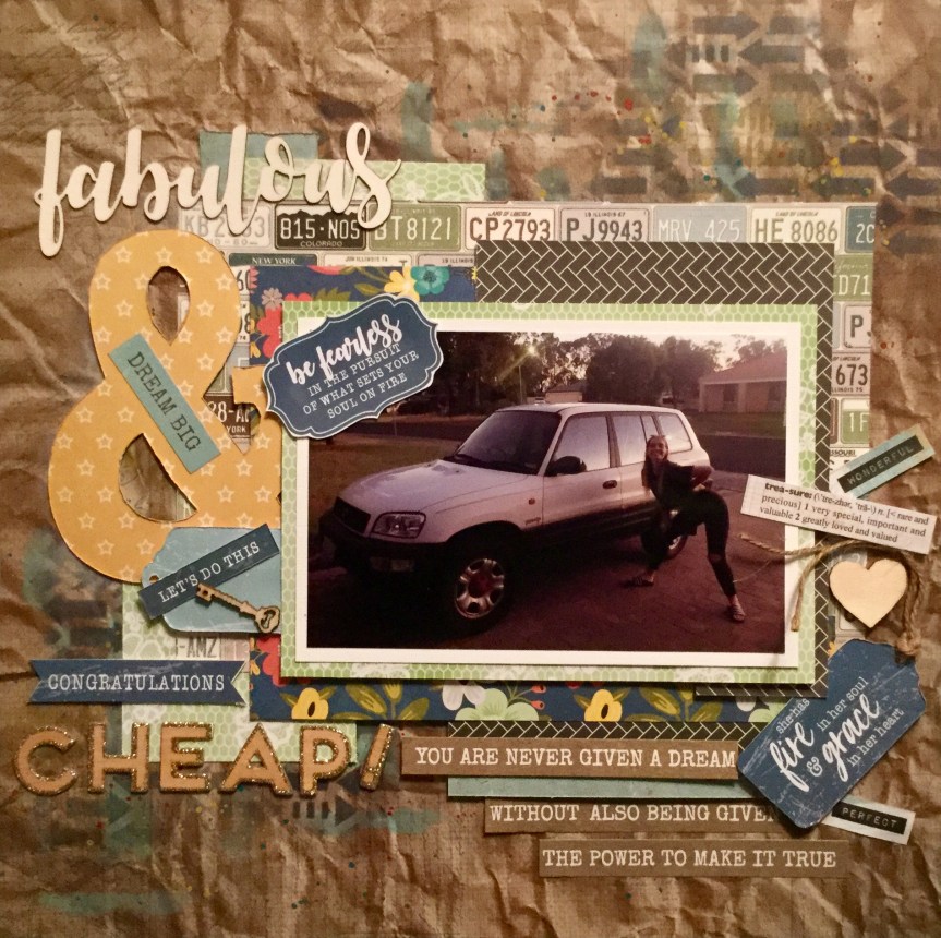
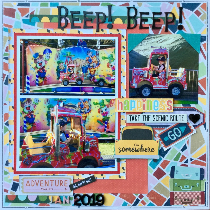
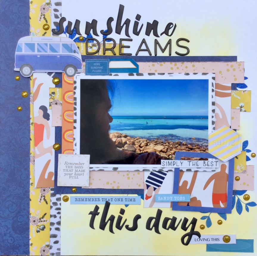
Challenge #1. was to create a layout based on this mood board, lots of pink and blue, flowers, cars and frames. My layout is of my youngest daughters recent car accident, she was hit side on by a 4WD vehicle.  Her car was written off!

2019-04-27 13.01.45-1

Challenge #2. was a blind crop, always lots of fun. You are given a list of ingredients prior 2019-04-26 00.32.58to the crop and the instructions to create the layout are released step by step in a live feed during the cyber crop.


2019-04-27 13.02.35-1

IMG_7345Challenge #3. was to create a layout with lots of negative space. I used an old picture of my eldest son wearing his denim overalls.

2019-04-28 06.37.21-1


Challenge #4. was to use the sketch below as inspiration for a layout.

2019-04-28 08.21.09

I had been noticing sunburst layouts making a comeback in the scrapbook World and decided to have a go creating a sunburst border for my layout.


2019-04-28 11.56.01-1

Challenge #5. was another blind crop. This one was messy with gesso and ink!

2019-04-26 00.28.53


2019-04-27 21.19.34-1

Challenge #6 was to make a card and Challenge #7. was a Tic Tac Toe, where you choose a row. I went with row 3, horizontal: die cuts, stencil and patterned paper.2019-05-01 20.34.15

2019-05-03 18.50.10-1

It was a great cyber crop, lots of fun and inspiration. I encourage everyone to check out Annas Craft Cupboard online store and blog and become part of the community (FB), you don’t want to miss their next cyber crop.

Keep on scrapping 🙂


May 2019 CKC Layout #3 & #4

Hello,

Just a quick post to share two more layouts that I have scrapped using my May Counterfeit Challenge Kit. While the rest of the scrapping World is taking the weekend off to scrap, I am trying to squeeze in a few scrappy moments. A very busy weekend here with visitors staying over, some grandbaby sitting and today is my youngest son’s birthday! Can’t quite believe that he is now 27. The whole family is getting together this evening to celebrate his birthday, as he is about to fly off to Victoria, Australia, on his never-ending journey to experience more of life and living. Oh, to be young again and have that freedom to travel anywhere you like.

Speaking of travel, did you watch Leslie Smith (from the Counterfeit Kit Challenge group) live on the FB Bash Your Scrapbook Stash(BYSS)? Leslie did an amazing job explaining IMG_7286 - Copy
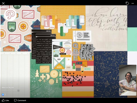
what and how the Counterfeit Kit Challenge works and how you can all join in. As part of the NSD weekend, Leslie demonstrated how she made her kit for the special NSD BYSS CKC collaboration challenge. The challenge is to construct a past Studio Calico kit called ‘Expedition Scrapbook Kit’. It is a great travel theme kit with lovely patterned papers and wood veneer embellishments, sequins and alphas. Go check out all the information to join the challenge on the CKC website and watch her video on the FB Bash Your Scrapbook Stash page and join in the fun of constructing your own counterfeit kit and layout using the provided sketch.

Now, my May CKC quick layouts. The layout 3. is a simple scrap lift using a PageMaps sketch from 2016. No mixed media at all this time, just some simple layering of paper and embellishments. It is a bright and fun layout of my grandson on one of the summer carnivals rides which are set up on the foreshore in the lovely (small) city of Busselton, Western Australia.

IMG_7272

Layout 4. is also about the same location, Busselton foreshore, The Goose restaurant is one of the best locations for sipping cocktails and watching the sun go down over the ocean and the famous Busselton Jetty.

A little bit of paint splatter on this layout and an abundance of embellishments…had to get rid of those pineapples in my kit somehow!

IMG_7279

Keep on scrapping and please do share what you are creating during the NSD celebrations around the World. Enjoy NSD 🙂

May 2019 CKC Forgery on the Third!

Hello again,

Time to join in with the May 2019 Counterfeit Kit Challenge, Forgery on the Third!

For this month, I decided to have a go forging some of those lovely, cute, girly teens which are featured on both the Jen Hadfield’s “Chasing Adventures” patterned papers and the various embellishments.

For me, the immediate image that popped into my head when I was looking at the collection was paper dolls. As a child, I was obsessed with paper dolls, all my pocket money went on buying paper doll books from the local newsagent’s store. I had wedding paper dolls, teen paper dolls and even troll paper dolls. In the seventies, paper dolls were high currency amongst little girls and I remember swapping different dolls with my friends and spending many hours role-playing happy stories with our sets of paper dolls. When we didn’t have money to buy paper dolls we made our own. I spent hours with my younger sister and brother making papers dolls and then designing collections of clothes for them to wear. So, so much fun 🙂

So, for the forgery, I went hunting for paper doll templates online. There are hundreds available and many are FREE. I was looking for teen designs similar to the collection and came across paperthinpersonas.com. What an amazing range of paper dolls are available here! I used the Marisole series of dolls which had a funky teen look. The templates can be downloaded in colour or black and white. I went with colour as I was feeling lazy, but black & white allows you to colour them to match your layout colours.


It takes a while to fussy cut out the dolls and their clothes but is worth the effort if you are looking at making some fun girly embellishments. There are also male paper dolls and a range of aliens, TV/film based characters available on the paperthinpersona.com website.

When you are cutting out the dolls and clothes you need to cut off the tabs. Sometimes, when you do this you will leave a little white showing, I just coloured these white bits with a black permanent marker. Then, I used a little tiny bit of the Tim Holtz Micro Glaze 81Bd+w4oVAL._SY550_to rub over the surface of each piece, this adds a little sheen to the printed cardstock. Next, you fix them together with glue and thin foam tape for a little dimension.

IMG_7075

Having taken on this challenge I really had no idea how I was going to use them in my layouts. I didn’t have any photos of my daughters on holiday or travelling, which I hadn’t already scrapped. Then I reflected on what trips and outings that I had taken over the last two years, there were a few trips with my besties and a few events where I took on the role of tour guide (over the Christmas holidays) to introduce some of my husband’s relatives to our region. I wasn’t sure that it was going to work, can images of young teens be inserted into layouts of a bunch of over 50 ladies on an art trail safari?

Anyway, here is what I used and how it all went together.

Layout 1. My papers and paper doll…

The process…coloured pencils to forge the floral paper. Some ink and mist to create a background paper. Layers of patterned paper and a grid design to feature my photos. A few embellishments.


The finished layout…


That cute paper doll…

IMG_7085

Layout 2.

The papers and doll…

The process… some messy fun with inks and mists.

The finished layout…

Overall, not a bad effort and I had lots of fun reminiscing and making those cute paper dolls embellishments.

Make sure that you check out what the Counterfeit Kit Challenge team are creating this month. There are always some fabulous ideas, skills and techniques used.

Counter Kit Challenge Blog

Guest Designer: Leanne Wagner

Cindy

Julene

Leslie

Lori

Tina

Laura

Keep on scrapping 🙂


May 2019 Counterfeit Kit Challenge

Good morning, it’s May! The busy and creative month for scrapbook enthusiasts everywhere and…

Happy National Scrapbook Day (NSD), weekend, week or month!

Hurray, there is so many challenges and fun events happening around the World. The Counterfeit Kit Challenge is off and racing for this month and they have collaborated with the Bash Your Stash FB group to celebrate NSD. Over three days there will be challenges, support videos and lots of fun, from the 3rd-5th of May (for us Aussies that means the 4th-6th). Plus…

IMG_7232I am the May CKC Guest Designer! Please, join in with all the fun and games this month and share all your creativity online.

This month’s inspiration kit has been chosen from the My Creative Scrapbook kit club, using their March 2019 kit. It is a colourful and fun kit made up from the Jen Hadfield “Chasing Adventures” collection. There are so many motifs and themes running through this collection which gives us loads of options when it comes to selecting papers and embellishments to create our own kits. I started by investigating the whole collection to get a good idea of what all the papers looked like on both sides and what motifs were included. You can check out the collection here and this website shows the individual pages.

Here is what I selected for my CKC kit…

IMG_7044

I ended up with a very large kit, as I looked for papers and cardstock with similar colours, patterns and motifs to the “Chasing Adventures” collection. I struggled to find the right greens and blues in my stock, and the floral I found has a dark navy background.

Here are my papers…

IMG_6954

IMG_6958

IMG_7043

In the kit, there are some papers which have pocket card print pages. I looked for pages with similar motifs to the collection in general.

With embellishments, I focused on motif and theme. Jen Hadfield’s collection has a range of different stickers with images and text, and some have foil. I searched through all my colour sorted image diecuts, pocket cards and text diecuts, as I don’t usually use/purchase stickers, so I only have a few.

I also included some coloured cardstock in my kit to mount photos and use as backgrounds. I will be using white cardstock and some mixed media products to vamp things up, I love getting messy with ink and paint.

I am very happy with my final kit, there are loads of ideas I have for using this kit. I feel that is is very vibrant and fun and I am looking forward to participating in this month’s CKC challenges.

Don’t forget to check out the May, CKC blog hop to see everyone’s counterfeit kits and layouts.

Counter Kit Challenge Blog

Guest Designer: Leanne Wagner

Cindy

Julene

Leslie

Lori

Tina

Laura

Happy scrapping everyone 🙂

Jen Schow & Hip Kit Club Scraplifts!

Welcome back,

Today is a quick share of some new layouts based on scraplifts. Often, when I’m scrapping for fun, and not always working on monthly challenges and other peoples criteria, I just want to relax. When I scrap I am always watching something, either a movie or art/craft YouTube videos. My mind is just enjoying the creative process of scrapping and the crafting videos give me a little company, of others who are also passionate about creating.

Now, those who have been following me know that I am working on using up my April CKC kit, which I have broken down into smaller kits (and photos). A couple of days ago I pulled a kit to work on a new layout and I decided to watch some Hip Kit Club videos. I IMG_6892came across a Jen Schow video of her scrapping a layout with their March kit. This March HipKit Club kit was the inspiration kit for this months CKC. I was impressed with her layout and decide to have some fun trying to recreate it using my supplies. Jen was making the layout for the HipKit Club Friday Challenge, part of the challenge was to use the following design.IMG_6895

It is a cute design which entails using some of your photos as banner flags. Jen uses only IMG_6891one photo in her layout and I only had one photo to work with as well.

I had lots of embellishments and 3×4 cards to play around with and turn into banner flags.

I could watch Jen Schow all day, she is a very talented scrapper and I love how she shares her little tricks and is honest about the process. As we all know, not everything always goes to plan all the time. Jen is one of those scrappers who share everything, the good and the bad. It’s great to see how others make changes to their designs along the way to achieve a pleasing outcome.

Making my banner flags took a little time, but was great fun. I just worked with what I had and made enough to fit across the page. *Sorry about my manky cutting board! Guess what’s on my birthday list?


It was a fun layout to complete, though a little fiddly threading on the tags and getting them to sit right. My layout scraplift turned out quite striking, using the black & white stripe background made everything pop! I include Jen Schow’s little signature tear section at the bottom of the page.

IMG_6904


Then, I also watched a Niki Rowland video for the Hip Kit Club, March kit. This layout uses one of their free cut files which you can download. I decided it would be fun IMG_6914to scraplift her design using my homemade kit. I don’t use cut files and decided to substitute the text cut file with some Jillibean letter die cuts. I wanted to use some of my patterned papers for some of the letters and so traced and fussy cut out some of the letters.

The photos I used are not that great, a little like prison shots! I had gone away for the weekend (for work) and came home to my husband with his new haircut, let’s just say that I wasn’t impressed. His nephew had come to stay for a boys weekend and offered to cut hubbies hair, this was what he ended up with! Hubby had needed a hair cut and was looking like a crazy scientist with Einstien hair, but………………………………………………this?

IMG_6967

and…

He kept it like this for several weeks! Sometimes wearing it in a ponytail! Secretly he thinks he’s a Viking, in reality, he comes from Scottish stock. He thought it was funny and it made his friends laugh, while I avoided going out with him anywhere.

I live with a crazy person, lucky for him and me the craziness is sporadic, and he often gives me things to scrap about.  🙂

Happy scrapping everyone


April 2019 CKC Layout #5

Good Friday and Easter blessings to everyone.

The rain is pouring down here, there is a chill in the air and my fire had gone out! So, after battling the fire lighting with very little paper and kindling, I am trying to catch up on what’s happening in the scrapbooking community. What did I find? The new CKC challenge has been posted and what a beauty it is for this time of the year. It’s all about hiding things on your layout (or in your photos), perhaps I will manage to snap a few photos to use today in our (early) Easter egg hunt and family gathering. Why are we celebrating Easter today? Well, we, as grandparents, like many families I’m sure, have to divvy up the holiday time spent with our grandson and children. It is tough having to share with the inlaws, once your children are grown and settled with families of their own. We are very lucky that the inlaws are all gorgeous people and at times we blend all our families together to celebrate holidays together, such as Christmas.

Anyway, let’s talk about layout number five. This layout killed two goals in one, I had 56158134_1623628067740035_5644509564444344320_n (1)
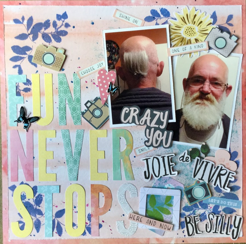
wanted to use up more of my CKC kit and I wanted to enter this month’s Annas Craft Cupboard inspiration challenge. The challenge features henna mandalas, lace and a positive quote about walking your own path. It also has hints of pink, silver, white and fawn. Luckily for me, I had made up a kit which worked beautifully with this challenge and the photo had the same sort of theme…working towards the goal you set for yourself.

IMG_6874

I used the very light pink patterned cardstock as my background and stencilled on some doily and decorative designs in black and light grey. Then splattered and smooshed on some blue watercolour paint.


This layout was pretty quick, a lot of layering of patterned paper and die cut embellishments.

It is my first layout using an Instagram photo. The photo is of my son-in-law, making his dream come true, as gaining an apprenticeship (piercing) in a Tattoo store, one step closer to being a Tattoo apprentice. He has since bought out part of the piercing business, so is now part owner. He also draws/designs tattoos for the biz, he is very artistic. It is a really hard industry to get into, you work for nothing for over a year before they consider offering you an apprenticeship, from what I watched on Youtube this is common practice in the industry around the World. We are all very proud of him for making his dreams come true.


IMG_6882

IMG_6885

I really love how this layout turned out and feel I met the criteria for the ACC Inspiration Challenge. My daughter, however, wasn’t happy with all the pink on what she considered was a masculine layout/photo. She thought it should have been all black & white, I just pulled on the colours in the photo…pink, blue and black! What do you think, yea or nay?

April 2019 CKC Layout #4.

Hello,

Today, another layout made using my CKC kit. This time I wanted to use the colourful watercolour paper which would work perfectly with my photos.  The photos capture this lovely moment of my grandson working away on another masterpiece. He is at that development stage where his drawings start to look like actual representations of objects and he spends lots of time adding details to his illustrations. This masterpiece is of a boat, a Viking boat of course, with all those oars. He loves to tell great stories about his drawings and explain every little mechanical detail about how it works, not surprising though, weren’t all the great artists scientists?

These are the papers and embellishments I had decided to use, I wasn’t sure if that grungy, green polka dot paper was going to work with the gorgeous watercolour paper.

I started off by tearing up some border strips and layering them together to create the background. Then, some stencilling with my favourite green ink, Tim Holtz’s ‘Mowed Lawn’. I use this green ink a lot, it is lovely and juicy and vibrant. The stencil came with my WRMK stamping platform kit, it was my first time trying it out. I selected this stencil because the triangular shape was similar to my grandson’s boat image.

Then, a little splatter of watercolour paint in two different blues.

I spent a lot of time building up layers of patterned paper to place my main photo on, distressing the edges of each piece with my fingernail. I wanted to include some of my hand coloured butterflies, so fussy cut a few out. The Live Colorfully title got lost, blending into the background of the watercolour paper and I had to place a piece of the grungy green paper underneath it to make it stand out.

Forty minutes later, after fiddling around and making many changes to the layout, I finally started to fix everything down. The title simply states what he is doing…drinking Milo and using markers! An ordinary day at Nanny’s house.

I do like how the layout came together. I managed to balance the grungy green with all that pretty colour and sneak in some butterflies. I used up a little more of my supplies from my CKC kit and captured another moment in time. The journaling and date will be added to the layout before I pop it into his album.


IMG_6873

Happy scrapping x

April 2019 CKC Challenge #1

Hello,

Well, I have attempted the first challenge for this month’s, Counterfeit Kit Challenge. The challenge involves scrapbooking about the weather, for those CKC scrappers above the equator, that means Springtime and us Southerners below the equator are feeling cool with Autumn upon us. As I type this the rain is pouring down and we are cosy inside with our wood fire burning and the washing drying on the airer. I love this time of year, everything seems fresh outside, all the dust washed away and the paddocks begin to become green again.

For myself, I have the added pleasure of school break over the next two weeks and so, on my first day of the holidays, I indulged in the pleasure of a whole day of scrapbooking. What did I scrap? Well, for the challenge I went with a Summer layout using a photo of my youngest son contemplating life while we were having a family day with relatives at the beach. It is not the best photo of my son, he is in shadow seeking shade under a tree with the hot Australian sun burning down on the rest of us. Yes, those little specks in the water are the rest of the family, enjoying the beautiful blue ocean and trying to escape the heat.

IMG_6848

The other thing I have been working on is cleaning up in my studio (aka, oldest son’s reclaimed bedroom), as you do after you have been scrapping for a few weeks. During this cleaning/organising frenzy, I broke my March CKC kit down into smaller layout kits. I find this a great way to get things done with everything already selected you quickly get through making your layouts.

During my clean up, I came across a little booklet from the Summer, International Film Festival which is held in the South West region. When I flicked through the book I noticed the great print on the inside of the cover and thought I could reuse it in some way.  Then I realised the colours and theme would work well with the kit I had made up for this layout.

Below are the papers and embellishments which I decided to use, including the booklet cover.

I started the layout off with some soft inking using Tim Holtz’s, Scattered Straw, Distress Oxide ink.

IMG_6838

Next, I played around with using strips of the different pattern papers to create the background.

Then, I double mounted the photo on white cardstock and the Kaisercraft black and white patterned paper. I spent quite a bit of time laying out were the embellishments might go. Once I am happy with it, I take a photo with my iPad, so I don’t forget where to place everything when I begin to fix things down.

IMG_6844

On this occasion, I was not happy with the layout, it had a bit too much negative space and didn’t look balanced. So, I took everything off and stamped some foliage on three of the corners/sides.

This made a big difference to how the layout looked, it added a little more interest to draw the viewers eye and seemed to add balance. I then finished it off with some gold sparkly gems and black Thicker alpha stickers for the titles.

IMG_6847

Another layout for the album. I have many other photos from this day and will be putting together some pocket page layouts using the leftover paper scraps from my kit.

Happy holidays, to those Aussies, also enjoying the school break!

April 2019 CKC Layout #2


Hello again,

Today’s share is my second CKC layout for this month. Once again, I started off with creating some more forgery items, this time it is some embellishments. The original inspiration kit for the April, Counterfeit Kit Challenge, was based on the March, Hipkit Club kit and had butterflies in sticker and die cut form. They were coloured either pink & green or in shades of blue. I attempted to copy these by colouring my black & white Kaisercraft butterfly paper with Copic markers and fussy cutting them out to use for embellishments on my layout.

Next, I tried my hand at forging another patterned paper. There is a lovely floral print with pink flowers and foliage and a blue background in the Hipkit inspiration kit. I couldn’t find anything similar in my stash to use as part of my kit, so decided to spend some time colouring in this brown and white Kaisercraft paper. I used a pink Copic marker for the flowers/foliage and a navy pencil for the background. It was a more difficult paper to colour and it was hard to get good coverage for the background.


I selected a range of papers to use for the layout based on colours I could see in my photo. I wasn’t sure it was going to work, some of the papers had strong designs and colours.

IMG_6710

Forgeries finished, I got busy using some sprays on white cardstock to create the background of the layout.

After drying and ironing my background, I began to think about building up further layers in green tones. I remembered that there was a patterned paper with large green polka dots amongst the Hipkit Club kit. I decided to borrow this idea and use one of the green papers I had in my kit to make polka dots which I fixed onto my background.

Then, I focused on mounting my photo with layers of patterned papers, including the coloured in patterned paper that I had worked on earlier.

I then trimmed down the background cardstock and mounted it onto the navy and white spot paper, this created a nice frame around the edge of the layout.

After building up the layers under my photo I fixed it onto the background using double-sided tape.

Then, I began to plan out where I would place my embellishment clusters and titles. I added some cameras along the edge which I had fussy cut from some patterned paper. I fussy cut out some flowers to use as embellishments and added my hand coloured butterflies.


After adding the titles, my layout was finished, another one for the family album.

IMG_6768IMG_6767IMG_6766

IMG_6765

April 2019 CKC Layout #1.

Hello,

My first layout with my April Counterfeit kit is based around the Forgery on the Fourth challenge where you make some of the kit supplies. As I mentioned earlier, I had included a few black and white papers which had some similar patterns and motifs to the original March, Hipkit Club kit. This Maggie Holmes paper img_6704.png
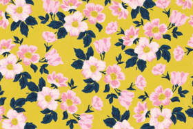
with a yellow background and flowers is really striking in the Hipkit Club kit and makes a bold statement of springtime. I wanted to try and turn my black & white floral into this vibrant mood by simply colouring it in. I decided to use coloured pencils and markers.

First I coloured the leaves in using a navy marker and then worked on the background, first using an ochre pencil and then working over this with a deep yellow pencil. It gave it good coverage and created a mustardy, warm yellow.

Next, I coloured the flowers using a pale pink Copic marker and added the darker pink to the flowers by blending in some rose pink coloured pencil.

I really liked the result, I felt that I had created the same mood and feel which the original had and got busy selecting the other papers for my layout. As usual, I looked for the colours in my photos to help select the papers from my kit.

This layout features photos of my daughter’s navel piercing, an odd thing to scrapbook, you might think? She certainly did! Let me say, that she sent me the photo of her new addition and was very proud to have finally gone through with the piercing. She had worked hard to get into shape, having lost over 24kg, through joining a gym and healthy eating. It was one of her goals to have a navel piercing on a belly good enough to show off!

Back to scrapping…

I wanted to use some of the sprays included in my kit and selected the distress ink. It proved too strong for the look I was after, so after wiping away most of it, I used some white acrylic paint to soften it into dreamy pink clouds and swishes. Then, added some blue splatters of ink.

I had just watched Janet Madison’s latest layout sharing video and was reminded about her using up scraps to create a border frame. I liked the idea of including all the patterned paper I had selected to form the outside border of my layout and quickly put it together.

I liked how the frame looked but when I added my pink mixed media cardstock everything just screamed…NO! I really didn’t like it, I needed something to stop the two clashing. I rummaged through my kit to find something to fix it and pulled out some gold washi tape. The gold tape did improve the clash slightly but  I didn’t like the result, it reminded me of old ladies who go cruising in leopard print shirts and gold lycra hot pants!

Things were not going well. I moved onto mounting my photos using the patterned papers, roughing up the edge of each layer. These I liked and I spent quite a bit of time trying to create layers on my background to place them on without creating more clash. It wasn’t quite working with my forged yellow flower paper being so bright. I decided to stamp some foliage onto the background to draw the viewers eye away from all the brightness.

After lots of fiddling around and indecisiveness, I thought  I should snip off a piece of the forged paper and use it to fussy cut some flower embellishments. This layout was taking a long time.

At last, things began to work for me and I managed to complete the layout using a selection of embellishments from my kit. It did not turn out like the layout I had envisioned, the use of the gold washi tape forced me to include some gold die cut embellishments. Surprisingly, this didn’t work out so bad, as the navel belly bar is made of gold.

IMG_6746

A lot of messing around and not super happy with it, but it is finished.

Time for number two layout…with no gold in sight!

April 2019, Counterfeit Kit Challenge

Happy days, the new Counterfeit Kit Challenge has been released for April.

This month I was super excited for the release, as when they released the hint post on their Facebook page I knew straight away which kit would be the inspiration. I had already been stalking the selected inspiration website and coveting their amazing kit which they developed and sold in March. I had even contemplated ordering it, but it is an expensive venture with postage to Australia. Then, I looked at sourcing the products included from Australian online scrapbook stores, not all the products were available from one store alone or at all! I did find quite a few products at my favourite store but reminded myself about my self imposed goal to use up what I already had and not buy more product (something which has not been going well for me with the sales)! Phew, thank goodness for the Counterfeit Kit Challenge.

So, let’s check out what the inspiration kit is and what is in it. The kit chosen for this months inspiration is the HipKit Clubs, March 2019 kit. You can find out about it on their website 0001822_march-2019-main-kitor check out the Counterfeit Kit Challenge website which has all the relevant links, including an unboxing video.

Can I pull the kit together with the product I already own? Well, the simple answer is no…and I still want to buy the kit. What’s a girl to do, improvise and forge, make some of the papers and embellishments from scratch, use what I have?

Where did I start? I always go through my paper pads first and then through my patterned papers which are sorted by colour. I discovered that I had very little of the 0001826_march-2019-paper-kitpapers with blues and florals and that green large polka dot had me stumped. What did I select? I went through the process of colour and pattern selection and then thought about what I could modify or make. Here is what I found…


I managed to get together some pinks and greens in assorted patterns, a gold foil special floral paper, a painted Kaisercraft black and white stripe and a floral which I plan to colour in with blue and pink pencils, markers or watercolours. I had no umbrellas and no blue hearts or butterflies.

So, I substituted several papers with similar colours, motifs or patterns. A two-tone Kaisercraft blue floral instead of hearts. Some 6×6 Kaisercraft black and white butterflies which I will colour blue and green. A Kaisercraft mustard and pink floral in a smaller print size than the Maggie Holmes paper. The only polka dot I could find that had navy and white. A beautiful Kaisercraft navy and white floral (b side,  P2499}which I love so much that I don’t want to cut it. Then, having no dark green polka dots, I selected this amazing Kaisercraft Hello (b side, P2514) paper which looks like an agate stone.

Next, I set aside a few maybe papers just in case…paint smooshes, dots, butterflies and a floral which could be coloured or fussy cut.

I also came across a few papers for fussy cutting to make embellishments, pink flowers and cameras.

The HipKit Club kit embellishments are bright and cheery with many spring/summer holiday motifs.

I had recently done a big sorting and organising of random die cuts from leftover kits, IMG_6476etc. and sorted them all by colour/theme into ziplock bags. I pulled out my neatly organised die-cuts and sorted through the bags of similar colours to the kit. Wozer, I found a tonne of similar motifs and quotes/ text to include in my kit.

Then, I grabbed a few black Thicker alphas to use for titles, some washi tape in plain gold and circles with mint/pink/gold, some Cocoa Vanilla Studio title die cuts and some foliage and butterfly stamps.

Woah, an exhausting process in all, but what a kit! This is going to be fun. I plan to scrap some fairly recent photos with my kit, my daughters birthday lunch, an unfortunate accident, a new big purchase and some summer fun.

Oops, I nearly forgot to include a bit of mixed media, some pink, green and blue spray ink/shimmer/shine. One homemade, one from Tim Holtz and one Heidi Swapp.

Make sure you check out all the April CKC designer’s kits and upcoming creations on the CKC website. Please, do join in with the challenge, it is a lot of fun? I will be sharing what I create here and on the CKC Monthly Link up page.

Happy scrapping everyone 🙂

RTS & CKC Mar. 2019-Layouts #9 & #10

Hello and happy St Pats Day,

Today I am sharing the last two layouts I made using Janet Madison’s RTS 4 for 4 series unnamedtechnique. You can view all of Janet’s videos for the series on her YouTube channel, RTS (Record the Story) Scrapbooking. As usual, I made some changes along the way, something Janet promotes…there is no one way, make it your own!

You can see the collection of papers I started with on my last post, I chose very feminine papers from my March Counterfeit Kit Challenge. Using the 4 for 4 series you end up making 4 layouts using 5 patterned 12×12 pieces of paper cut to different sizes and then working on a cardstock background. The leftover scraps are used to make cards with, something which I haven’t tried yet. Years ago, when I first ventured into papercraft, cards were my main focus. I even sold them through several businesses, was commissioned to create them, taught classes on stamping and cardmaking, and had tutorials published. Now, I just can’t get enthusiastic about making cards, though I do ooh and aah over all the new stamp releases. However, I agree with Janet that we should all be making our own gift cards, we have the skills and loads of scraps to use up!

Layout #9 (for CKC, #3 for RTS-4 for 4)

For this layout, I selected a very light, shell pink cardstock for the background. You can see the patterned papers cut to Janet’s specified sizes, I used a mix of old and new papers. A lovely raspberry pink floral, a text (a recent purchase, Jilliebean – Reap the Grain) and a strip of mint, criss-cross kisses. The butterfly and flowers die cuts are from Tim Holtz’s idea-ology salvaged elements, and I chose a few tags to include from my stash.

I put the background together first. I had an issue with the text paper, it probably wouldn’t have bothered most people but I do suffer a little from perfectionism. If you read the text you can see that there are some words and quotes which don’t fit with my photo. My photo is a 4×4 of my daughter by herself and several parts of the text refer to more than one person…see how picky I am. There is the terms: You & Me, Family, and together. I couldn’t work with this and needed to find ways to cover up these terms. The first thing I did was add the mint criss-cross strip across the term ‘& Me’, it didn’t quite cover it all, so I add a strip of gold, glitter washi tape. Problem solved!

IMG_6426

Next, I needed to deal with the large words, ‘Family’and ‘together’, on the right-hand side. Fortunately, my photo would cover this area, but it did mean that the placement was different from Janet’s recommendation.

I then thought the photo needed to stand out more from the background and added a white cardstock border. I wanted to include my handmade gold frames in this layout and mounted them on some scrap pink checked paper. They would do a good job at covering up the text on the left of the layout, and be substituted for the absence of photos. Janet’s #3 layout uses 3 photos and I only had one.

IMG_6431

I had wanted to use the teal glitter Thickers from my CKC kit and thought I needed to get some teal colour on the page, as my papers did not include this colour. So, out came some distress ink and a cheap stencil. I focused on stencilling over the areas with the inappropriate (for me) text.

Next, I went to work adding the embellishments strategically placing them to cover up those annoying words. This took me quite a lot of time, I moved things around a lot and it just wasn’t working for me. I also stamped on some distress raspberry pink, little foliage images to try and pull it all together, around the clusters. A few tiny punched out red hearts and flowers were also added.

I’m not completely happy with the end result, but as Janet always tells us ‘the friends and family looking through the albums will not notice’. It is us that is far too critical of our own work. We need to learn to…let it be, let it be!

IMG_6471


Layout #10 (for CKC, #4 for RTS-4 for 4)

So, this layout starts out with me scanning and enlarging the photo I want to use. Like my previous layouts, it is an old photo of my daughter which was once framed and hung on our hallway wall. The papers used are the same as Layout #9, except for a little strip of the large flower print (used in Layouts 7 & 8). I chose a few tags and a daisy die cut from my CKC kit and decided to work on white cardstock so I could splash around some ink.

I pulled out my favourite oxide ink, Mustard Seed, it creates an amazing golden yellow, and I used the plastic bag technique, activating the ink with water, to create a vibrant background.

Next, I wanted to include some stencilling on the background, picking up a few of the colours form the ‘LOVE’ tag. I put a few washi tape strips along the base of the page and then got busy stencilling on some simple shaped flowers using a range of distress ink colours. They blended beautifully, creating an almost rainbow coloured effect. I also stencilled a strip of white cardstock to use for some embellishments.

Time to fussy cut out those flowers.

Now, I needed to create some frames from scraps to cover the rough edges and bits of white left around my trimmed down photo. As, previously, I used the old Creative Memories cutting system, it was a quick and easy option.

IMG_6454

Then, I mounted the photo and frames onto the layout using foam tape.

IMG_6458

Time to build up the layers of embellishments, both handmade (stamped & stencilled) and purchased. A mix of flowers, tags and enamel dots. Then some Thickers for the title.

The end result is a very, bright, colourful layout, a lot more intense than I envisaged. Another layout in the album, happy scrapping everyone.

IMG_6459

RTS & CKC Mar. 2019- Layouts #7 & #8

Good morning,

Today I am sharing two layouts I made using my March Counterfeit Kit Challenge and my second attempt at Janet Madison’s, RTS Scrapbooking 4 for 4 series. Once again, I unnamed
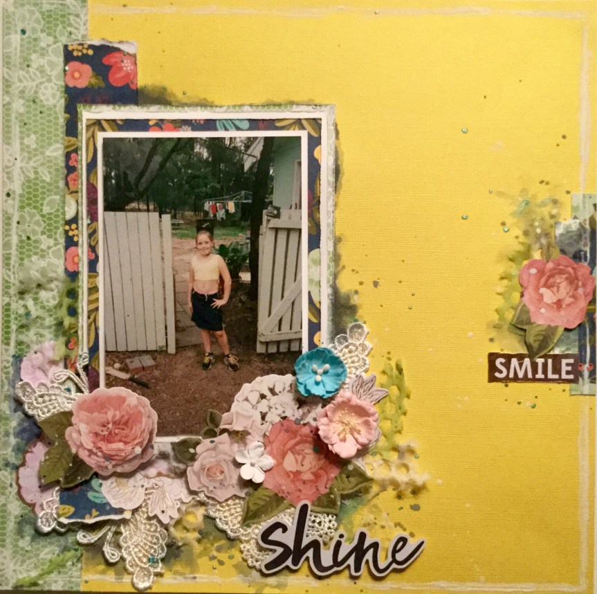
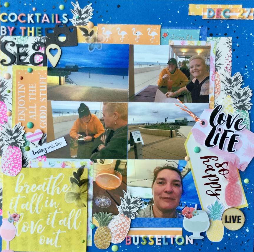
mixed things up using old and new supplies and this time added some stamping and splashes of watercolour paint. Both of the layouts are using old photos of my daughter, the photos were once framed and hung in our hallway. Unfortunately, over the years, they have fallen off the wall and the frames had smashed, I hid them away waiting for the right sized frames to come along with which to fix them. I have had no luck in finding similar sized and shaped frames, so I decided to use them as is or scan the photos (to enlarge) and create layouts to include in my daughter’s albums. Here is the result…

My paper selection for this RTS 4 for 4 kit was selected from my March CKC kit, I went very girly this time and included flowers and ice-cream coloured cardstocks.

Layout #7

Here are my papers cut to size according to Janet’s directions, the cardstock, a lovely buttery yellow and a few embellishments I chose to include.

IMG_6278

A little fun stencilling along two edges of the cardstock, using Distress Oxide inks and an old $2 stencil from the Reject shop.

Then, some stamping over the stencilling to build up a little more interest and draw the eye. I used a few different stamps which had I had collected from past monthly Uniquely Creative subscription kits.

A few splashes of watercolour paint…

Then, adhering the patterned paper pieces to create the background as per. Janet’s instructions.

IMG_6292

Next, I decided to use the original photo as it was a reasonable size (6×4) with only the corners being trimmed off. I think it was originally in an octagon shaped frame. I doubled mounted the photo onto white cardstock and the #5 patterned paper. Then, I used two scraps, to mount behind the photo.

Now, how to hide those trimmed corners? Washi tape of course! Which I also used on the background.

Time for some embellishments, some Uniquely Creative dies cut made with my Sizzix Big Shot, tags, wood veneer flowers (KaiserCraft), butterflies (Tim Holtz), punched hearts, enamel dots and die cut flowers (Tim Holtz). For the title, I used American Crafts, Hardcover, Thickers.

The finished layout just screams sunshine, summer days and a pretty girl. I love how it turned out and am very pleased to have used a photo that was sitting neglected in a drawer.

IMG_6304

Layout #8

Working with this photo was a little trickier, the original photo was a 3×4 cut down into a smaller shape to fit into a tiny oval frame. How was I going to use this?

First, I scanned the photo and enlarged it to print onto a 4×6 glossy photo paper. Given that the photo was 28 yrs old, it came out reasonably well and worked well with the selected papers which had been cut to Janet’s sizes. I collected up some embellishments to use on the layout, with a heavy influence of pink and pretty.

I needed to trim down the photo and try and smooth out the edges, so I pulled out my very old school Creative Memories cutter. The oval cutter was a perfect size and easy option to use, however, because the original photo had been roughly cut I needed some way to cover the little bits of white which still showed. That’s when I had the brainwave to cut some oval frames to hide some areas of white. This worked in well with the CKC challenge #1-Frame It Up.

I splashed around some watercolour paint and stamped some flowers on my background. The background was made up using patterned paper pieces and two washi tapes.

Next, fun again making and adding the embellishments, and fixing the photo and frames into place. In Janet’s layout, she includes two photos, I substituted the journal card instead of a photo to balance the design. The embellishments and title were similar to the previous layout: Uniquely Creative dies cut/made with my Sizzix Big Shot, tags,  butterflies (Tim Holtz), enamel dots, die cut flowers (Tim Holtz), and for the title, I used American Crafts, Hardcover, Thickers.

Another, very pretty layout to pop in my daughter’s album.

IMG_6345

I have two more layouts to complete to finish this 4 for 4 series, both are also using old photos of my daughter. I hope to work on them this weekend and clean up my

Please do check out Janet Madison’s RTS 4 for 4 series on YouTube and you may like to join the new love RTS fan group on FaceBook?  Plus, do check out the Counterfeit Kit Challenge website, you will have lots of fun joining in with their monthly kit challenge. It is a great way to use up your supplies.

Happy scrapping, everyone 🙂