Making Spectrum Sherbet inspired backgrounds!

Hello, old friends!

Here I am back again playing after a very loooonnnngggg break. Life last year got completely crazy for me and time to blog was just beyond me. I was overwhelmed with going back to University to study for the third time, what was I thinking? Well, really it was studying, and upgrading my qualifications or losing the chance to further employment. Anyway, I qualified with flying colours and life is a lot more mellow. So, I have been loving having the opportunity to scrap and paint when I’m not working.

Anyway, let’s scrap! Like half the scrapbook community I have fallen completely in love with the 49 and Market, Spectrum Sherbet collection. A scrapbook collection with the most amazing colours, textures and patterns. I wanted to buy it all but unfortunately, my finances couldn’t stretch to buying the whole collection, plus I already have so many supplies to use up, that I held back and just purchased the one classic pack and two packets of the acetate leaves. Both products are absolutely beautiful.

So, beautiful that I don’t want to use the paper as I only have one of each! Being two-sided sheets, with gorgeous designs on both sides makes it even more difficult. How can I possibly choose which side to use? Well, my creative mind had an epiphany when I realised that I could try and make some of my own papers in the same style as these beauties.

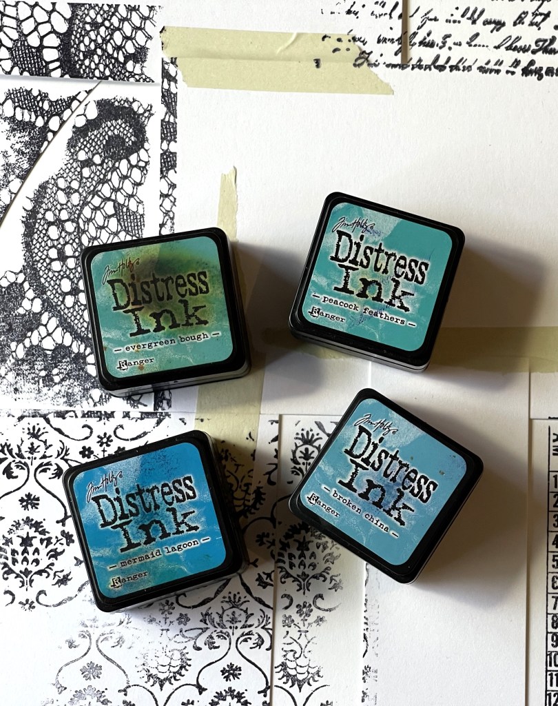
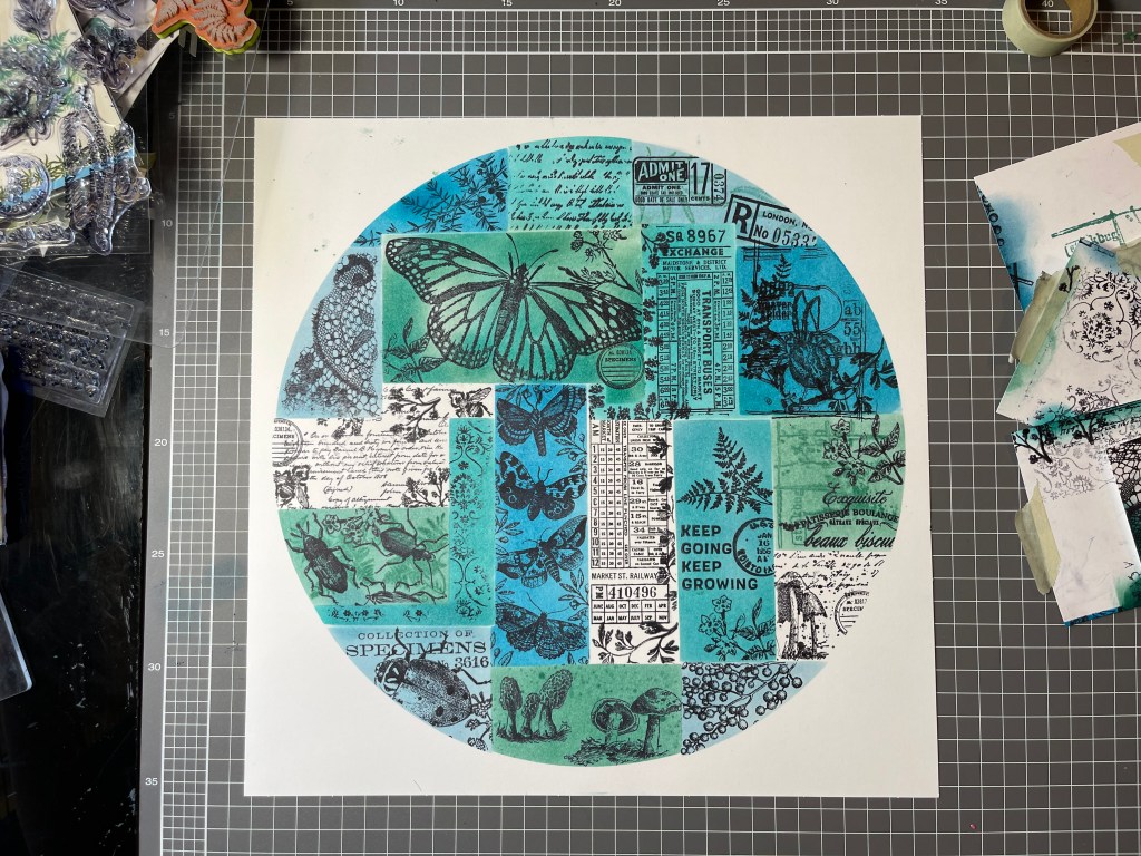
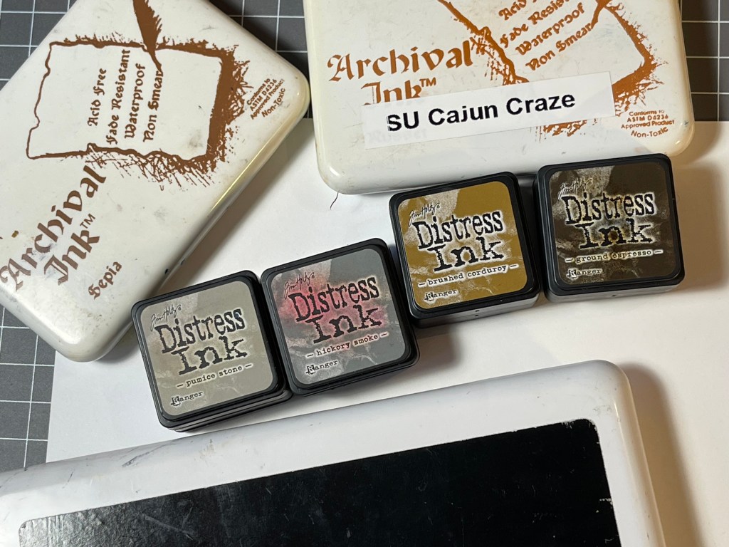
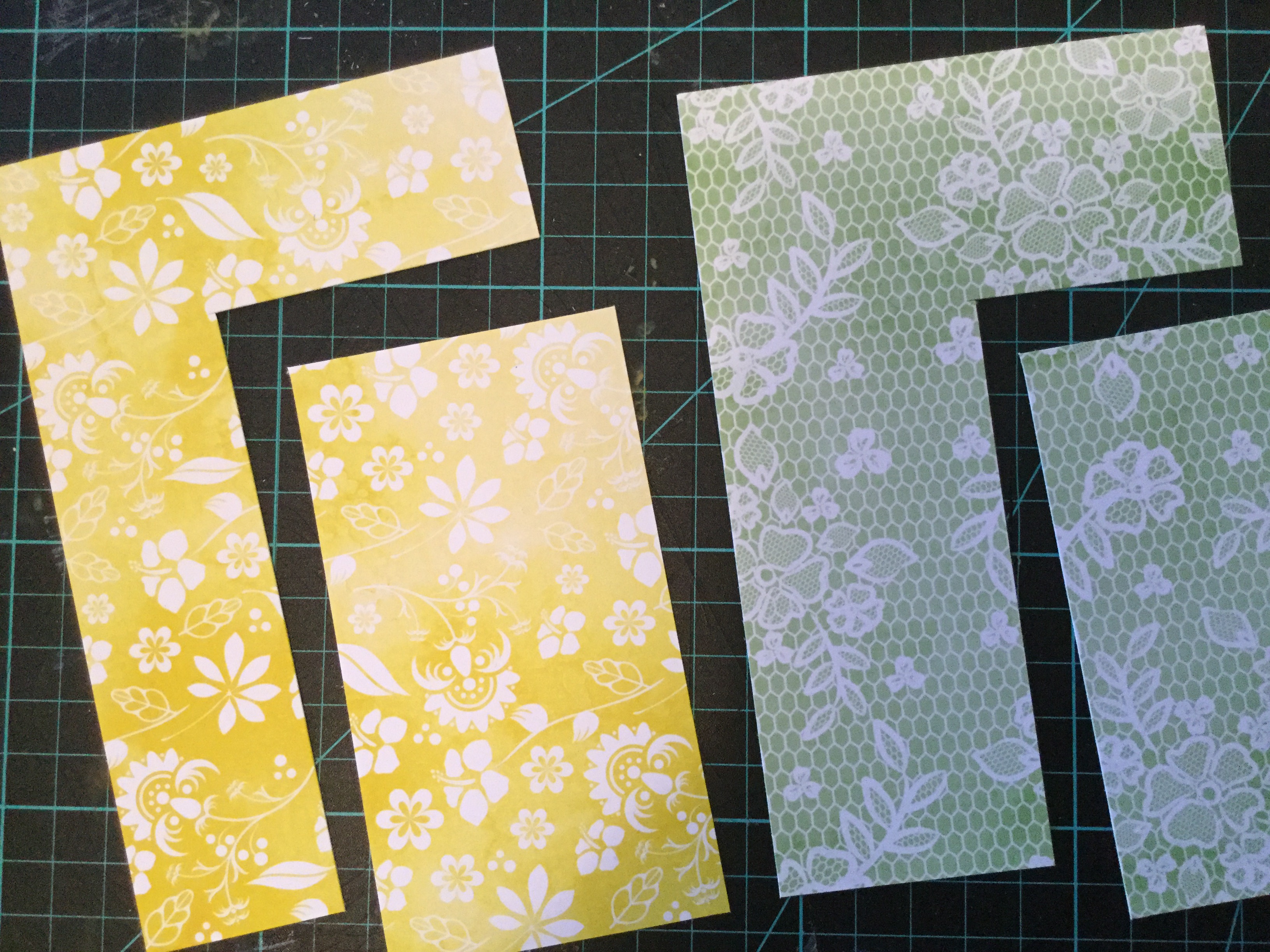
So, make I did, and it was a wonderful experience. Yes, it took me a few hours but who cares about time when one is creating. I stepped back in time and used an old stamping technique, masking, which worked really well to create that collaged look. I chose to work with Tim Holtz Distress inks (for my first attempt) and chose to try and create a teal blue and green background.

I really stepped out of my comfort zone and even filmed the process. Yes, people, I have made my first ever scrapbook video. Something that I have been planning to do for years but have not been brave enough, nor had the time. It’s pretty basic, so be kind. If you are interested in watching it, you can view it on my YouTube channel here. I would appreciate any feedback, so please do leave a constructive comment and like the video. With some motivation and support from other crafters, I hope to continue to develop my video production skills.

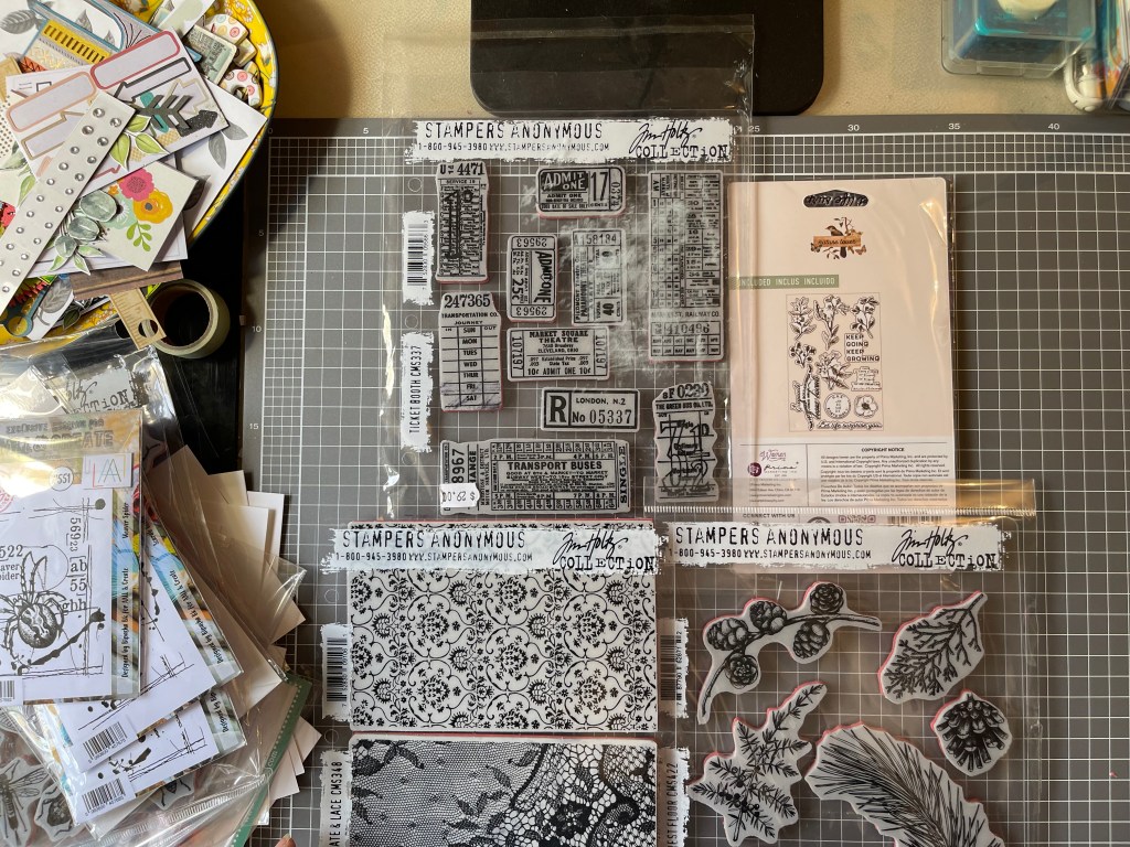
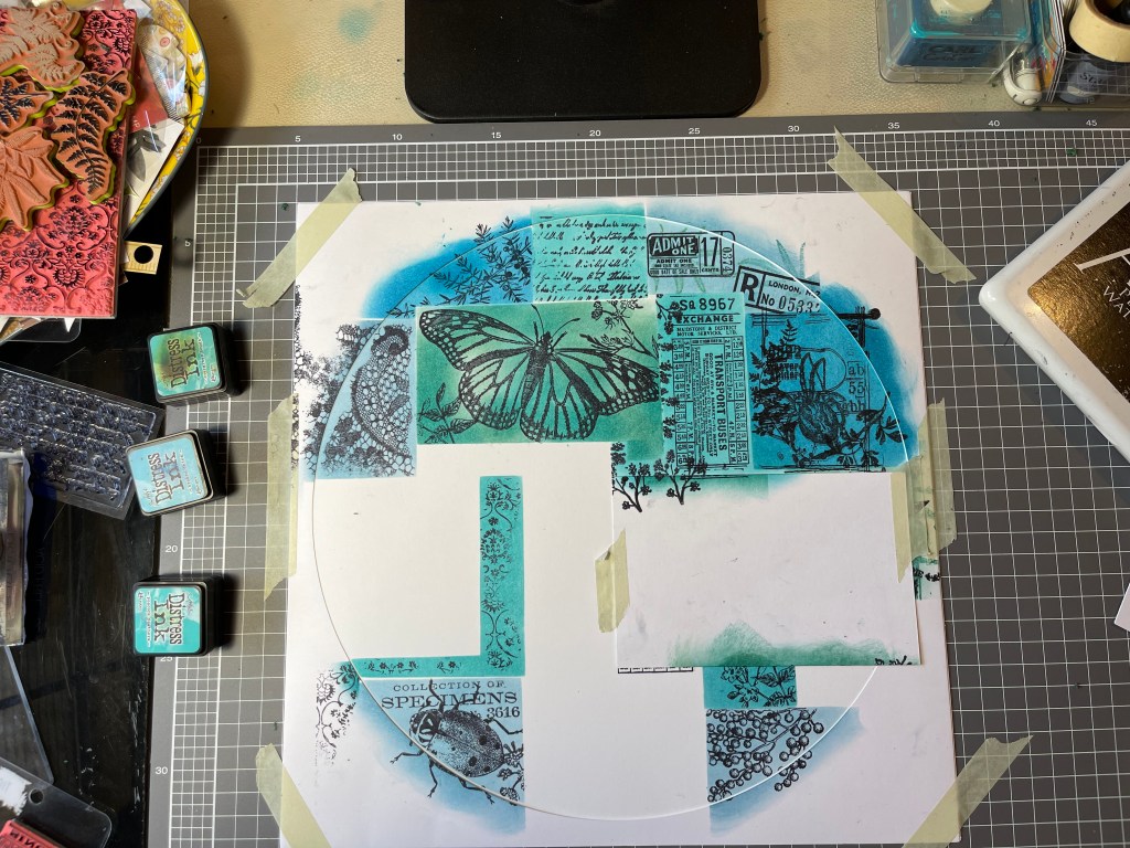
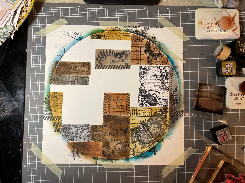
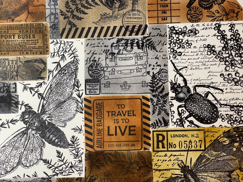
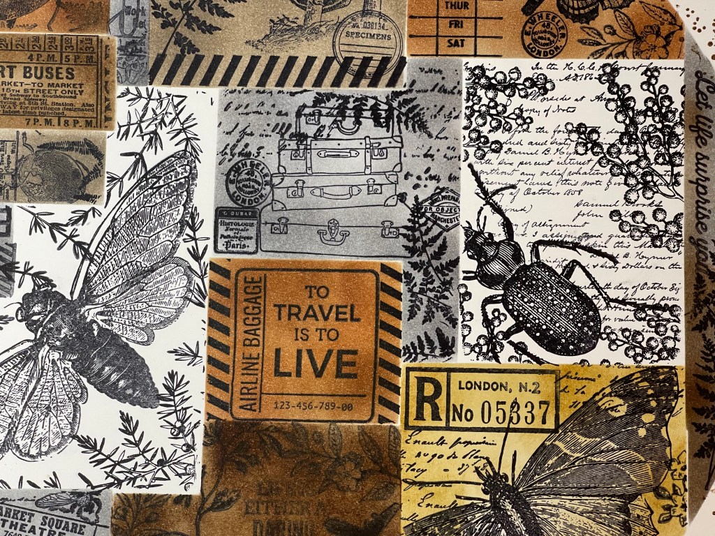
Right, so let’s look at stamping and masking. First I selected a heap of stamps which could blend to create a similar nature theme. I also selected some travel stamps for fun, which I used on the second background. I chose to use some Vicki Boutin foundation mixed media cardstock for the first layout, it’s a good quality cardstock made to take wet media, so should easily handle a bit of ink. I also use some thinner Poppy Craft cardstock which I used for the masking shapes and for making a template.

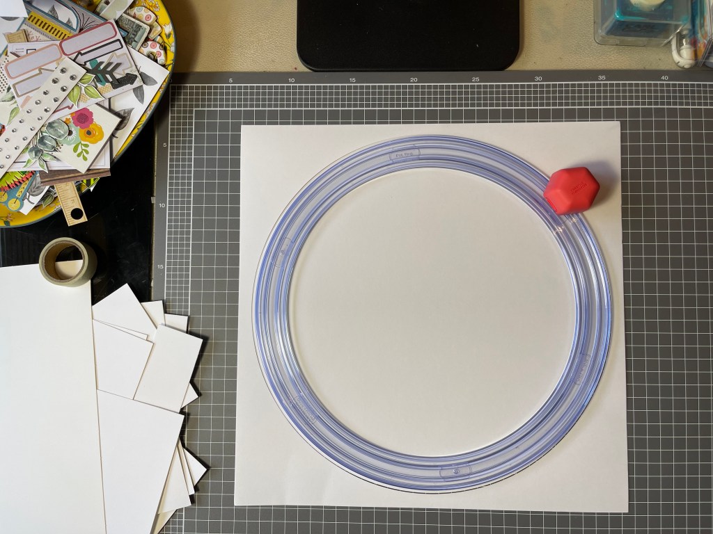
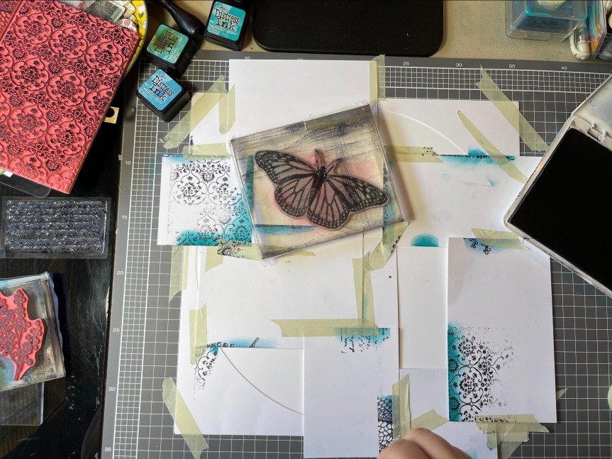
Template? Yes, I decided to not directly copy the Spectrum Sherbet design making a 12×12 sheet but used the collage look within a circle template design. I masked off different sections of the circle and stamped on my images, colouring each section with the distress inks. It was a pretty easy process but a bit fiddly and time-consuming. I really like how it looks in a circle design. I ended up adding a little stamped splash around the edges where I accidentally got some ink smudges. overall, I’m pretty happy with how it turned out.

So happy that I made a second background, working with grey and brown inks and adding some travel stamped images. Not at all a sherbet colour, but I love it anyway.

Heidi Swapp, Wolf Pack, even more, Layouts!

Hello all,

Here are a few more layouts I completed using up the Heidi Swapp ‘Wolf Pack’ paper pad. I am finding this collection to be very versatile, though it is stretching my mind trying to come up with layout ideas using the bear papers. Hopefully, something will spark and I will conquer the bear!

The first layout is of my eldest son. The papers are from Wolf Pack, but I used a range of embellishments which I found in my stash.

2019-06-17 21.58.46-1

Next up, a layout of my Step-Dad who has been busy renovating the verandah on their 40yr old home (which he also built). A bit of stamping and splashing around some ink on this layout.

2019-06-22 15.15.16-1

Some simple layouts, a layout of hubbies bonsai plant after pruning and a layout about a pesky rat which moved into our home for the winter!

I have made up another 5 kits (with photos) using the Wolf Pack collection paper pad. I’m not sure when I will have time to scrap them, as I have several projects on the go at the moment, but I will share when I have managed to finish and kill this ‘Wolf Pack’ paper pad.


Happy scrapping everyone 🙂

Heidi Swapp, Wolf Pack Layout #2.

Hi again,

Today I am sharing another layout I made using the Heidi Swapp, Wolf Pack collection. This layout features my youngest son at a different stage of his life. The photo I SBC_ac-314693_96233
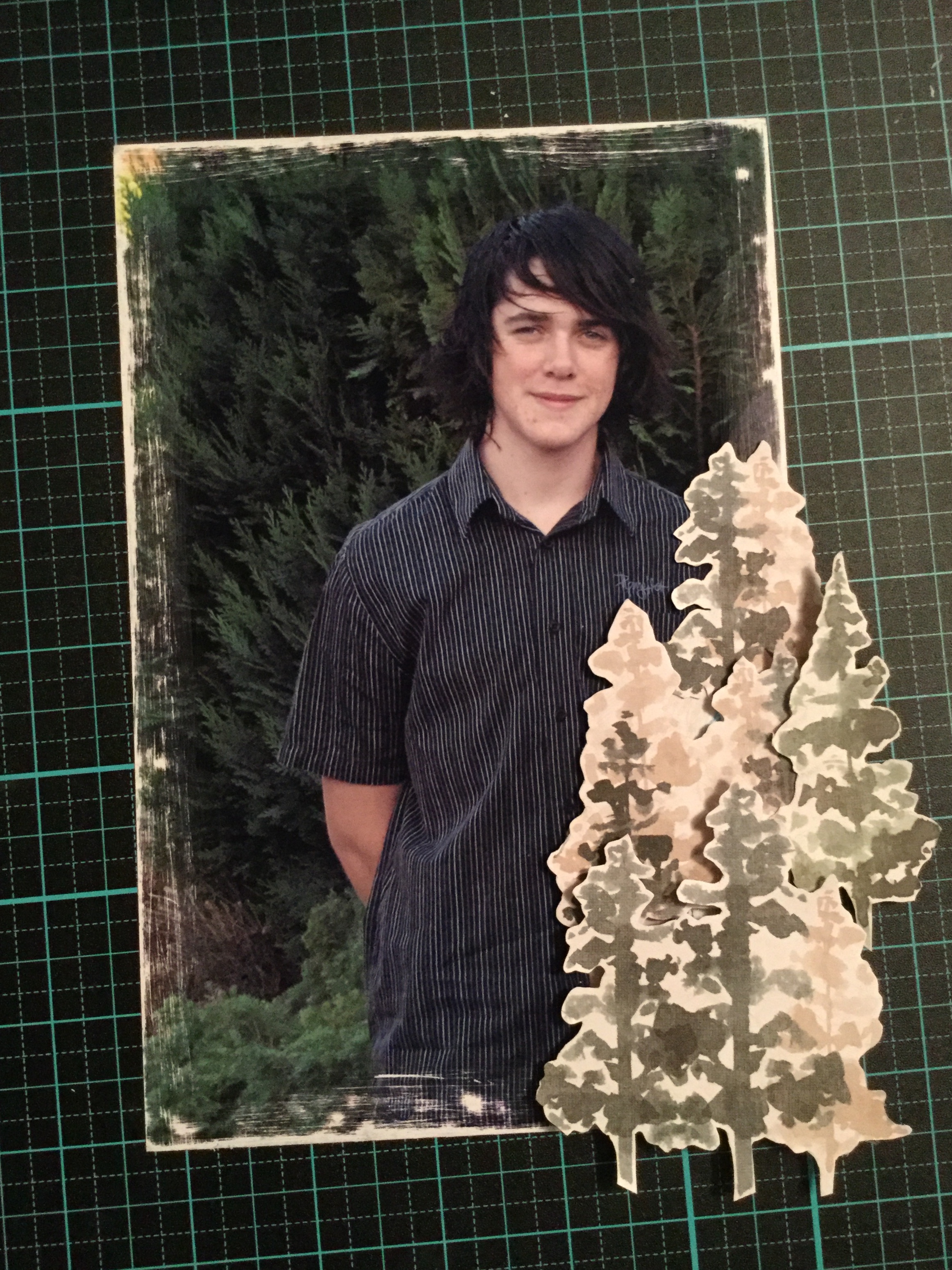
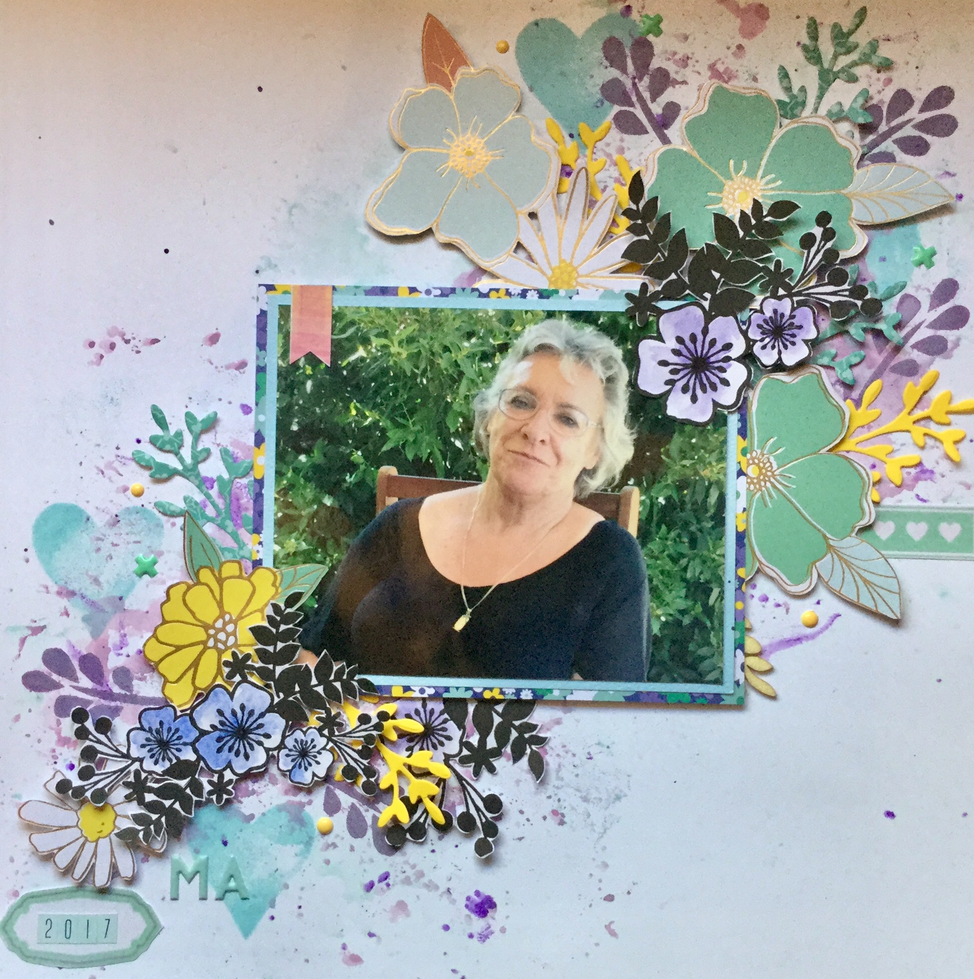
have used was originally a photo of all four of my children together which I have scrapped several times, so they each have one. This time I cropped the photo down to try and just get my youngest son in the image, as I don’t have many teen photos of him to use in layouts. The problem I encountered, as you can see, is that part of my eldest daughter was still in the image. As gorgeous as she is, she had to go for this layout! Here’s how I erased my daughter from the image by hand, the old fashioned way and then, put the layout together.

Below are the Wolf Pack papers I used and the washi tape. I selected the B side of the Explorer paper, a fun polka dot print and the B side stripe print of the Zodiac paper, plus the Woodsy paper with the pine trees.


First, I fussy cut the pine trees from the Woodsy paper to use as embellishments.

IMG_7664

A little sandpaper worked magic to create an interesting border and camouflage my daughter’s bright dress into the foliage.

Then, I layered my fussy cut pine trees over what was left of my daughter. She always did like to climb and hide in trees. 🙂

IMG_7668

When constructing the background I applied strips of washi tape horizontal onto each stripe of the B side, Zodiac paper.

Then, I used Tim Holtz Oxide Distress inks and the plastic bag technique to smoosh some colour onto the background. I was careful not to use too much water or the washi tape may have lifted.

Next, I mounted the photo onto pieces of the banding strips offcuts from the papers and adhered it to the background with a layer of foam. A few more pine trees were added on the other side of the photo for balance.

img_7676.jpg

A small cluster of paper scraps, sticker quotes (Tim Holtz) and embellishments were added to the bottom left corner. Then, I covered the photo over to protect it and splashed around some white watercolour paint.  I used a few of the Wolf Pack puffy stickers to add a little dimension. I think I did well hiding my daughter in the bushes. Haha 🙂

IMG_7764

I am loving using this collection, it is so very versatile. Please do share what you are making with the Wolf Pack collection.  You can share links to your work in the comments section, remember that you need to click on the title of the post to open the page to comment.

Keep on scrapping 🙂


Heidi Swapp, Wolf Pack Layout Fun!

Hi everyone,

I recently treated myself to some scrap goodies for Mother’s Day and my birthday, amongst what I purchased was some of the lovely masculine Wolf Pack collection by Heidi Swapp. It’s a gorgeous collection with lots of potential and versatility, I saw myself SBC_ac-314693_96233being able to create layouts about my sons, daughters, grandson and Christmas. The lovely outdoor pine forest, mountains and starry nights would work well for our traditional, annual, Christmas tree hunt. The other papers, a mix of contemporary and cultural patterns in black, white and shades of greens, and the wood grain can be used for recording many special events or moments.

For this layout, I chose to use three of the collection papers, the Zodiac, the wood grain (B side of Mama Bear) and the black and white bold stripe (B side of Woodsy). I also wanted to use the washi tape and the very cute puffy stickers.

To start with I used some texture gesso paste and a Kaisercraft stencil (Distressed Dots)  on my background, a mix of stripe and wood grain paper. The stencil gives a lovely grunge effect.

IMG_7651

After drying of the gesso, I applied Tim Holtz Distress Oxide inks. You just stamp the pad on a smooth surface, mine is a piece of black acrylic, and add water to the ink, then paint the ink onto the stencilled gesso. The fluid ink runs into all the crevices of the gesso and blends together beautifully.

While that dries I got to work on mounting my photo. I used the banding strips trimmed off the papers, each strip has a print motif on it of one of the other papers in the collection…wolves, bears, etc. Because they are little strips and I am using them as edging mounts, you can’t identify them as bears, etc.

Next, I mounted the photo onto the background and began to embellish the layout. Even SBC_ac-314687_85251_0
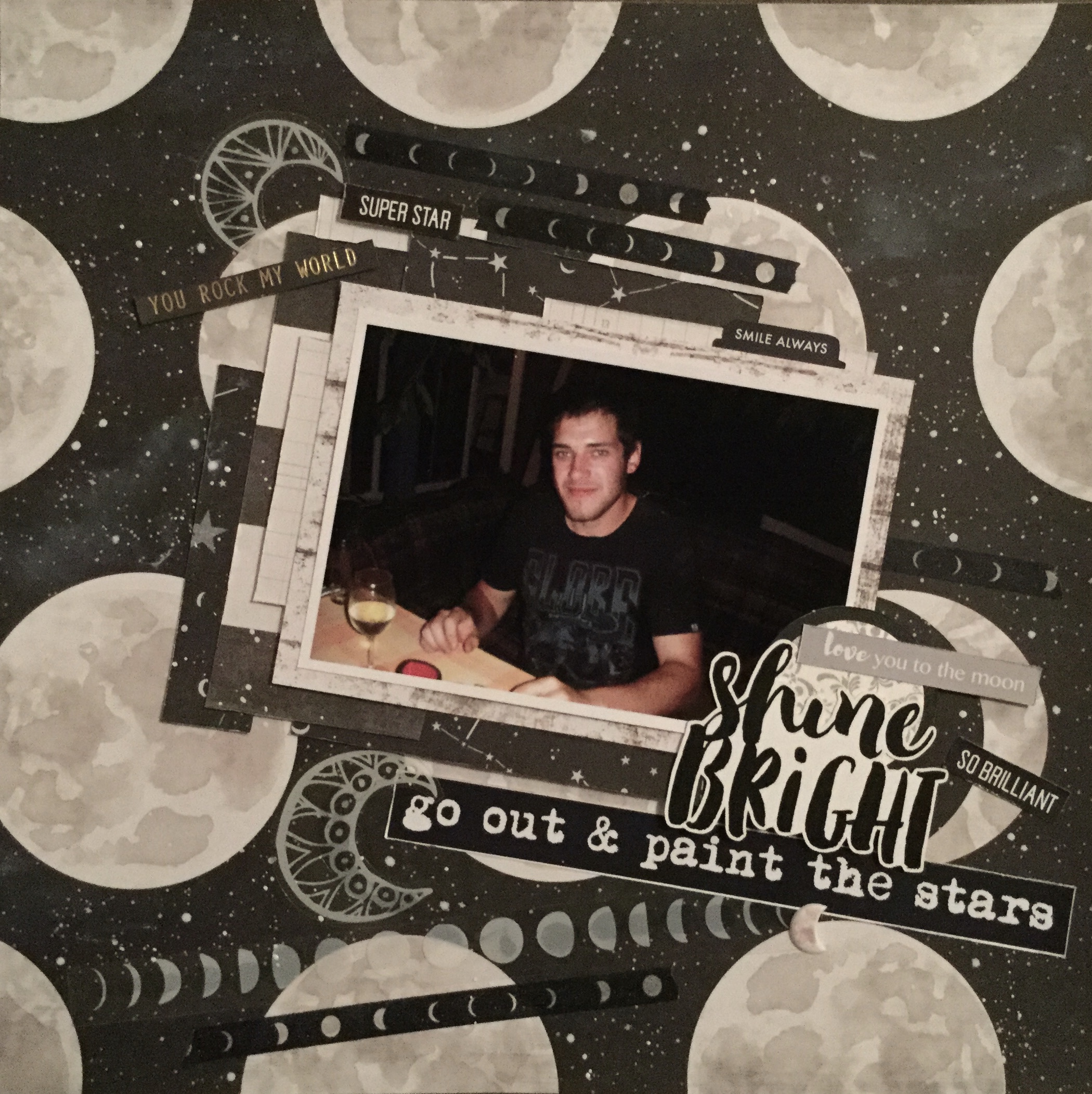
though the papers are quite masculine and I am using a photo of my teenage son, I couldn’t stop myself from adding some sparkle and shine to the layout. The Zodiac paper features the night sky and astrology motifs and I wanted to highlight this in my design. I used a variety of sequins in crystal, navy, aqua and green to decorate and enhance the layout. Then, I splattered on some watercolour paint in white, green, dark blue and brown.IMG_7659

The final touch was to add the puffy star stickers, some moon washi tape and some cotton thread bunches, then a few Tim Holtz quote stickers and a little extra splatter.

I decided not to add a title, the layout was to capture my son at this stage of his life when he was full of dreams and possibilities for the future. The quote stickers were appropriate and told the story, a title would draw the viewers eye away from the photo.

IMG_7660

I love how this turned out and it was fun to create. I can’t wait to use the rest of this collection. Who else is using the Wolf Pack collection? Share links to your work in the comments section, remember that you need to click on the title of the post to open the page to comment.

Happy scrapping 🙂

May 2019 CKC Challenge #2.

Dreams are the seeds of change.

Nothing ever grows without a seed,

and nothing ever changes without a dream. – Debby Boone

Ch#2 image

How beautiful is that quote? This is the second challenge set by the May, Counterfeit Kit Challenge team. Create a layout based on this quote, theme, image or colours.

For me, being a very visual person, it was the colour and image which first grabbed my attention. I love that dreamy blue and blowing those seeds into the wind reminded me of childhood, I knew that my page would be of my grandson or my own children when they are young. When I went through my photo boxes I came across some lovely photos of my grandson sleeping in his car seat on his way to visit us. He looked so peaceful asleep and I’m sure he was dreaming happily, this was definitely the photos to use for the challenge.

When I went through my kit looking for papers, I didn’t find the right blue or patterns in file
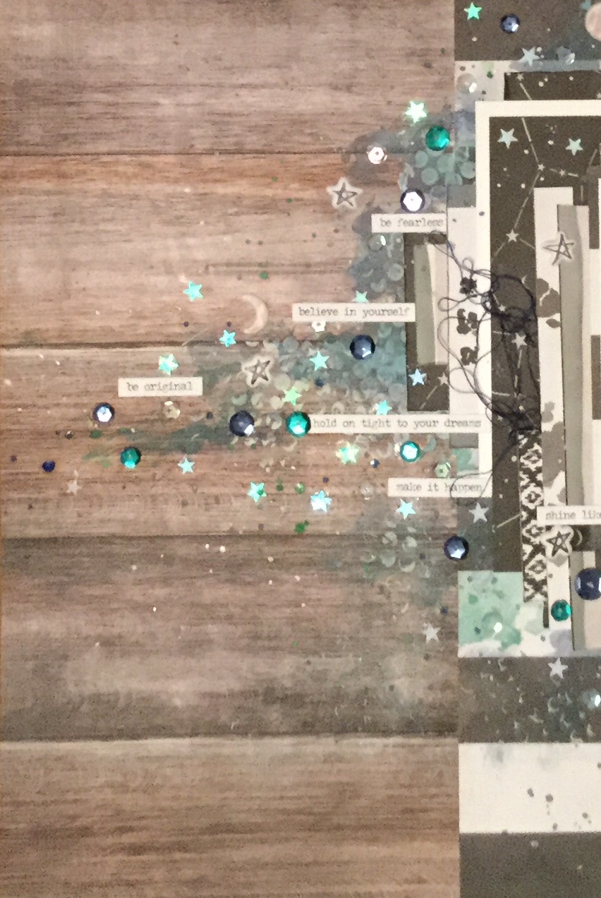
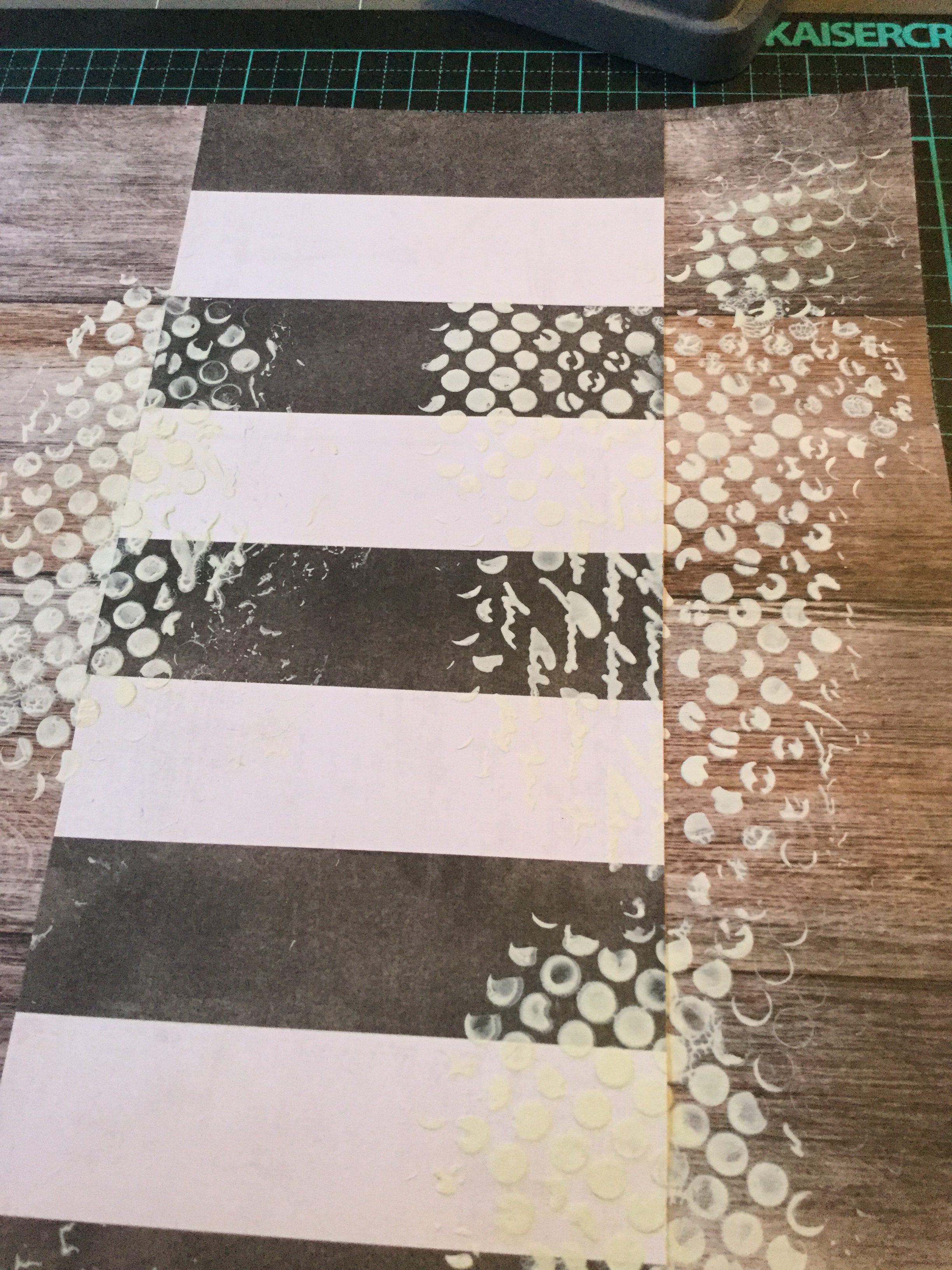
my kit. The only patterned paper I had included which was light blue had aeroplanes on it, so I decided to create my own background on cardstock using my new Vicki Boutin stencils.

I started by using the starburst/flower stencil and some white gesso texture paste, stencilling across most of the page. After leaving it to completely dry, I sprayed on some Heidi Swapp Teal Color Shine and gently rubbed it over the texture paste stencilled flowers. This created some lovely shiny areas and enhanced the texture of the stencilling.

Next, I used some Tim Holtz distress inks and the leaf stencil and stencilled the design around the edges of the cardstock, blending the two blue inks to create a more dreamy coloured surface. *The nighttime lighting makes it look a little green and purple in these photos.

Then, I got busy fussing cutting out some white flowers and foliage to use as embellishments on the layout. I found a few acetate embellishments from Kaisercraft and Heidi Swapp to use, and some black and white seed embellishments from the PinkFresh Studio, A Case of the Blahs collection. I mounted my photos onto scraps of patterned paper from my May kit. The title, Dream, is from the Rainbow Roux, Jillibean collection.

The finished layout looks very dreamy and meets the challenge criteria brief beautifully.

IMG_7465

Keep checking in on what other CKC scrappers are creating either on the blog with the monthly link up page or on their FB community page. Please leave any comments below, remember that you need to click on the title of the post to open the page to comment.

Happy scrapping 🙂

RTS & CKC Mar. 2019- Layouts #7 & #8

Good morning,

Today I am sharing two layouts I made using my March Counterfeit Kit Challenge and my second attempt at Janet Madison’s, RTS Scrapbooking 4 for 4 series. Once again, I unnamedmixed things up using old and new supplies and this time added some stamping and splashes of watercolour paint. Both of the layouts are using old photos of my daughter, the photos were once framed and hung in our hallway. Unfortunately, over the years, they have fallen off the wall and the frames had smashed, I hid them away waiting for the right sized frames to come along with which to fix them. I have had no luck in finding similar sized and shaped frames, so I decided to use them as is or scan the photos (to enlarge) and create layouts to include in my daughter’s albums. Here is the result…

My paper selection for this RTS 4 for 4 kit was selected from my March CKC kit, I went very girly this time and included flowers and ice-cream coloured cardstocks.

Layout #7

Here are my papers cut to size according to Janet’s directions, the cardstock, a lovely buttery yellow and a few embellishments I chose to include.

IMG_6278

A little fun stencilling along two edges of the cardstock, using Distress Oxide inks and an old $2 stencil from the Reject shop.

Then, some stamping over the stencilling to build up a little more interest and draw the eye. I used a few different stamps which had I had collected from past monthly Uniquely Creative subscription kits.

A few splashes of watercolour paint…

Then, adhering the patterned paper pieces to create the background as per. Janet’s instructions.

IMG_6292

Next, I decided to use the original photo as it was a reasonable size (6×4) with only the corners being trimmed off. I think it was originally in an octagon shaped frame. I doubled mounted the photo onto white cardstock and the #5 patterned paper. Then, I used two scraps, to mount behind the photo.

Now, how to hide those trimmed corners? Washi tape of course! Which I also used on the background.

Time for some embellishments, some Uniquely Creative dies cut made with my Sizzix Big Shot, tags, wood veneer flowers (KaiserCraft), butterflies (Tim Holtz), punched hearts, enamel dots and die cut flowers (Tim Holtz). For the title, I used American Crafts, Hardcover, Thickers.

The finished layout just screams sunshine, summer days and a pretty girl. I love how it turned out and am very pleased to have used a photo that was sitting neglected in a drawer.

IMG_6304

Layout #8

Working with this photo was a little trickier, the original photo was a 3×4 cut down into a smaller shape to fit into a tiny oval frame. How was I going to use this?

First, I scanned the photo and enlarged it to print onto a 4×6 glossy photo paper. Given that the photo was 28 yrs old, it came out reasonably well and worked well with the selected papers which had been cut to Janet’s sizes. I collected up some embellishments to use on the layout, with a heavy influence of pink and pretty.

I needed to trim down the photo and try and smooth out the edges, so I pulled out my very old school Creative Memories cutter. The oval cutter was a perfect size and easy option to use, however, because the original photo had been roughly cut I needed some way to cover the little bits of white which still showed. That’s when I had the brainwave to cut some oval frames to hide some areas of white. This worked in well with the CKC challenge #1-Frame It Up.

I splashed around some watercolour paint and stamped some flowers on my background. The background was made up using patterned paper pieces and two washi tapes.

Next, fun again making and adding the embellishments, and fixing the photo and frames into place. In Janet’s layout, she includes two photos, I substituted the journal card instead of a photo to balance the design. The embellishments and title were similar to the previous layout: Uniquely Creative dies cut/made with my Sizzix Big Shot, tags,  butterflies (Tim Holtz), enamel dots, die cut flowers (Tim Holtz), and for the title, I used American Crafts, Hardcover, Thickers.

Another, very pretty layout to pop in my daughter’s album.

IMG_6345

I have two more layouts to complete to finish this 4 for 4 series, both are also using old photos of my daughter. I hope to work on them this weekend and clean up my

Please do check out Janet Madison’s RTS 4 for 4 series on YouTube and you may like to join the new love RTS fan group on FaceBook?  Plus, do check out the Counterfeit Kit Challenge website, you will have lots of fun joining in with their monthly kit challenge. It is a great way to use up your supplies.

Happy scrapping, everyone 🙂

Mix it up! RTS 4 for 4 & CKC March 2019

Hey everyone,

as some of you may already know, I am a big fan of RTS Scrapbooking. The amazing Janet Madison shares all her scrapbooking knowledge on her RTS Scrapbooking YouTube unnamedchannel. She is a wealth of knowledge and so generous with her time and skills. For a while, Janet has been making a series of videos called 4 for 4. The idea is that you use a set amount of papers (5), cut into a specified size, and then add in some alphas and embellishments to create 4 layouts and some cards. Janet talks you through the whole process step by step, through her videos. This month, I decided to give it a go. I hadn’t tried it out before, but have used similar systems to create mini albums (6×6 and 8×8) in the past. Using a system like this can really speed up your productivity and get a whole heap of layouts completed and into albums.

Layout 1.

First, you need to select your papers and cardstock, you need a selection of papers with a range of patterns. Janet talks you through this process and provides all the detailed instructions. She suggests the best patterns to use. I thought it would be fun to use my kit which I had put together for the March Counterfeit Kit Challenge.

A new Facebook group has recently been formed for the scrapbook fans of RTS. It is called love rts and you can access a PDF copy of the 4 for 4 instructions in the group. I printed this out and worked through the instructions while watching the RTS videos and scrapping my layouts.

Janet suggests selecting four alphas for your layout, two large and two small. I chose two glitter alphas to work in with the March CKC.


Also on the material list is washi tape, here is my selection. Once again I went with some glitz selecting three glitter washi tape and a gold metallic to link in with my CKC kit. Janet gives you lots of options to use instead of washi tape.

IMG_6184

Cutting up the papers is quite simple, though I would suggest that you watch Janet’s video a few times before starting. You do need to think about which direction you want your patterns to run, this is especially important if you use a paper which has text.


Next, I built up the background following Janet’s recommendations. I started with white cardstock and then changed my mind using green instead. I mounted my photo and begun adding the titles, something I usually do last.

I was short on embellishment in my CKC kit and decided to make some as it was the Forgery on the 4th challenge day. I used some stamps and ink I had included in my kit.


After adding the homemade embellishments, some enamel dots, washi tape and a few other bits and bobs, it was finished. Thanks, Janet 🙂

IMG_6207

Happy with the first ‘4 for 4’ RTS layout, I moved onto number two. Once again following Janet’s directions, watching her video and including some handmade embellishments.

Layout 2.

IMG_6213

Two more to go 🙂

I have enjoyed the process and may even use the 4 for 4 system with a different set of papers. A great way to get layouts completed quickly and as simply as you like. Janet encourages you to take the process and make it your own, perhaps I will add a little mixed media next time. The skies the limit…oh, the places you can go with Janet’s guidance!

D-Lish Scraps Feb. Challenge 2019

Good morning,

A quick show and tell today. Two layouts for two February challenges fromThe D-lish 51872921_10156787038486421_9045415925280407552_nScraps team. You can check out their new March inspiration and challenges on their blog and Facebook site.

The first I attempted asked you to add a heart to your layout. An easy enough task, I started with creating a background using a Kaisercraft stencil and some Tim Holtz ink.

I was using some old, cheeky photos of my daughter. I pulled out some patterned paper scraps in colours which matched my photos.

I trimmed down the papers, roughed up the edges and layered them onto the background. I wasn’t happy with how far the stencilling went and added some more on.

IMG_6055

A little bit of splatter was needed, out came the watercolour paints.

I was trying to use up some old embellishments and added a couple of vertical stripes to the layout, one sticker and one chipboard. The photos were mounted on cream cardstock.

Time to go old school with some foil embellishments. Anyone remember these?

Using up more old embellishments and some die cut letters for a title.


A few bits of ribbon and washi tape to finish it off. The finished layout is very happy and cheerful.

IMG_6090

The second challenge I attempted was to use a frame on your layout, something I haven’t done in a while. I have many old, frame embellishments to use up!

51949013_10156788513031421_6502307515202535424_o

It was a very quick layout, lots of layering but no mixed media! Once again, trying to use up some old supplies, rub ons. Does anyone buy these anymore?

I also included some newish embellishments, lovely blue and white paper flowers.

A simple, easy layout which turned out quite sweet.

IMG_6105

Happy scrapping everyone 🙂


Anna’s Craft Cupboard Challenge!

Hey,

I have been having fun this morning scrapping a layout for the February layout challenge at Anna’s Craft Cupboard. The challenge involves including a splash of colour IMG_5789in your layout and my order of LemonCraft papers from Anna’s had just arrived, providing some vibrant yellow, pink and green. I have been quite good at not buying new supplies (apart from my regular kit subscription from Uniqeley Creative) and using up what I have, but these papers have been on my want list for a while now. I succumbed to temptation and purchased a few LemonCraft papers, some Mintay papers and stocked up on some cardstock in blues and greens ( a need) which I always run out of.IMG_5723


Anyway, back to scrapping. I decided to go with the green telephone box image as my inspiration. The colour gave me an excuse to use my new papers and I liked the criss-cross lines of the windows on the telephone box. I used a neutral kraft coloured background and splashed around some watercolour paint in yellow and a green which I mixed. In my head, I was seeing a layout with lots of layers and texture, pulling on the colours and patterns in the photo I was using. The photo is a very old image of my eldest daughter after she had just woken from a nap. She has those dreamy eyes, tousled hair and red cheeks which all toddlers seem to have after some zzzzzzs.


Next, I used some Tim Holtz inks and a KaiserCraft stencil to add a bit more interest and texture to the background. I thought the criss-cross design of the stencil linked to the telephone box image, as did some of the geometric shapes with my photo.

I then, cut out some of the LemonCraft papers into 4′ inch strips and cut them down into IMG_5806
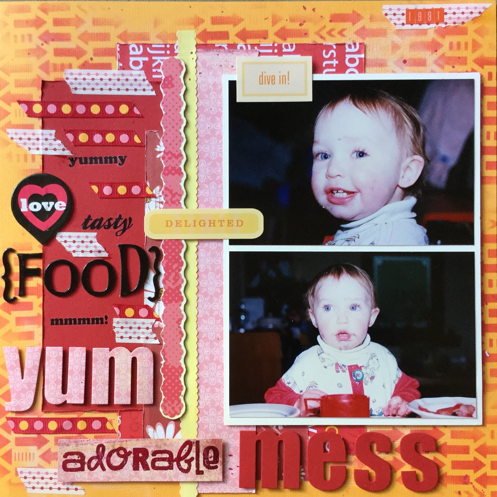
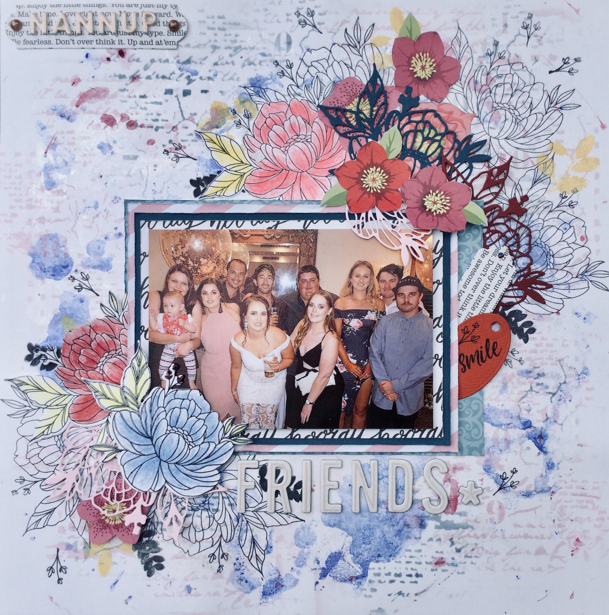
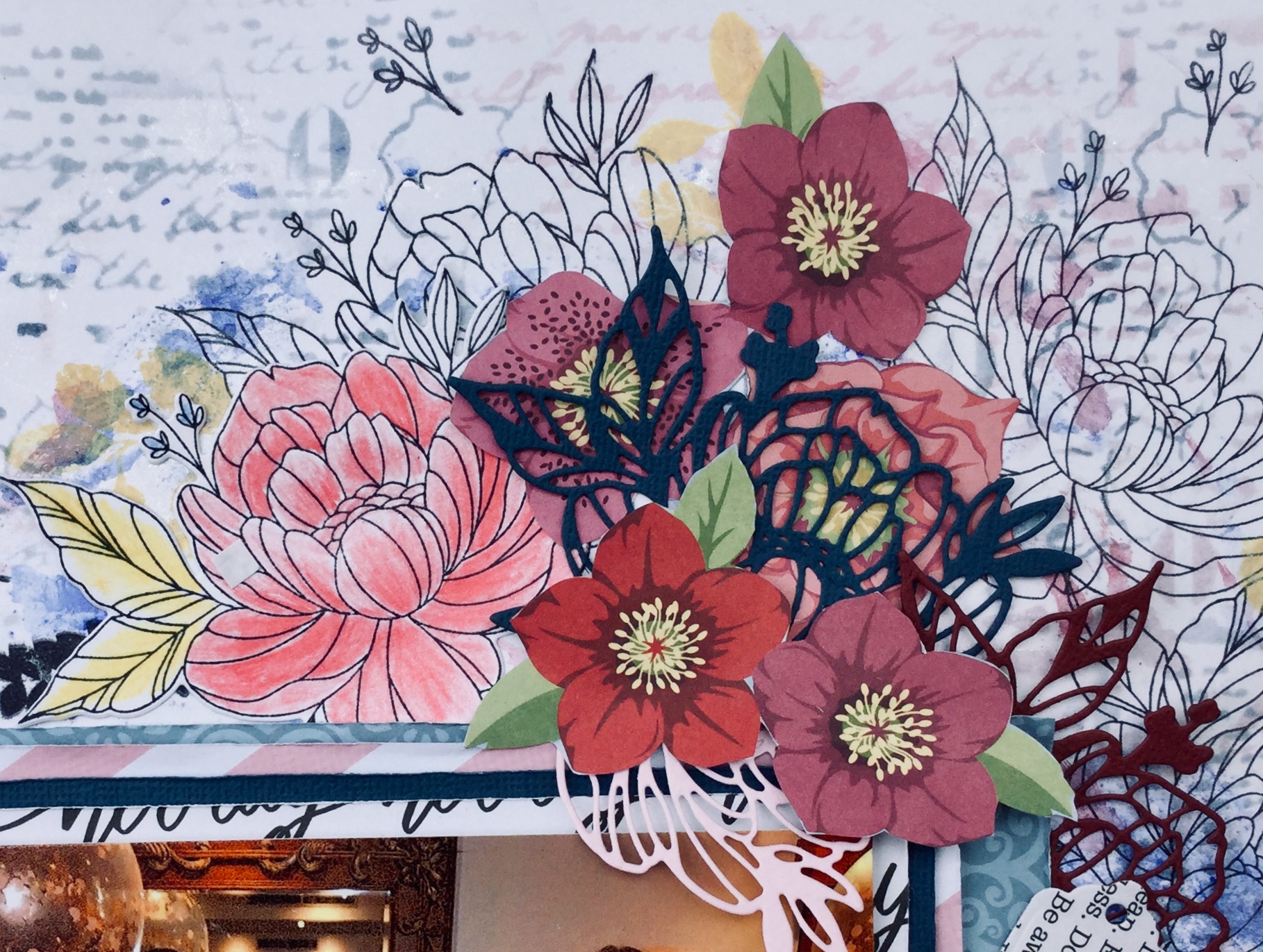
4 x 6 rectangles which I used for frames and pieces to mat the photo. The two 4 x 6 left were used to cut embellishments with my Sizzix Bigshot. I used a mix of dies, many were from the Uniquely Creative and the KaiserCraft range.  I decided that I needed a few more greens and some white to balance the layout, so found some scrap papers and cardstock to cut a few more diecuts. You can see that I incorporated some traditional design styles and some contemporary designs. I used the geometric die because of the pattern on my daughters top. The top was handknitted by my mother, which I had completely forgotten about until I started working on the layout. She knitted many clothes for my children, a pastime which she has had to give up due to arthritis.


In my LemonCraft order, I purchased a matching cut apart sheet. I fussy cut out the doilies and the green butterflies.

Then, I went to town building up the layers of die cuts and papers using double-sided tape and foam tape. The title I created by painting some white cardstock with vivid green. I really love how it has turned out, it is very summery and speaks to the season when the photo was taken, the Christmas summer holidays.

IMG_5814

Haha…can you see the little fly who snuck into my layout photo? Summertime here in Australia = flies 🙂

Uniquely Creative Feb. Challenge

Hello everyone,

I finally found some time to scrap, my new job is taking up more time than I like and there is so much marking when you start off a new school year. I needed a break and decided to crack open the Uniquely Creative February kit which arrived on Wednesday. It is a glorious kit, so much colour and interesting mixed media. A tropical/summer kit based around the Kaiser Craft ‘Paradise Found’ collection. PK599
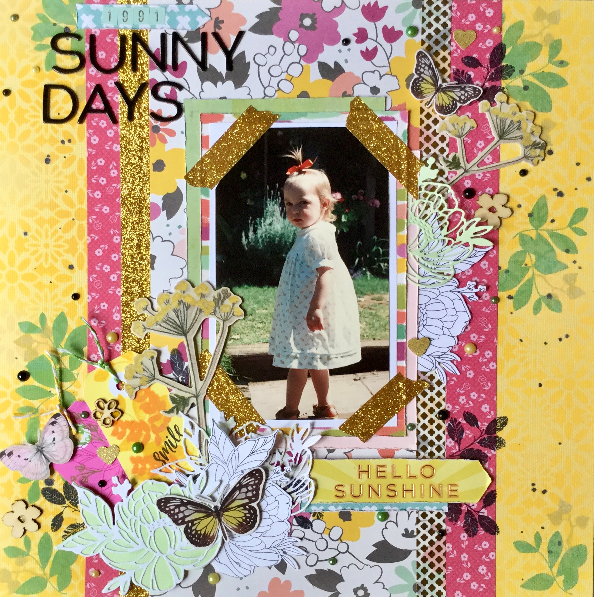
I am loving the papers, all that greenery, yummy teals and beautiful, bright hibiscus flowers. The problem is I don’t have any tropical photos, no tropical island holidays for us yet! Though, it did give me the opportunity to remind hubby about how he mentioned he’d like to go to Fiji, the perfect reason to holiday…to use up scrapbook paper.

Because I was struggling for photos, I decided to work with some summer holiday beach photos. I had just finished using the December Uniquely Creative kit, an ocean-themed kit, which I had managed to make 8 layouts with (adding in extra cardstock) and still have scraps left for another couple of layouts.

I had a gorgeous photo leftover of my daughter sun baking on one of our favourite holiday beaches. We have amazing beaches and coastline in Australia. It is from a holiday we went on about ten years ago, this beach has pure, fine, white sand that squeaks when you walk across it.  I thought it would be the perfect photo to use with the Uniquely Creative February kit and Sketch Challenge, as it has hibiscus flowers on the beach towel.

I started off making the background, using the ‘Ocean Air’ paper, I added some blue watercolour paint smooshes and splatters.

Then, I selected the ‘Salt Water’ paper to cut out the large circle in the sketch layout. I didn’t want to lose the shells on the edges of the circle, so I cut around them and kept them attached.

IMG_5739

The lovely hibiscus die (add-on to the kit), worked beautifully to create a halo effect around the edge of the circle. I was thinking about the sun and sunbeams, as I glued them into place. I cut them from the white cardstock painted with the yellow and orange watercolour supplied in the kit.

I used some hessian border and patterned paper to make the vertical stripes in the sketch.IMG_5745

Next, I mounted the photo on white cardstock and rough up the edges. Then, I added a layer underneath of the ……. paper. You can easily tear this paper into the shape you need by adding a line of water to soften the fibres of the paper. It creates a lovely torn, tatty edge.

Finally, I added a range of embellishments from the kit around the edges of the circle and photo. I fussy cut a few extra shells from the leftover ‘Salt Water’ paper and attached them with foam tape. I added some of the sisal fibre threads for a little more textural interest. I used white cardstock paint with blue watercolour paint and the supplied ‘paradise’ die to create the title.


IMG_5772

Not a bad effort, I think it works well with the photo. Now to use up that tropical foliage and hibiscus papers…keep scrapping!


Jan. CKC #3 Layout

Hi again,

Here is a quick layout which I put together prior to going to summer school. Once again, I am working in poor lighting at night and splashing around some Oxide ink and using some dies.

I started off with selecting which papers I wanted to use to mount my photo. The photo is of three of my children, it is not often that they are together, so I wanted to capture this memory. I pulled papers from my CKC kit which worked with the colours of their clothes.img_5280

Next, I used the Uniquely Creative flower stamp which I had used previously on a layout and stamped a border along the side of my cardstock. I carefully covered the stamped flowers and splashed on/around some Tim Holtz Oxide Inks using the plastic bag technique. img_5281

I then used some leftover die cuts from earlier and glued them over the stamped images. I wanted them to have a little dimension, so I only applied glue to the centre of each flower. I purposely placed them off centre to create a shadowed effect and reveal part of the stamped imaged underneath. I layered two die cuts to create a corner embellishment and cut down a die cut and tucked it between my layered papers at the top of the photo.

img_5282

Then, I added my title and used one of my little ribbon bows to finish off the layout. It was a fairly quick layout which has captured this moment in time.

img_5290

Jan. 2019 CKC – Forgery #1.

Hello again.

Here is my first layout featuring my forged paper. I had decided that I wanted to scrap a funny photo of my grandson playing with playdough. He had made a playdough man and his mum sent through the photo for us to view. As boys do, he was being silly when Photo Dec 09, 6 32 13 PM
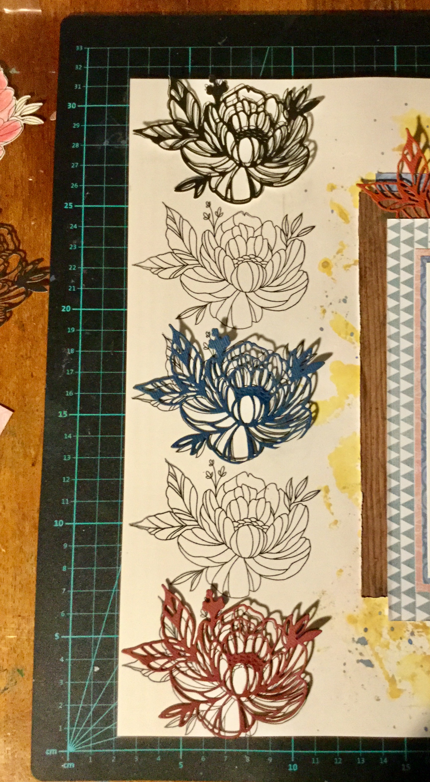
posing for the photo, so the quality is not great. It is a little blurry but does capture his cheekiness. Let me just say that the playdough man is magnificent, a work of art! Well, I may be biased, it does have all the important elements of a human which is the goal when you are four. It was the playdough figure which triggered my idea for the forged paper. The playdough feet are rough circles, much like the black and white circle paper featured in the Felicity Jane ‘Hannah’ kit.

I decided to create my own circle paper to use as a background for the layout. It was a simple process of loosely tracing circles onto to the white cardstock using an Artline permanent marker. I used a washi tape container to trace around.  Then, I painted some of the circles with Tim Holtz Oxide inks in colours which matched the theme and photo. Unfortunately, the so-called permanent marker did bleed around the edges when it interacted with the watered down ink. After the first bleed, I was a little more careful when applying the ink.img_5233

Then, even though I liked the look of the painted circles I thought it needed something else. I pulled out a Fiskars geometric diamond stamp which was similar to one of the papers in the Felicity Jane kit and stamped the image across the page. Still not happy with the result, I decided it needed more colour and wanted to reduce the white space. I used the Tim Holtz micro glaze to protect my inked circles. I love this product, the tiniest amount makes the inked area waterproof, stopping any colour shifting and allowing you to add colour over the top. After rubbing on the micro glaze I applied the blue watercolour paint.

Next, I selected some patterned paper and coloured cardstock to mount the photos. I prefer to use several mounts on each photo, something which has gone out of fashion these days. In one of the photos, you see the wooden floor in their house, this inspired me to mount the photos on a background of woodgrain paper from my kit.


As I had mentioned in an earlier post, I didn’t have a scallop washi tape to include in my kit. I img_5250decided to substitute this with a strip of polka dot paper trimmed down to create a scalloped edge. I attached this to the edge of the woodgrain background.

Including embellishments that reflected the Felicity Jane kit had me troubled. Flowers, love hearts and a bike didn’t really go with my photo choices. I hummed and hawed over this, what to add? Then I decided to go with it and added a few flowers, a tag and the die cut word awesome. I’m not super happy with the result and would have liked to reach for some other embellishments but I was trying to only use things from my kit.

Anyway, it is another layout completed and I did meet the goal of forging some elements for the challenge. Happy scrapping everyone.

img_5255


CKC Jan. Layout #1

Hello again 🙂

Here is my first layout using my January CKC kit. If you haven’t been following you can check out my kit here and get all the details on how to participate at the Counterfeit Kit Challenge blog.

Photo Dec 09, 6 32 20 PM
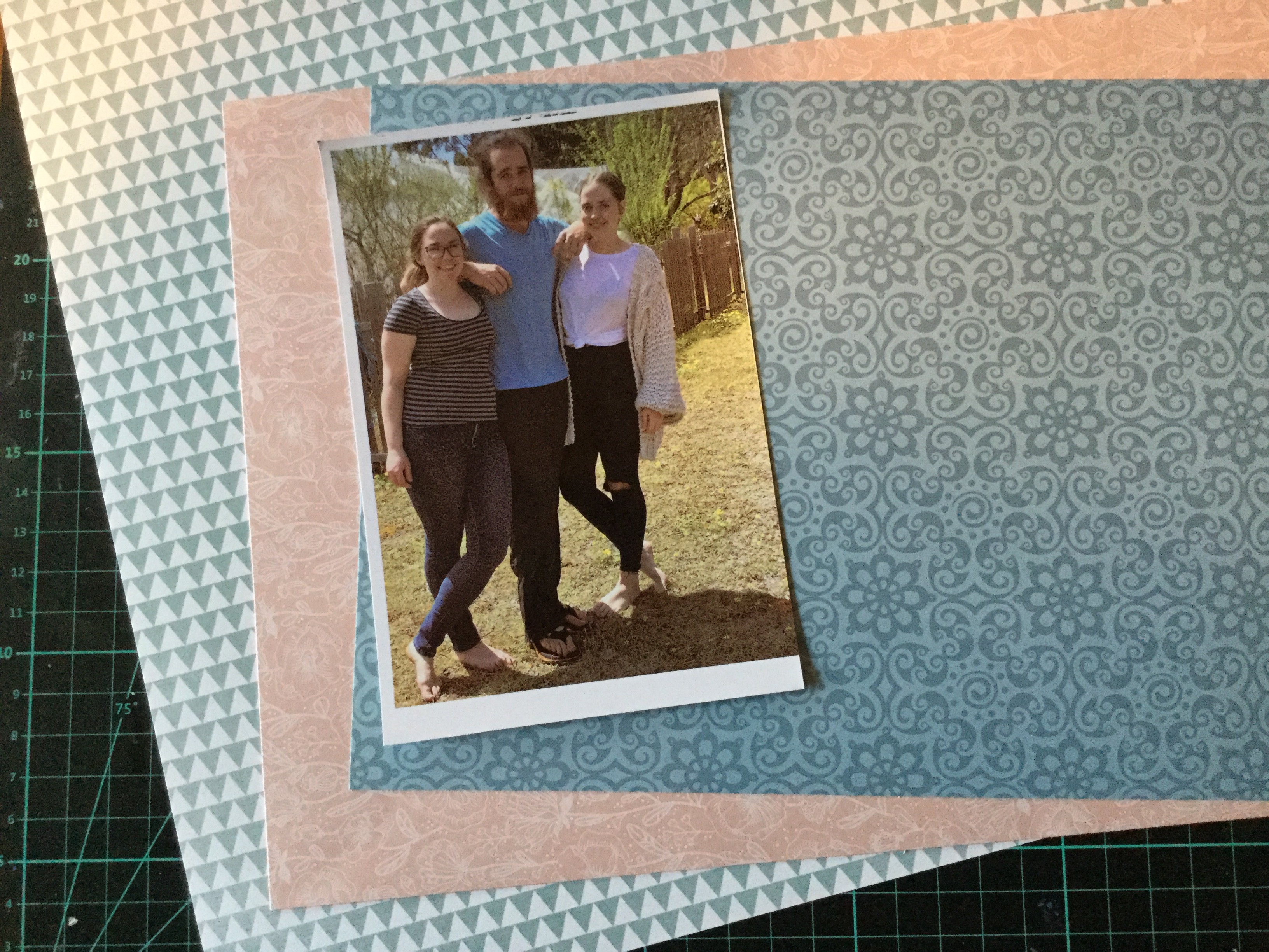
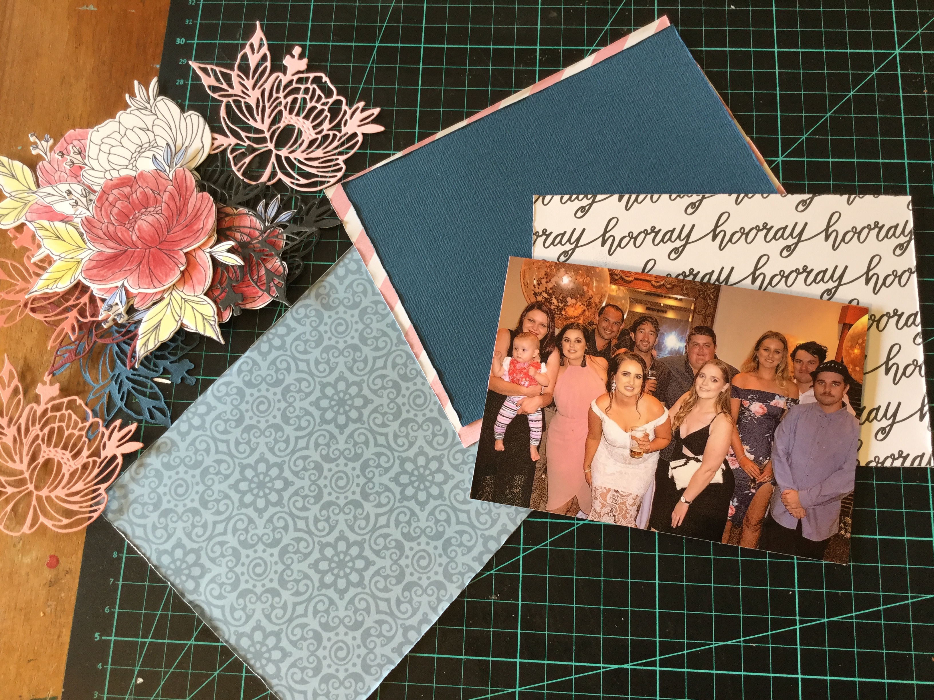
So, first up, I went with a photo of my daughter and her friends having a night out. The photo has several of the pinks, blues and burgundies found in the Felicity Jane ‘Hannah’ collection.

I decided to have a play with some mixed media, using my watercolour paints and the plastic bag technique I smooshed some paint around my white cardstock. The blue paint I used came out a lot stronger than I expected and I nearly started over but decided to keep going and find some way to tone it down.


I tried stencilling on some ink to create some texture and distract from the intense blue. I used Tim Holtz’s Spun Sugar and Stormy Sky distress inks, both work beautifully with the Felicity Jane colour theme.

Then, I began making some embellishments. I stamped out some flowers using the Uniquely Creative Mini Bloom Advent Stamp and coloured them using Polychromos coloured pencils. Then I die cut them out, love this matching die, it makes it so much quicker than fussy cutting them. I also cut some flowers out of coloured cardstock using the matching die.

Next, I stamped some flowers and foliage onto my background. I decided to fussy cut flowers from some papers I had put aside for making embellishments. The colours coordinated well with my pencils and inks.

I then mounted my photo using some patterned paper and coloured cardstock. I rough up the edges using my fingernail and layered the pieces using foam and double-sided tape.IMG_5222

I spent a lot of time fixing the flowers into place, I keep changing my mind and fiddling with the layers. I added a Thickers alpha title and some die cut tags. Overall, I think it has turned out quite well, but my colours are too strong and perhaps a little overpowering compared with the original kit. Moving on to layout number two, I hope you are enjoying participating in the CKC challenge.IMG_5227 (1)


IMG_5228 (1)IMG_5229 (1)IMG_5230 (1)IMG_5231 (1)

Jan. 2019 Counterfeit Kit Challenge

Good morning.

Well, I am off and racing with the new CKC. I put my kit together yesterday and surprisingly found it a little tricky. The papers in the Felicity Jane ‘Hannah’ kit are fairly Photo Dec 09, 6 32 13 PMsimple in pattern and design, but I fell short when rummaging through my supplies. I struggled to find just the right subtle blues, greens and pinks. I didn’t quite make it with the patterns, mine were either too heavy and thick in line or not geometric. Even though I knew I had previously had some fish scale/scallop paper, I could not find a scrap of it. So, here is what I ended up with…

For this month, I decided to keep it small and achievable. Often I go overboard and select an abundance of papers and embellishments which makes a mega kit. I am sticking to my word for the year, “Complete”, having a smaller kit will help me achieve this. To start with I chose papers by colour and/or pattern, a lot of the papers I selected in my initial rummage came from Christmas collections. Weird hey?


I didn’t have a floral paper with the right colours, so decided to go with a black and white floral which I can colour to match the collection. No fish scales/scallops meant that I needed a substitute, I went with a polka dot design in both black and white and blue and white. My check is smaller than the original and as you can see has the Three Wise Men featured. The men will get the chop and will not be featuring in my layouts. My text paper has a lot less white space than the original and reads ‘Hooray’. Overall, I have more colour than the original Felicity Jane kit but I think I can make it work.

I had a pile of papers left over once I sorted through to get to this point and decided to keep them on hand for creating embellishments. In the pile are two florals which I had picked out because of the blue patterned backgrounds, then I realised that the flowers had the same colourways as the Felicity Jane flowers, a strong burgundy and a soft pink. I might fussy cut these for embellishments.


Photo Dec 09, 6 32 20 PMFor my embellishments, I didn’t have a lot which matched with the original kit. Being a girl obsessed with colour, I don’t tend to buy scrapbook supplies with such a mild palette. I decided that I could forge many of them and make my own. So, I dug deep into my dies and stamps and found similarly themed ones which I could use with my papers/cardstock to make a range of embellishments.

I found that I owned a bicycle die, yes! I also have quite a few texts dies and tag dies. I do not have any heart stickers, so will use my heart die. As for the floral stamp, I just received a lovely floral stamp in my Uniquely Creative Advent Kit which I am looking forward to trying out. It came with two matching dies which means no fussy cutting, hurrah! My bows will be satin ribbon bows, as I’m not interested in purchasing any tulle, even though the tulle bows look very cute. I have included some inks and not being able to deny myself, may splash around some paints. You can see that I selected some cardstock to use for backgrounds, photo mounts and tags. The colours I selected to match the Felicity Jane colour theme, though they look darker in the photos. Hhmm…maybe they are too dark, I may have to swap some out. That’s what happens when you are selecting cardstock at night in poor lighting.


I still need to choose my alpha stickers, I may go with two different sizes in pink. I also need to sort through my 3×4 quote/journal cards and find ones with a suitable colour range. The kit also included a scallop washi tape, hmm, not sure what I use for this. I may just use strips of paper/cardstock or use a different patterned washi tape in the same colour.

If you would like more details and get a better idea about the Felicity Jane ‘Hannah’ kit there is a great unboxing video worth watching by the LindseyDecor channel.

Make sure that you keep up to date with the challenge by checking in often and following the CKC blog. I can’t wait to see what everyone creates. Here are the great CKC scrappers, design team and Master Forgers for you to enjoy

Happy New Year!

Happy New Year to all.

Well, down in Oz it is the second of January and our lovely guests are moving on today to visit other Western Australian family. When I say lovely I really mean it. They have been just gorgeous and we have had a lot of fun. You can not love guests who pitch in with the dishes and even cook us treats and meals. We explored parts of the South West region and made lots of memories (and took photos) doing a vast range of activities. We swam in different oceans, went caving, climbed a lighthouse (the tallest in Australia), swam in the Blackwood River, ate local chocolate, sampled and bought amazing olive oil, and enjoyed local wine and gourmet food. Sometimes we drank a little too much wine, New Year’s Eve being one of those occasions, and spent the next day relaxing in the pool, on the lounge reading or watching movies. At times we did old-fashioned things, we put

away our devices, and we played board games. I taught our new family how to play Canasta, something I later regretted when they started winning every game. We laughed a lot and loved the funny interactions between our grandson and our other young family members. We have truly had a happy holiday season spent with much-loved family and friends. I hope that the silly season also brought you moments of joy, love and surprise. Now, to get busy scrapping those moments…

First up, for me, it is to do a whole lot of catch up. I have not scrapped for 6 weeks!

Today I am kicking off with selecting my kit for the January Counterfeit Kit Challenge. Have you seen this beauty? It is a little bittersweet for me, I love this month’s selected kit, but I am

a little sad because I was invited to be the guest designer for this kit. I was so honoured to be asked and sadly had to turn down the offer due to my busy life commitments. I really hope I have a chance at a later date to participate as a guest designer, what a fun challenge that would be. How lovely is it that Meagan Johnson took up the challenge, and what a talented scrapper she is. I love her clean lines and contemporary style, Meagan is part of the Becky Higgins Creative Team, wow, impressive. Make sure you join in with the challenge to use up your stash and follow the CKC team members as they share what they create and set challenges.

Next, on the list is using my one and only subscription kits, from Uniquely Creative. I am way behind with using these up. I set myself a challenge that as each kit came in I would use it. Hhhmm, life got in the way. I have a few to use, the first being the September kit. This one is filled with yummy mixed media products but themed around winter snow/snowflakes which we don’t have here in Western Australia. I am going to have to be creative and come up with some snow-free layouts. I also have the November kit to complete, this one is very girly with flowers, butterflies, lace and heritage pastel papers. The other one to complete is the 2018 Advent Kit, which is also very girly with florals. I am thinking that I may finally finish off my baby daughters album with both these girly kits, my daughter is now 24! Last, the December kit which is sea themed and will be great for my recent holiday snaps. Oh no, the January kit ships in five days, I need to get busy.

So, that is what is on my agenda for the next few weeks. I will try and share what I create and use up. I am looking forward to playing with my new Tim Holtz Oxide inks which Santa gave me and incorporating some stamps and tools which have been sitting too long. Oh, and I have $100 to spend on craft/art supplies, my Christmas gift from my mother. What shall I buy? I also have a weeks holiday planned to join in with the Albany Summer School, I am looking forward to learning some new artistic skills and techniques and meeting like-minded people. My other catch up will be watching my favourite YouTube scrap blogger, Janet from RTS Scrapbooking, whilst I scrap and create. What will you be working on over the summer?


CKC – Sprinkle, Sparkle Layouts!

Morning, here are my two layouts which incorporate some sprinkles and sparkles for the Counterfeit Kit Challenge number one. The first layout features my cheeky grandson at 9 mths, the quality of the photos was not great. They are a little blurry but I used them anyway, as they captured his cheeky personality and a happy moment in time on an adventure. The layout itself was fairly quick, some smooshing of oxide inks for the background on a lovely indigo cardstock and a strip of star paper. Then I sprinkled on some gold watercolour paint and mounted the main photo on layered, distressed edged papers. Some fussy cut stars, Citrus Twist Kit cut apart embellishments, enamel crosses, a wood veneer painted star and it was finished!

IMG_4516

The next layout has sprinkles and sparkles, this one also features my grandson. One of our favourite things to do at the local park is play on the wizzy dizzy. We always laugh so much and there have been times when Nanny and Granddad fall off! In these photos, Master Four is trying to do it all himself which is no easy feat. My choice of layout design links to the shape and movement of the featured playground equipment. I liked the idea of building up circular layers and creating that sense of being dizzy by ‘seeing stars’.

The background was created by splashing on oxide distress ink mixed with water and then blotting it off with a tissue. Then I used the inky tissue to apply some soft, swirly, whispers of colour. I wet the inky tissue and rubbed it around the page in a circular motion. Next, I raided the kitchen, to add some wine glass circles of ink, a little forgery inspired by the Vicki Boutin patterned paper in the original Citrus Twist Kit. This was topped off with some splashes and sprinkles of watercolour paint.

Step two, another kitchen raid…use a bowl to guide my stamping. I wanted a circle of stars swirling around my background. I used my new Carabelle Studio art stamp which has a really delicate sprinkling of stars. I didn’t use a block with it, so I could bend and manipulate the stamp to fit the curvature of the bowl.

Third kitchen raid…crockery to cut my paper circles! I also dragged out my old Creative Memories cutting system to cut the smaller circles. Because I was layering the papers, I could use some of the papers which didn’t fit my theme/photos or any layout I was likely to do in the future. For example, the white swan paper, swans where I live are black!

I slotted my 4×4 photos in between the circle layers, intentionally making them topsy-turvy to match the theme. It would have looked better with smaller, 3×4 photos but I was too lazy to print any more photos. I mounted the main photo on another paper which didn’t fit the theme, the rain clouds, but the little pops of raindrop colour did match with the other papers.

Next, I added the title and got busy with my Sizzix cutting out sparkly, gold stars with glitter cardstock. I used my new Tim Holtz thinlit die which has a great range of star sizes. I attached the stars with foam tape and glue. Then, I popped on a few handmade text quotes. Finished!

I am pretty happy with this crazy, dizzy, topsy-turvey layout. It does achieve the feeling that I was going for and was fun to create. Happy scrapping everyone.

IMG_4515

CKC November Layouts #2 & #3

More mess with inks and watercolours…

Yes, I keep playing around splashing around the colour to make some gorgeous backgrounds. The funny thing is when we do this we often cover it up with our photos and embellishments. Sometimes, for me, I get a little regretful when I have to cover up all the pretty colours. Yesterday, was one of those days.

I was working on two more layouts using my Counterfeit Kit Challenge collection. The first is a layout of my grandson, I am still trying to complete his baby albums. Because the photo is very soft and pretty, I thought the colours in this kit would work well. I began by creating the background using oxide inks, layering the colours and adding a little stamping. The stamp arrived two days ago and my rule is when you purchase anything you must use it! The little stars helped soften the edges of the paper and fitted with the CKC embellishments.

Then, it was a simple process of mounting my photo with a range of patterned papers, each piece was distressed around the edges with my fingernail. Next, I decided to have a go making some thread bows to embellish the layout. I used the fork technique from here. It worked very well and was quick to do.IMG_4419

Adding the embellishments took very little time, I used some forged flowers, stars (wood and paper) and an old, chipboard heart. I think it pulled together well, the pop of pink softens it and draws in the skin tones in the photo. It is kinda girly for a boy, but you can get away with that with baby photos.

IMG_4421

Layout #3 is another grandson page when he is a little older and hanging out with his favourite person…Granddad.

More colour was splashed around, this is the one where I didn’t want to cover it up. I used some old heart stamps in this one. See, the yellowed acrylic block…yep, the stamp is so old, it fused to the block! Note to everyone: do not be slack and leave your cling stamps on any acrylic blocks for long periods of time! Pack away properly and use your stash, its been years since this stamp was used.

I used a whole heap of the FREE Citrus Twist Kit cut apart die cuts on this layout and a few of my forged pandas.

Overall, it came together well. I like the embellishment cluster and was pleased to find some way to incorporate the pandas. Thank goodness for cute kids.

IMG_4428

P.S. Sorry that the images look cream, the cardstock is a crisp white. I am struggling to get a decent photo, with white it (iPad) always seems to cast yellow or blue light whether I’m inside or out.


CKC Layout #1 – Ma

Good morning, yesterday I had a lovely time playing with my Counterfeit Kit. I got messy with some inks and watercolours and pulled some inspiration from this months focus website, Citrus Twist Kits. They have an amazing design team and I spent a little time pouring over the Creative Team Gallery. Wow, some beautiful work to inspire us CKC scrappers.

I really loved some of the page formats used in the October DT layouts. The work of  Nathalie Desousa with her flourish of diagonal flowers made me drool. I decided to see if I could use this inspiration on one of my layouts, using the forged flowers and my CKC papers.

I started off getting messy, building up a background on my white cardstock using some Tim Holtz Oxide Inks and some watercolour paints. In the first layer, I stamped some hearts using a very old, cheap, foam stamp. Then, I layered on the beautiful purples and added some splatters. I dried each layer before adding the next. Next, I pulled out my handmade foam branch stamp and used the beautiful, Dusty Concord oxide ink. I am in love with this colour, full strength you get a dark, dense plum image and activated with water, it creates a musty, dreamy lavender (see the lightest purple, layer 2).

Next, I selected papers to mount my photo. This image is of my mum from last summer (2017) at my grandson’s birthday party. I am one of those lucky daughters, whose mother is their best friend. She can be relied upon to listen to any vent, laugh and cry with me, share guidance and advice, and drink champagne! The photo is quite neutral, you could put any coloured papers with it. I decided to select a floral with some green tones and a bold hit of purple. IMG_4398

Then I spent time fussy cutting flowers form some patterned paper and trimming up some of my forged flowers (FREE cut files from Citrus Twist). I die cut some leaves to add a pop of yellow and jade. It all came together quite quickly after that, building up the layers of flowers, die-cuts and some wood veneer leaves. Then, a few enamel dots sprinkled around the edges of the flowers, title and date.

I love how it turned out and am surprised how the colours worked together so well. I would not have selected to use that colour range in my daily scrapping, the CK challenge is a great way to push you out of your comfort zone. Thank you, Nathalie Desousa, for your inspirational layout design. If you would like to see how Nathalie created her layout check out her video here.

IMG_4409

Mixing Challenges! CKC Layout #5 & #6.

Squeezing in another two layouts before the October Counterfeit Kit Club challenge ends. These two layouts were made during Anna’s Craft Cupboard ‘Old School’ Cyber Crop last weekend. The first one was an ‘English’ (school subject)challenge in which you needed to include a story/text. I used products from my CKC kit to make the layout. The photos in the layout are of me and hubby trying to take a nice selfie, you can tell we haven’t quite mastered the technique. Because, the photos were poor quality, taken in a dark corner with very little light and on my iPad, I tried to edit them and fix the colour/light. I managed to get a better image but they are grainy (you can see in the close-up, above). This is why I went with small photos and used a piece of textured vellum over the larger, main photo. Plain vellum can sometimes hide and enhance a poor quality photo, in this case, the textured vellum masked the graininess and anyone viewing it would think I was trying to be creative with my embellishment. Shhhhh, don’t tell them!IMG_4203

The next was for a blind layout challenge. If you haven’t tried one of these, they are a lot of fun! One of the design members from ACC, this time the very talented Rikki Graziani, releases each process step by step (line by line), you have no image to work from just text. It can be very challenging. Unfortunately, this time I had family visiting and wasn’t able to participate live online but managed to give it a go later in the weekend. I copied all Rikki’s instructions from the FB Community page and printed them out before I started. This made it a whole lot easier than having to wade through mountains of comments (live online). The papers and products were from my CKC and worked very well with my photos. I also made a pocket page, as I had a lot more photos of this event.

IMG_4206

Mixing Challenges! ACC & CKC

Hello everyone. Today I am sharing a layout which I did in a Cyber Crop with Anna’s Craft Cupboard community group on FaceBook, last weekend. It was a lot of fun and had a challenging theme, Old School, which opened up a whole lot of creative thinking and making. Each challenge was based around a learning subject area or using an Old School style of scrapping, using up supplies which have gone out of style in the world of scrapbooking. This layout was my attempt at the Math challenge, your layout needed to include numbers!

Because I was participating in the  October Counterfeit Challenge Kit I wanted to use the papers and embellishments from my kit. I also wanted to use some of my recent purchases, if I buy something new I make sure I use it and not stash it away. What arrived in the mail two weeks ago was the new Tim Holtz Entomology die which matches IMG_4214
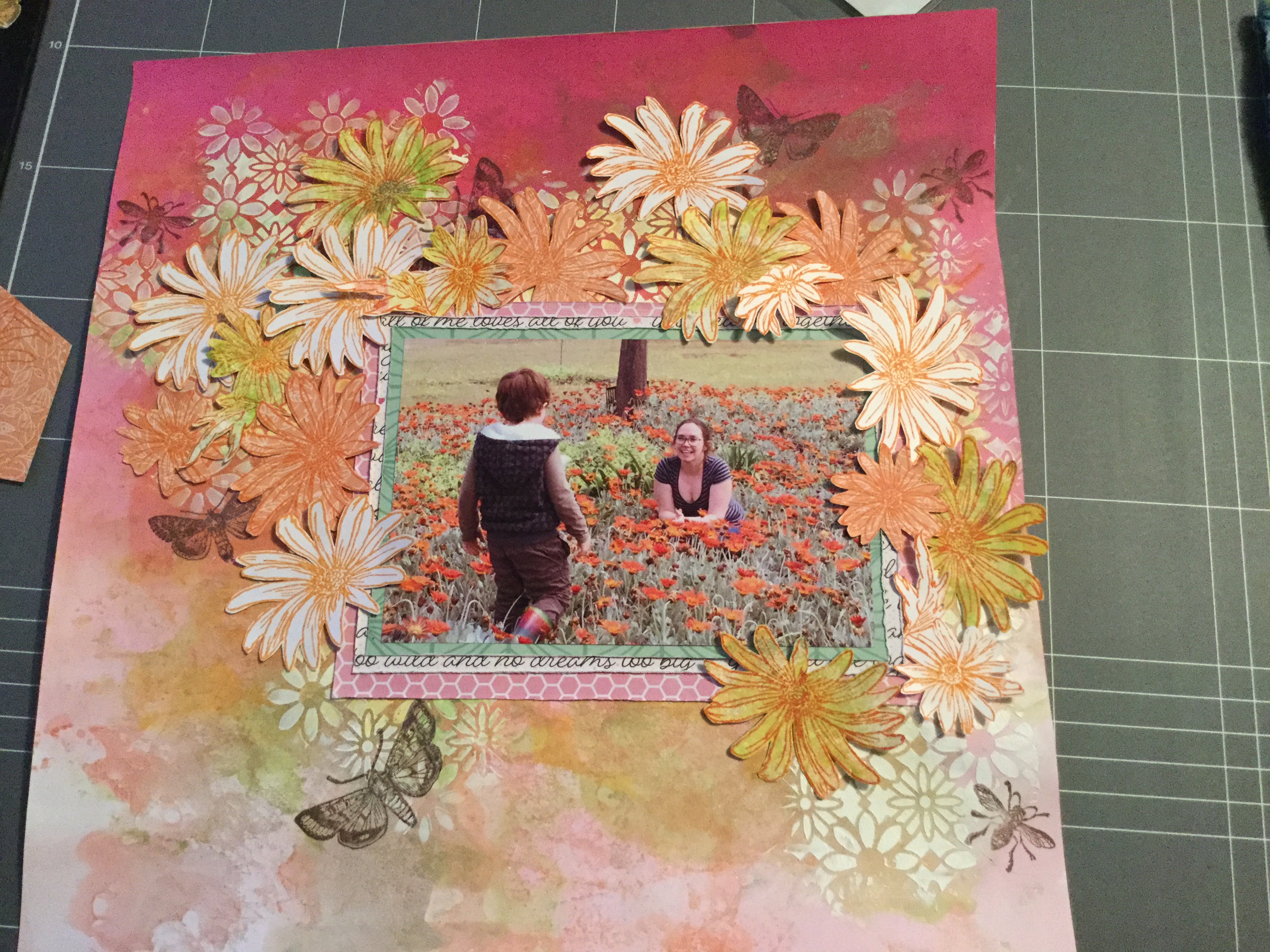
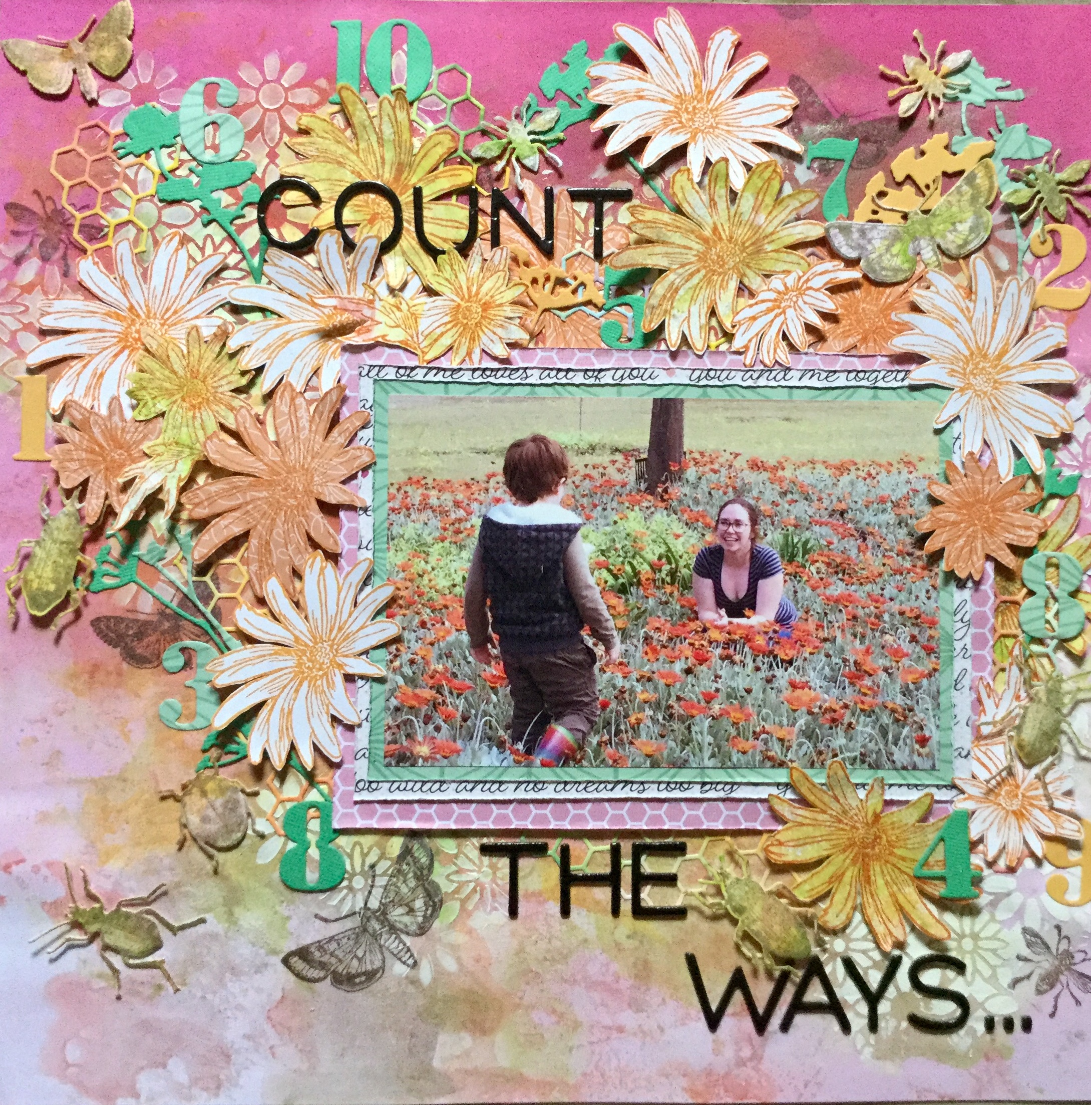
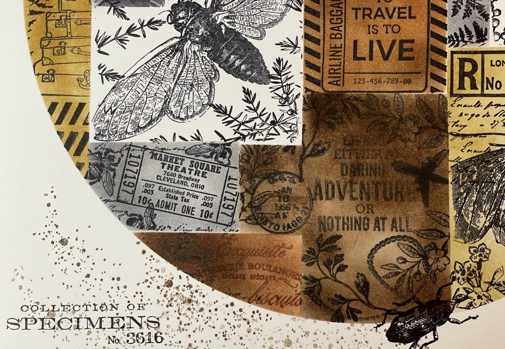
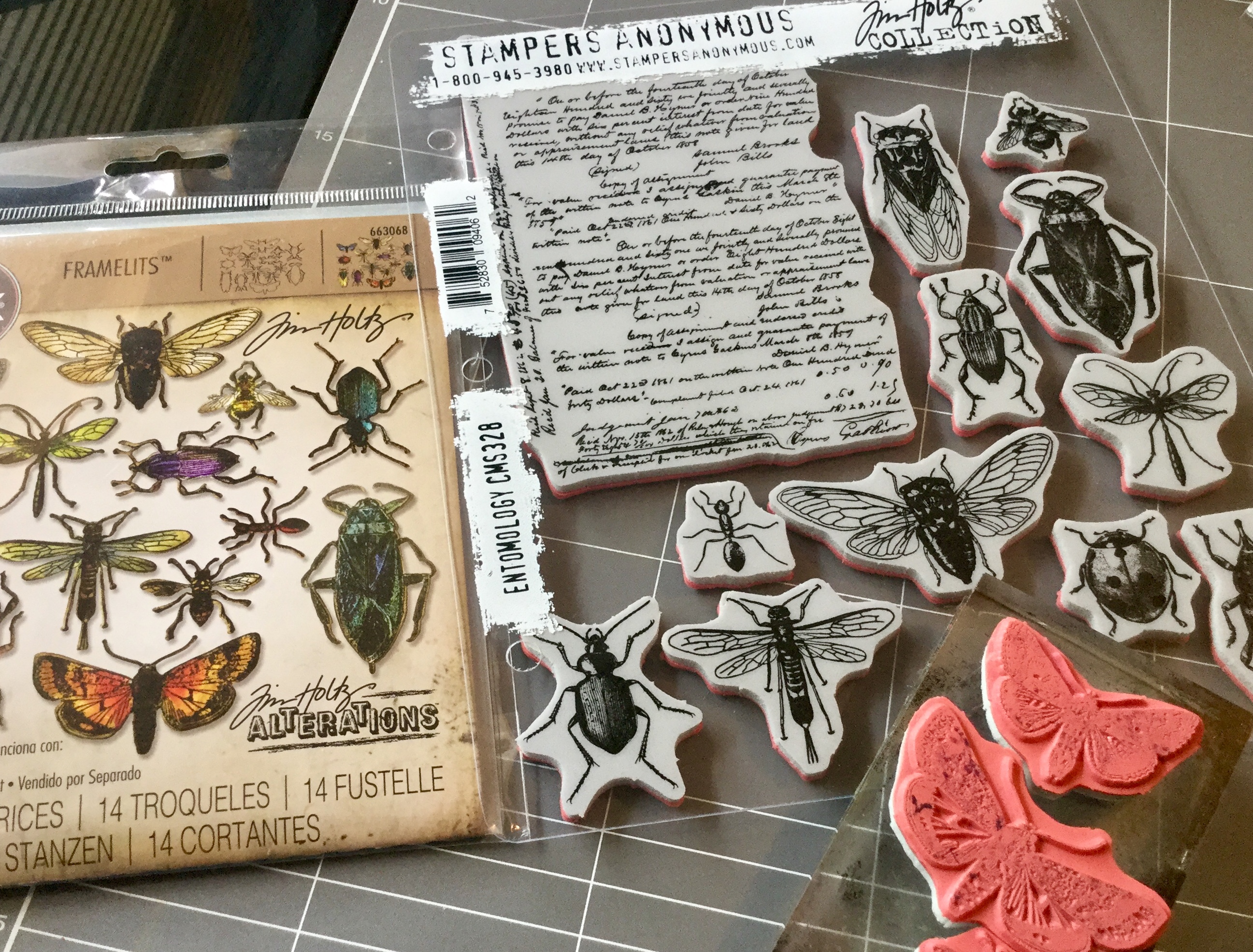
with the stamp set (released earlier in the year). I had been waiting for months for the release and then for it to arrive in Australia, it is amazing! The die is spot on, there is absolutely no white space around your stamped image, it cuts the thinnest and tiniest insect legs and antennae.

With this layout, I got messy using distress inks, Heidi Swapp shine and some DIY shine. I messed around smooshing and spraying the inks, creating backgrounds to use in the layout. Some I liked and some didn’t quite work.

Then, I used a floral stencil and some white gesso to create some texture on my main background. I used an old membership card to scrape the gesso across the stencil, very rough and messy. IMG_4215

The paper which I wasn’t keen on became the cardstock for my insect embellishments. Just a tip, if you do purchase this wee crawly critter die set, use some washi tape to hold the dies in place while cutting. They do need to be lined up precisely and being so little may move when you crank them through your Sizzix.

Next, I added some more distress ink to the stencilled flowers, the white gesso made them stand out a little too much. I stamped some insects onto the background using a soft grey and a brown distress ink. Then, I got busy stamping orange daisies onto some orange/apricot patterned paper scraps (from my kit), scraps of my mixed media cardstock and onto some white cardstock.  Does this look familiar? Yep, it is the same stamp used on this layout here. A few stamped flowers where hit with some distress green, just to pull in some colours in my photo. Then I spent some time watching scrap blogs on Youtube while I fussy cut out all the flowers.IMG_4219

I then built up the layout, layering die cuts and flowers, and fixing everything into place using double sided tape and foam.

So, “Where are the numbers?”I hear you ask. Good question, after all, it was a Math challenge. Well, the numbers tied in with my title and photo and were cut using dies. I used this particular photo because my daughter’s face shone with happiness. We were having a lovely day just messing around on our property, enjoying the sunshine and the abundance of flowers spreading colour everywhere. In a burst of energy, she literally tiptoed into the flowers and sat amongst the colour. Her son did not want to miss out on this opportunity and joined her. Her face said it all…let me ‘Count the Ways’.

IMG_4224