Bounce! A quick layout for #3 using my September Counterfeit Kit. This layout got the lovely smoosh effect using the Tim Holtz Oxide inks. One of the self-imposed challenges that I placed on myself several months ago was that any new art/craft supplies coming into my house must be used. No hiding supplies away and not using them. This has been easy with these inks, I am using them every time I scrap.
One of the reasons I decided to join in with the Counterfeit Kit Challenge was that it hit my other self-imposed rule which is using up old supplies and using old tools/media. The materials and tools I have used for this layout are both old and new. I started off working on my white cardstock background using the crushed olive ink. I love this colour, it glows on a white background and really has the translucent sheen of virgin olive oil. I used the simple and fun plastic bag application technique. Swipe the ink pad a few times onto the bag. Then use a paintbrush and water to activate the ink on the plastic, move the ink around so you lose any indication of the stamp pad ink image. Place the ink side of the bag down onto your cardstock and use your hands to smoosh the ink around. Lift and move the bag to smoosh in other areas, if you can see wet ink on the surface double dip and pick up that ink to use somewhere else on your page. 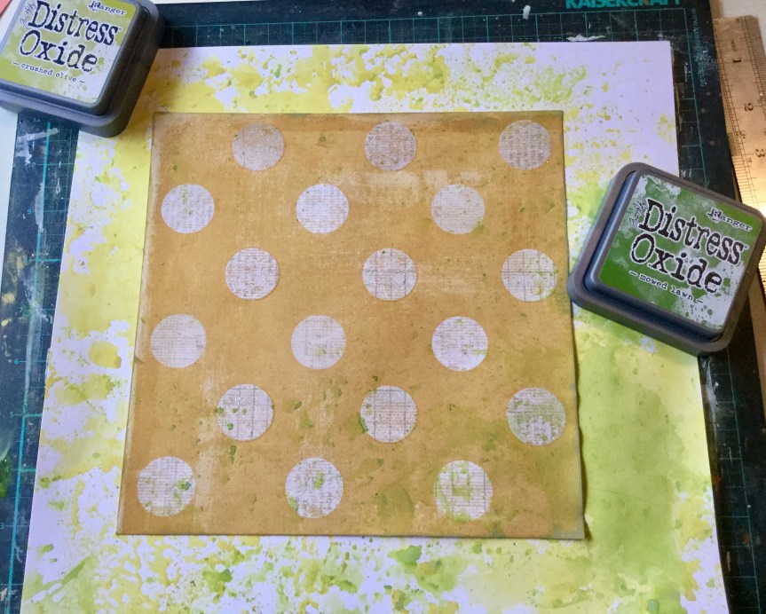
Because smooshing is so fun and I was trying to create an explosive type of texture which would emphasise the energy of a bouncing ball. I went in again with a second colour. I attached a piece of patterned paper and then applied the mowed lawn ink. You need to be a little bit careful when doing this, as you will get some warping if your paper is too thin or you apply too much ink/water in one area. You can see on the right side, the lower corner has a bit of warping occurring. I knew photos were going over this corner so I was heavy handed but I was careful to not have any warping on the other three corners which I knew would be exposed to the viewer.
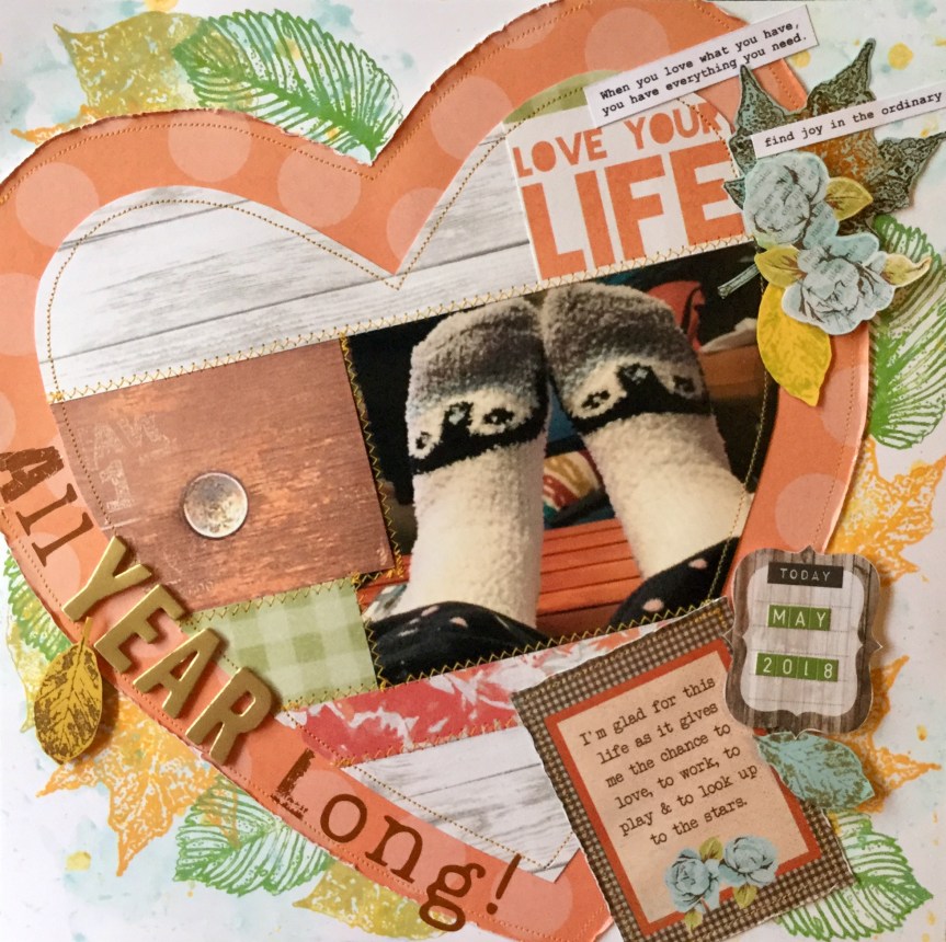
Next, I added in my photos, I mounted the first two together on an old, green floral paper. The photo featuring the new ball and my grandson I mounted on white because I wanted it to stand out. This was a little moment in time when I was on  Nanny duty looking after my grandson while his mum was at work. We had a great day doing lots of things and stopped along the way to buy a drink. The store had one of those giant gumball type machines filled with coloured bouncy balls. He was very excited to use his $2 coin and get a ball. We went across the road to this little park to try out the new ball and did it bounce….yeah, like crazy! Thirty minutes of fun and laughter.
Time to add the embellishments, I still wanted to emphasise the bounce and craziness of a ball out of control. I didn’t have any embellishments which would do this, so I got out some black acrylic paint and a shot glass and made some circle prints to represent the bouncing ball. I dried it off with a heat gun and attached my other embellishments and text from my kit.


I’m really happy with the finished layout, it didn’t use up much of my kit supplies but I did get in a few of my forged leaves, I used 3 papers and some enamel dots. My journaling will go on a tag in the yellow wood grain pocket. The pocket was made from one of the patterned paper sheets I had in my maybe pile. I have used a part of that paper, the wooden drawer front, on layout #2 as well.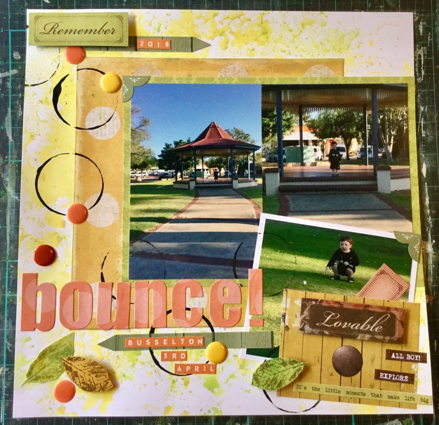

 coverings and partly because they are comfy. We have concrete floors and the socks keep my feet warm and create a sense of relaxation. If I have socks on inside it means me time, a little Netflix, some painting, some crafting, some wine (not every day) and maybe a little chocolate or cheese. Who would think a pair of 99c socks could create such luxury. It’s the simple things in life.
 scrapbook magazines. Like most scrappers now I use the internet for inspiration. The half I have kept I have to use for scrap lifts or if there is nothing useful in the mag they get passed on to my Mum who also scraps. Today’s inspiration came from an old 2007 Canadian magazine, with a layout called Family by Summer Fullerton. I think this may be her
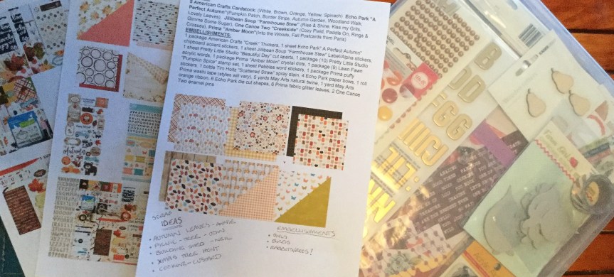


 original Crisp Apple Classic kit designed by Noel Mignon.


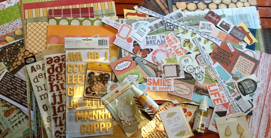
 Hello Scrappers, I am excited to be joining in with the September

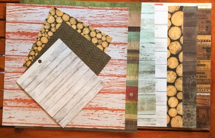


 My substitute for the Tim Holtz distress stain is two Heidi Swapp shines in gold and mustard. I haven’t decided on which stamps to use but will most likely use some leaf and foliage stamps. The bows I will make out of scraps from the kit and I will turn some of my embellishment die-cuts into chipboard elements. My choice in washi tape is a lovely metallic and white diagonal stripe for some added bling. I may also add some wood veneers and some ribbon.