Hello, old friends!
Here I am back again playing after a very loooonnnngggg break. Life last year got completely crazy for me and time to blog was just beyond me. I was overwhelmed with going back to University to study for the third time, what was I thinking? Well, really it was studying, and upgrading my qualifications or losing the chance to further employment. Anyway, I qualified with flying colours and life is a lot more mellow. So, I have been loving having the opportunity to scrap and paint when I’m not working.

Anyway, let’s scrap! Like half the scrapbook community I have fallen completely in love with the 49 and Market, Spectrum Sherbet collection. A scrapbook collection with the most amazing colours, textures and patterns. I wanted to buy it all but unfortunately, my finances couldn’t stretch to buying the whole collection, plus I already have so many supplies to use up, that I held back and just purchased the one classic pack and two packets of the acetate leaves. Both products are absolutely beautiful.
So, beautiful that I don’t want to use the paper as I only have one of each! Being two-sided sheets, with gorgeous designs on both sides makes it even more difficult. How can I possibly choose which side to use? Well, my creative mind had an epiphany when I realised that I could try and make some of my own papers in the same style as these beauties.

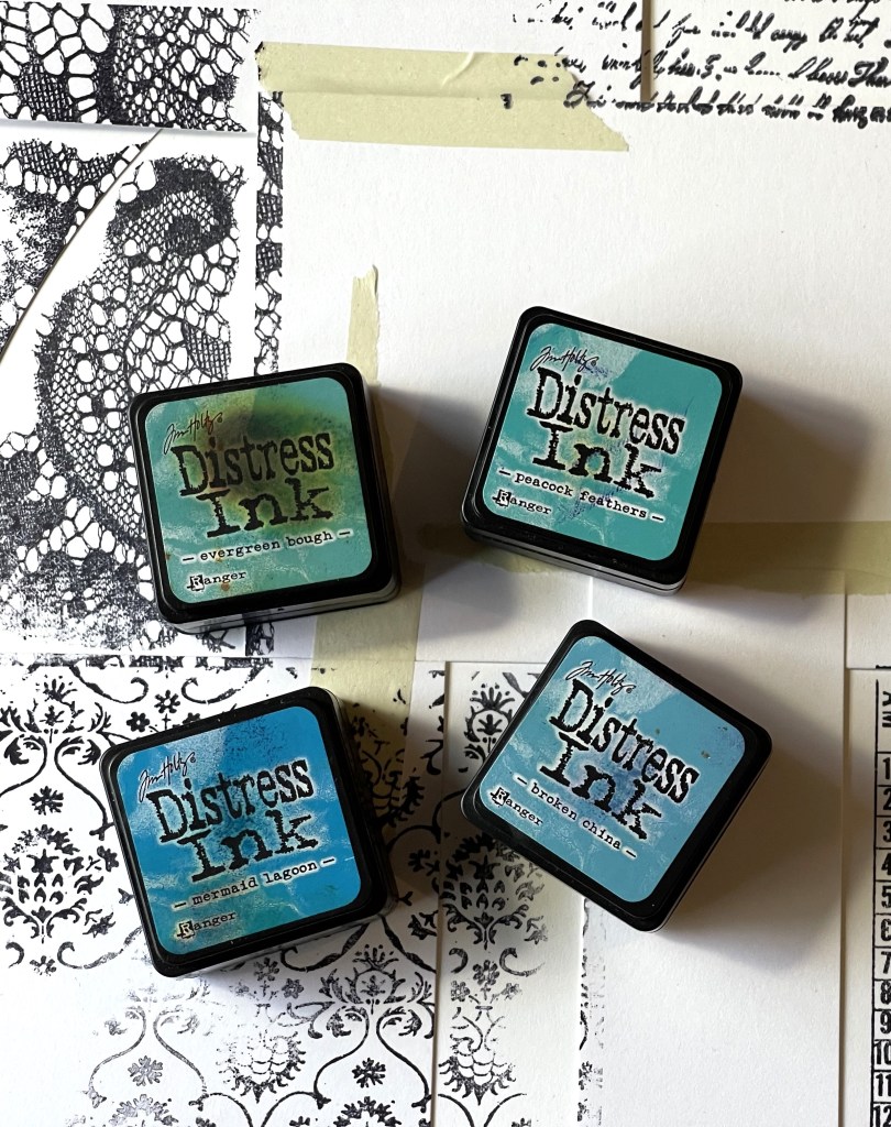
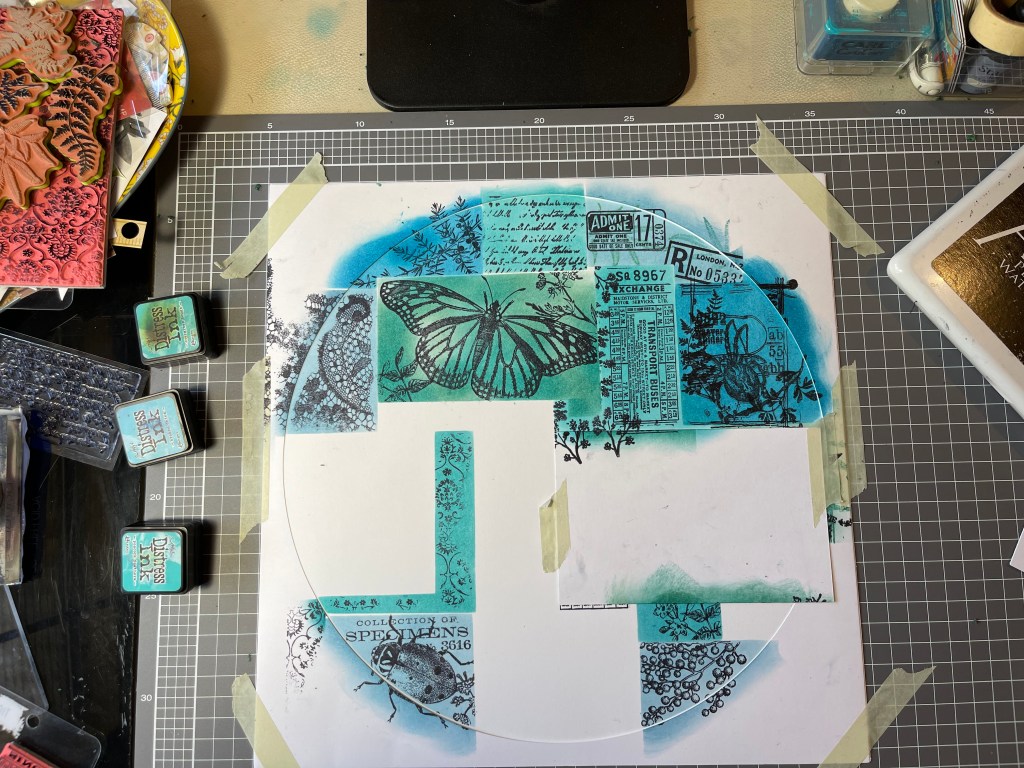
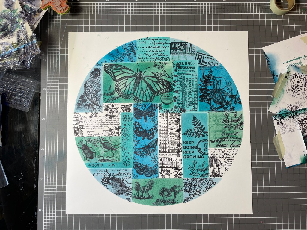
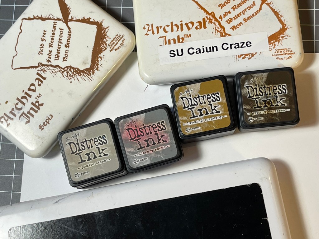
So, make I did, and it was a wonderful experience. Yes, it took me a few hours but who cares about time when one is creating. I stepped back in time and used an old stamping technique, masking, which worked really well to create that collaged look. I chose to work with Tim Holtz Distress inks (for my first attempt) and chose to try and create a teal blue and green background.
I really stepped out of my comfort zone and even filmed the process. Yes, people, I have made my first ever scrapbook video. Something that I have been planning to do for years but have not been brave enough, nor had the time. It’s pretty basic, so be kind. If you are interested in watching it, you can view it on my YouTube channel here. I would appreciate any feedback, so please do leave a constructive comment and like the video. With some motivation and support from other crafters, I hope to continue to develop my video production skills.
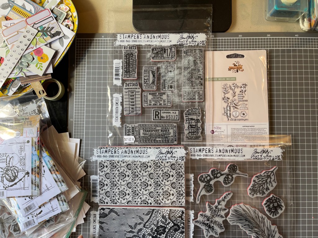
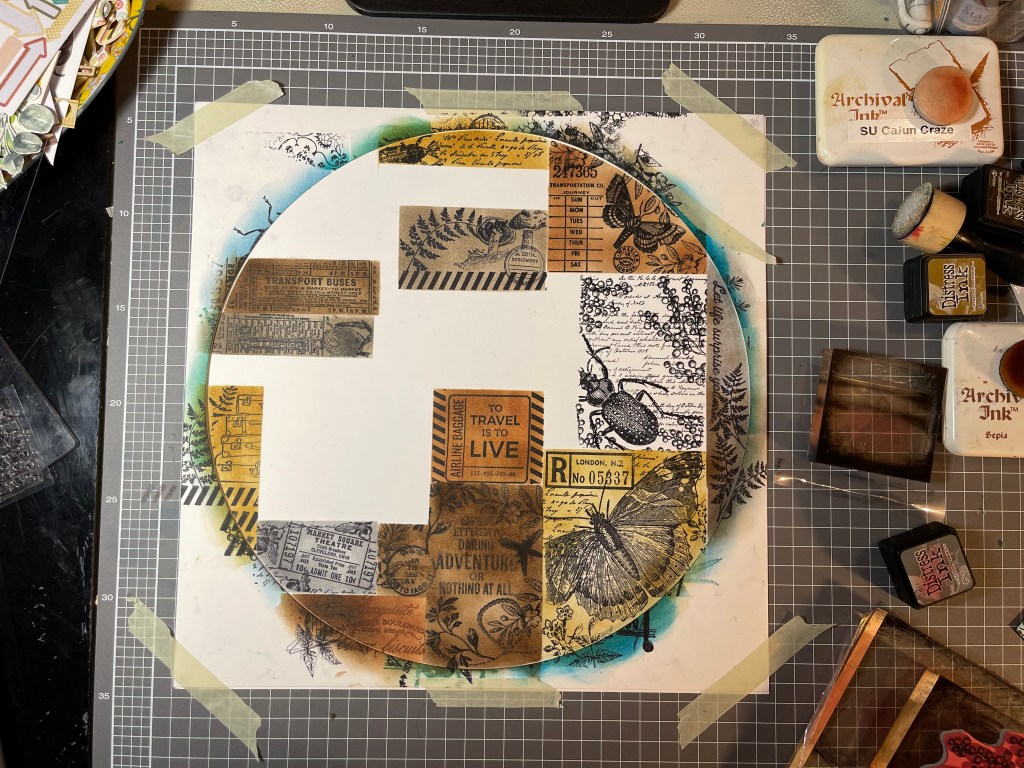
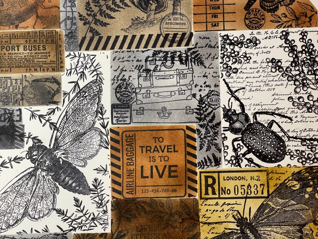
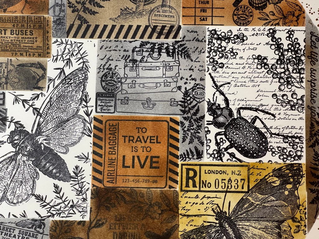
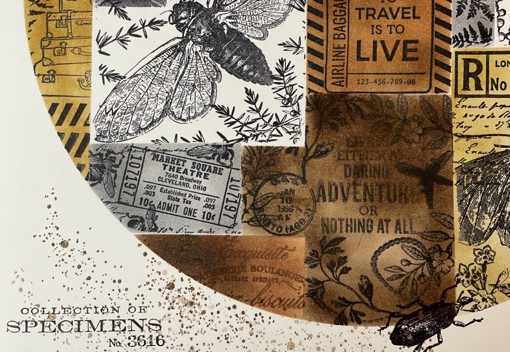
Right, so let’s look at stamping and masking. First I selected a heap of stamps which could blend to create a similar nature theme. I also selected some travel stamps for fun, which I used on the second background. I chose to use some Vicki Boutin foundation mixed media cardstock for the first layout, it’s a good quality cardstock made to take wet media, so should easily handle a bit of ink. I also use some thinner Poppy Craft cardstock which I used for the masking shapes and for making a template.


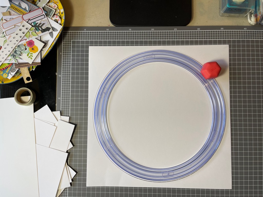


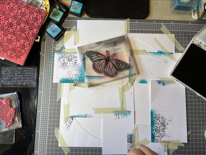

Template? Yes, I decided to not directly copy the Spectrum Sherbet design making a 12×12 sheet but used the collage look within a circle template design. I masked off different sections of the circle and stamped on my images, colouring each section with the distress inks. It was a pretty easy process but a bit fiddly and time-consuming. I really like how it looks in a circle design. I ended up adding a little stamped splash around the edges where I accidentally got some ink smudges. overall, I’m pretty happy with how it turned out.
So happy that I made a second background, working with grey and brown inks and adding some travel stamped images. Not at all a sherbet colour, but I love it anyway.


 posing for the photo, so the quality is not great. It is a little blurry but does capture his cheekiness. Let me just say that the playdough man is magnificent, a work of art! Well, I may be biased, it does have all the important elements of a human which is the goal when you are four. It was the playdough figure which triggered my idea for the forged paper. The playdough feet are rough circles, much like the black and white circle paper featured in the Felicity Jane ‘Hannah’ kit.


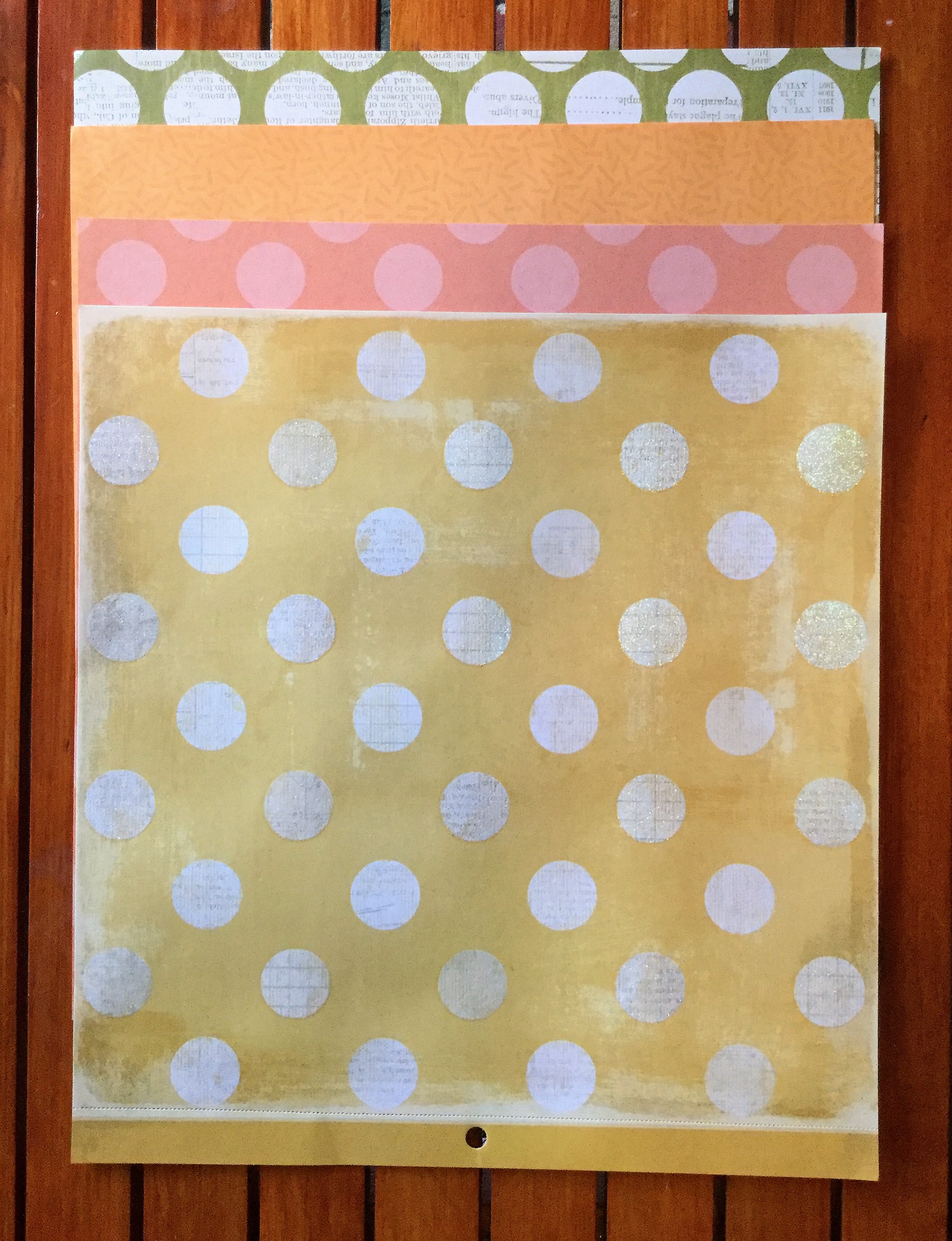
 decided to substitute this with a strip of polka dot paper trimmed down to create a scalloped edge. I attached this to the edge of the woodgrain background.


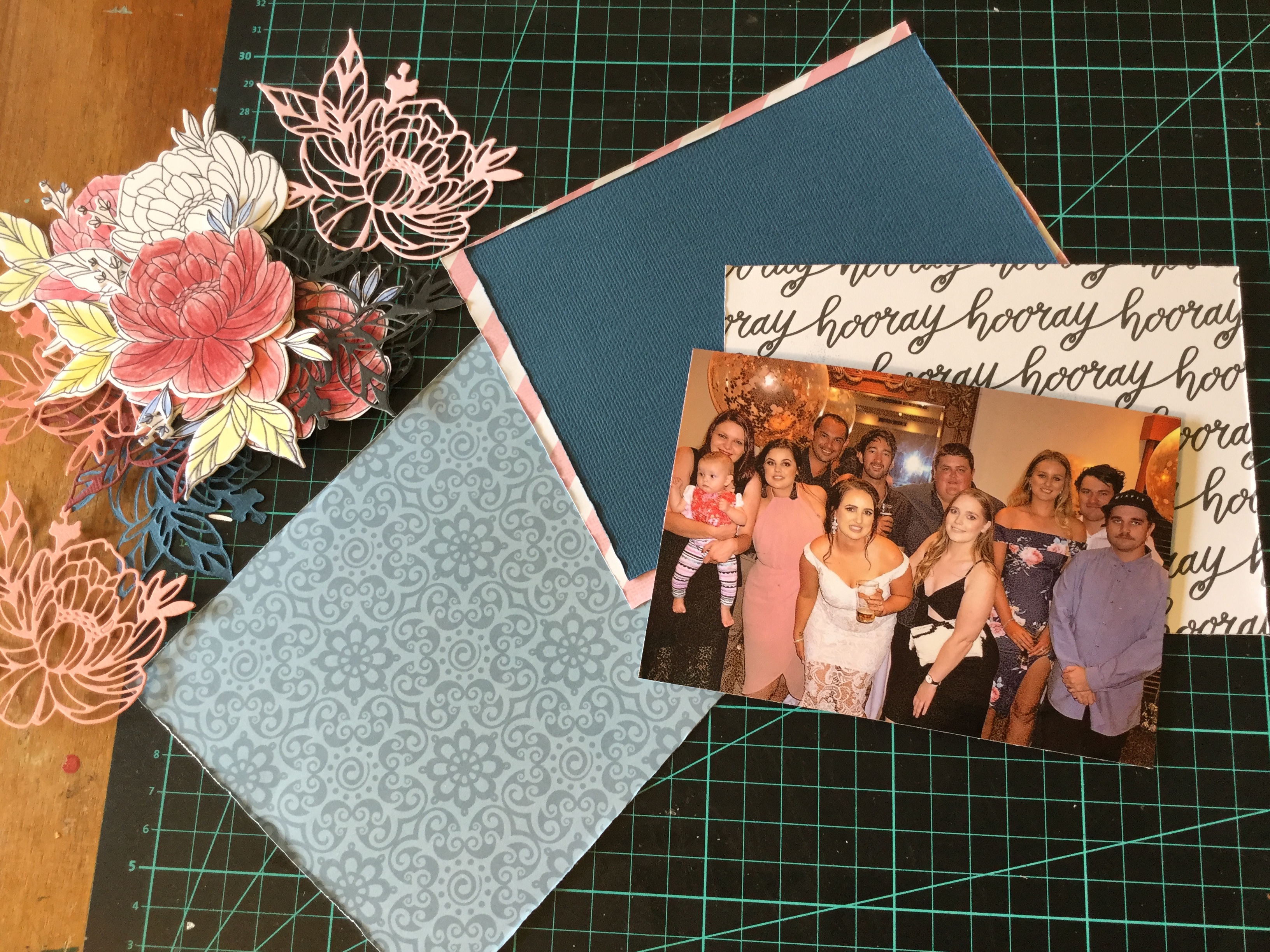
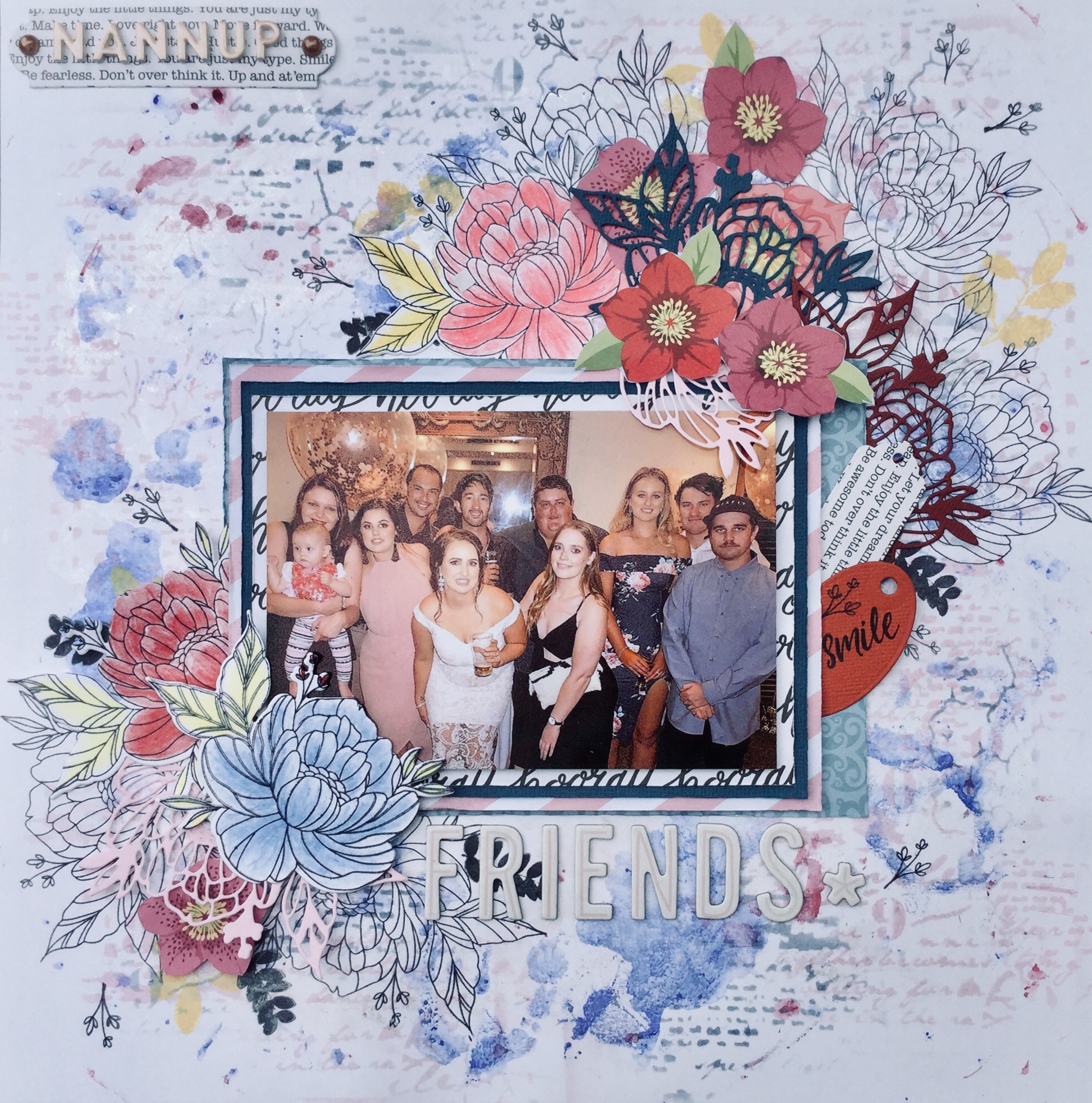
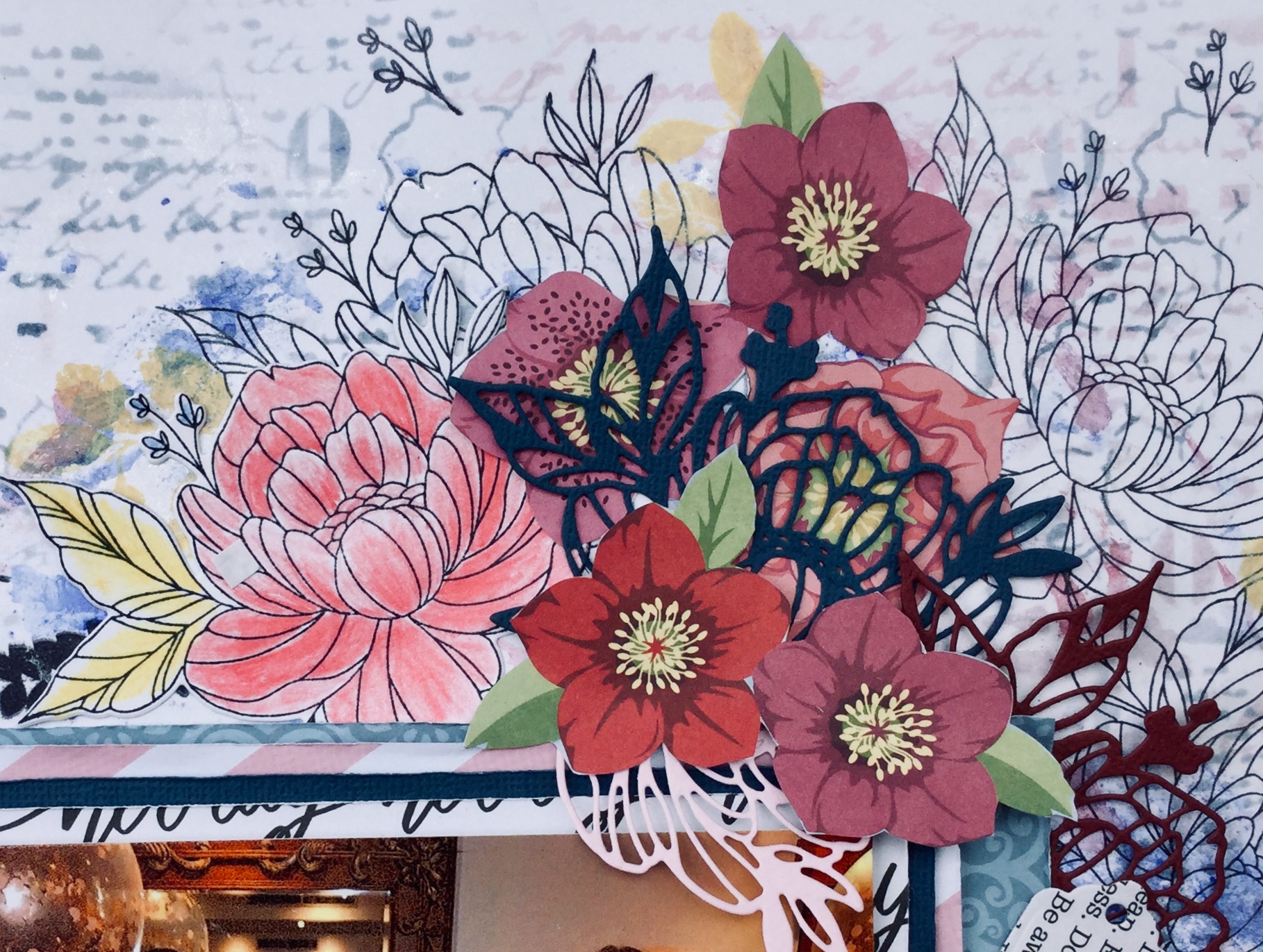
 So, first up, I went with a photo of my daughter and her friends having a night out. The photo has several of the pinks, blues and burgundies found in the Felicity Jane ‘Hannah’ collection.


")

")


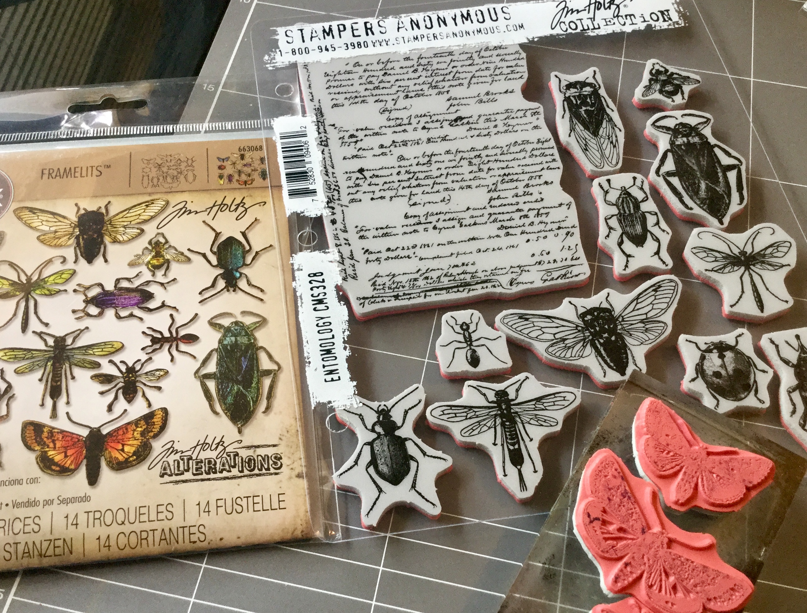 with the stamp set (released earlier in the year). I had been waiting for months for the release and then for it to arrive in Australia, it is amazing! The die is spot on, there is absolutely no white space around your stamped image, it cuts the thinnest and tiniest insect legs and antennae.


 Hello Scrappers, I am back joining in with the


 “What are we going to do now?”. He keeps us all on our toes, working and creating.
 Each layout was a quick and simple design with a little stamping and ink on number ten. Both layouts are inspired by the work of others, as I just wanted to get them done and move onto the October Counterfeit Kit Challenge.
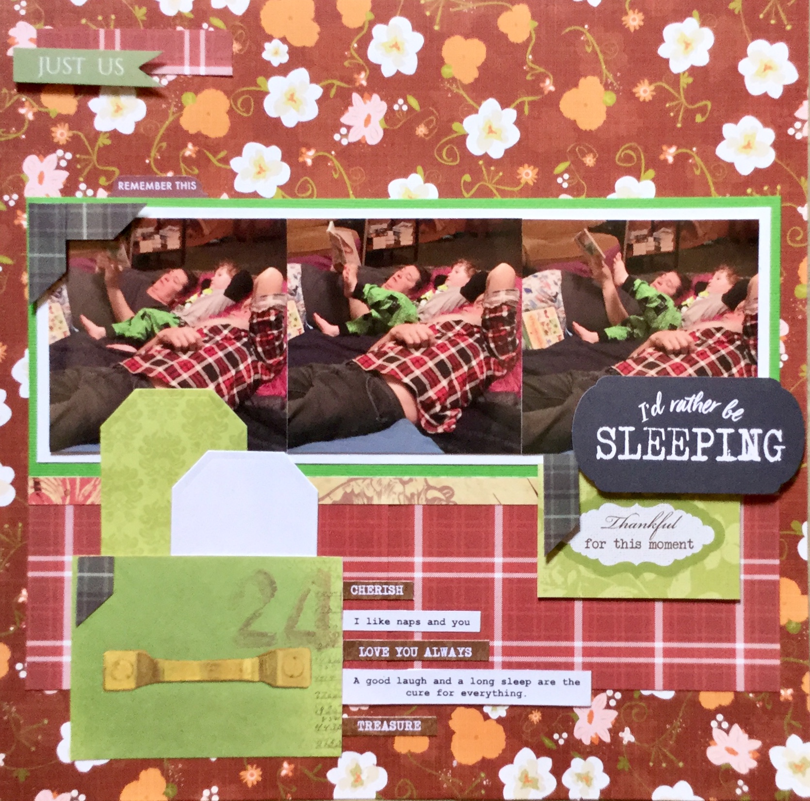


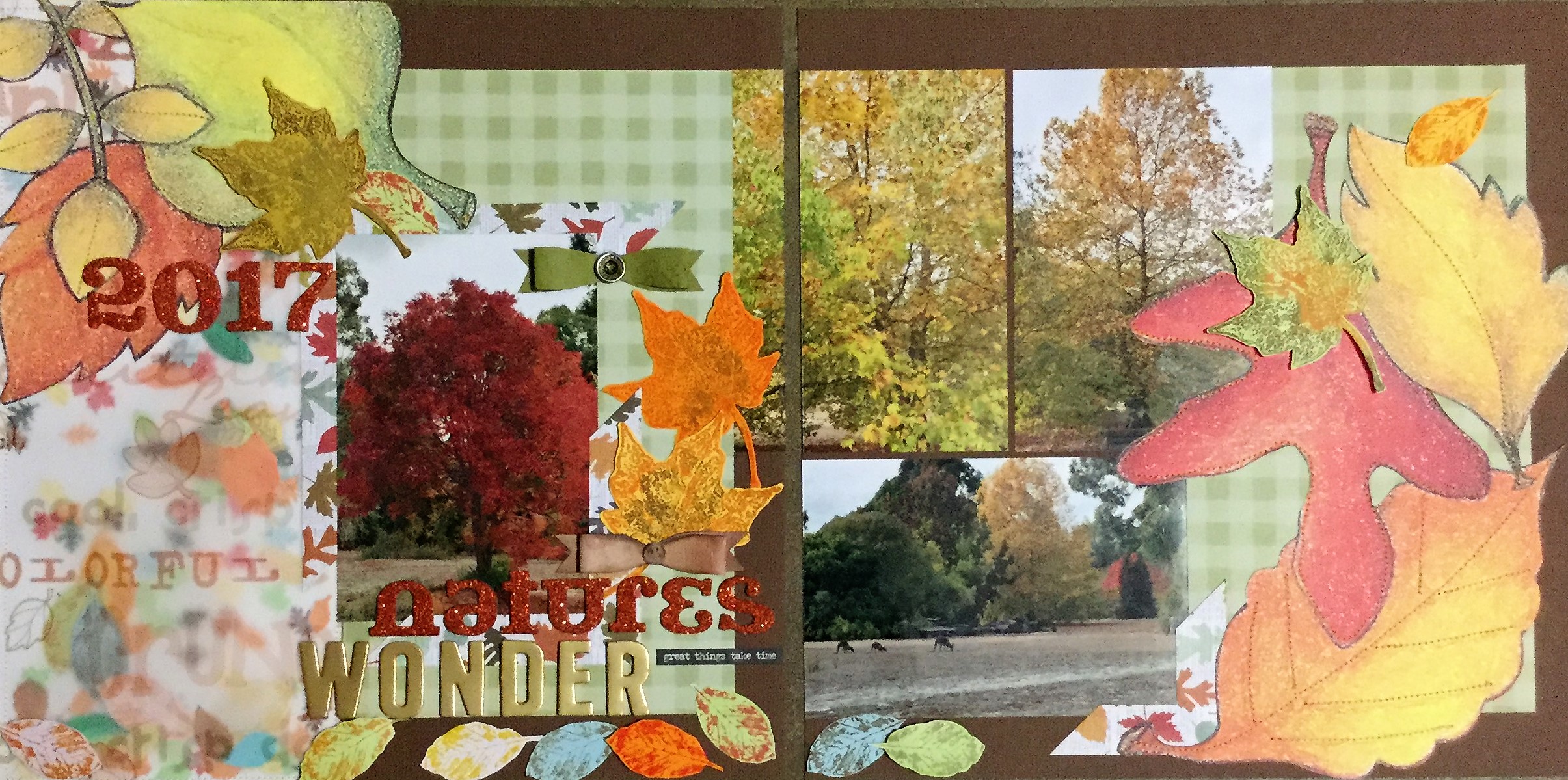
 the rural Great Southern region of our state. Three of my artist friends and I set off on Sunday to begin our road trip pursuing the

 Know idea what that is? We didn’t know either. It is a medium which you can use that gives the appearance of encaustic wax without all the mess and heating. You can create luscious layers of translucent colours, embed materials in your work and if using oil paint, it speeds up the drying process. You can get several different versions/brands, we managed to track down some Langridge Wax Paint Paste. I can’t wait to try it out and see if it works with a range of mixed media techniques.


 I am looking forward to seeing the October CKC kit, there have been sneak peaks on FB. I am loving those colours and the woodgrain. I can’t wait to see what everyone creates with their version of this month’s challenge kit. Keep creating and enjoy the last day of September. I will be trying to get a couple more layouts completed from my counterfeit kit.


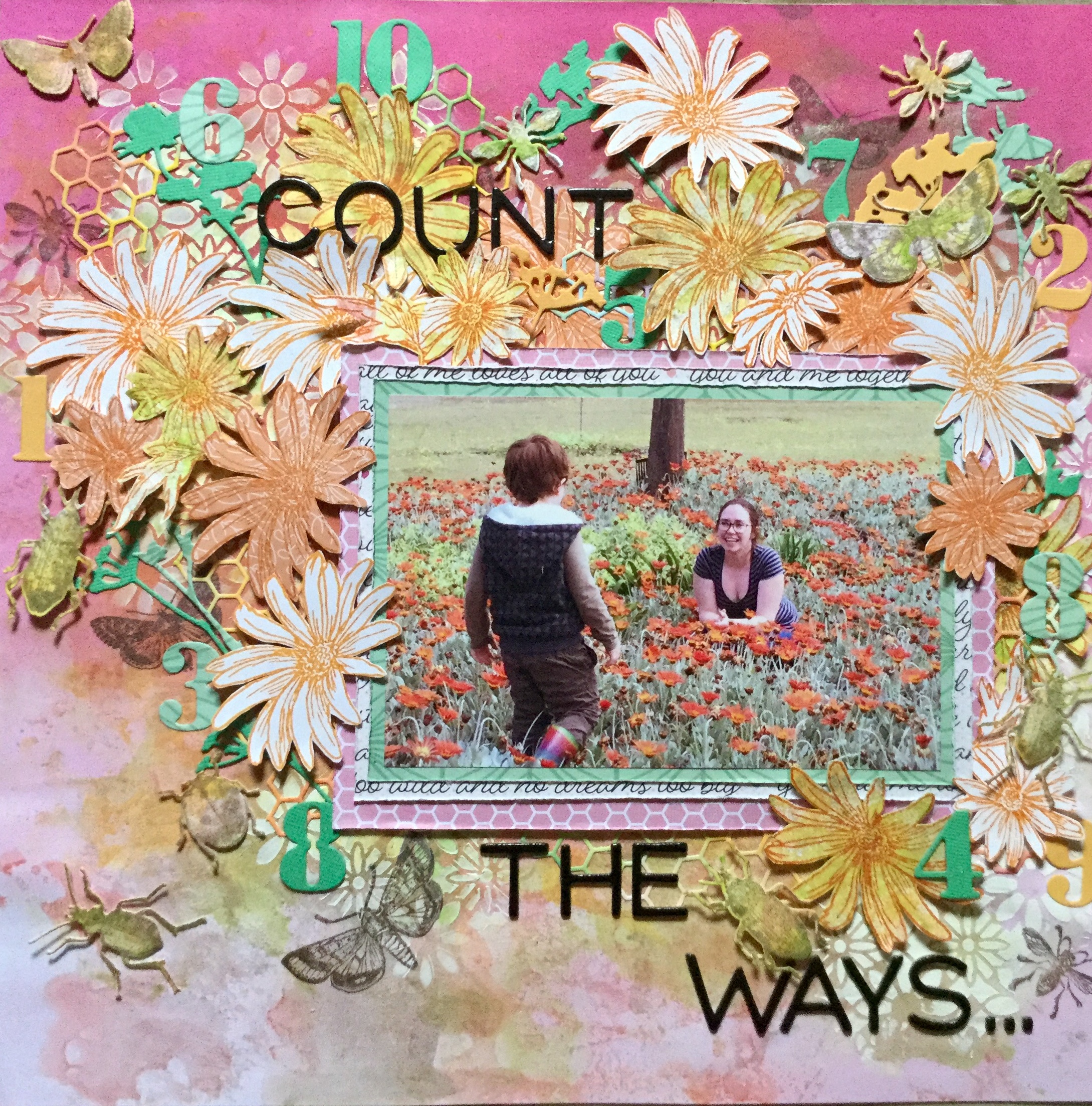
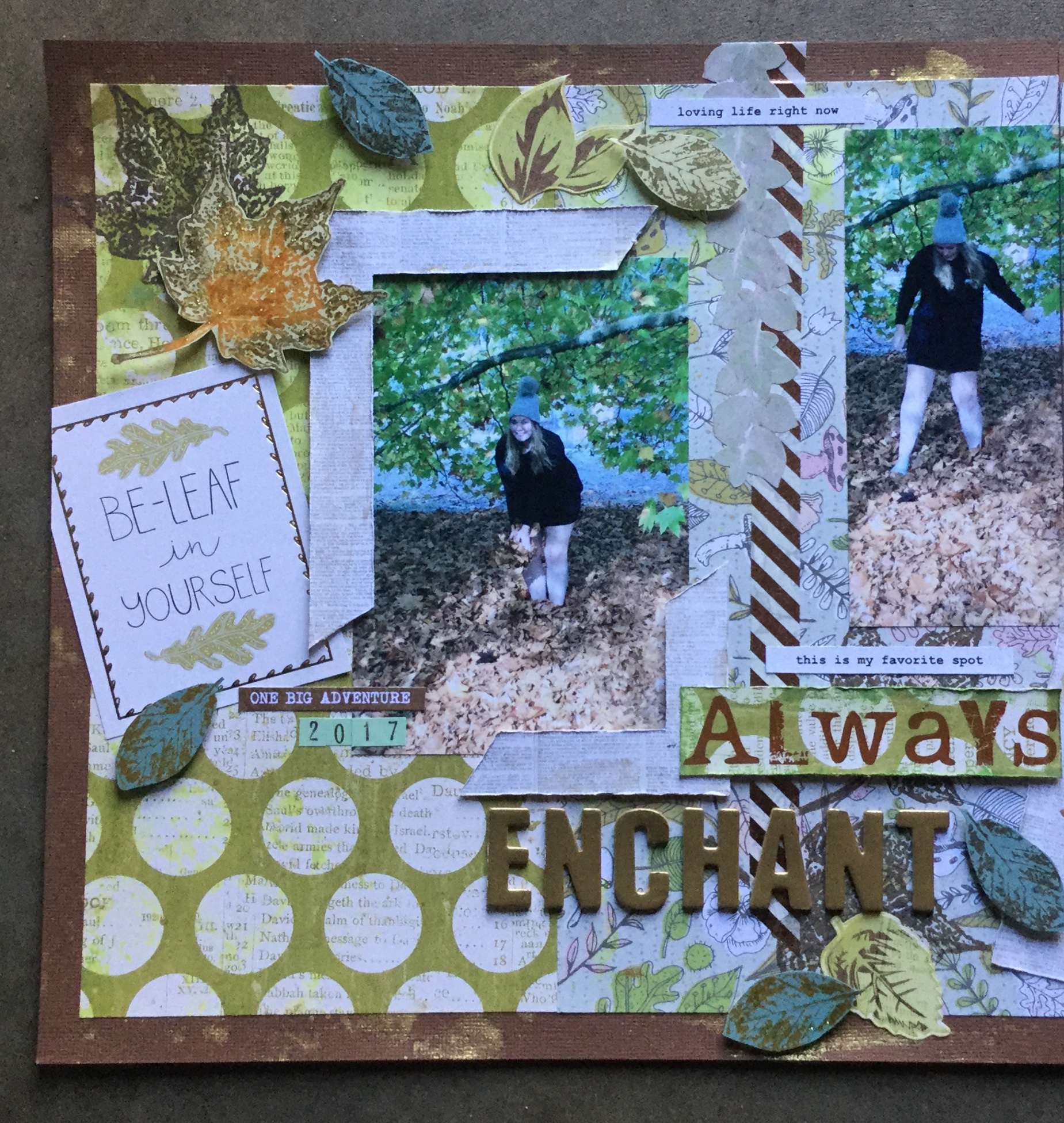
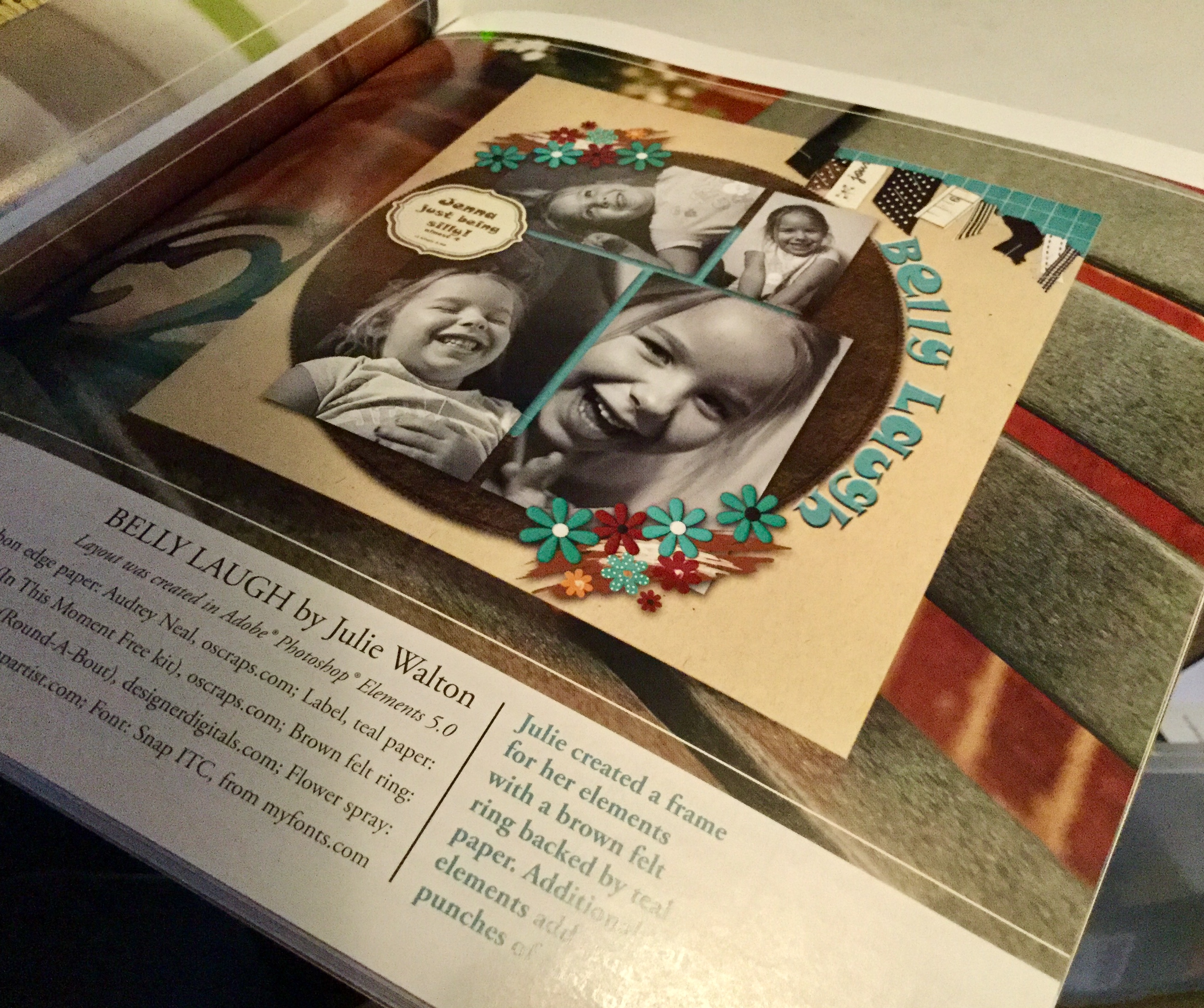 lot of layouts featuring circle formats or circle embellishments. So, I delved back in time and was inspired by Julie Walton’s, Belly Laugh layout. Julie’s layout is pretty simple with clean lines, as usual, mine turned out very busy with lots of embellishments. Well, I am trying to use things up!


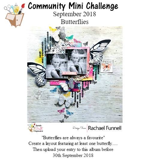
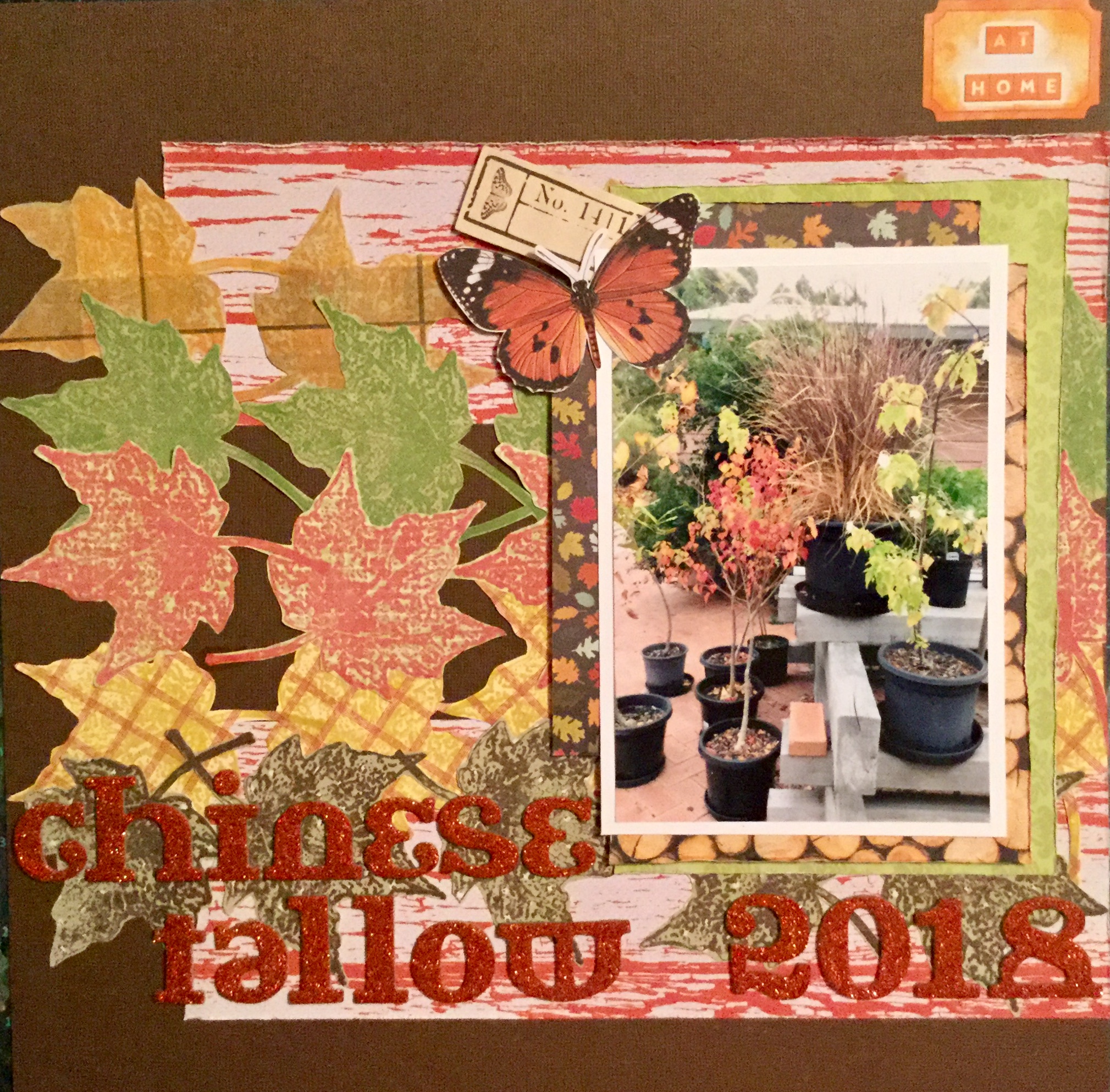
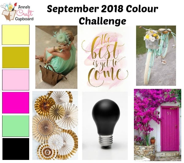 challenge was designed by Rachael Funnell. It is quite an unusual choice of colours this month and it has taken me a while to actually start my layout. I selected my papers but then battled with photos, several times I waded through my sorted photos to find something suitable. Finally, I came across some old photos of myself and my youngest daughter from 23 yrs ago!
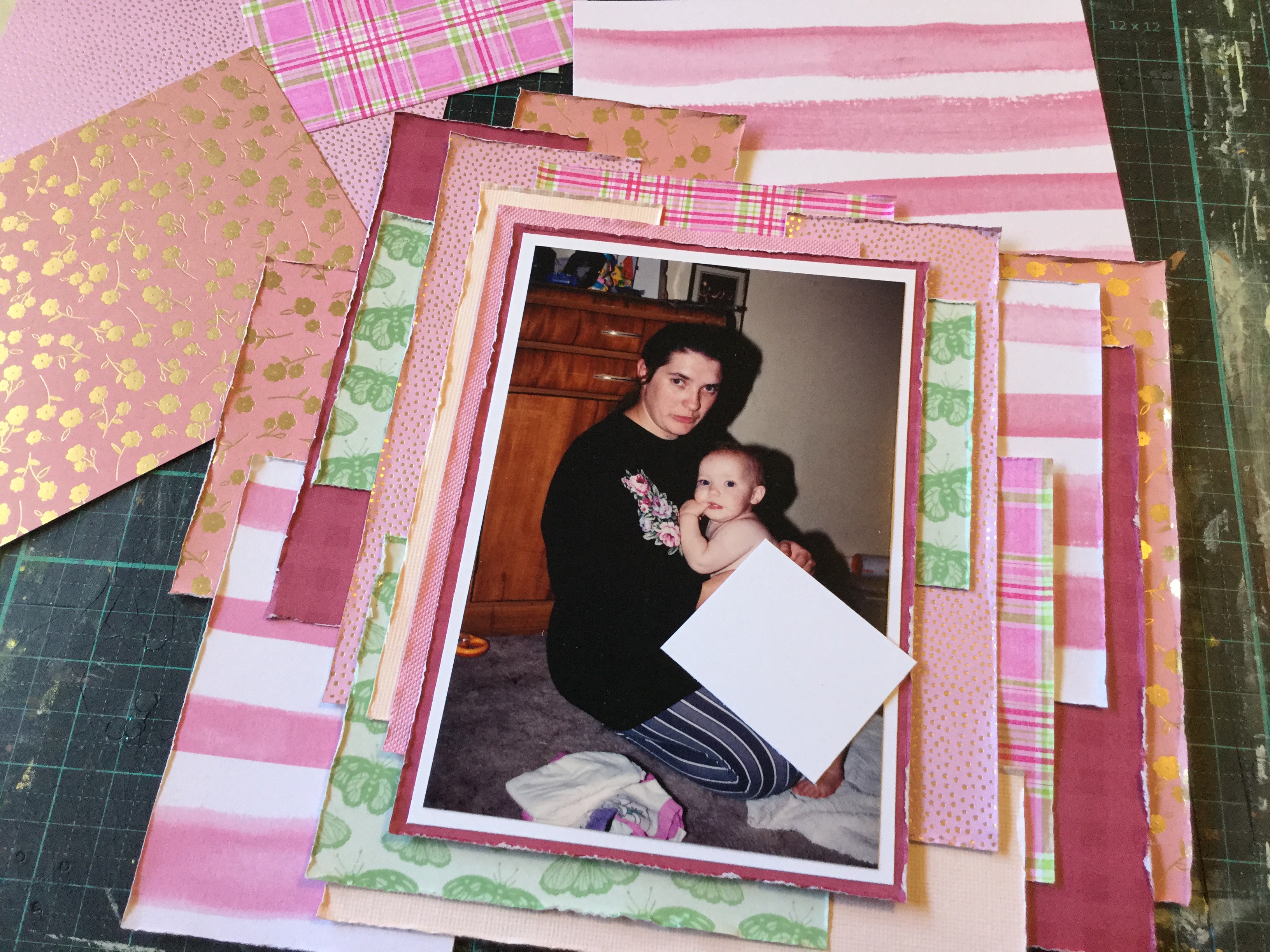 jumper inspired my choices. The roses on the jumper were stitched on by myself all those years ago after my jumper got scorched when drying near our wood fire.


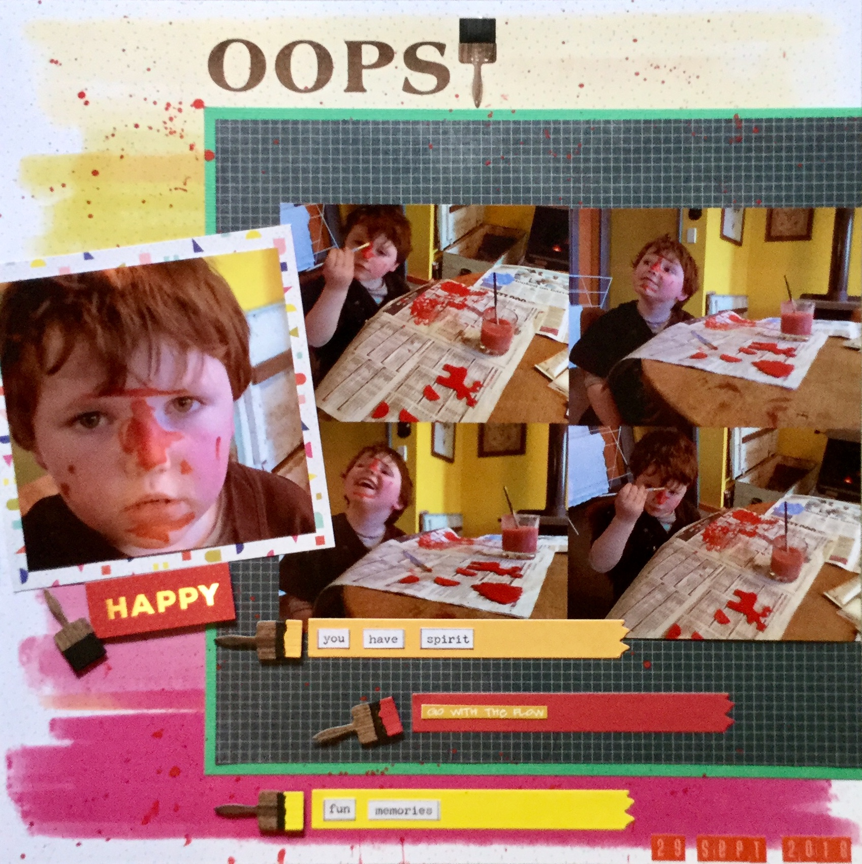
 Hello again, I am just popping in with a layout I created for a September colour layout challenge on the


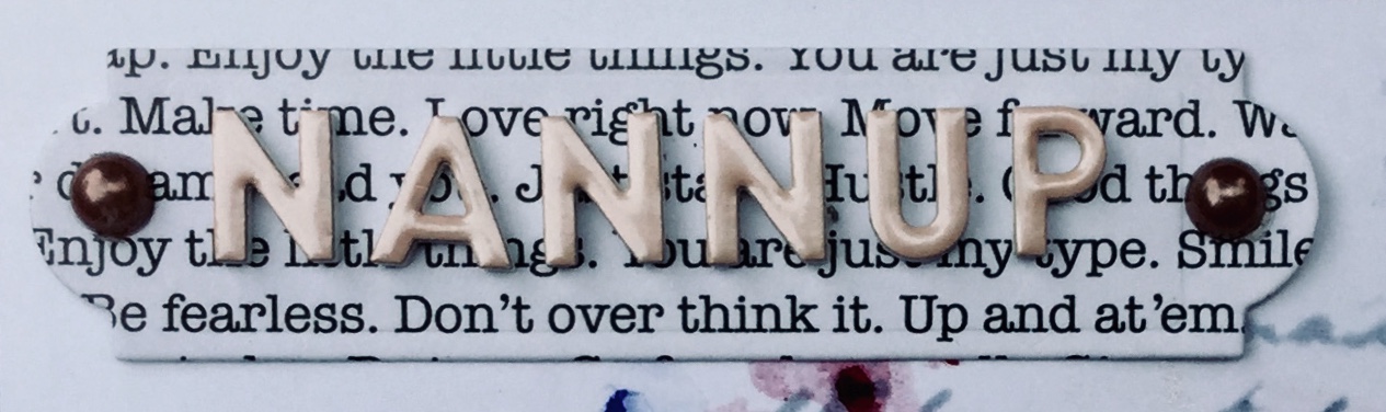
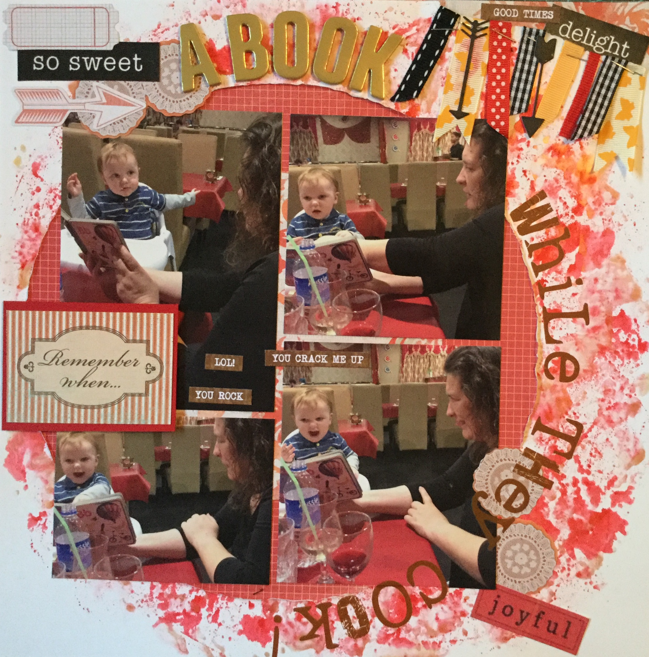
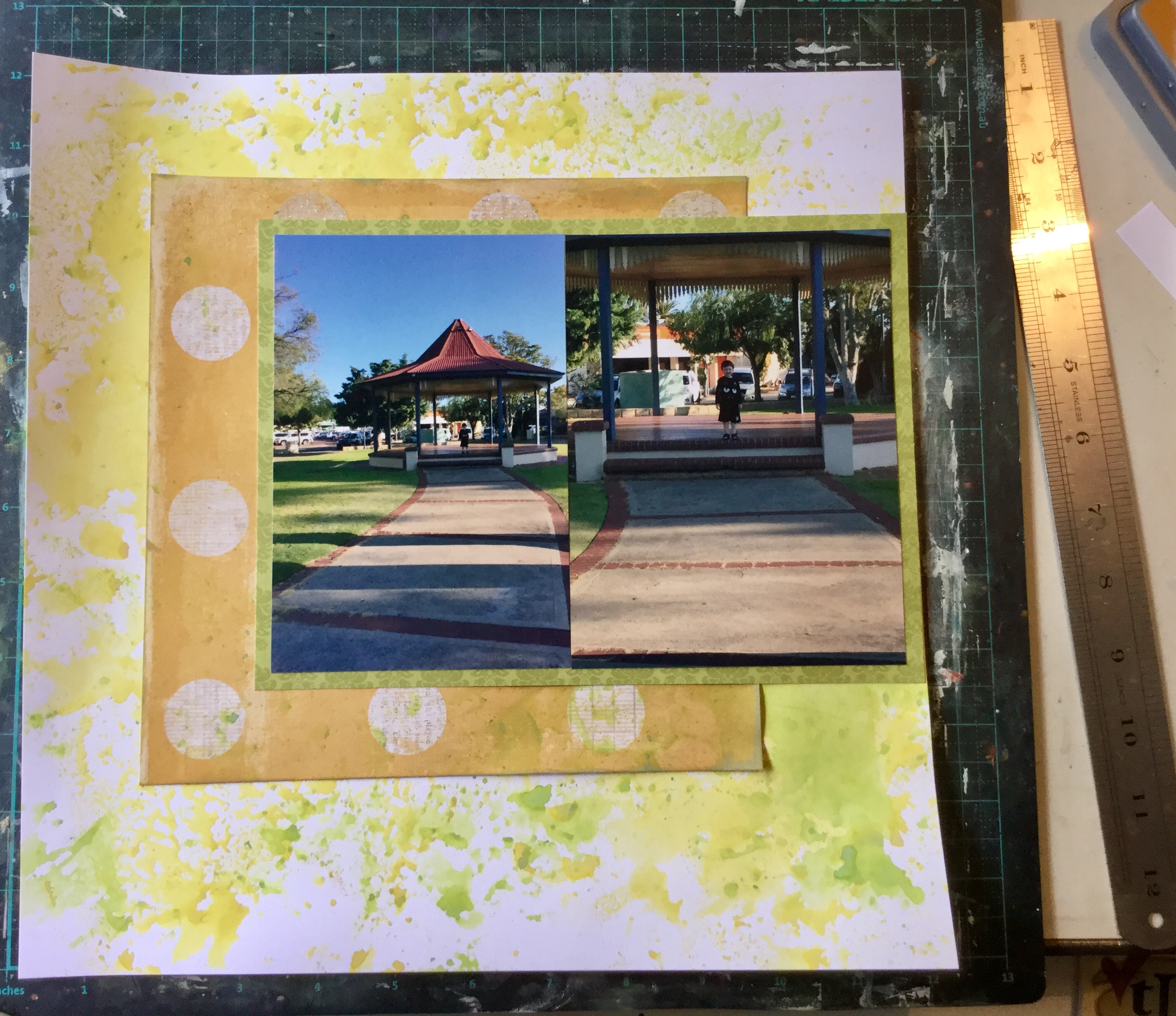 Nanny duty looking after my grandson while his mum was at work. We had a great day doing lots of things and stopped along the way to buy a drink. The store had one of those giant gumball type machines filled with coloured bouncy balls. He was very excited to use his $2 coin and get a ball. We went across the road to this little park to try out the new ball and did it bounce….yeah, like crazy! Thirty minutes of fun and laughter.


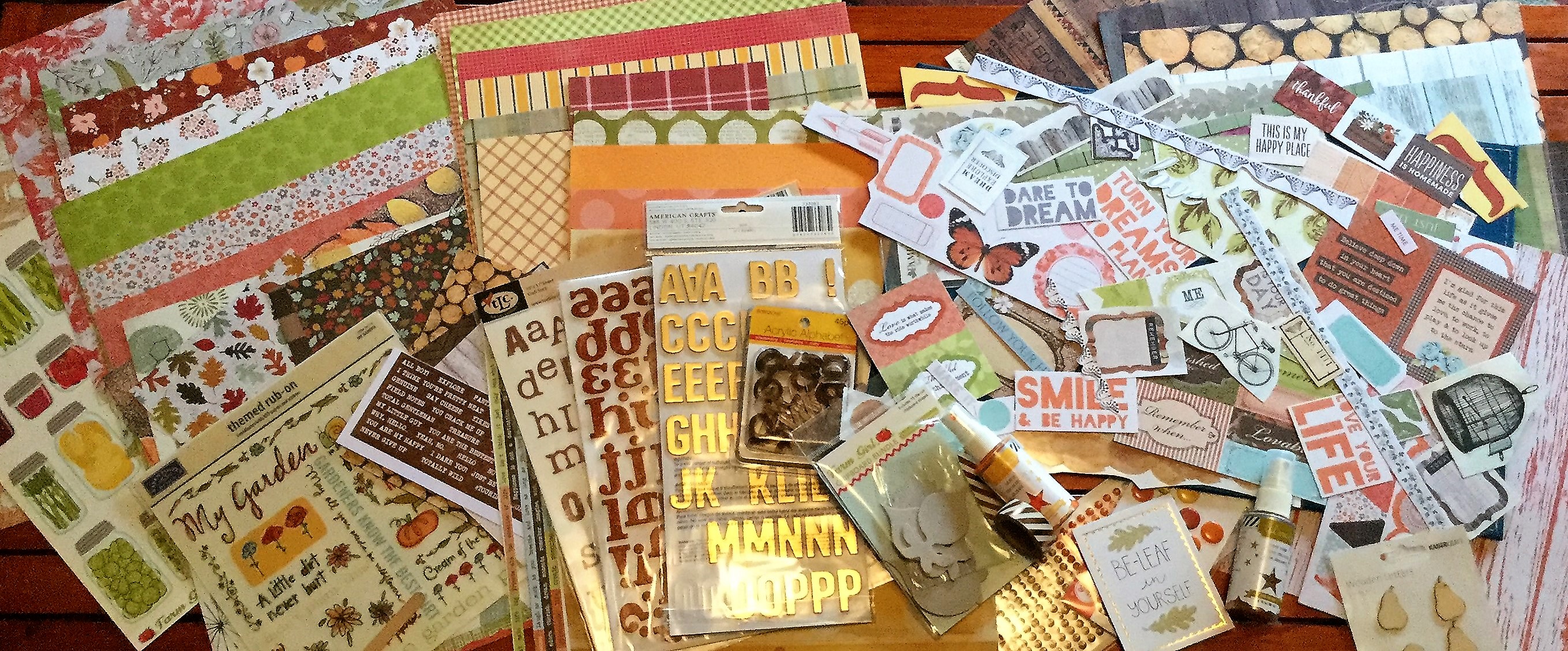
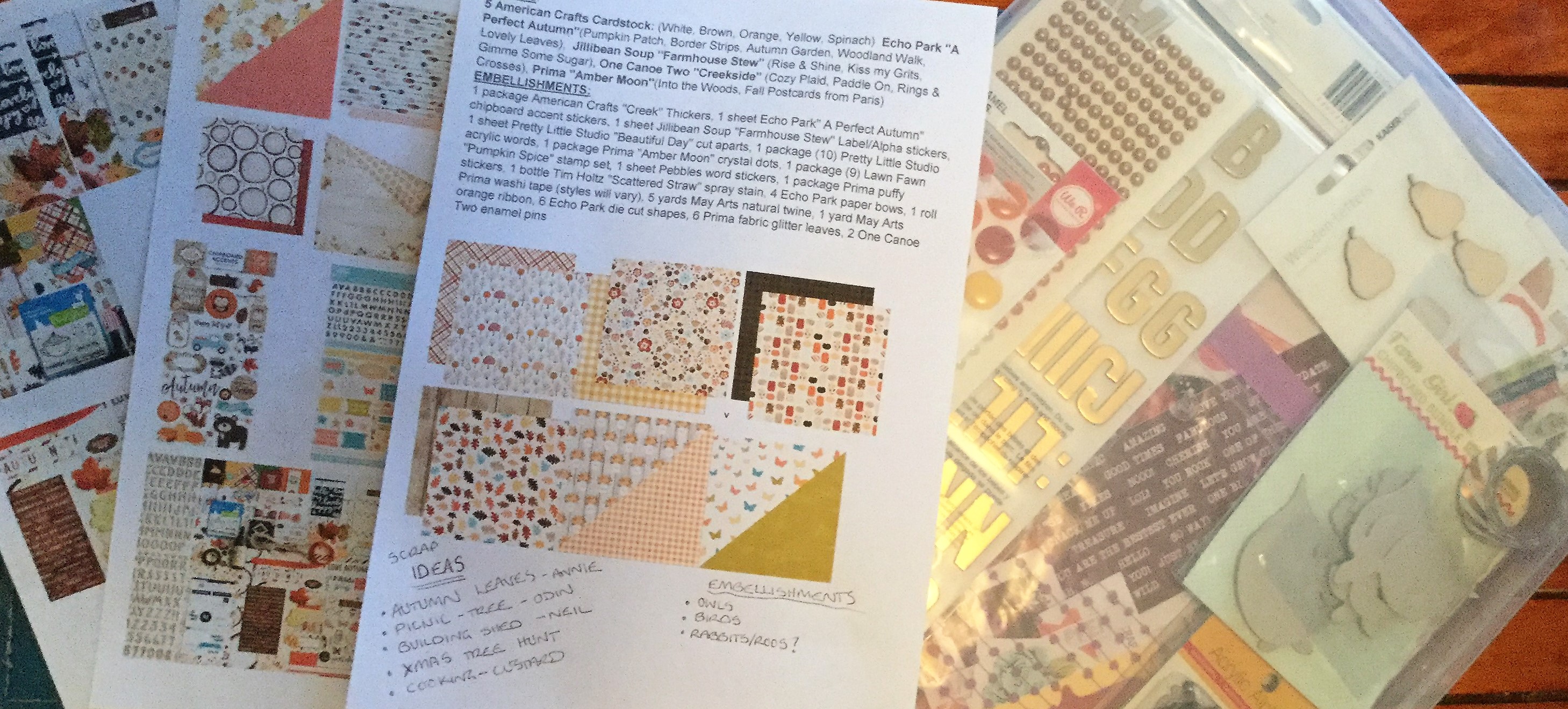
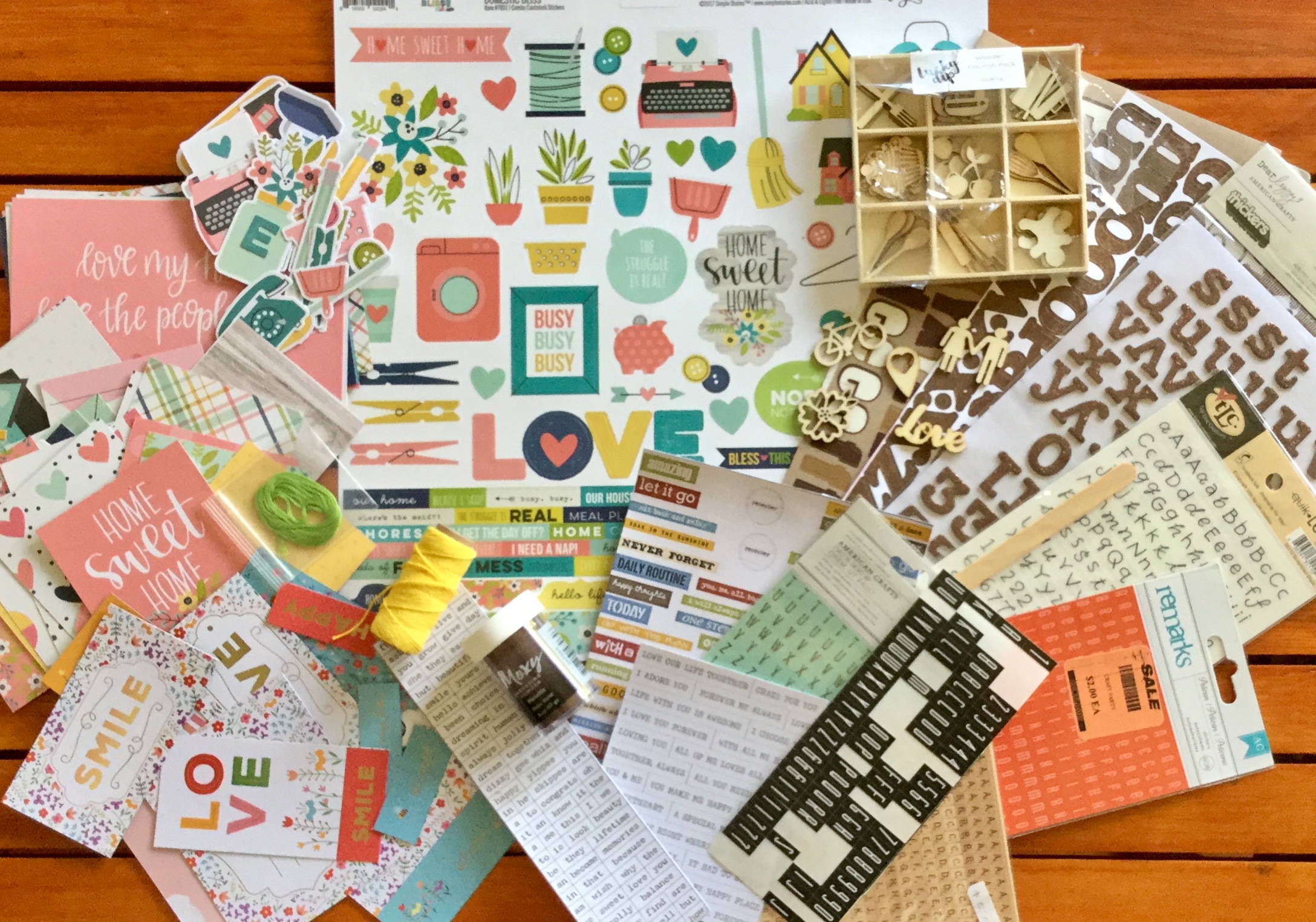
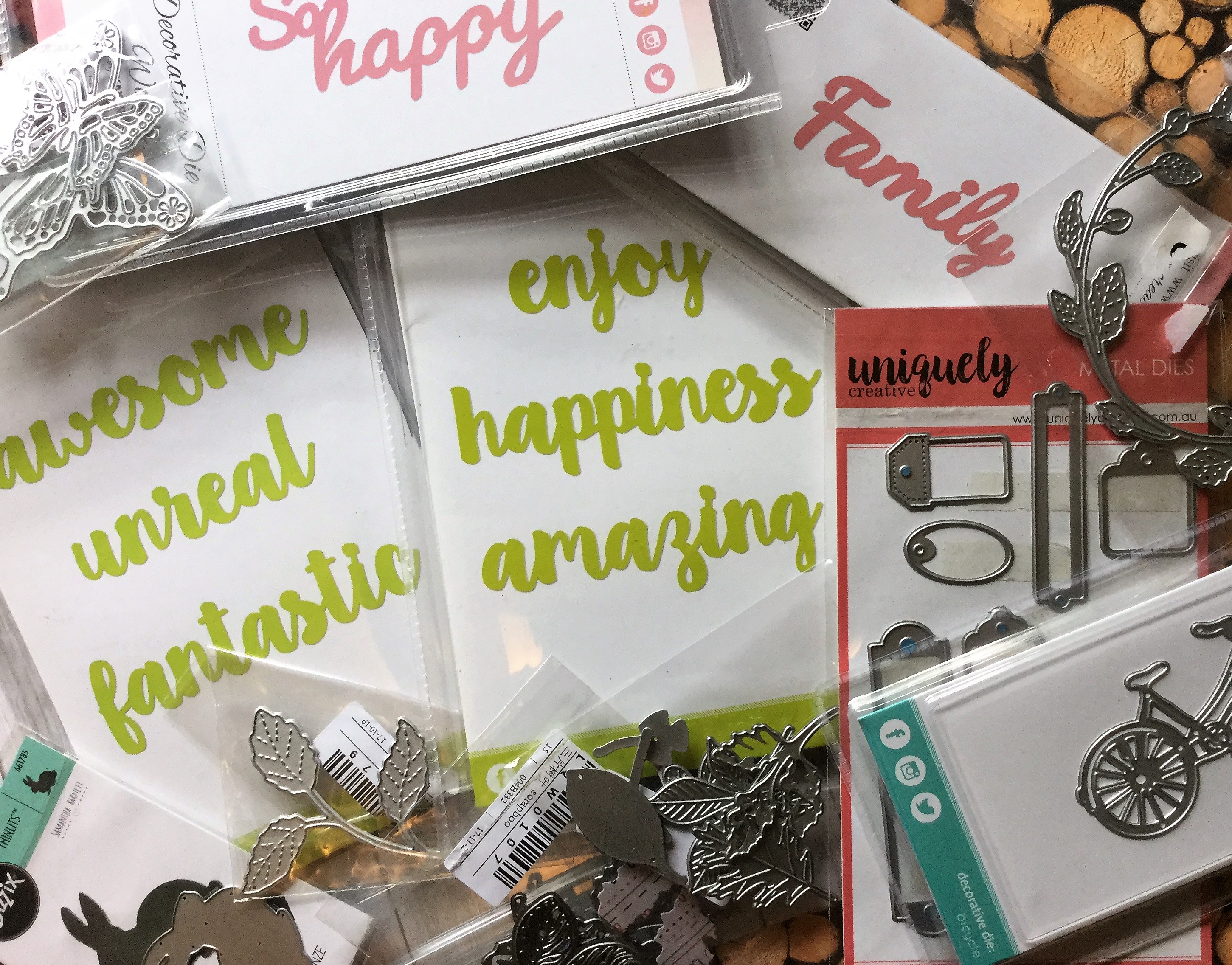 My substitute for the Tim Holtz distress stain is two Heidi Swapp shines in gold and mustard. I haven’t decided on which stamps to use but will most likely use some leaf and foliage stamps. The bows I will make out of scraps from the kit and I will turn some of my embellishment die-cuts into chipboard elements. My choice in washi tape is a lovely metallic and white diagonal stripe for some added bling. I may also add some wood veneers and some ribbon.