Be You – ACC Colour Challenge

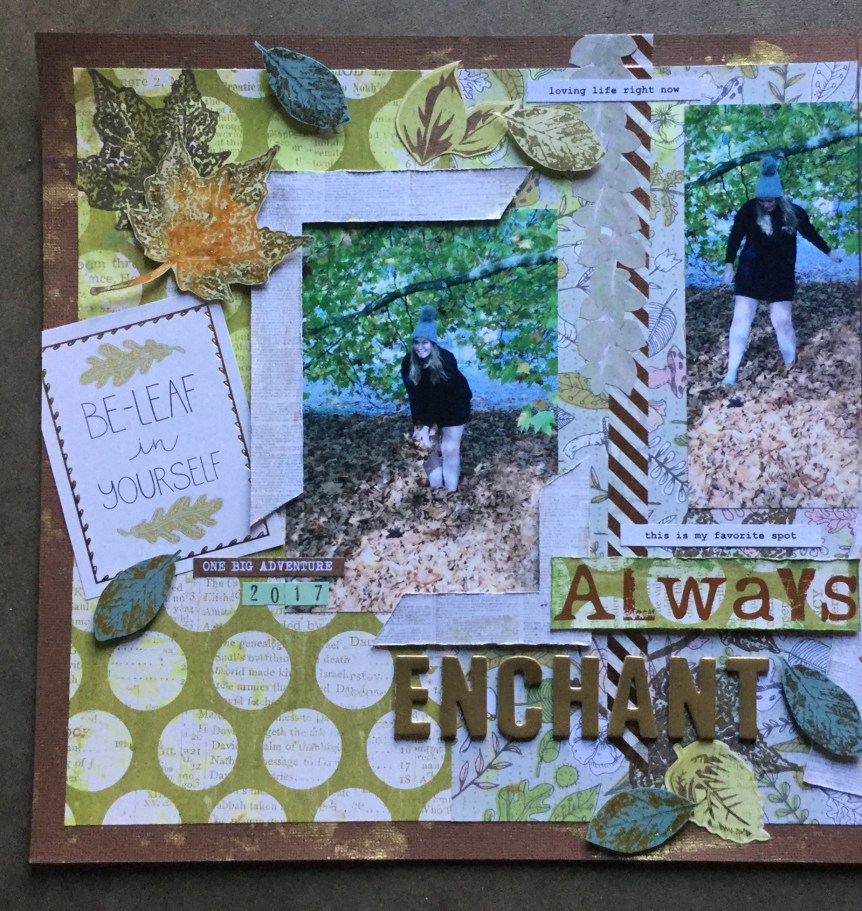
Anna’s Craft Cupboard’s September 2018 Scrapbooking Colour Challenge is happening, every month they offer a colour challenge and a mini challenge. This months colour September-2018challenge was designed by Rachael Funnell. It is quite an unusual choice of colours this month and it has taken me a while to actually start my layout. I selected my papers but then battled with photos, several times I waded through my sorted photos to find something suitable. Finally, I came across some old photos of myself and my youngest daughter from 23 yrs ago!

I decided to use these photos based on the colours in the photos. I am a scrapper who works around colour and theme/mood, which is why I went with roses as an embellishment. The colour of my jumper in the image, black, and the rose fabric on theIMG_3711 jumper inspired my choices. The roses on the jumper were stitched on by myself all those years ago after my jumper got scorched when drying near our wood fire.

I selected a range of papers which would work with the colour challenge and built up layers of paper under the mounted photo. I roughed up the edges of each paper piece using my fingernail.

I decide to go with a white background and splashed around some pink inks. I used a stencil and pink ink to add some texture, as usual, most of this mixed media ended covered up. I didn’t have any rose embellishments left in my stash and stamped some roses onto white cardstock instead to create some embellishments. Then, I decided that the black stamped image would look interesting in the background.IMG_3712

I spent a long time playing with my stamped roses, adding colour washes using oxide and distress inks, and then fussy cutting them. I slowly added the roses and some die cut leaves. Because it is so busy I went very simple and understated with the title, using only a small wooden text ‘Be You’ which I coloured black with a Copic marker.  I thought it needed something else, some texture, and added the pleated,  baby pink,  checked ribbon.

IMG_3718

I think the style works with the photo but generally, I am not a flower type girl, unless they arrive hand delivered by the bunch! This is why I enjoy doing challenge layouts, it often makes you step out of your self-imposed box and try something new or bring back something old. Onto the next challenge…butterflies, more girly pretties.41748703_1779864508802559_501826680399069184_n (1)

Always Enchant – Counterfeit Kit

#5 layout for the Counterfeit Kit Challenge. This layout was also a simple one using a little ink and my handmade leaf embellishments.

I started with a little oxide ink on my background papers and card stock. Then I splashed on some gold Heidi Swapp Color Shine.

Next, some fussy cutting, I cut out my hand stamped leaves. I used both the glitz-ed ones and plain ones. The photos I am using are of my youngest daughter, she is bubbly and bright, and loves to come home to visit. Playing with the Autumn leaves is one of those favourite childhood memories which she cant resist as an adult. It was sunny but cold and we were on one of our strolls around the property and heading off towards the bush (State Forrest, next to us) when she jumped under the tree and into the leaves. Some people just never grow up 🙂

Then, I worked on building up the embellishments and title. I decide I wanted to frame the photo rather than mount it with card stock. I must admit that I am old school and usually mount all my photos. These photos worked really well with the papers and blended into the background, so I used them as is. I had some very old stickers in my kit that needed using up, I used only the leaves. The corner frames I made from a piece of 6×6 patterned paper, and used the central leftover image as an embellishment. I had to change my title, as I had wanted to have Always Enchanting but only had two ‘n’s left. One of the pitfalls of using up alpha Thickers/stickers.

Overall, it turned out nicely and I like the scattered leaves across the layout. As usual I need to add my journal notes, that is what the space on the left corner is for.

These last photos of the layout have a slight blue tinge, the true colours are like the images above. I took these photos at 5 am in the morning, the light streaming in was different. Outside it was freezing, there was ice on the ground, a typical Spring morning for us.IMG_3690

IMG_3691

IMG_3693

1-2-3…GO! – Counterfeit Challenge

This layout is my attempt at the #1 colour challenge for those participating in the September Counterfeit Challenge. My layout, my fourth for the Counterfeit Challenge is a fairly simple layout with not a speck of mixed media in sight.  The colour challenge specified using the colours red, gold and purple. This proved difficult for me as I had no purple in my counterfeit collection of papers. I ended up having to rummage through my stash and pull out two purple papers, one which had lots of text and one with a fine white polka dot. I have no idea what brand the papers are as they were purchased in a bag of craft paper scraps from the local market. I cut up the purple text sheet to use the quotes as embellishments on my layout. I also had no red cardstock in my kit and used a piece from my stash for my background.

I decided to go with a simple background made up of different widths of strips of patterned paper. I added some Washi tape in rose gold around three edges of the layout. Then, I mounted my photo on cardstock and added the embellishments, some text and die cuts. It is pretty busy and definitely not a layout I would scraplift but it is one more layout for the album. I did find it challenging using these papers, for the photos I had selected.IMG_3650

Yellow Challenge!

IMG_3663Hello again, I am just popping in with a layout I created for a September colour layout challenge on the Scrappingclearly FB page. I had fun playing with some mixed media when making the background. I used a Kaisercraft brick wall stencil with some white gesso paint to add some texture. I scraped the gesso across the stencil, then I lifted the stencil and laid it in the other direction and applied more gesso. This created a criss-cross brick texture on the page. I dried it off with a heat gun and applied some Tim Holtz Wild Honey Oxide Ink using the plastic back technique. After drying the ink I applied some Heidi Swapp Mustard Color Shine, again using the plastic bag technique.

Next, I fussy cut a section of flowers from my patterned paper and used it face down as a stencil on the background, dabbing some distress ink over it to create some foliage shadow areas.

Then, I fixed the flowers in place and mounted my photo on some scraps of yellow-toned patterned papers. I rough up the edges of each layer with my fingernail. I then decide to do the same to the fussy cut flowers and used my fingernail to turn up the petals of each flower.IMG_3641

I used my Sizzix Big Shot to cuts some flower and foliage embellishments in grey and yellow card/paper. Then, I created some small clusters of the embellishments on three edges of the photo. Last, I added my titles using two-word die-cuts and some puffy alphas from Pink Paislee. IMG_3640IMG_3644

Bounce! – Counterfeit Kit

Bounce! A quick layout for #3 using my September Counterfeit Kit. This layout got the lovely smoosh effect using the Tim Holtz Oxide inks. One of the self-imposed challenges that I placed on myself several months ago was that any new art/craft supplies coming into my house must be used. No hiding supplies away and not using them. This has been easy with these inks, I am using them every time I scrap.

One of the reasons I decided to join in with the Counterfeit Kit Challenge was that it hit my other self-imposed rule which is using up old supplies and using old tools/media. The materials and tools I have used for this layout are both old and new. I started off working on my white cardstock background using the crushed olive ink. I love this colour, it glows on a white background and really has the translucent sheen of virgin olive oil. I used the simple and fun plastic bag application technique. Swipe the ink pad a few times onto the bag. Then use a paintbrush and water to activate the ink on the plastic, move the ink around so you lose any indication of the stamp pad ink image. Place the ink side of the bag down onto your cardstock and use your hands to smoosh the ink around. Lift and move the bag to smoosh in other areas, if you can see wet ink on the surface double dip and pick up that ink to use somewhere else on your page. IMG_3595

Because smooshing is so fun and I was trying to create an explosive type of texture which would emphasise the energy of a bouncing ball. I went in again with a second colour. I attached a piece of patterned paper and then applied the mowed lawn ink. You need to be a little bit careful when doing this, as you will get some warping if your paper is too thin or you apply too much ink/water in one area. You can see on the right side, the lower corner has a bit of warping occurring. I knew photos were going over this corner so I was heavy handed but I was careful to not have any warping on the other three corners which I knew would be exposed to the viewer.

Next, I added in my photos, I mounted the first two together on an old, green floral paper. The photo featuring the new ball and my grandson I mounted on white because I wanted it to stand out. This was a little moment in time when I was on IMG_3596
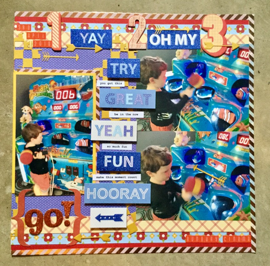
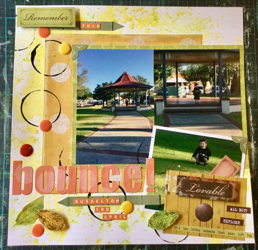
Nanny duty looking after my grandson while his mum was at work. We had a great day doing lots of things and stopped along the way to buy a drink. The store had one of those giant gumball type machines filled with coloured bouncy balls. He was very excited to use his $2 coin and get a ball. We went across the road to this little park to try out the new ball and did it bounce….yeah, like crazy! Thirty minutes of fun and laughter.

Time to add the embellishments, I still wanted to emphasise the bounce and craziness of a ball out of control. I didn’t have any embellishments which would do this, so I got out some black acrylic paint and a shot glass and made some circle prints to represent the bouncing ball. I dried it off with a heat gun and attached my other embellishments and text from my kit.

I’m really happy with the finished layout, it didn’t use up much of my kit supplies but I did get in a few of my forged leaves, I used 3 papers and some enamel dots. My journaling will go on a tag in the yellow wood grain pocket. The pocket was made from one of the patterned paper sheets I had in my maybe pile. I have used a part of that paper, the wooden drawer front, on layout #2 as well.img_35971.jpg

All Year Long! – Counterfeit Kit

Layout number two using my September Counterfeit Kit. A little bit quirky, I imagine not many people scrapbook photos of socks but these socks are special to me. My lovely daughters gave them to me on Mother’s Day this year. Well, they didn’t just give me one pair of bed socks, they gave me nine pairs! You see, I have this weird obsession in wearing these socks while at home for most of the year, partly because we have no floor IMG_3591
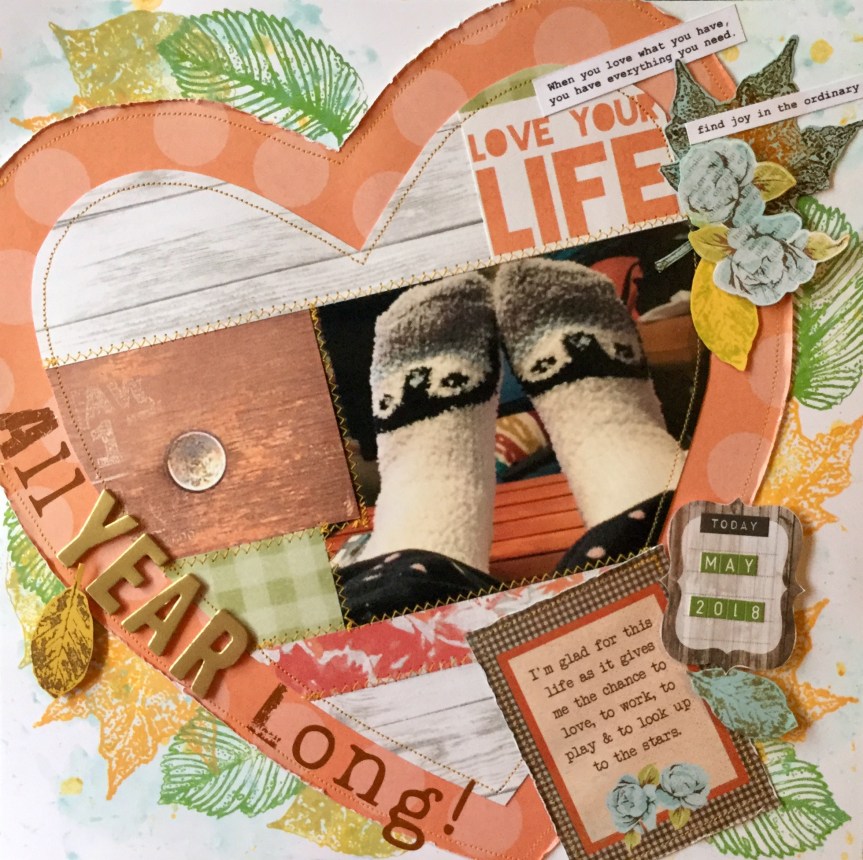
coverings and partly because they are comfy. We have concrete floors and the socks keep my feet warm and create a sense of relaxation. If I have socks on inside it means me time, a little Netflix, some painting, some crafting, some wine (not every day) and maybe a little chocolate or cheese. Who would think a pair of 99c socks could create such luxury. It’s the simple things in life.

After layout #1, I wanted to keep playing with the sewing machine and my distress oxide inks. I put my pale blue and white snowflake bedsocks on and got started. First up, some inspiration! In my recent cull, I decided that I would get rid of at least half of my IMG_3571scrapbook magazines. Like most scrappers now I use the internet for inspiration. The half I have kept I have to use for scrap lifts or if there is nothing useful in the mag they get passed on to my Mum who also scraps. Today’s inspiration came from an old 2007 Canadian magazine, with a layout called Family by Summer Fullerton. I think this may be her blog but I could be wrong, there may be another Summer Fullerton.

The reason I decided to have a go scrap lifting this layout was that Summer had machine stitched the heart photos and papers together, much like a quilt. I thought this idea would give my layout a cosy feeling to go with the socks.

First up, I sketched a heart shape onto a piece of white 12×12 scrap paper. Then I cut out the heart and used it as a template to cut a heart from my patterned paper.

I added some colour to my white background cardstock using the oxide inks and the plastic bag technique.IMG_3573

Then, I roughed up the edges of the heart using my fingernail and attached it to the cardstock.

Next, I worked on creating the central heart, joining my photos and patterned paper together onto my template and trimming it to a heart shape. Then I stitched it together using a zigzag stitch. Both hearts were machined stitched to the background.

Embellishments and the title were added.

IMG_3594

The finished layout. I may add my journaling to the top left corner of the heart. On to layout number 3!

Nature’s Wonder – Counterfeit Kit

My first Counterfeit Kit layout features photos of a few of the autumn foliage trees on our property, they were planted over the last 25yrs by my husband. One photo shows some of our daily wildlife which resides in our garden, several well fed kangaroos who love to nibble anything available. They have exotic tastes and at the moment have developed a taste for citrus, stripping our orchard trees of any leaves within their reach. Fencing garden areas and netting the trees is the only way we can harvest anything for ourselves.

I had fun creating this layout. My design inspiration came from Meggy Blethen. Meggy just released a video of her latest layout featuring a shaker section. It is a great layout and the shaker made me think of falling leaves…ahha…genious! I asked Meggy if I could scrap lift her shaker idea and she kindly agreed. With visions of falling autumn foliage tumbling down I got started. I decided to use a piece of paper which I had been holding on to for years. I really loved the crayoned drawn leaves in the design but had not wanted to cover it up. Years later, the answer was simple…fussy cutting! I got busy and fussy cut all of the leaves.

I then went on to make my shaker pocket. I used another old product, a sheet of printed vellum from the now defunct TLC scrapbook company. I used my craft punched mini leaves, I literally sprinkled a handful over my strip of white cardstock and then spent time turning over any wrong side up (white) leaves, and fixing the leaves into place using some clear gel medium. The gel medium worked well, I poured a small amount into the lid of the bottle and applied it with my fingers to the cardstock, pouring a little on and smooshing it around. Some leaves did move a bit but it just added to the random, chaotic effect of leaves in the wind.

Next, I got out the sewing machine and stitched down three sides of the vellum and tossed in some of my forged stamped leaves and some sequin leaves. Then I stitched down the opening and voila…a pocket of falling autumn leaves!

2018-09-07 08.10.33

Then I got busy with the sewing machine stitching on my fussy cut leaves. I tried to enhance the leaves by adding some stitched veins. If you try this make sure you shake the loose leaves to the bottom of the pocket before you stitch, otherwise you get them caught up in your sewing and will lose the motion aspect of falling leaves.

I then used one of my 6×6 papers to make some corner strips to mount my photos with. I was able to just use one half (one triangle) for the whole layout.

2018-09-07 08.23.22

Next, I got busy sticking down my photo and adding some embellishments and a title. I used a few of the forged stamped leaves and handmade bows.

I was very happy with the finished one-page layout but then decided to turn it into a two-page spread. It took me a while to put together anything I was happy with, I walked away several times and had a break. Which is why this blog post is late, I just couldn’t get the layout finished and fussed around, moving pieces back and forth. I slept on it and finally got it completed the next day. My journaling is missing, it will go into space at the top of the layout. I may also add a few more leaves around the top edge…see, still not completely happy. I need to let it go and move on to the next layout. I had loads of fun making the shaker pocket and doing the stitching.2018-09-07 20.51.10

2018-09-07 20.50.58

Forging My Way – Counterfeit Kit Challenge

Forgeries on the Fourth is the first mini-challenge in the Counterfeit Kit Challenge. Those joining in with the challenge try and make some embellishments or papers from the DSC_0287_edited-1_1024x1024original Crisp Apple Classic kit designed by Noel Mignon.

I started early and made some hand cut paper bows in a similar fashion to the Apple Crisp kit bows but I added metallic buttons for a little bling. I am not a scrapper or fashionista who indulges in bows so it will be a challenge for me to include them in my layouts.

2018-09-03-15-55-46.jpg

Then I had a go at reproducing some autumn leaf embellishments. I decided to use my recent Tim Holtz mini distress dies and some very old stamps. I am not even sure what brand they are, they are made with purple rubber and are very detailed with defined veins. I used up some little scraps of cardstock and patterned paper, stamping the images on with two colours of ink per leaf. I then added some glitter glitz to several of the leaves and fussy cut out the remaining leaves. The glitter leaves will be fussy cut when needed.

I also pulled out some very old small craft punches with three different leaf designs. My first attempt to punch them through cardstock proved disastrous, even with brute force. After some help from hubby who offered and also failed, we got out some Alfoil (aluminium foil) and folded it several times then punched away in the hope of sharpening the punches. It didn’t work 😦

I then decided to try some patterned paper and we had more success, yes, I said we because Hubby had got into the crafting groove and was helping me create a pile of autumn leaves. He is usually the person in the garden raking up the leaves. I plan to use the leaves in my very first layout which will feature photos of our autumn trees planted on our property 20 years ago by my husband.2018-09-05 06.43.22

Counterfeit Kit Challenge – September

CKblinkie (2)Hello Scrappers, I am excited to be joining in with the September Counterfeit Kit Challenge. My inspiration came from my favourite YouTube blogger, Janet Madison from  RTS Scrapbooking (Record The Story). Janet is a dedicated scrapper determined to use up her inventory. She kindly shares how she creates kits, makes embellishments and organises her supplies.

This month’s Counterfeit Kit is based upon a Fall/Autumn theme and proves a real challenge for those of us South of the equator. The kit features many elements which are foreign to those located in Australia, such as autumn pumpkins, racoons, bears and pumpkin pie! For us Aussies, Autumn is quite green due to our non-deciduous native trees, unless you live in an area which has been planted with deciduous foliage or have a husband like mine who has an obsession with Japanese Maples.

This months kit has been borrowed from Noel Mignon, called the “Apple Crisp Classic Kit”. You can find it here at https://www.noelmignon.com/products/apple-crisp-kit.

DSC_0287_edited-1_1024x1024

The challenge for me, when trying to put my own kit together was finding papers to substitute some of the traditional fall elements. I also don’t use many orange and yellow papers/embellishments in my daily scrapping. Many of the papers I found were B side papers, designs which I hadn’t purchased the patterned paper for. I also had problems finding any dark wood grain paper, as I love wood grain and have been making a lot of male layouts this year. My supplies are now low, I only had two dark woodgrain papers, both have butterflies featured in the corners. So, what did I find?

First up, these are my check and stripe substitutes…

2018-09-02 16.00.00

Then, woodgrain papers…

2018-09-02 15.59.19

Next, flowers and foliage…

2018-09-02 16.02.15

For pumpkin papers…spots/circles!

2018-09-02 16.03.06

And, mason jars/autumn cooking…

2018-09-02 16.04.05

Embellishments proved a little easier, I found many Kaisercraft elements from various kits which I could use. I decided to substitute the word die-cuts for actual dies and will cut words/elements as needed.2018-09-02 15.50.12 
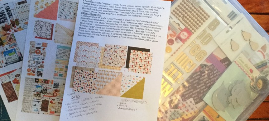
My substitute for the Tim Holtz distress stain is two Heidi Swapp shines in gold and mustard. I haven’t decided on which stamps to use but will most likely use some leaf and foliage stamps. The bows I will make out of scraps from the kit and I will turn some of my embellishment die-cuts into chipboard elements. My choice in washi tape is a lovely metallic and white diagonal stripe for some added bling. I may also add some wood veneers and some ribbon. 2018-09-02 16.16.04

My choice of alphas for titles is a mix of stickers and rub-ons. I have a packet of the foam gold Thickers used in the original kit and decided to mix in some burnt orange glitter stickers and chocolate brown rub ons. 2018-09-02 16.06.43

So, what might I make from this huge kit? I’m thinking about doing a range of layouts, some will be autumn themed, some will be cooking and a few will be based on family events, like picnics. I can’t wait to see what everyone else does.


2018-09-02 16.19.362018-09-02 16.19.202018-09-02 17.37.35

Some of the papers and embellishments came from the following paper pads and collections…


I have a few sheets which are in the maybe pile, I may or may not use them. There is a couple of mushroom papers, one in gold and one in black and white. I thought perhaps I could colour the images to bring them into the same colour palette as the kit. I also have a vellum which has a fall/autumn print which may be useful, a white and gold floral print and a wooden drawer print which could be used. 2018-09-02 16.05.06

I will share what I create as I work through the kit and mini-challenges. If you would like to see what other scrappers have gathered together for their kits make sure you follow the hop blog list on Counterfeit Kit blog.

The hop blog list…

Guest Designer – Janet Krause – https://youtu.be/V4KS39SmlXc
Leslie – Blessed
Tina – Falling for You

Laura – https://www.instagram.com/mrsp_scrapsandtea/


Times

What I have been working on is my one and only subscription kit which I purchase from Uniquely Creative. In my challenge to use things up and cut down on my spending, this is the one thing I couldn’t give up. What I love about this scrapbooking kit is that it often challenges you to try new techniques and products which you may not have used before. It is great value, you get loads of product based around one of Kaisercraft’s new collections. This months kit, from June, featured the Anthology collection. I try and create every layout with the kit which is possible if you add a few more pieces of cardstock and swap a few papers around. They also include card projects within the kit but I am no longer a card maker, so I use the ideas as embellishments on layouts.

Here are a few layouts I have made using June 2018, kit.  2018-07-22 11.11.19
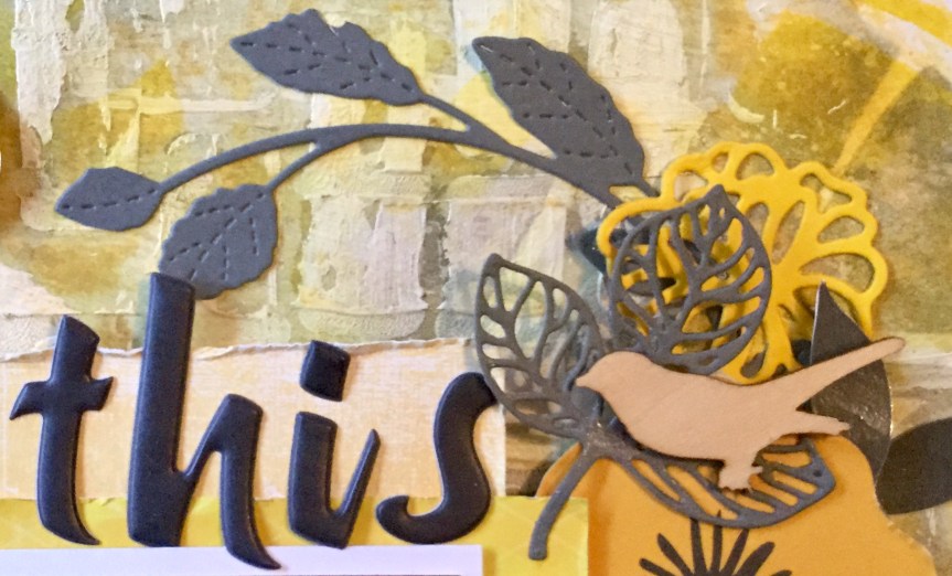
The first is one of the layouts designed by Tracey Schultz. I swapped the paint colours to suit my photo and used different bird embellishments.

The next kit layout I created was designed by Elisa Ablett, once again I made some changes to work with my photo and layout theme. My photos are of my grandson and husband stalking our chickens, well, there was a little bit of chasing involved. No chickens were hurt in the production of this layout!

I swapped the floral print paper for the Anthology 12×12 Scrapbook Paper – Plumology paper. Then I got to work colouring in the feathers to match with the colours in my photo, my grandson’s t-shirt was the inspiration. I loved how Elisa Ablett had coloured the chipboard title, so I followed her lead and used my Copic markers to do the same. It was an easy process, line up the ruler and run the marker along the edge of the ruler, the result is beautiful pastel lines!

I had several photos to use and decided to make it a double layout. The original design has flower die cuts, so I grabbed my Tim Holtz dies and some matching paper/cardstock scraps to make a bunch of flowers. I also inked up some flower embellishments and doilies to go with the colour theme. I am pretty happy with the finished layouts, they will be back to back in my album and I will add a pocket page layout for the rest of the chook chasing photos.

2018-07-22 11.11.42

2018-07-22 11.11.55

After making several of the kit layouts I went rogue and created my own layout. I selected papers and embellishments from the kit but added a few extras, using Kaisercraft dies, cardstock scraps and a very old Cosmo Cricket chipboard alpha called ‘Extra Extra’. Hitting the mark with my self-imposed challenge of using up an old product.

2018-07-22 11.12.11


Clean & Keen

Today I am on a mission to use up a patterned paper which I don’t like. We all have some paper which we wonder what were we thinking to buy that? Perhaps, it came in a kit or was a bargain that you couldn’t pass up. My piece is from a now defunct company, TLC, and has a very bright red, white and blue geometric circular design. It is definitely a dated design which would look very out of place in most contemporary scrapbook albums.

Having strong primary blue and red, I decided to use it for one of my son’s layouts. I am currently working on finishing off his childhood albums, let me just say that I am way behind. He turns thirty next month!

Clean and keen 2
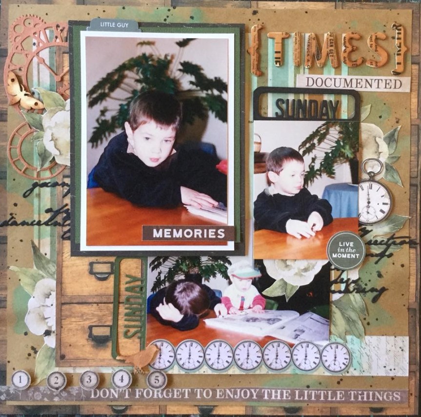
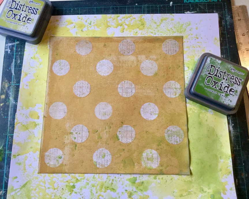
I started off by altering the paper itself, my photo is of my son and daughter bathed and ready for bed, and I was thinking about what related to clean. Bubbles seemed to pop into my creative brainstorm and would link nicely with the circular design on the paper. I used a Kaisercraft stencil and acrylic paint to sponge bubbles across the page.

After letting it dry, I sponged Ranger ‘Denim’ Adirondack Earthtones ink over the white painted bubbles. The layered stencilling creates an interesting texture. You can see in the photos that I use ordinary car wash Clean and keen 3sponge to apply my mix media colours. I have been using car wash sponge for years, you can pick one up from any of the cheap, two dollar type shops. Use some large scissors to snip the sponge into 8-10 pieces and you a have a very versatile application tool which has only cost you a couple of dollars for the whole lot. When working with inks you can use each edge of your sponge piece for a different colour! They wash clean very easily with soap and water, some staining will occur but doesn’t transfer when you use them next. When you use them with acrylic paint, wash them as soon as you finish otherwise they will dry with a firm crust. Should this happen, you can simply trim off the stiffened surface and you are good to go again.

Next, I got busy making some embellishments. One of my self-imposed rules is if I purchase anything new I must use it straight away. This week I purchased the WRK Precision Press, it is similar to the Misti and Tim Holtz stamping plates. It helps with aligning your stamps and makes stamping multiple copies of images a lot quicker. I grabbed a nice dotty border stamp and some text stamps and tried it out.


I cut some dies, the Uniquely Creative scribble circle die and layered them with my stamped embellishments. It took me a while to decide on the final placement and I shuffled and reshuffled them until I thought it looked balanced.


Finally, I decided what I liked, glued everything into place and added the title. I used some fairly new Kaisercraft alpha stickers and some very old Me and My Big Ideas alpha stickers for the title. I’m not that happy with the look of the title and may change it later, everything is a learning process. Overall, what went from an outdated and unloved piece of paper turned into something a bit more funky and fresh. It is not an outstanding layout but it is acceptable and is one more photo in the album.

Clean and keen 11


Break Time!

June challenge Show us your stuffThis challenge has been one of my favourite this month. The Show Us Your Stuff, June challenge is very open ended, you can do anything you like. They are encouraging you to hand make elements for your layout. Yay, time to get messy!

For my layout, I decided to not waste time thinking about the layout format but put my time into making cute embellishments. I selected a scrap layout from one of my favourite scrappers to scrap lift. Aliza Deutsch’s layout really drew me in with her great use of white space and interesting embellishments. I liked how clean and modern it looked even though it had several embellishments. I know some believe that you should not use other peoples work and always create your own. But history shows us that every artist learns from another and shares their skills with others, this is especially prevalent in our technological world. I am not saying copy another’s work and claim it as your own, but using someone’s ideas as inspiration or to challenge yourself is a great way to get started and learn new skills. Some days you just want to get started and not agonise over how to get going, with thousands of photos to scrap you need a few shortcuts. Scraplifting is one way of saving some time. If you are publishing your work you must make sure that you do acknowledge the original artist, and if possible, link to the original source. Aliza’s layout can be found here. As you will see below, I did follow Aliza’s layered format but moved it diagonally on the page to fit with my photo/paper size. 2018-06-24 09.45.02

Once again I tried to meet my self-imposed goals by using old supplies and incorporating mixed media supplies. After layering my papers and backing my photo, I started creating some tag embellishments. I looked through my scrap pieces for some wood look paper which would tie in with the wooden elements within the photo. This photo was taken 28 years ago! My how things have changed, I nearly didn’t use this photo and almost covered up the cigarette, but then I decided that it shows how things were then. It has a place in history. Yes, those viewing it in the future and now will be shocked but it demonstrates what society thought was ok back then…smoking inside with a child. Twelve years earlier than this, I remember as a child being asked to roll my grandfather’s cigarettes. Coming from a European background this was considered ok. Thank goodness we have all become more educated.

The stamped images are an old 2008 set from Stampin Up! I used Ranger inks to add an aged, heritage look to the tags. No, that is not tobacco stains! I used my favourite colours, the beautiful ‘Butterscotch’ Ranger alcohol ink which I poured straight from the bottle onto the cardstock and let it seep and flow into interesting shapes. I also poured a little onto a sponge and rubbed it over the card surface, you need to work very quickly as it evaporates. I used two Ranger Archival ink pads, Russet and Sepia, which I applied around the edges of the cardstock with a sponge.  I topped off the layout with a modern font title using Pink Fresh’s puffy alphas from the A case of the Blahs collection. I really like the end result, a nice meld of old and new.

Break Time 2


Mix it up!

Well, here I  go, my first scrap blog. I’m not sure why I have never done this, the blogging thing for my papercraft. I have been paper crafting for many years and sharing, learning and teaching various art disciplines for at least two decades. Because of this, I have some very old supplies and I am on a mission to use them up. I have set myself a few rules this month: using what you have; anything new must be used straight away and not stashed away; join in more challenges; make time for what I love and share what I create, and use my mixed media supplies to create embellishments.

Ok, so, in the last few weeks of June I have been working on making this happen. First up I have been researching the work of other wonderful artists and companies who have monthly challenges for us creative scrappers…woah, there is so many! For my first post, I am starting off with my favourite, who I have been involved in for a few years which is Anna’s Craft Cupboard Community, owned by Bri Richard Bartlett. The store provides a wonderful service but the scrapping community is what I treasure, everyone is passionate about what they do, supportive and fun. Bri and the design team put together two monthly challenges and also offer online crops throughout the year with loads of challenges. Their June challenges included a sketch challenge and a ‘share your favourite technique’ challenge. June 2018 sketch challenge

Draw!
My entry for the Anna Craft Cupboard, June 2018, sketch challenge.

My entry for the sketch challenge hit most of my self-imposed rules. I dragged out some old purple rubber text stamps and created some text embellishments using scraps of old papers. I had fun smooshing watercolour paint to create the rainbow background, then I scribbled over the paint with a Zig writer pen trying to recreate my grandsons drawing. I used some older KaiserCraft border dies and newer Uniquely Creative scribbly circle dies. Then I topped it off with some text quotes from my recent purchase, the Cocoa Vanilla ‘Boys Rule’collection.

June 2018 challenge

Awesome - One Cool Kid
My entry for the June 2018, Anna’s Craft Cupboard challenge.

My favourite, go to technique is stencilling. It is such a quick and easy way to create interesting backgrounds. This layout is also made from the Cocoa Vanilla ‘Boys Rule’ collection, I love the embellishment collections with this range and bought every one. They are super versatile and I have been using them for a whole range of layouts. The stencilled background was created from one of my favourite KaiserCraft stencils, the diamond pattern layers really well and creates great texture when you overlap it. I used my very old Ranger ‘Pool’ Adirondack Brights ink and the Stazon Jet black ink. The Stazon black looks very light as I intentionally sponged it very lightly, after sponging off the excess dark, full strength ink on a scrap of paper. I also bumped up the grunge of the paper by flicking on some black, brown and blue watercolour paint.