Hello everyone,
Today I am playing catch up on my blog, May is a crazy time of the year for me and my family and finding time to sit and blog is tricky. In May, every weekend is a party! We celebrate three (out of 6) family birthdays, mine included, and we also have Mother’s Day in Australia, add to that NSD (day, week, month…haha), the ACC Cyber Crop and then work stuff (standardised state testing, etc.) and life gets busy!
So, here I am sharing 3 layouts which I have squeezed in over the last few weeks, but haven’t found the time to share on my blog. Working backwards today…
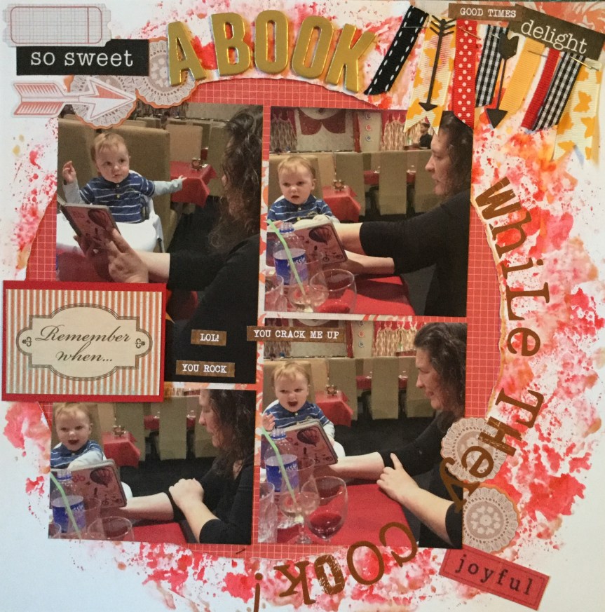
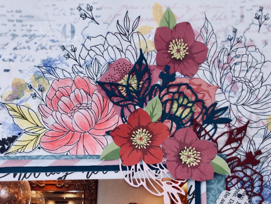
Layout #7
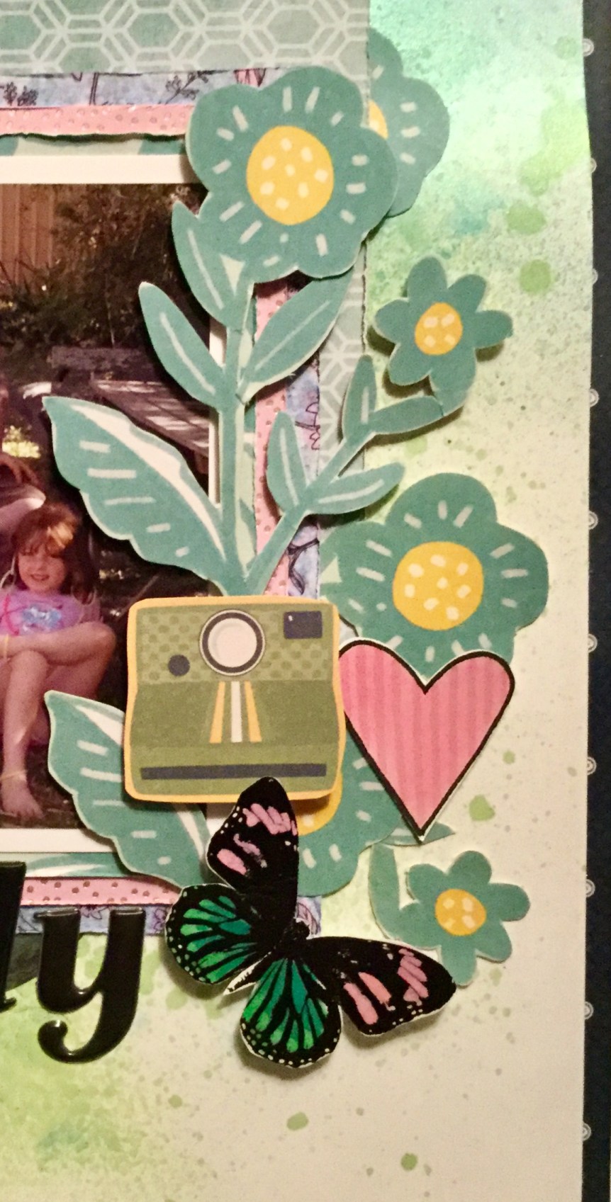
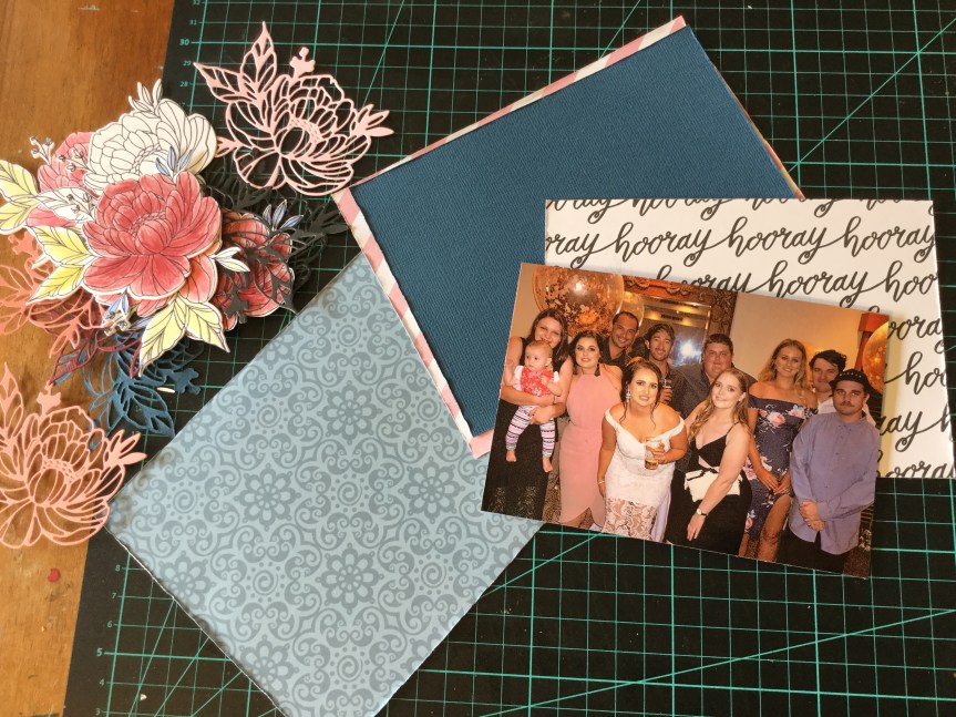
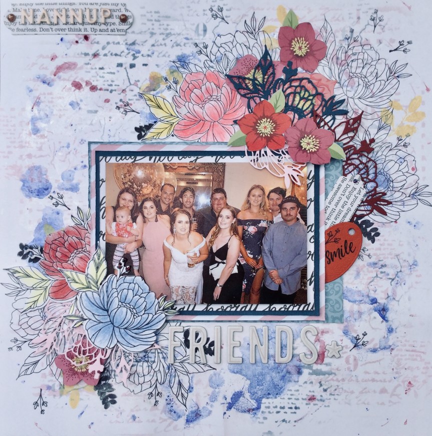
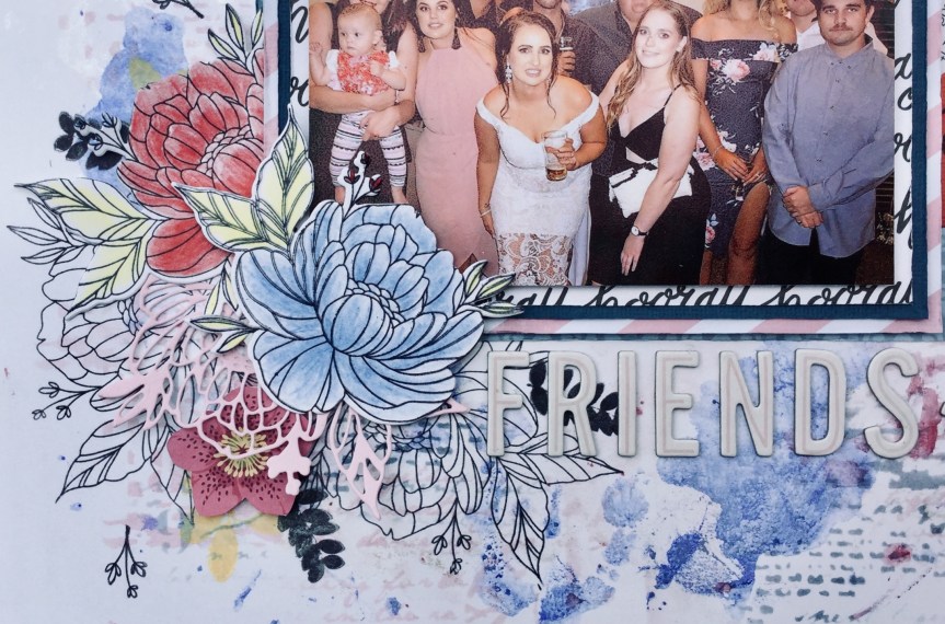
This layout features photos of my friends on holiday with me, we do an Art Trail tour throughout the W.A., South West and Greater Southern Region. As we travel, we stay at different local backpacker accommodation. We prefer cheap accommodation, then we have more money to spend on art/craft supplies, artworks, food and happy juice! These photos are when we arrived home late after a fabulous day out meeting artists and talking and viewing art, then a gourmet meal and plenty of happy juice, and we decided to play Scrabble. Things got a little silly, who knew that such words existed…um, they don’t!


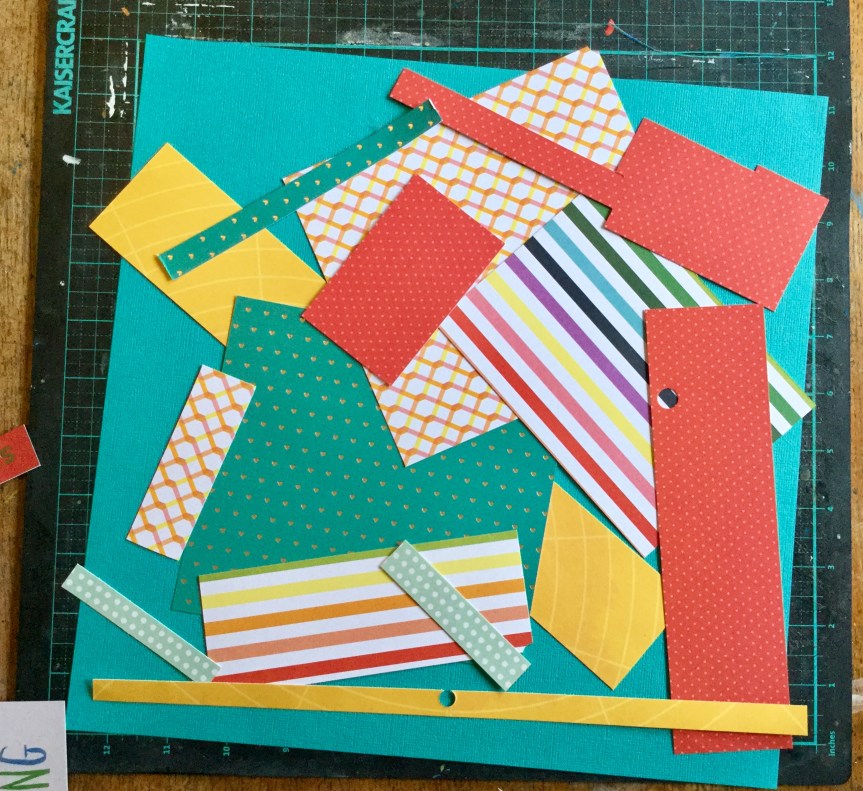
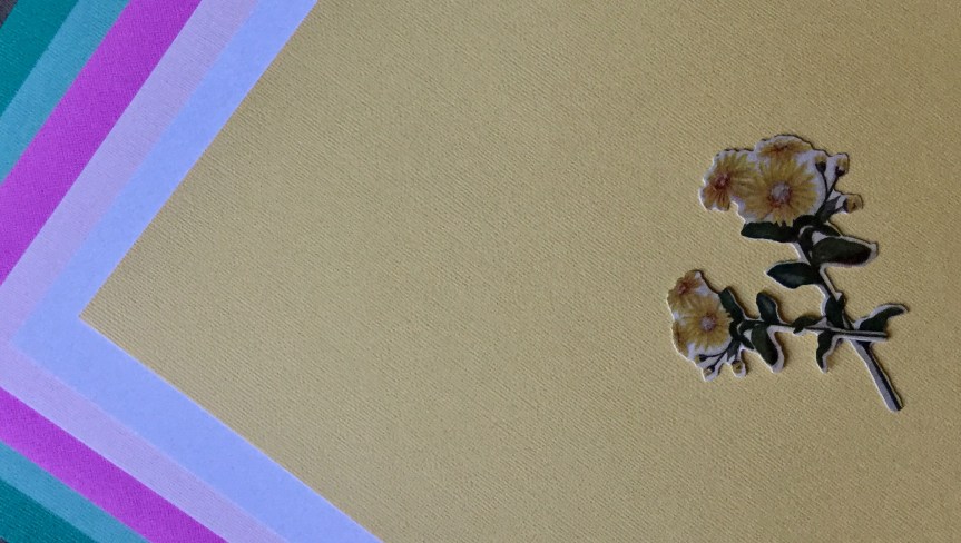
Using papers from my May CKC kit, I decided to create a layered border around my layout. I tend to always cut out the middle of the paper when layering, gives you more paper to use later. I thought the text paper would work well, given we were playing Scrabble in the photos.


Next, I thought I would add some letters to the page using stamps and archival ink. I also splattered on some watercolour paint in turquoise, red and blue.


I added a few tag and quote embellishments, some are from Kaisercraft and the little quotes are from Uniquely Creative. Then, I added my title and some subtitles. The main title is using American Crafts, Jewelry Box, Thickers and the subtitle is also an American Crafts, foam Thickers, called Happy Life, which I love and am trying to buy more of, but finding them sold out at most stores.


The finished layout, I am happy with it, it is fun and a little haphazard, much like the game we were playing.

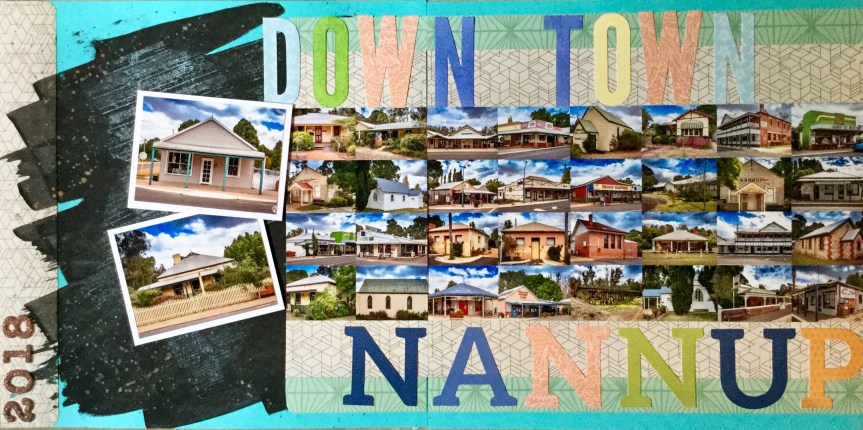
Layout #6
These photos gave me the opportunity to use some of the tropical papers and embellishments in my kit. Most of what I used came from the DCWV Bahama Mama paper pad which features lots of pineapples, flamingos, bananas and tropical foliage. Some of the papers have pink foil which gives it a little sparkle. I was interested in using the foliage papers, as the local cafe where we were having drinks has lots of these types of plants and you can see them in the photos.


I started by adding some patterned paper (flamingos, which had nothing to do with the photos), a doily and an embellishment 6×4 card which I trimmed down. I thought about where my photos would be placed. I had wanted to include three photos but it just didn’t look right, so one got binned. I ended up trimming down the tropical background and mounting it onto some green cardstock, I seem to have a thing for borders at the moment.

I felt like adding a bit of sparkle to the layout and strategically splashed on some Heidi Swapp, Mustard Color Shine. This would be my next favourite Color Shine, after the gold, it really glows and is vibrant, some of them are not as showy.


Oops…doily wrinkles will need to be covered.
Then I mounted my photos and began building layers of paper and cardstock behind  them. I had fun adding the embellishments, I really wanted to use up quite a few of the embellishments from my kit, many of the ones I used are from a Heidi Swapp ephemera pack and some I fussy cut from the AC Bahama Mama papers.
I like how the layout turned out, it is one more layout towards our family moments album, about our long lost relatives who came to visit.

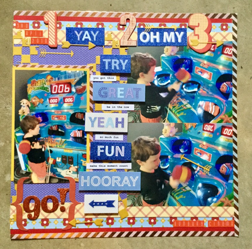
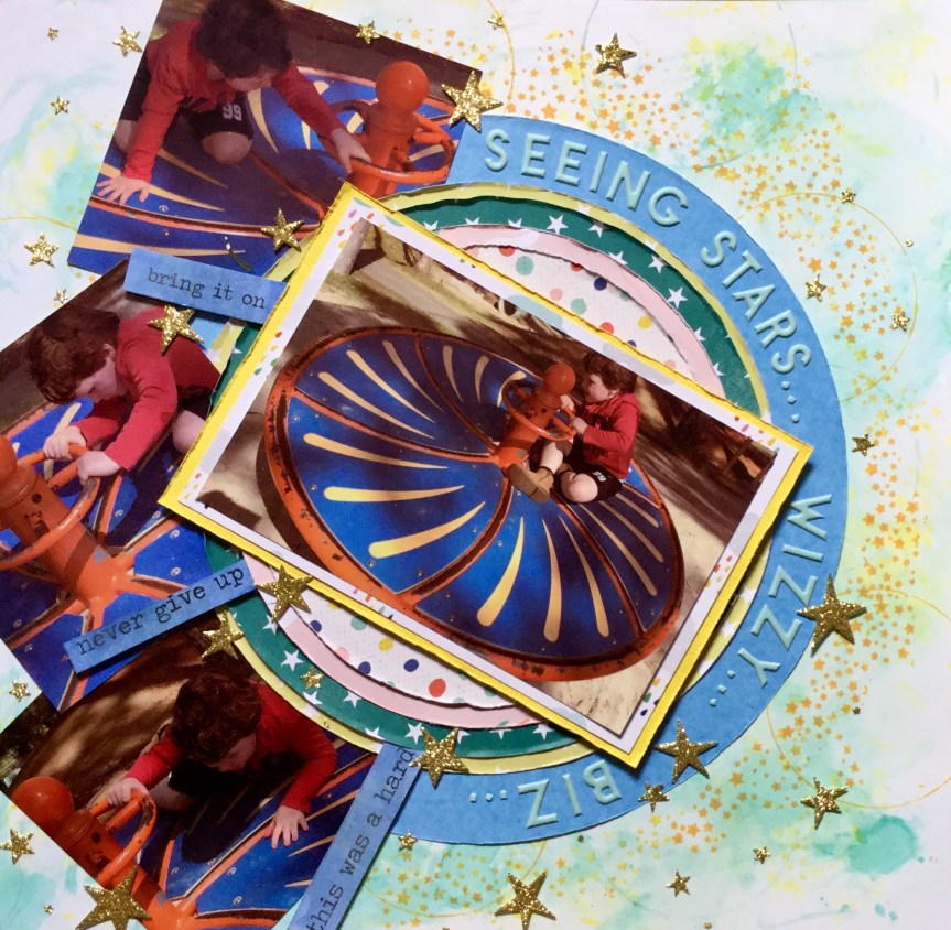
Layout #5
This layout, made from my CKC kit, turned out bright and fun. It is a scraplift from a 2016, Becky Fleck Pagemaps.


The layout features photos of my grandson and his cousin using a bouncy castle at the Simmos Icecreamery. It is a very simple design, no mixed media, but I did try and focus on getting in some movement by using downward strips of paper and layering the photos on the diagonal.


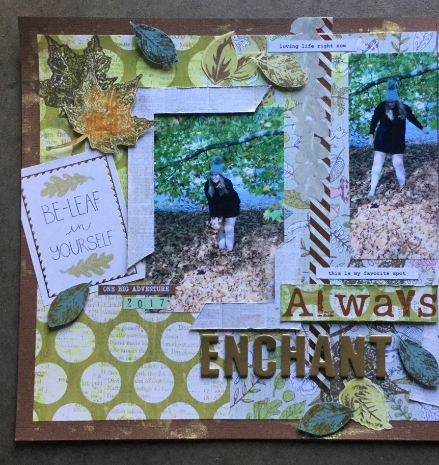
As you can see, all of these layouts still need the dates and journaling added. I am very bad at adding the journaling during the creating process and always end up making the journaling a process in itself, sitting at the computer with a whole stack of layouts and going through them one by one. I very rarely hand journal, as I have terrible handwriting.
Please do keep sharing what you create on the FB Counterfeit Challenge Website and blog? Make sure that you keep up to date with what others are creating on the Monthly Link Up page.
Keep on scrapping everyone 🙂


 channel. She is a wealth of knowledge and so generous with her time and skills. For a while, Janet has been making a series of videos called 4 for 4. The idea is that you use a set amount of papers (5), cut into a specified size, and then add in some alphas and embellishments to create 4 layouts and some cards. Janet talks you through the whole process step by step, through her videos. This month, I decided to give it a go. I hadn’t tried it out before, but have used similar systems to create mini albums (6×6 and 8×8) in the past. Using a system like this can really speed up your productivity and get a whole heap of layouts completed and into albums.


")


 you happy. The colours and patterns in the kit offer up loads of variety for various layout themes and the embellishments are a very versatile mixed bag of objects, text and glitz. I had a lot of fun searching through my stash and selecting papers that mimicked the original kit in either colour, motif or pattern.


 posing for the photo, so the quality is not great. It is a little blurry but does capture his cheekiness. Let me just say that the playdough man is magnificent, a work of art! Well, I may be biased, it does have all the important elements of a human which is the goal when you are four. It was the playdough figure which triggered my idea for the forged paper. The playdough feet are rough circles, much like the black and white circle paper featured in the Felicity Jane ‘Hannah’ kit.


 decided to substitute this with a strip of polka dot paper trimmed down to create a scalloped edge. I attached this to the edge of the woodgrain background.


 So, first up, I went with a photo of my daughter and her friends having a night out. The photo has several of the pinks, blues and burgundies found in the Felicity Jane ‘Hannah’ collection.


")

")


 simple in pattern and design, but I fell short when rummaging through my supplies. I struggled to find just the right subtle blues, greens and pinks. I didn’t quite make it with the patterns, mine were either too heavy and thick in line or not geometric. Even though I knew I had previously had some fish scale/scallop paper, I could not find a scrap of it. So, here is what I ended up with…


 For my embellishments, I didn’t have a lot which matched with the original kit. Being a girl obsessed with colour, I don’t tend to buy scrapbook supplies with such a mild palette. I decided that I could forge many of them and make my own. So, I dug deep into my dies and stamps and found similarly themed ones which I could use with my papers/cardstock to make a range of embellishments.


 majority have been male. Also, remember that I had a go making
 and more pinks and greens. I have tried to base mine on picking up the colours and feel of this kit.


 Next, I put the layout together using a simple, linear, layered design, overlapping the papers and adding my embellishments. As I don’t have any puffy stickers, I used some wooden cherries which I coloured with Tim Holtz’s red Barn Door ink. It wasn’t the best choice but was sitting on my desk, it rubbed off on my fingers and I had to apply some Microglaze to try and seal it. I should have used a dye ink. I added some small text and alphas from my CKC kit. A fairly quick and simple layout, another one for the family album.
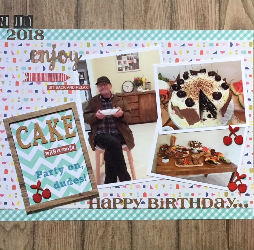

 Hello Scrappers, I am back joining in with the


 “What are we going to do now?”. He keeps us all on our toes, working and creating.
 Each layout was a quick and simple design with a little stamping and ink on number ten. Both layouts are inspired by the work of others, as I just wanted to get them done and move onto the October Counterfeit Kit Challenge.


 the rural Great Southern region of our state. Three of my artist friends and I set off on Sunday to begin our road trip pursuing the

 Know idea what that is? We didn’t know either. It is a medium which you can use that gives the appearance of encaustic wax without all the mess and heating. You can create luscious layers of translucent colours, embed materials in your work and if using oil paint, it speeds up the drying process. You can get several different versions/brands, we managed to track down some Langridge Wax Paint Paste. I can’t wait to try it out and see if it works with a range of mixed media techniques.


 I am looking forward to seeing the October CKC kit, there have been sneak peaks on FB. I am loving those colours and the woodgrain. I can’t wait to see what everyone creates with their version of this month’s challenge kit. Keep creating and enjoy the last day of September. I will be trying to get a couple more layouts completed from my counterfeit kit.


 lot of layouts featuring circle formats or circle embellishments. So, I delved back in time and was inspired by Julie Walton’s, Belly Laugh layout. Julie’s layout is pretty simple with clean lines, as usual, mine turned out very busy with lots of embellishments. Well, I am trying to use things up!