

Good Morning,
Today I am sharing a few more layouts using the Heidi Swapp, Wolf Pack collection. In June, when I first got this paper pad, one of the FB groups put out the challenge to use up a whole paper pad. Now, the idea was to use an old one which  you have had sitting around for a few years, untouched! I did not have any untouched paper pads, only brand new ones (birthday/Mother’s Day gifts) which is why I decided to use this paper pad. I am doing well, getting through the pad with 14 papers left out of 36. The ones left are mostly pine trees, wolves and bear papers, given that I live in a country with no wolves and bears it is a challenge.
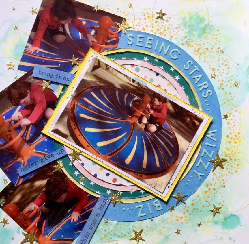
The first is Layout #3. I used the paper which looks like a starry night, it is the B side of the Tracks paper. On top of this, I stencilled white gesso using a Studio Light Grunge collection stencil. I blended the edges of the gesso to give it a milky way look. I then splattered white watercolour paint over the paper to increase the number of stars on the paper.


Once dry, I added different shades of blue Tim Holtz Oxide Inks which seeped into the gesso crevices (using water/brush) and blended into my starry night (using blending sponge).


Then, I mounted my photo onto scraps of the Wolf Pack collection papers and adhered it to the background.
Next, I used the stencil and oxide ink on white cardstock to create some embellishments. I cut this apart into little triangles and diamonds and layered them onto the page using foam and double-sided tape.


The finished layout came together well with the addition of a title and a few acrylic stars.

Next, Layout #4. This layout was very simple and quick, I used the map paper  and added some colour across the page using the plastic bag smooshing technique. The Tim Holtz ‘Tumbled Glass’ oxide ink created a soft blue surface to work on, I then splattered some watercolour paint across the page in browns and blue.


Then, I worked on building layers with patterned paper from the Wolf Pack and assorted embellishments from my stash.


The final touch was adding the title.
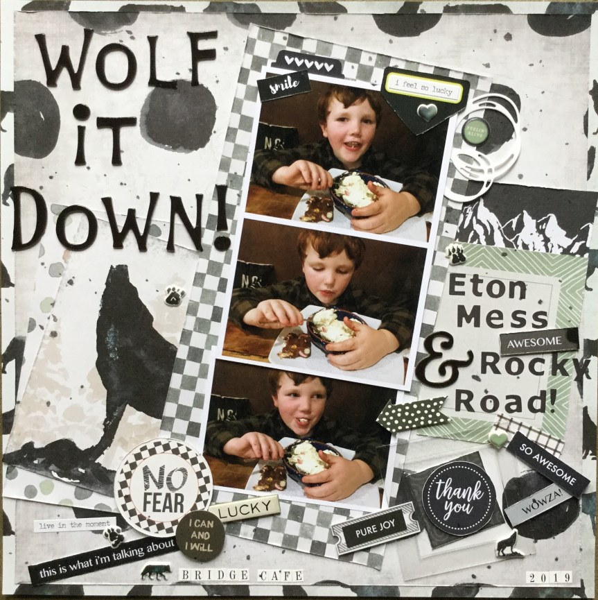
Layout #5. is my favourite so far. I wanted to find a way to use the wolf papers  in the collection and finally come up with an idea when I came across some photos of my grandson eating some dessert.
I started by creating a framed background using two of the papers. Then I built up papers to mount my photos on and added the title ‘Wolf it Down’. No mixed media was used in this layout.


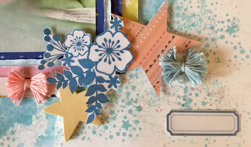
A subtitle was added using part of the cut apart sheet and then lots of text quote embellishments and some Wolf Pack puffy stickers.


The finished layout ended up just how I wanted it, messy and fun.


 doing. When I haven’t been working I’ve been snuggled up reading, scrapbooking or sorting. The sun has been beaming sometimes but it has been bitterly cold and so, I am more than happy to sort and clean spaces.
 Nope, there was three finished layouts and a dozen not finished! And…they were old! Not just a little old, big old, like 12-15 years old! So, I’m sitting on the floor looking at these layouts and I laughed at how terrible some of them were, and I cringed and questioned what was I thinking? They were terrible, there was no design thought, no embellishments on many, no style what so ever and certainly no mixed media. They were seriously old school and I could see why I hadn’t been interested in finishing them. Hmm… what they did have was photos, not all of them great either but still images of family history which needed to be rescued. So, after pondering on how far I had changed in scrapbooking technique and skill, plus attitude (Yep, at one stage in my life I did not like or see any benefit in scrapbooking, I even complained about having to do it (in my workplace), I was a stamper/artist. My husband loves to remind me about this, now that every spare minute is spent on scrapping.), anyhow, I decided to finish or redo the layouts.


 wanted to use up more of


 I am loving the papers, all that greenery, yummy teals and beautiful, bright hibiscus flowers. The problem is I don’t have any tropical photos, no tropical island holidays for us yet! Though, it did give me the opportunity to remind hubby about how he mentioned he’d like to go to Fiji, the perfect reason to holiday…to use up scrapbook paper.


 posing for the photo, so the quality is not great. It is a little blurry but does capture his cheekiness. Let me just say that the playdough man is magnificent, a work of art! Well, I may be biased, it does have all the important elements of a human which is the goal when you are four. It was the playdough figure which triggered my idea for the forged paper. The playdough feet are rough circles, much like the black and white circle paper featured in the Felicity Jane ‘Hannah’ kit.


 decided to substitute this with a strip of polka dot paper trimmed down to create a scalloped edge. I attached this to the edge of the woodgrain background.


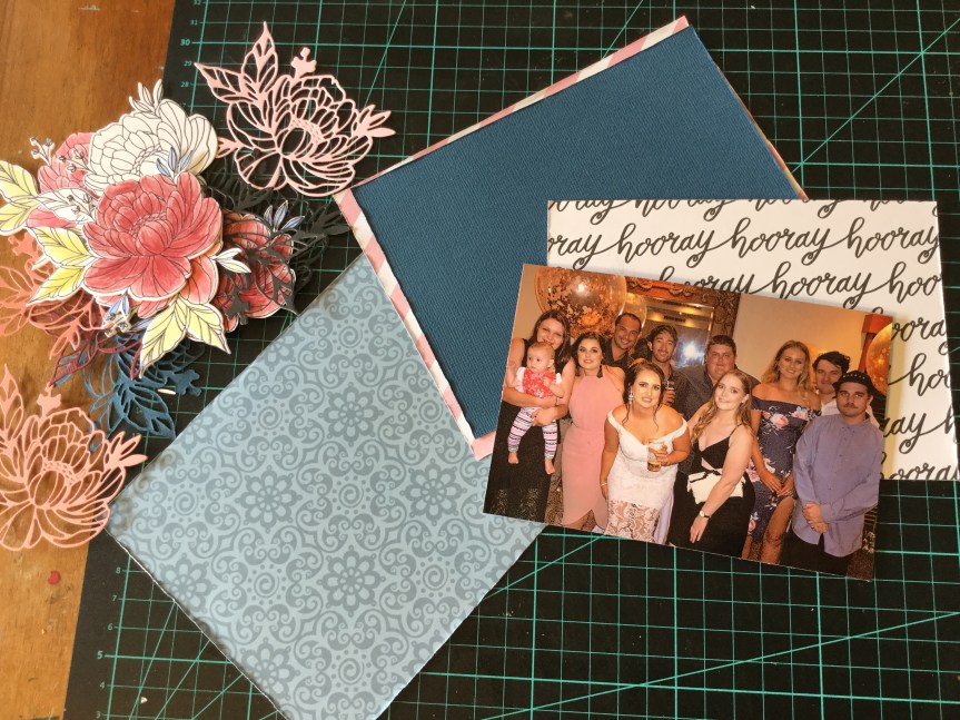
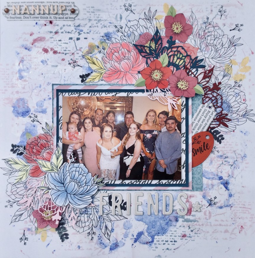
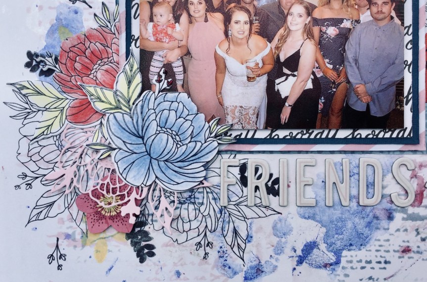
 So, first up, I went with a photo of my daughter and her friends having a night out. The photo has several of the pinks, blues and burgundies found in the Felicity Jane ‘Hannah’ collection.


")

")


 simple in pattern and design, but I fell short when rummaging through my supplies. I struggled to find just the right subtle blues, greens and pinks. I didn’t quite make it with the patterns, mine were either too heavy and thick in line or not geometric. Even though I knew I had previously had some fish scale/scallop paper, I could not find a scrap of it. So, here is what I ended up with…


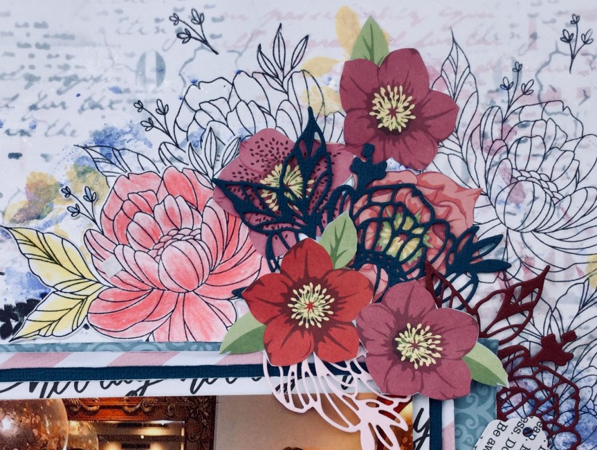
 For my embellishments, I didn’t have a lot which matched with the original kit. Being a girl obsessed with colour, I don’t tend to buy scrapbook supplies with such a mild palette. I decided that I could forge many of them and make my own. So, I dug deep into my dies and stamps and found similarly themed ones which I could use with my papers/cardstock to make a range of embellishments.


 watercolour style! This worked well, I tried out both the black printed image and the light grey. What I found with both was that the paint did put an opaque film across the printed image. This was easily fixed by going over the images with a black permanent marker. It even enhanced it, giving them a more handmade look.


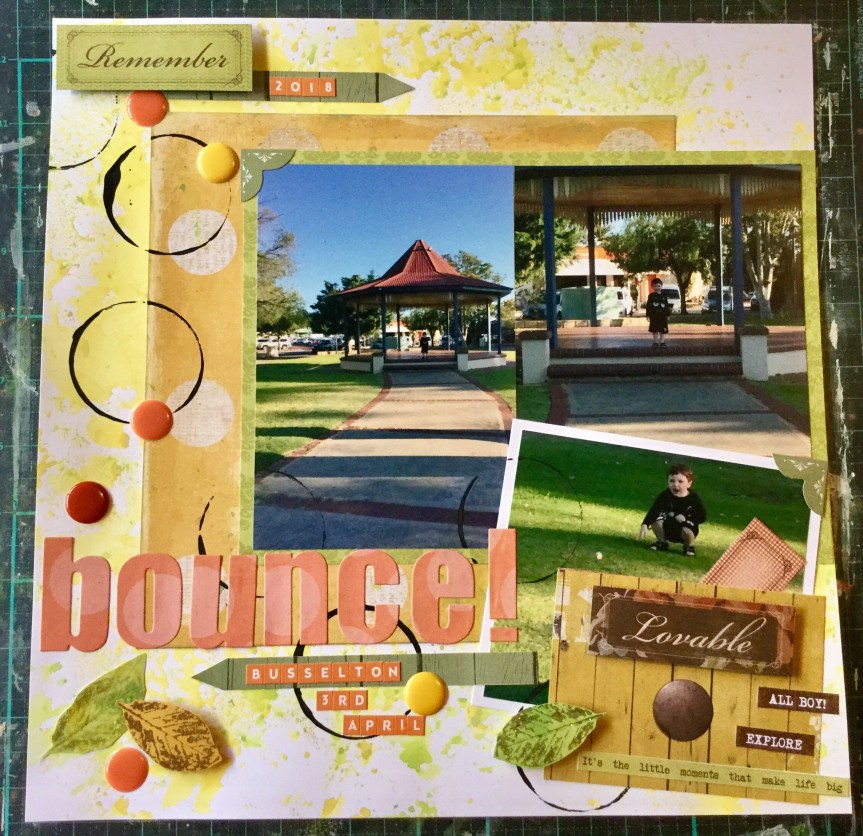
 Nanny duty looking after my grandson while his mum was at work. We had a great day doing lots of things and stopped along the way to buy a drink. The store had one of those giant gumball type machines filled with coloured bouncy balls. He was very excited to use his $2 coin and get a ball. We went across the road to this little park to try out the new ball and did it bounce….yeah, like crazy! Thirty minutes of fun and laughter.


 I started off by altering the paper itself, my photo is of my son and daughter bathed and ready for bed, and I was thinking about what related to clean. Bubbles seemed to pop into my creative brainstorm and would link nicely with the circular design on the paper. I used a Kaisercraft stencil and acrylic paint to sponge bubbles across the page.
 sponge to apply my mix media colours. I have been using car wash sponge for years, you can pick one up from any of the cheap, two dollar type shops. Use some large scissors to snip the sponge into 8-10 pieces and you a have a very versatile application tool which has only cost you a couple of dollars for the whole lot. When working with inks you can use each edge of your sponge piece for a different colour! They wash clean very easily with soap and water, some staining will occur but doesn’t transfer when you use them next. When you use them with acrylic paint, wash them as soon as you finish otherwise they will dry with a firm crust. Should this happen, you can simply trim off the stiffened surface and you are good to go again.


