

Hello,
My first layout with my April Counterfeit kit is based around the Forgery on the Fourth challenge where you make some of the kit supplies. As I mentioned earlier, I had included a few black and white papers which had some similar patterns and motifs to the original March, Hipkit Club kit. This Maggie Holmes paper 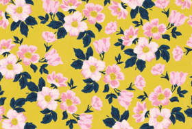 with a yellow background and flowers is really striking in the Hipkit Club kit and makes a bold statement of springtime. I wanted to try and turn my black & white floral into this vibrant mood by simply colouring it in. I decided to use coloured pencils and markers.
First I coloured the leaves in using a navy marker and then worked on the background, first using an ochre pencil and then working over this with a deep yellow pencil. It gave it good coverage and created a mustardy, warm yellow.


Next, I coloured the flowers using a pale pink Copic marker and added the darker pink to the flowers by blending in some rose pink coloured pencil.


I really liked the result, I felt that I had created the same mood and feel which the original had and got busy selecting the other papers for my layout. As usual, I looked for the colours in my photos to help select the papers from my kit.


This layout features photos of my daughter’s navel piercing, an odd thing to scrapbook, you might think? She certainly did! Let me say, that she sent me the photo of her new addition and was very proud to have finally gone through with the piercing. She had worked hard to get into shape, having lost over 24kg, through joining a gym and healthy eating. It was one of her goals to have a navel piercing on a belly good enough to show off!
Back to scrapping…
I wanted to use some of the sprays included in my kit and selected the distress ink. It proved too strong for the look I was after, so after wiping away most of it, I used some white acrylic paint to soften it into dreamy pink clouds and swishes. Then, added some blue splatters of ink.


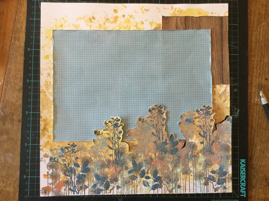
I had just watched Janet Madison’s latest layout sharing video and was reminded about her using up scraps to create a border frame. I liked the idea of including all the patterned paper I had selected to form the outside border of my layout and quickly put it together.


I liked how the frame looked but when I added my pink mixed media cardstock everything just screamed…NO! I really didn’t like it, I needed something to stop the two clashing. I rummaged through my kit to find something to fix it and pulled out some gold washi tape. The gold tape did improve the clash slightly but I didn’t like the result, it reminded me of old ladies who go cruising in leopard print shirts and gold lycra hot pants!


Things were not going well. I moved onto mounting my photos using the patterned papers, roughing up the edge of each layer. These I liked and I spent quite a bit of time trying to create layers on my background to place them on without creating more clash. It wasn’t quite working with my forged yellow flower paper being so bright. I decided to stamp some foliage onto the background to draw the viewers eye away from all the brightness.


After lots of fiddling around and indecisiveness, I thought I should snip off a piece of the forged paper and use it to fussy cut some flower embellishments. This layout was taking a long time.


At last, things began to work for me and I managed to complete the layout using a selection of embellishments from my kit. It did not turn out like the layout I had envisioned, the use of the gold washi tape forced me to include some gold die cut embellishments. Surprisingly, this didn’t work out so bad, as the navel belly bar is made of gold.


A lot of messing around and not super happy with it, but it is finished.
Time for number two layout…with no gold in sight!

 or check out the
  papers with blues and florals and that green large polka dot had me stumped. What did I select? I went through the process of colour and pattern selection and then thought about what I could modify or make. Here is what I found…


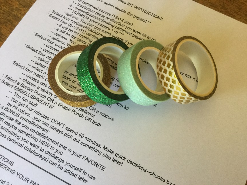
 etc. and sorted them all by colour/theme into ziplock bags. I pulled out my neatly organised die-cuts and sorted through the bags of similar colours to the kit. Wozer, I found a tonne of similar motifs and quotes/ text to include in my kit.


 technique. You can view all of Janet’s videos for the series on her YouTube channel, RTS (Record the Story) Scrapbooking. As usual, I made some changes along the way, something Janet promotes…there is no one way, make it your own!


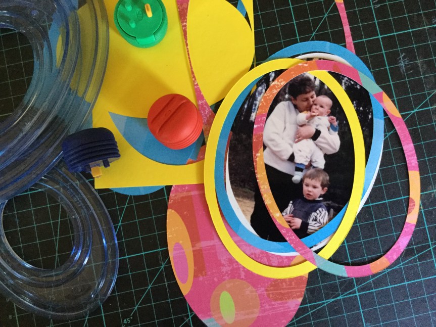


 mixed things up using old and new supplies and this time added some stamping and splashes of watercolour paint. Both of the layouts are using old photos of my daughter, the photos were once framed and hung in our hallway. Unfortunately, over the years, they have fallen off the wall and the frames had smashed, I hid them away waiting for the right sized frames to come along with which to fix them. I have had no luck in finding similar sized and shaped frames, so I decided to use them as is or scan the photos (to enlarge) and create layouts to include in my daughter’s albums. Here is the result…


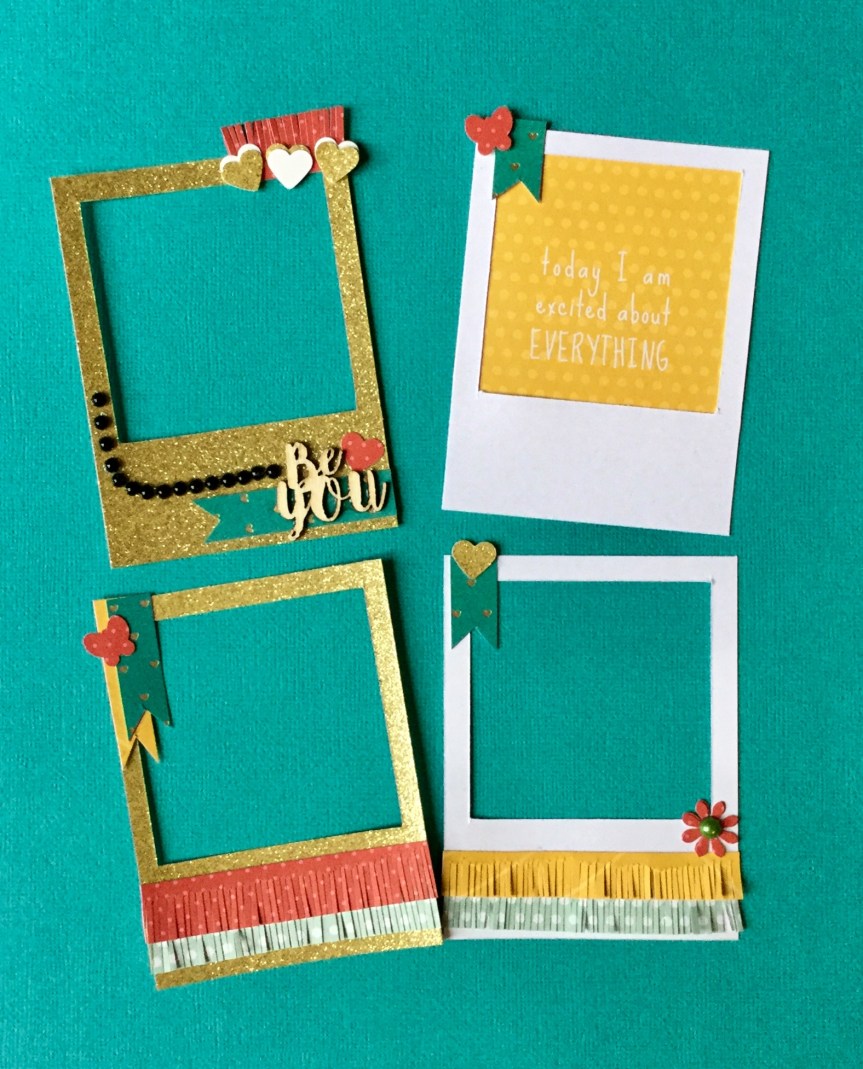


 channel. She is a wealth of knowledge and so generous with her time and skills. For a while, Janet has been making a series of videos called 4 for 4. The idea is that you use a set amount of papers (5), cut into a specified size, and then add in some alphas and embellishments to create 4 layouts and some cards. Janet talks you through the whole process step by step, through her videos. This month, I decided to give it a go. I hadn’t tried it out before, but have used similar systems to create mini albums (6×6 and 8×8) in the past. Using a system like this can really speed up your productivity and get a whole heap of layouts completed and into albums.


")


 you happy. The colours and patterns in the kit offer up loads of variety for various layout themes and the embellishments are a very versatile mixed bag of objects, text and glitz. I had a lot of fun searching through my stash and selecting papers that mimicked the original kit in either colour, motif or pattern.


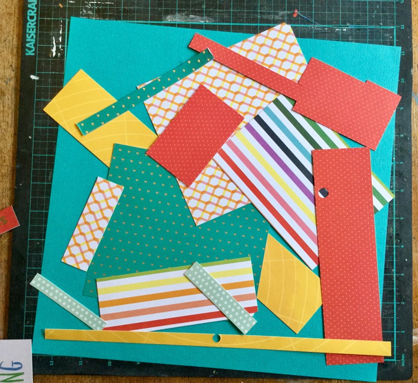
 Scraps


 in your layout and my order of
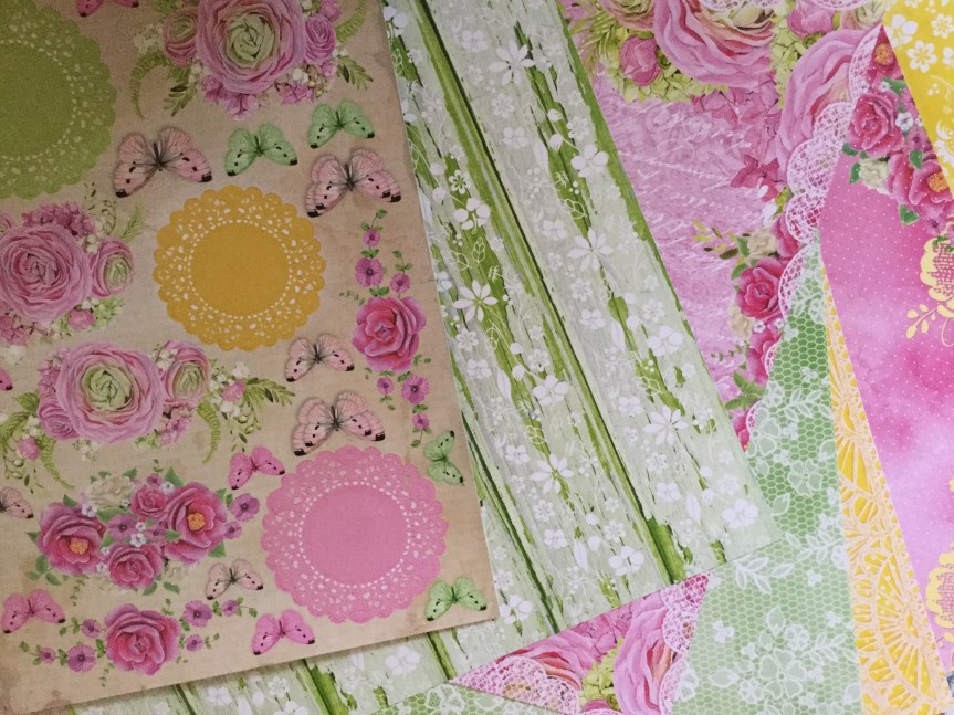


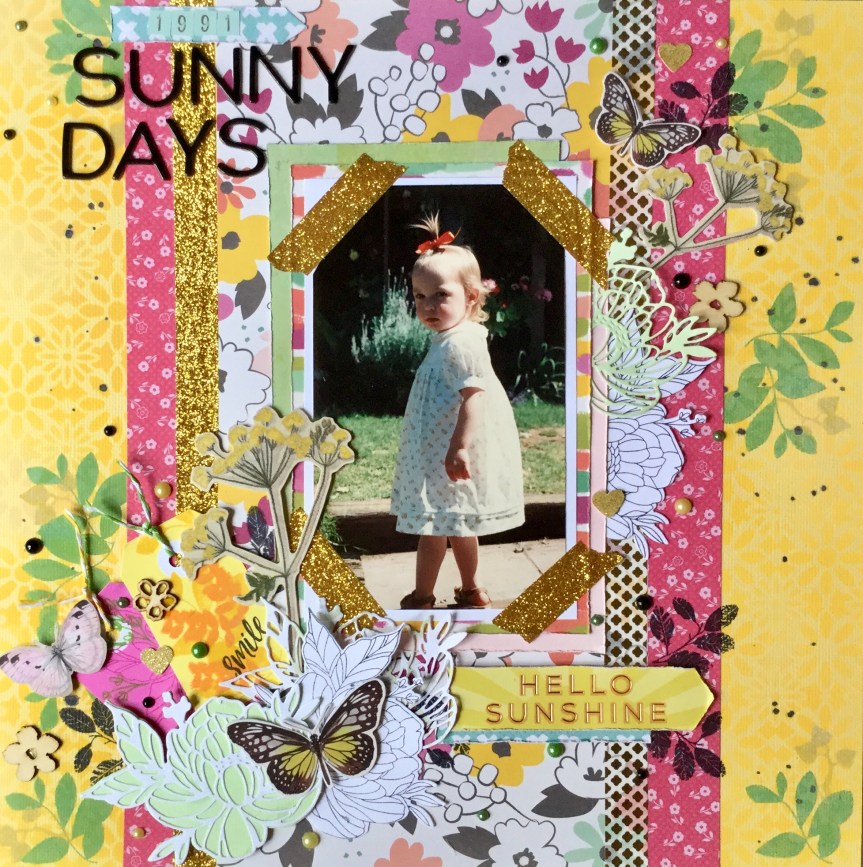
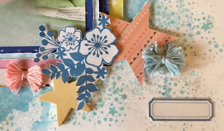
 4 x 6 rectangles which I used for frames and pieces to mat the photo. The two 4 x 6 left were used to cut embellishments with my Sizzix Bigshot. I used a mix of dies, many were from the Uniquely Creative and the KaiserCraft range. I decided that I needed a few more greens and some white to balance the layout, so found some scrap papers and cardstock to cut a few more diecuts. You can see that I incorporated some traditional design styles and some contemporary designs. I used the geometric die because of the pattern on my daughters top. The top was handknitted by my mother, which I had completely forgotten about until I started working on the layout. She knitted many clothes for my children, a pastime which she has had to give up due to arthritis.


 I am loving the papers, all that greenery, yummy teals and beautiful, bright hibiscus flowers. The problem is I don’t have any tropical photos, no tropical island holidays for us yet! Though, it did give me the opportunity to remind hubby about how he mentioned he’d like to go to Fiji, the perfect reason to holiday…to use up scrapbook paper.


 looking at my photos I wanted to emphasise the sense of going down into the earth. I decided to cut around the stamped foliage with a scalpel and slip some of the photos behind the cuts. Dah, Dah… walking down into the cave.


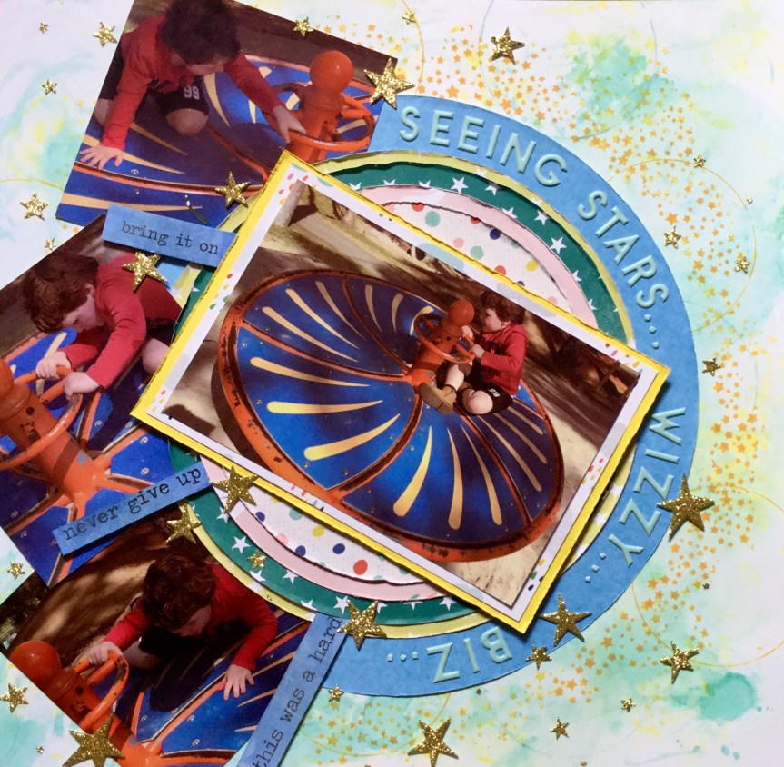
 posing for the photo, so the quality is not great. It is a little blurry but does capture his cheekiness. Let me just say that the playdough man is magnificent, a work of art! Well, I may be biased, it does have all the important elements of a human which is the goal when you are four. It was the playdough figure which triggered my idea for the forged paper. The playdough feet are rough circles, much like the black and white circle paper featured in the Felicity Jane ‘Hannah’ kit.


 decided to substitute this with a strip of polka dot paper trimmed down to create a scalloped edge. I attached this to the edge of the woodgrain background.


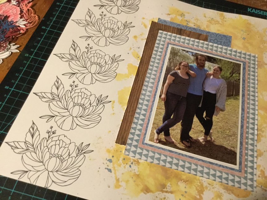
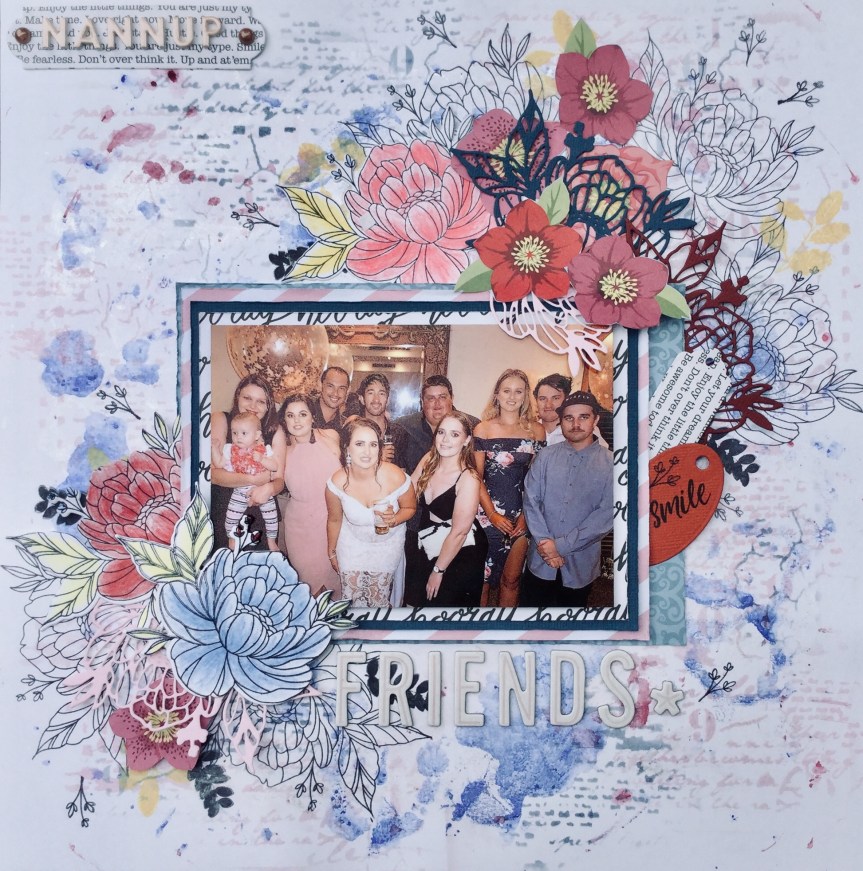
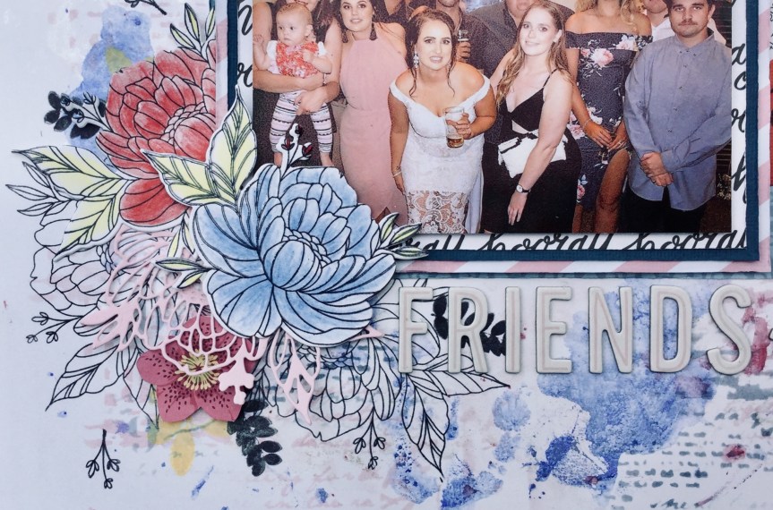
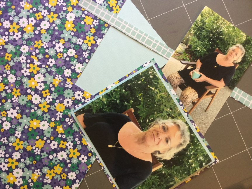
 So, first up, I went with a photo of my daughter and her friends having a night out. The photo has several of the pinks, blues and burgundies found in the Felicity Jane ‘Hannah’ collection.


")

")


 simple in pattern and design, but I fell short when rummaging through my supplies. I struggled to find just the right subtle blues, greens and pinks. I didn’t quite make it with the patterns, mine were either too heavy and thick in line or not geometric. Even though I knew I had previously had some fish scale/scallop paper, I could not find a scrap of it. So, here is what I ended up with…


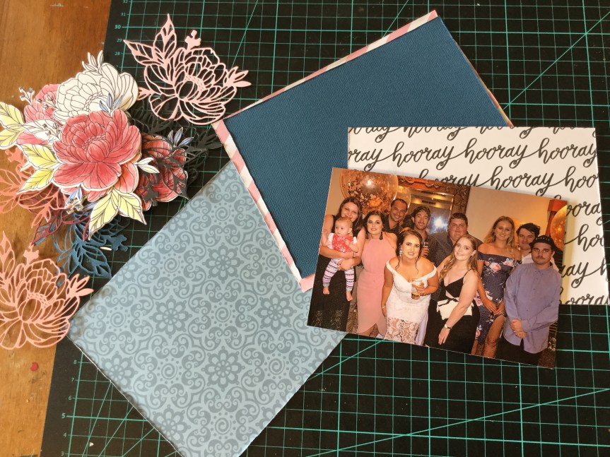
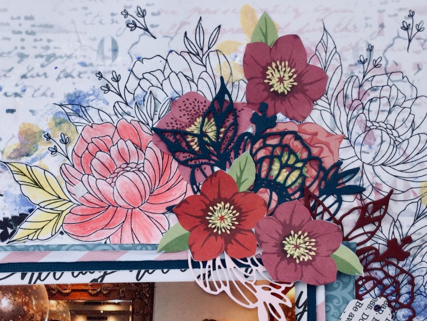
 For my embellishments, I didn’t have a lot which matched with the original kit. Being a girl obsessed with colour, I don’t tend to buy scrapbook supplies with such a mild palette. I decided that I could forge many of them and make my own. So, I dug deep into my dies and stamps and found similarly themed ones which I could use with my papers/cardstock to make a range of embellishments.


 watercolour style! This worked well, I tried out both the black printed image and the light grey. What I found with both was that the paint did put an opaque film across the printed image. This was easily fixed by going over the images with a black permanent marker. It even enhanced it, giving them a more handmade look.


