April 2019 CKC Layout #2


Hello again,

Today’s share is my second CKC layout for this month. Once again, I started off with creating some more forgery items, this time it is some embellishments. The original inspiration kit for the April, Counterfeit Kit Challenge, was based on the March, Hipkit Club kit and had butterflies in sticker and die cut form. They were coloured either pink & green or in shades of blue. I attempted to copy these by colouring my black & white Kaisercraft butterfly paper with Copic markers and fussy cutting them out to use for embellishments on my layout.

Next, I tried my hand at forging another patterned paper. There is a lovely floral print with pink flowers and foliage and a blue background in the Hipkit inspiration kit. I couldn’t find anything similar in my stash to use as part of my kit, so decided to spend some time colouring in this brown and white Kaisercraft paper. I used a pink Copic marker for the flowers/foliage and a navy pencil for the background. It was a more difficult paper to colour and it was hard to get good coverage for the background.


I selected a range of papers to use for the layout based on colours I could see in my photo. I wasn’t sure it was going to work, some of the papers had strong designs and colours.

IMG_6710

Forgeries finished, I got busy using some sprays on white cardstock to create the background of the layout.

After drying and ironing my background, I began to think about building up further layers in green tones. I remembered that there was a patterned paper with large green polka dots amongst the Hipkit Club kit. I decided to borrow this idea and use one of the green papers I had in my kit to make polka dots which I fixed onto my background.

Then, I focused on mounting my photo with layers of patterned papers, including the coloured in patterned paper that I had worked on earlier.

I then trimmed down the background cardstock and mounted it onto the navy and white spot paper, this created a nice frame around the edge of the layout.

After building up the layers under my photo I fixed it onto the background using double-sided tape.

Then, I began to plan out where I would place my embellishment clusters and titles. I added some cameras along the edge which I had fussy cut from some patterned paper. I fussy cut out some flowers to use as embellishments and added my hand coloured butterflies.


After adding the titles, my layout was finished, another one for the family album.

IMG_6768IMG_6767IMG_6766

IMG_6765

April 2019 CKC Layout #1.

Hello,

My first layout with my April Counterfeit kit is based around the Forgery on the Fourth challenge where you make some of the kit supplies. As I mentioned earlier, I had included a few black and white papers which had some similar patterns and motifs to the original March, Hipkit Club kit. This Maggie Holmes paper img_6704.pngwith a yellow background and flowers is really striking in the Hipkit Club kit and makes a bold statement of springtime. I wanted to try and turn my black & white floral into this vibrant mood by simply colouring it in. I decided to use coloured pencils and markers.

First I coloured the leaves in using a navy marker and then worked on the background, first using an ochre pencil and then working over this with a deep yellow pencil. It gave it good coverage and created a mustardy, warm yellow.

Next, I coloured the flowers using a pale pink Copic marker and added the darker pink to the flowers by blending in some rose pink coloured pencil.

I really liked the result, I felt that I had created the same mood and feel which the original had and got busy selecting the other papers for my layout. As usual, I looked for the colours in my photos to help select the papers from my kit.

This layout features photos of my daughter’s navel piercing, an odd thing to scrapbook, you might think? She certainly did! Let me say, that she sent me the photo of her new addition and was very proud to have finally gone through with the piercing. She had worked hard to get into shape, having lost over 24kg, through joining a gym and healthy eating. It was one of her goals to have a navel piercing on a belly good enough to show off!

Back to scrapping…

I wanted to use some of the sprays included in my kit and selected the distress ink. It proved too strong for the look I was after, so after wiping away most of it, I used some white acrylic paint to soften it into dreamy pink clouds and swishes. Then, added some blue splatters of ink.

I had just watched Janet Madison’s latest layout sharing video and was reminded about her using up scraps to create a border frame. I liked the idea of including all the patterned paper I had selected to form the outside border of my layout and quickly put it together.

I liked how the frame looked but when I added my pink mixed media cardstock everything just screamed…NO! I really didn’t like it, I needed something to stop the two clashing. I rummaged through my kit to find something to fix it and pulled out some gold washi tape. The gold tape did improve the clash slightly but  I didn’t like the result, it reminded me of old ladies who go cruising in leopard print shirts and gold lycra hot pants!

Things were not going well. I moved onto mounting my photos using the patterned papers, roughing up the edge of each layer. These I liked and I spent quite a bit of time trying to create layers on my background to place them on without creating more clash. It wasn’t quite working with my forged yellow flower paper being so bright. I decided to stamp some foliage onto the background to draw the viewers eye away from all the brightness.

After lots of fiddling around and indecisiveness, I thought  I should snip off a piece of the forged paper and use it to fussy cut some flower embellishments. This layout was taking a long time.

At last, things began to work for me and I managed to complete the layout using a selection of embellishments from my kit. It did not turn out like the layout I had envisioned, the use of the gold washi tape forced me to include some gold die cut embellishments. Surprisingly, this didn’t work out so bad, as the navel belly bar is made of gold.

IMG_6746

A lot of messing around and not super happy with it, but it is finished.

Time for number two layout…with no gold in sight!

April 2019, Counterfeit Kit Challenge

Happy days, the new Counterfeit Kit Challenge has been released for April.

This month I was super excited for the release, as when they released the hint post on their Facebook page I knew straight away which kit would be the inspiration. I had already been stalking the selected inspiration website and coveting their amazing kit which they developed and sold in March. I had even contemplated ordering it, but it is an expensive venture with postage to Australia. Then, I looked at sourcing the products included from Australian online scrapbook stores, not all the products were available from one store alone or at all! I did find quite a few products at my favourite store but reminded myself about my self imposed goal to use up what I already had and not buy more product (something which has not been going well for me with the sales)! Phew, thank goodness for the Counterfeit Kit Challenge.

So, let’s check out what the inspiration kit is and what is in it. The kit chosen for this months inspiration is the HipKit Clubs, March 2019 kit. You can find out about it on their website 0001822_march-2019-main-kitor check out the Counterfeit Kit Challenge website which has all the relevant links, including an unboxing video.

Can I pull the kit together with the product I already own? Well, the simple answer is no…and I still want to buy the kit. What’s a girl to do, improvise and forge, make some of the papers and embellishments from scratch, use what I have?

Where did I start? I always go through my paper pads first and then through my patterned papers which are sorted by colour. I discovered that I had very little of the 0001826_march-2019-paper-kitpapers with blues and florals and that green large polka dot had me stumped. What did I select? I went through the process of colour and pattern selection and then thought about what I could modify or make. Here is what I found…


I managed to get together some pinks and greens in assorted patterns, a gold foil special floral paper, a painted Kaisercraft black and white stripe and a floral which I plan to colour in with blue and pink pencils, markers or watercolours. I had no umbrellas and no blue hearts or butterflies.

So, I substituted several papers with similar colours, motifs or patterns. A two-tone Kaisercraft blue floral instead of hearts. Some 6×6 Kaisercraft black and white butterflies which I will colour blue and green. A Kaisercraft mustard and pink floral in a smaller print size than the Maggie Holmes paper. The only polka dot I could find that had navy and white. A beautiful Kaisercraft navy and white floral (b side,  P2499}which I love so much that I don’t want to cut it. Then, having no dark green polka dots, I selected this amazing Kaisercraft Hello (b side, P2514) paper which looks like an agate stone.

Next, I set aside a few maybe papers just in case…paint smooshes, dots, butterflies and a floral which could be coloured or fussy cut.

I also came across a few papers for fussy cutting to make embellishments, pink flowers and cameras.

The HipKit Club kit embellishments are bright and cheery with many spring/summer holiday motifs.

I had recently done a big sorting and organising of random die cuts from leftover kits, IMG_6476etc. and sorted them all by colour/theme into ziplock bags. I pulled out my neatly organised die-cuts and sorted through the bags of similar colours to the kit. Wozer, I found a tonne of similar motifs and quotes/ text to include in my kit.

Then, I grabbed a few black Thicker alphas to use for titles, some washi tape in plain gold and circles with mint/pink/gold, some Cocoa Vanilla Studio title die cuts and some foliage and butterfly stamps.

Woah, an exhausting process in all, but what a kit! This is going to be fun. I plan to scrap some fairly recent photos with my kit, my daughters birthday lunch, an unfortunate accident, a new big purchase and some summer fun.

Oops, I nearly forgot to include a bit of mixed media, some pink, green and blue spray ink/shimmer/shine. One homemade, one from Tim Holtz and one Heidi Swapp.

Make sure you check out all the April CKC designer’s kits and upcoming creations on the CKC website. Please, do join in with the challenge, it is a lot of fun? I will be sharing what I create here and on the CKC Monthly Link up page.

Happy scrapping everyone 🙂

RTS & CKC Mar. 2019-Layouts #9 & #10

Hello and happy St Pats Day,

Today I am sharing the last two layouts I made using Janet Madison’s RTS 4 for 4 series unnamedtechnique. You can view all of Janet’s videos for the series on her YouTube channel, RTS (Record the Story) Scrapbooking. As usual, I made some changes along the way, something Janet promotes…there is no one way, make it your own!

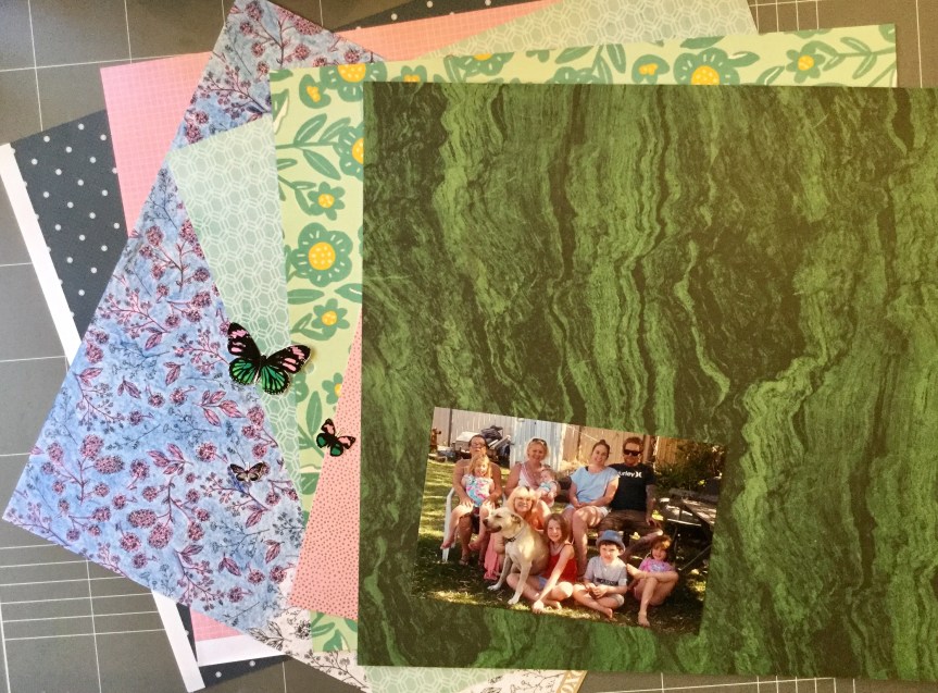
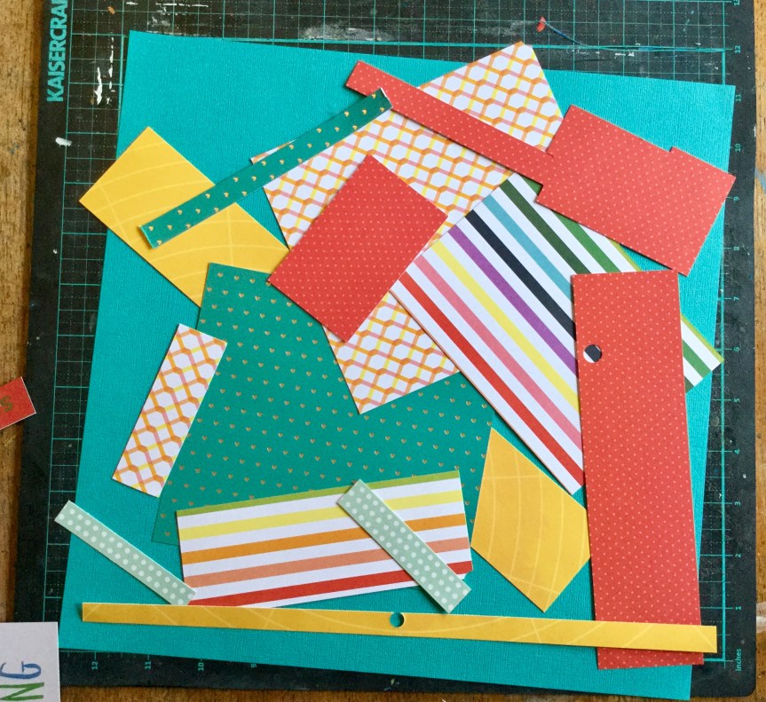
You can see the collection of papers I started with on my last post, I chose very feminine papers from my March Counterfeit Kit Challenge. Using the 4 for 4 series you end up making 4 layouts using 5 patterned 12×12 pieces of paper cut to different sizes and then working on a cardstock background. The leftover scraps are used to make cards with, something which I haven’t tried yet. Years ago, when I first ventured into papercraft, cards were my main focus. I even sold them through several businesses, was commissioned to create them, taught classes on stamping and cardmaking, and had tutorials published. Now, I just can’t get enthusiastic about making cards, though I do ooh and aah over all the new stamp releases. However, I agree with Janet that we should all be making our own gift cards, we have the skills and loads of scraps to use up!

Layout #9 (for CKC, #3 for RTS-4 for 4)

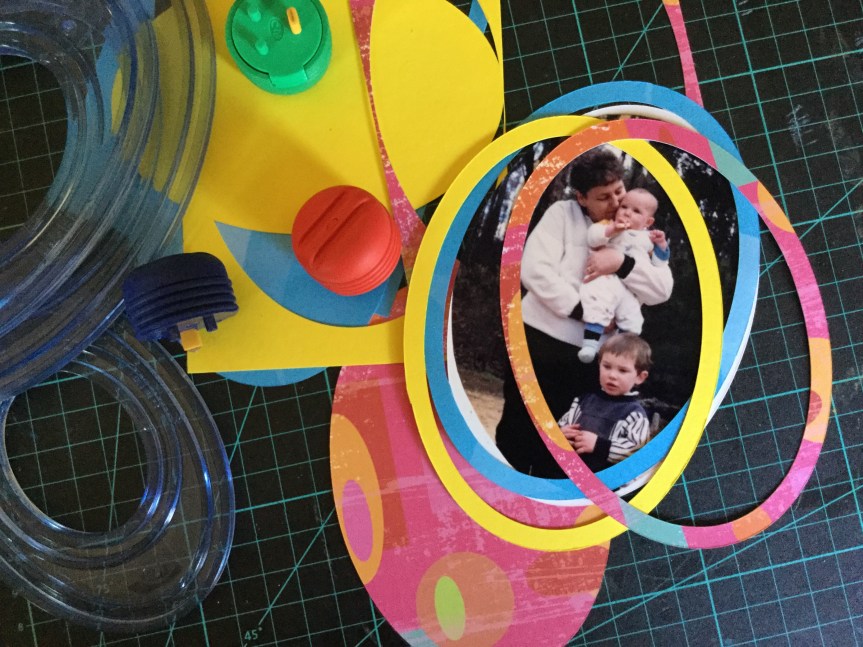
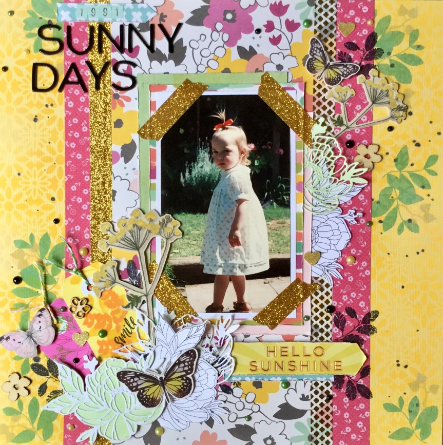
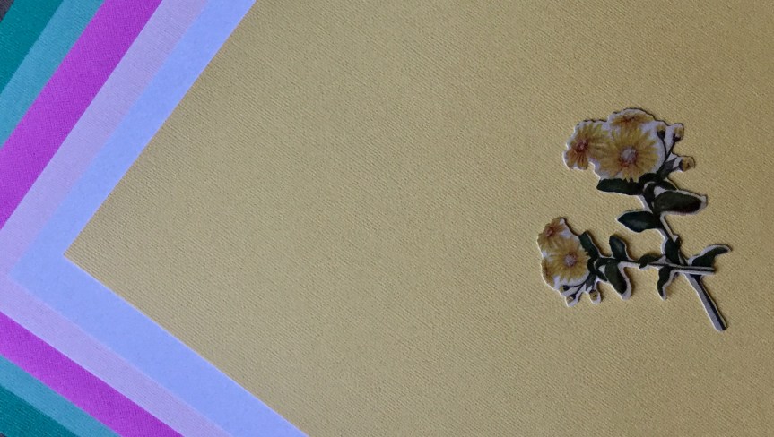
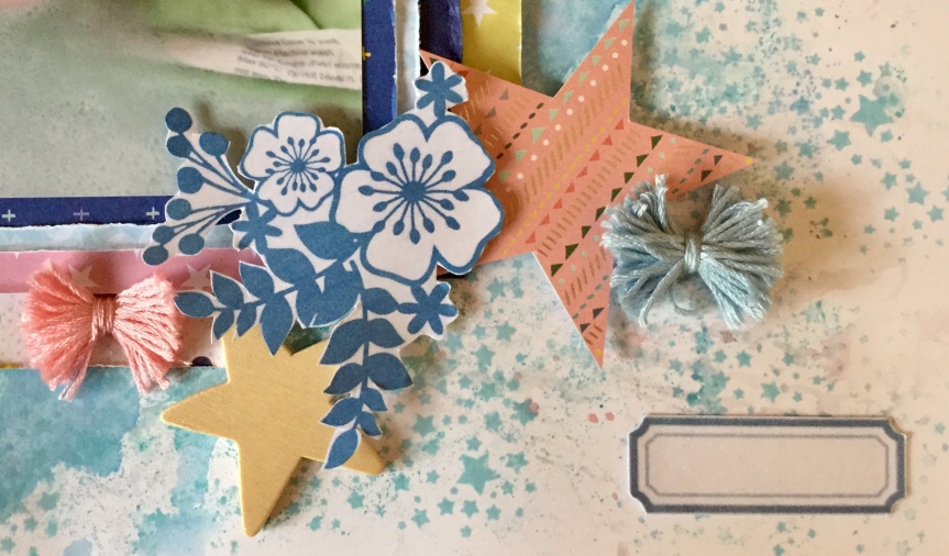
For this layout, I selected a very light, shell pink cardstock for the background. You can see the patterned papers cut to Janet’s specified sizes, I used a mix of old and new papers. A lovely raspberry pink floral, a text (a recent purchase, Jilliebean – Reap the Grain) and a strip of mint, criss-cross kisses. The butterfly and flowers die cuts are from Tim Holtz’s idea-ology salvaged elements, and I chose a few tags to include from my stash.

I put the background together first. I had an issue with the text paper, it probably wouldn’t have bothered most people but I do suffer a little from perfectionism. If you read the text you can see that there are some words and quotes which don’t fit with my photo. My photo is a 4×4 of my daughter by herself and several parts of the text refer to more than one person…see how picky I am. There is the terms: You & Me, Family, and together. I couldn’t work with this and needed to find ways to cover up these terms. The first thing I did was add the mint criss-cross strip across the term ‘& Me’, it didn’t quite cover it all, so I add a strip of gold, glitter washi tape. Problem solved!

IMG_6426

Next, I needed to deal with the large words, ‘Family’and ‘together’, on the right-hand side. Fortunately, my photo would cover this area, but it did mean that the placement was different from Janet’s recommendation.

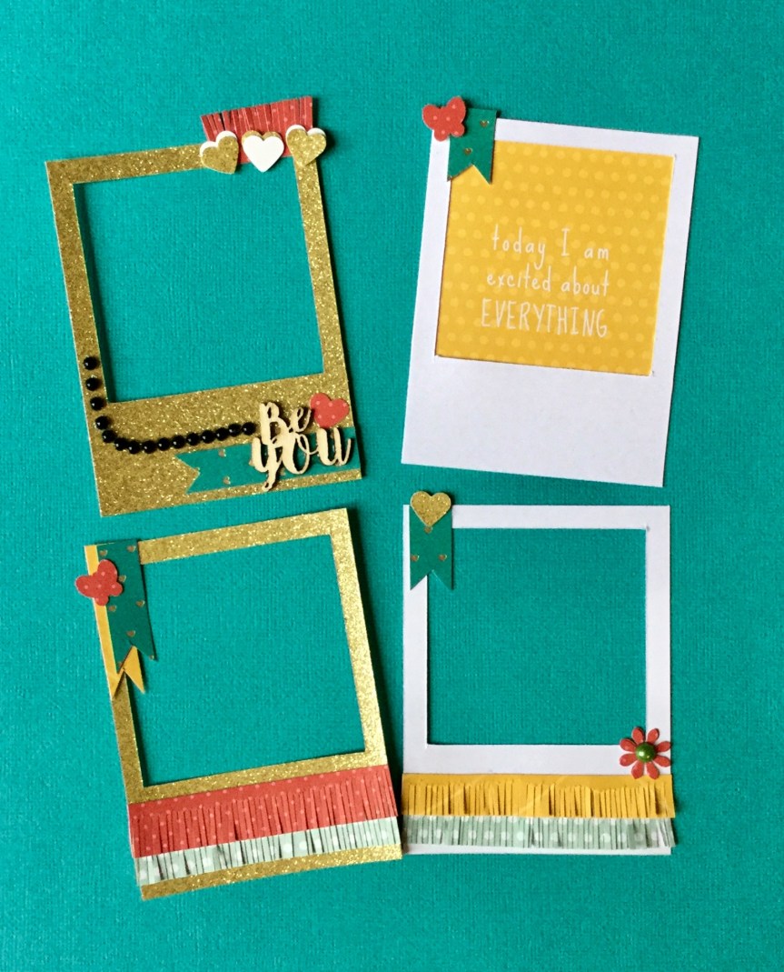
I then thought the photo needed to stand out more from the background and added a white cardstock border. I wanted to include my handmade gold frames in this layout and mounted them on some scrap pink checked paper. They would do a good job at covering up the text on the left of the layout, and be substituted for the absence of photos. Janet’s #3 layout uses 3 photos and I only had one.

IMG_6431

I had wanted to use the teal glitter Thickers from my CKC kit and thought I needed to get some teal colour on the page, as my papers did not include this colour. So, out came some distress ink and a cheap stencil. I focused on stencilling over the areas with the inappropriate (for me) text.

Next, I went to work adding the embellishments strategically placing them to cover up those annoying words. This took me quite a lot of time, I moved things around a lot and it just wasn’t working for me. I also stamped on some distress raspberry pink, little foliage images to try and pull it all together, around the clusters. A few tiny punched out red hearts and flowers were also added.

I’m not completely happy with the end result, but as Janet always tells us ‘the friends and family looking through the albums will not notice’. It is us that is far too critical of our own work. We need to learn to…let it be, let it be!

IMG_6471


Layout #10 (for CKC, #4 for RTS-4 for 4)

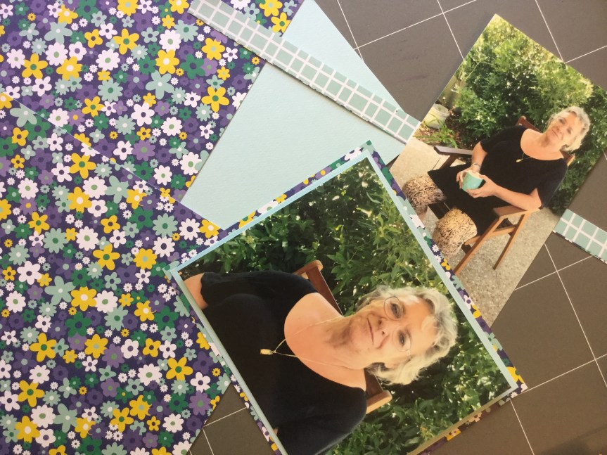
So, this layout starts out with me scanning and enlarging the photo I want to use. Like my previous layouts, it is an old photo of my daughter which was once framed and hung on our hallway wall. The papers used are the same as Layout #9, except for a little strip of the large flower print (used in Layouts 7 & 8). I chose a few tags and a daisy die cut from my CKC kit and decided to work on white cardstock so I could splash around some ink.

I pulled out my favourite oxide ink, Mustard Seed, it creates an amazing golden yellow, and I used the plastic bag technique, activating the ink with water, to create a vibrant background.

Next, I wanted to include some stencilling on the background, picking up a few of the colours form the ‘LOVE’ tag. I put a few washi tape strips along the base of the page and then got busy stencilling on some simple shaped flowers using a range of distress ink colours. They blended beautifully, creating an almost rainbow coloured effect. I also stencilled a strip of white cardstock to use for some embellishments.

Time to fussy cut out those flowers.

Now, I needed to create some frames from scraps to cover the rough edges and bits of white left around my trimmed down photo. As, previously, I used the old Creative Memories cutting system, it was a quick and easy option.

IMG_6454

Then, I mounted the photo and frames onto the layout using foam tape.

IMG_6458

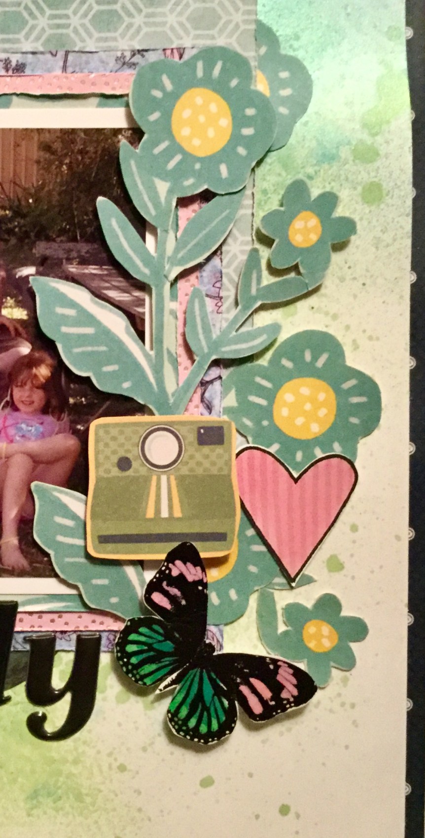
Time to build up the layers of embellishments, both handmade (stamped & stencilled) and purchased. A mix of flowers, tags and enamel dots. Then some Thickers for the title.

The end result is a very, bright, colourful layout, a lot more intense than I envisaged. Another layout in the album, happy scrapping everyone.

IMG_6459

RTS & CKC Mar. 2019- Layouts #7 & #8

Good morning,

Today I am sharing two layouts I made using my March Counterfeit Kit Challenge and my second attempt at Janet Madison’s, RTS Scrapbooking 4 for 4 series. Once again, I unnamedmixed things up using old and new supplies and this time added some stamping and splashes of watercolour paint. Both of the layouts are using old photos of my daughter, the photos were once framed and hung in our hallway. Unfortunately, over the years, they have fallen off the wall and the frames had smashed, I hid them away waiting for the right sized frames to come along with which to fix them. I have had no luck in finding similar sized and shaped frames, so I decided to use them as is or scan the photos (to enlarge) and create layouts to include in my daughter’s albums. Here is the result…

My paper selection for this RTS 4 for 4 kit was selected from my March CKC kit, I went very girly this time and included flowers and ice-cream coloured cardstocks.

Layout #7

Here are my papers cut to size according to Janet’s directions, the cardstock, a lovely buttery yellow and a few embellishments I chose to include.

IMG_6278

A little fun stencilling along two edges of the cardstock, using Distress Oxide inks and an old $2 stencil from the Reject shop.

Then, some stamping over the stencilling to build up a little more interest and draw the eye. I used a few different stamps which had I had collected from past monthly Uniquely Creative subscription kits.

A few splashes of watercolour paint…

Then, adhering the patterned paper pieces to create the background as per. Janet’s instructions.

IMG_6292

Next, I decided to use the original photo as it was a reasonable size (6×4) with only the corners being trimmed off. I think it was originally in an octagon shaped frame. I doubled mounted the photo onto white cardstock and the #5 patterned paper. Then, I used two scraps, to mount behind the photo.

Now, how to hide those trimmed corners? Washi tape of course! Which I also used on the background.

Time for some embellishments, some Uniquely Creative dies cut made with my Sizzix Big Shot, tags, wood veneer flowers (KaiserCraft), butterflies (Tim Holtz), punched hearts, enamel dots and die cut flowers (Tim Holtz). For the title, I used American Crafts, Hardcover, Thickers.

The finished layout just screams sunshine, summer days and a pretty girl. I love how it turned out and am very pleased to have used a photo that was sitting neglected in a drawer.

IMG_6304

Layout #8

Working with this photo was a little trickier, the original photo was a 3×4 cut down into a smaller shape to fit into a tiny oval frame. How was I going to use this?

First, I scanned the photo and enlarged it to print onto a 4×6 glossy photo paper. Given that the photo was 28 yrs old, it came out reasonably well and worked well with the selected papers which had been cut to Janet’s sizes. I collected up some embellishments to use on the layout, with a heavy influence of pink and pretty.

I needed to trim down the photo and try and smooth out the edges, so I pulled out my very old school Creative Memories cutter. The oval cutter was a perfect size and easy option to use, however, because the original photo had been roughly cut I needed some way to cover the little bits of white which still showed. That’s when I had the brainwave to cut some oval frames to hide some areas of white. This worked in well with the CKC challenge #1-Frame It Up.

I splashed around some watercolour paint and stamped some flowers on my background. The background was made up using patterned paper pieces and two washi tapes.

Next, fun again making and adding the embellishments, and fixing the photo and frames into place. In Janet’s layout, she includes two photos, I substituted the journal card instead of a photo to balance the design. The embellishments and title were similar to the previous layout: Uniquely Creative dies cut/made with my Sizzix Big Shot, tags,  butterflies (Tim Holtz), enamel dots, die cut flowers (Tim Holtz), and for the title, I used American Crafts, Hardcover, Thickers.

Another, very pretty layout to pop in my daughter’s album.

IMG_6345

I have two more layouts to complete to finish this 4 for 4 series, both are also using old photos of my daughter. I hope to work on them this weekend and clean up my

Please do check out Janet Madison’s RTS 4 for 4 series on YouTube and you may like to join the new love RTS fan group on FaceBook?  Plus, do check out the Counterfeit Kit Challenge website, you will have lots of fun joining in with their monthly kit challenge. It is a great way to use up your supplies.

Happy scrapping, everyone 🙂

RTS & CKC March 2019 – Layouts 3-6

Morning all,

I had a lovely day yesterday, the rain was slow and steady for most of the day, and I indulged myself watching my favourite scrap idols on YouTube and finishing off my challenge layouts. I enjoyed completing the Janet Madison,  RTS 4 for 4 layouts using some of my March Counterfeit Kit Challenge kit. I ended up with 6 layouts in total, as I didn’t make the cards. I used the scraps I had left to create two more layouts instead.

The first two layouts I made were quite simple using photos from my grandson’s fifth birthday party. I decided to finish off scrapping the other birthday event photos with the rest of the RTS 4 for 4 supplies.

Layout 3.(4for4 Series // Layout #3)

With layout 3,  I made a few changes to Janet’s original design. Something which Janet encourages in her videos, make it your own. I flipped how she had laid out the photos, putting two at the top and one photo at the bottom. The reason I did this was that my photos are of my grown, adult children and my husband going down the slides at the Little Monsters indoor fun park where the birthday party was celebrated. I wanted the last photo in the sequence to stand out and be noticed, where my husband nearly wipes out our youngest daughter!

All of us grownups, my children, myself, my husband and some of the parents attending the party had a fun and crazy time trying out the slides. We had been using them for about an hour before we noticed a sign at the top of the slides…No Adults on The Slides!

Oops! Did that stop us? Um, no, we were having way too much fun by then. I guess we regressed to our childhood and the manager did not stop us, well that’s our excuse.

IMG_6226

Layout 4. (4for4 Series // Layout #4)

One great thing I am finding with the RTS 4 for 4 series is that I am using up a lot of washi tape. I may finally get to the end of a roll. Layout four includes 4 photos, if you haven’t noticed, each of Janet’s layouts increases by one photo at a time.

For my layout, I used photo’s slightly larger (3×4) than Janet’s. It still worked fine but hid a bit more of the background papers.

I loved that this time I had a thin strip of rainbowed stripe paper to work from. The colours really work with my photos. Janet uses a few other materials for her horizontal strips, ribbon and paper strips, I stuck with my washi tape. Gotta use that stuff up!

You can see in Janet’s layout that she introduces some of the green, 5th paper sheet (check out her video for all the details). I had already eaten into my 5th sheet and had used it for matting photos, I had this odd shaped piece left. It wasn’t long enough to go across the page, so I cut it down into two strips and joined them together.

Once I have the background adhered to the cardstock, I lay out where I think everything else will go. When I’m happy with it I take a quick photo of it with my iPad before pulling it all off again. This helps me remember the layout placement and I get busy sticking everything into place.

The finished layout looks happy and bright, especially on that white cardstock, the colours pop!

IMG_6237

So, what do I have left? It is at this stage that Janet goes into a card making tutorial (4for4 Series // 4 Cards). Not being a card maker any longer, even though Janet makes some strong points on why we should be making our own, the cost of cards these days, etc., I decided to make some more layouts. Heres what I had left…

IMG_6240

and… of course, I had the rest of my March CKC kit to pull supplies from. I didn’t want to pull any other coloured pattern paper from the kit, but I had included some glitter cardstock to die cut some text/quotes with. Part of the CKC is that you forge, create some of your own embellishments, etc. For March, you needed to include some frames in the kit, something which I have a whole box of, but do you think I could find them to include them in my kit? Nope! This can be one of the downfalls of cleaning and sorting out your craft room, trying to find stuff. In my head, I can clearly see where the box used to sit on the shelf. Grrrr

Anyhow, I decided to make some frames using my gold glitter cardstock and some standard white cardstock. Like any dedicated artisan, I researched online for a DIY video and found a great one by Meg on her YouTube Litlle Hot Tamale channel.  The tutorial is called Diy Polaroid Embellishments – Build Your Stash #1.  Meg does a great job at sharing two different ways to make your own frames. I went with technique #2 but cut the frames with my Fiskars paper cutter and not scissors.

After cutting the frames, Meg shows you ways to decorate them. I loved the little fringed paper strips and thought that would work beautifully with my festive birthday photos.

IMG_6257

Layout 5.

So, layout five is made from the leftover scraps and features photos of my grandson going down the slide. The photos are not of great quality but they capture the excitement and energy of the moment. I cut the three top photos down to 3×3 and topped each with one of the homemade frames (adhered with foam tape).

IMG_6269

Layout 6.

This one is super simple, using up the scraps, some washi tape and a few scraps of white cardstock. I used the frame quote embellishment on this layout and a couple of the gold glitter square cutouts leftover from making the frames. I may embellish this further, it is a little too empty for my normally cluttered style. Janet would be asking where are the clusters? The visual triangle? It was late and I had lost my mojo.

IMG_6273

Next, I am going to have another go with Janet Madison’s, RTS 4 for 4 using up the rest of my March CKC kit. What I have left in my March CKC kit is a lot more pretty, flower prints, big and small and lots of pinks, yellow and soft greens. This RTS 4 for 4 will definitely be some girly layouts and I will try and get some mixed media happening on these layouts.

Happy Scrapping

Mix it up! RTS 4 for 4 & CKC March 2019

Hey everyone,

as some of you may already know, I am a big fan of RTS Scrapbooking. The amazing Janet Madison shares all her scrapbooking knowledge on her RTS Scrapbooking YouTube unnamedchannel. She is a wealth of knowledge and so generous with her time and skills. For a while, Janet has been making a series of videos called 4 for 4. The idea is that you use a set amount of papers (5), cut into a specified size, and then add in some alphas and embellishments to create 4 layouts and some cards. Janet talks you through the whole process step by step, through her videos. This month, I decided to give it a go. I hadn’t tried it out before, but have used similar systems to create mini albums (6×6 and 8×8) in the past. Using a system like this can really speed up your productivity and get a whole heap of layouts completed and into albums.

Layout 1.

First, you need to select your papers and cardstock, you need a selection of papers with a range of patterns. Janet talks you through this process and provides all the detailed instructions. She suggests the best patterns to use. I thought it would be fun to use my kit which I had put together for the March Counterfeit Kit Challenge.

A new Facebook group has recently been formed for the scrapbook fans of RTS. It is called love rts and you can access a PDF copy of the 4 for 4 instructions in the group. I printed this out and worked through the instructions while watching the RTS videos and scrapping my layouts.

Janet suggests selecting four alphas for your layout, two large and two small. I chose two glitter alphas to work in with the March CKC.


Also on the material list is washi tape, here is my selection. Once again I went with some glitz selecting three glitter washi tape and a gold metallic to link in with my CKC kit. Janet gives you lots of options to use instead of washi tape.

IMG_6184

Cutting up the papers is quite simple, though I would suggest that you watch Janet’s video a few times before starting. You do need to think about which direction you want your patterns to run, this is especially important if you use a paper which has text.


Next, I built up the background following Janet’s recommendations. I started with white cardstock and then changed my mind using green instead. I mounted my photo and begun adding the titles, something I usually do last.

I was short on embellishment in my CKC kit and decided to make some as it was the Forgery on the 4th challenge day. I used some stamps and ink I had included in my kit.


After adding the homemade embellishments, some enamel dots, washi tape and a few other bits and bobs, it was finished. Thanks, Janet 🙂

IMG_6207

Happy with the first ‘4 for 4’ RTS layout, I moved onto number two. Once again following Janet’s directions, watching her video and including some handmade embellishments.

Layout 2.

IMG_6213

Two more to go 🙂

I have enjoyed the process and may even use the 4 for 4 system with a different set of papers. A great way to get layouts completed quickly and as simply as you like. Janet encourages you to take the process and make it your own, perhaps I will add a little mixed media next time. The skies the limit…oh, the places you can go with Janet’s guidance!

Counterfeit Kit Challenge March 2019

Hello,

I am back into the fray with creating and joining in with the March Counterfeit Kit Challenge for 2019. Sadly, I missed out on both the January (I didn’t finish this month) and February CKC (I didn’t start), life was just too busy. Things have settled down a little and I figured if I put together a smaller kit it would be doable. So, here it is my version of the inspiration kit. The kit from Scrapbook and Cards is called ‘Blue Skies & Butterflies’. How lovely is that? Even the name makes INSPO KITyou happy. The colours and patterns in the kit offer up loads of variety for various layout themes and the embellishments are a very versatile mixed bag of objects, text and glitz. I had a lot of fun searching through my stash and selecting papers that mimicked the original kit in either colour, motif or pattern.

Here are my papers. I didn’t have any pink check and I went with a painted pink stripe instead. My large flower paper was lacking some blue, so I added in a small floral print with a navy blue background. I didn’t have any frame print paper, I added a wire (diamond) print instead. My striped paper has a lot more white with rainbow coloured stripes. Some of my B side coloured papers have different prints to the original kit but are similar colours.IMG_6175IMG_6176IMG_6177

My cardstock is a lot like the original.

IMG_6165

I added in a lot more text embellishments, I didn’t have any glitter text word Thickers or stickers. I will be using some glitter alphas to make my own words and also forge some using glitter and black cardstock and my Sizzix. I have included a few text and floral stamps and some Tim Holtz distress and oxide inks.

IMG_6174

If you are interested in joining in with the Counterfeit Kit Challenge you can find all the details on their blog. Make sure you follow along with the design team and check out the challenges during the month of March.


D-Lish Scraps Feb. Challenge 2019

Good morning,

A quick show and tell today. Two layouts for two February challenges fromThe D-lish 51872921_10156787038486421_9045415925280407552_nScraps team. You can check out their new March inspiration and challenges on their blog and Facebook site.

The first I attempted asked you to add a heart to your layout. An easy enough task, I started with creating a background using a Kaisercraft stencil and some Tim Holtz ink.

I was using some old, cheeky photos of my daughter. I pulled out some patterned paper scraps in colours which matched my photos.

I trimmed down the papers, roughed up the edges and layered them onto the background. I wasn’t happy with how far the stencilling went and added some more on.

IMG_6055

A little bit of splatter was needed, out came the watercolour paints.

I was trying to use up some old embellishments and added a couple of vertical stripes to the layout, one sticker and one chipboard. The photos were mounted on cream cardstock.

Time to go old school with some foil embellishments. Anyone remember these?

Using up more old embellishments and some die cut letters for a title.


A few bits of ribbon and washi tape to finish it off. The finished layout is very happy and cheerful.

IMG_6090

The second challenge I attempted was to use a frame on your layout, something I haven’t done in a while. I have many old, frame embellishments to use up!

51949013_10156788513031421_6502307515202535424_o

It was a very quick layout, lots of layering but no mixed media! Once again, trying to use up some old supplies, rub ons. Does anyone buy these anymore?

I also included some newish embellishments, lovely blue and white paper flowers.

A simple, easy layout which turned out quite sweet.

IMG_6105

Happy scrapping everyone 🙂


Anna’s Craft Cupboard Challenge!

Hey,

I have been having fun this morning scrapping a layout for the February layout challenge at Anna’s Craft Cupboard. The challenge involves including a splash of colour IMG_5789in your layout and my order of LemonCraft papers from Anna’s had just arrived, providing some vibrant yellow, pink and green. I have been quite good at not buying new supplies (apart from my regular kit subscription from Uniqeley Creative) and using up what I have, but these papers have been on my want list for a while now. I succumbed to temptation and purchased a few LemonCraft papers, some Mintay papers and stocked up on some cardstock in blues and greens ( a need) which I always run out of.IMG_5723


Anyway, back to scrapping. I decided to go with the green telephone box image as my inspiration. The colour gave me an excuse to use my new papers and I liked the criss-cross lines of the windows on the telephone box. I used a neutral kraft coloured background and splashed around some watercolour paint in yellow and a green which I mixed. In my head, I was seeing a layout with lots of layers and texture, pulling on the colours and patterns in the photo I was using. The photo is a very old image of my eldest daughter after she had just woken from a nap. She has those dreamy eyes, tousled hair and red cheeks which all toddlers seem to have after some zzzzzzs.


Next, I used some Tim Holtz inks and a KaiserCraft stencil to add a bit more interest and texture to the background. I thought the criss-cross design of the stencil linked to the telephone box image, as did some of the geometric shapes with my photo.

I then, cut out some of the LemonCraft papers into 4′ inch strips and cut them down into IMG_5806
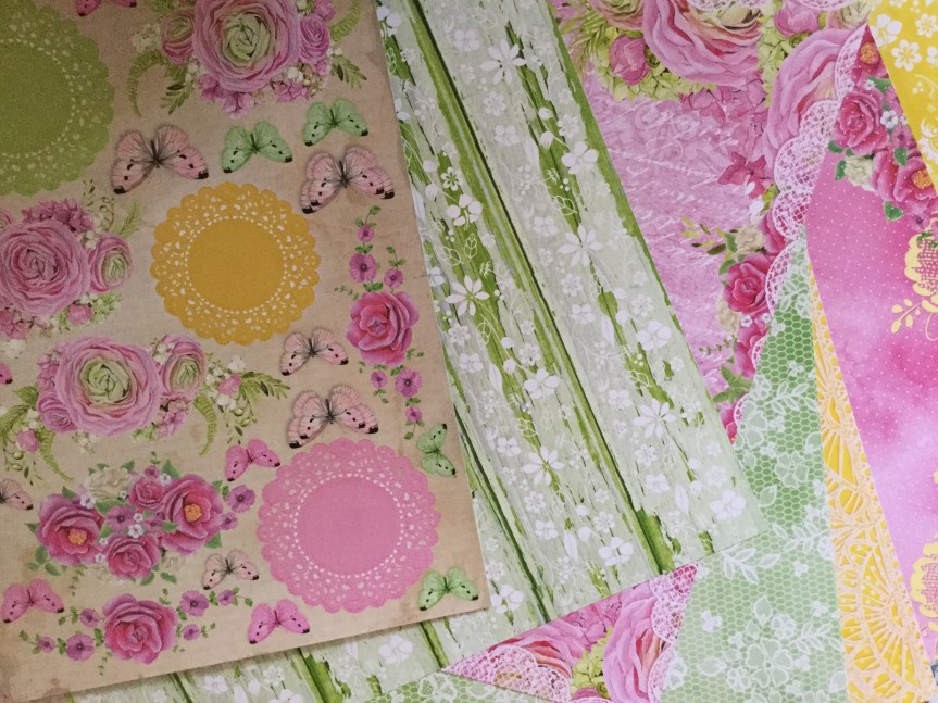
4 x 6 rectangles which I used for frames and pieces to mat the photo. The two 4 x 6 left were used to cut embellishments with my Sizzix Bigshot. I used a mix of dies, many were from the Uniquely Creative and the KaiserCraft range.  I decided that I needed a few more greens and some white to balance the layout, so found some scrap papers and cardstock to cut a few more diecuts. You can see that I incorporated some traditional design styles and some contemporary designs. I used the geometric die because of the pattern on my daughters top. The top was handknitted by my mother, which I had completely forgotten about until I started working on the layout. She knitted many clothes for my children, a pastime which she has had to give up due to arthritis.


In my LemonCraft order, I purchased a matching cut apart sheet. I fussy cut out the doilies and the green butterflies.

Then, I went to town building up the layers of die cuts and papers using double-sided tape and foam tape. The title I created by painting some white cardstock with vivid green. I really love how it has turned out, it is very summery and speaks to the season when the photo was taken, the Christmas summer holidays.

IMG_5814

Haha…can you see the little fly who snuck into my layout photo? Summertime here in Australia = flies 🙂

Uniquely Creative Feb. Challenge

Hello everyone,

I finally found some time to scrap, my new job is taking up more time than I like and there is so much marking when you start off a new school year. I needed a break and decided to crack open the Uniquely Creative February kit which arrived on Wednesday. It is a glorious kit, so much colour and interesting mixed media. A tropical/summer kit based around the Kaiser Craft ‘Paradise Found’ collection. PK599I am loving the papers, all that greenery, yummy teals and beautiful, bright hibiscus flowers. The problem is I don’t have any tropical photos, no tropical island holidays for us yet! Though, it did give me the opportunity to remind hubby about how he mentioned he’d like to go to Fiji, the perfect reason to holiday…to use up scrapbook paper.

Because I was struggling for photos, I decided to work with some summer holiday beach photos. I had just finished using the December Uniquely Creative kit, an ocean-themed kit, which I had managed to make 8 layouts with (adding in extra cardstock) and still have scraps left for another couple of layouts.

I had a gorgeous photo leftover of my daughter sun baking on one of our favourite holiday beaches. We have amazing beaches and coastline in Australia. It is from a holiday we went on about ten years ago, this beach has pure, fine, white sand that squeaks when you walk across it.  I thought it would be the perfect photo to use with the Uniquely Creative February kit and Sketch Challenge, as it has hibiscus flowers on the beach towel.

I started off making the background, using the ‘Ocean Air’ paper, I added some blue watercolour paint smooshes and splatters.

Then, I selected the ‘Salt Water’ paper to cut out the large circle in the sketch layout. I didn’t want to lose the shells on the edges of the circle, so I cut around them and kept them attached.

IMG_5739

The lovely hibiscus die (add-on to the kit), worked beautifully to create a halo effect around the edge of the circle. I was thinking about the sun and sunbeams, as I glued them into place. I cut them from the white cardstock painted with the yellow and orange watercolour supplied in the kit.

I used some hessian border and patterned paper to make the vertical stripes in the sketch.IMG_5745

Next, I mounted the photo on white cardstock and rough up the edges. Then, I added a layer underneath of the ……. paper. You can easily tear this paper into the shape you need by adding a line of water to soften the fibres of the paper. It creates a lovely torn, tatty edge.

Finally, I added a range of embellishments from the kit around the edges of the circle and photo. I fussy cut a few extra shells from the leftover ‘Salt Water’ paper and attached them with foam tape. I added some of the sisal fibre threads for a little more textural interest. I used white cardstock paint with blue watercolour paint and the supplied ‘paradise’ die to create the title.


IMG_5772

Not a bad effort, I think it works well with the photo. Now to use up that tropical foliage and hibiscus papers…keep scrapping!


Jan. CKC #4 – Step by Step

Hello again,

I am sharing my fourth CKC Jan. kit layout, this one is a double page spread. It’s been a while since I’ve done a double page layout, with this one I wanted a vast page to mimic the outdoors. The photos I am using are from last year when I met up with my Dad and we got to spend some time together. This doesn’t happen very often, as he lives 400km away and he is often travelling/prospecting which can easily stretch the distance to 4000km or more! On this day we decided to do a little exploring together and went to check out one of the South West regions caves. Because we went underground I started the layout off by creating an earthy coloured background.

On top of my earthy background, I built up layers of stamped foliage using some colours which I pulled from the Felicity Jane kit. Some smokey blues and teals. You can see that my cardstock had become quite warped from the mixed media/water application. I just press it, between two pieces of white paper, with an iron to reduce the warping. It usually results in a smooth surface, though sometimes you may need to dampen the back of the cardstock with a spritzer.

Then, I mounted the main photo with several layers of paper. I tried to use up the last of that Christmas paper.

I added some papers to the background. This is where things got interesting, after img_5408looking at my photos I wanted to emphasise the sense of going down into the earth. I decided to cut around the stamped foliage with a scalpel and slip some of the photos behind the cuts. Dah, Dah… walking down into the cave.

img_5413

I roughed up the edges of the cuts to add a bit of texture. Then, I got busy adding embellishments and sticking down my photos. I cut some foliage and text dies using my Big Shot Sizzix and added some enamel dots.

I felt some areas were lacking something and looked a little unfinished, so I stamped on some more leaves to fill the gaps. Then, I added the location and date using some foam alphas. I am pretty happy with the end result, though it is quite busy and somewhat over embellished in my usual style.img_5426

img_5429img_5430img_5431


Jan. 2019 CKC – Forgery #1.

Hello again.

Here is my first layout featuring my forged paper. I had decided that I wanted to scrap a funny photo of my grandson playing with playdough. He had made a playdough man and his mum sent through the photo for us to view. As boys do, he was being silly when Photo Dec 09, 6 32 13 PMposing for the photo, so the quality is not great. It is a little blurry but does capture his cheekiness. Let me just say that the playdough man is magnificent, a work of art! Well, I may be biased, it does have all the important elements of a human which is the goal when you are four. It was the playdough figure which triggered my idea for the forged paper. The playdough feet are rough circles, much like the black and white circle paper featured in the Felicity Jane ‘Hannah’ kit.

I decided to create my own circle paper to use as a background for the layout. It was a simple process of loosely tracing circles onto to the white cardstock using an Artline permanent marker. I used a washi tape container to trace around.  Then, I painted some of the circles with Tim Holtz Oxide inks in colours which matched the theme and photo. Unfortunately, the so-called permanent marker did bleed around the edges when it interacted with the watered down ink. After the first bleed, I was a little more careful when applying the ink.img_5233

Then, even though I liked the look of the painted circles I thought it needed something else. I pulled out a Fiskars geometric diamond stamp which was similar to one of the papers in the Felicity Jane kit and stamped the image across the page. Still not happy with the result, I decided it needed more colour and wanted to reduce the white space. I used the Tim Holtz micro glaze to protect my inked circles. I love this product, the tiniest amount makes the inked area waterproof, stopping any colour shifting and allowing you to add colour over the top. After rubbing on the micro glaze I applied the blue watercolour paint.

Next, I selected some patterned paper and coloured cardstock to mount the photos. I prefer to use several mounts on each photo, something which has gone out of fashion these days. In one of the photos, you see the wooden floor in their house, this inspired me to mount the photos on a background of woodgrain paper from my kit.


As I had mentioned in an earlier post, I didn’t have a scallop washi tape to include in my kit. I img_5250decided to substitute this with a strip of polka dot paper trimmed down to create a scalloped edge. I attached this to the edge of the woodgrain background.

Including embellishments that reflected the Felicity Jane kit had me troubled. Flowers, love hearts and a bike didn’t really go with my photo choices. I hummed and hawed over this, what to add? Then I decided to go with it and added a few flowers, a tag and the die cut word awesome. I’m not super happy with the result and would have liked to reach for some other embellishments but I was trying to only use things from my kit.

Anyway, it is another layout completed and I did meet the goal of forging some elements for the challenge. Happy scrapping everyone.

img_5255


CKC Jan. Layout #1

Hello again 🙂

Here is my first layout using my January CKC kit. If you haven’t been following you can check out my kit here and get all the details on how to participate at the Counterfeit Kit Challenge blog.

Photo Dec 09, 6 32 20 PM
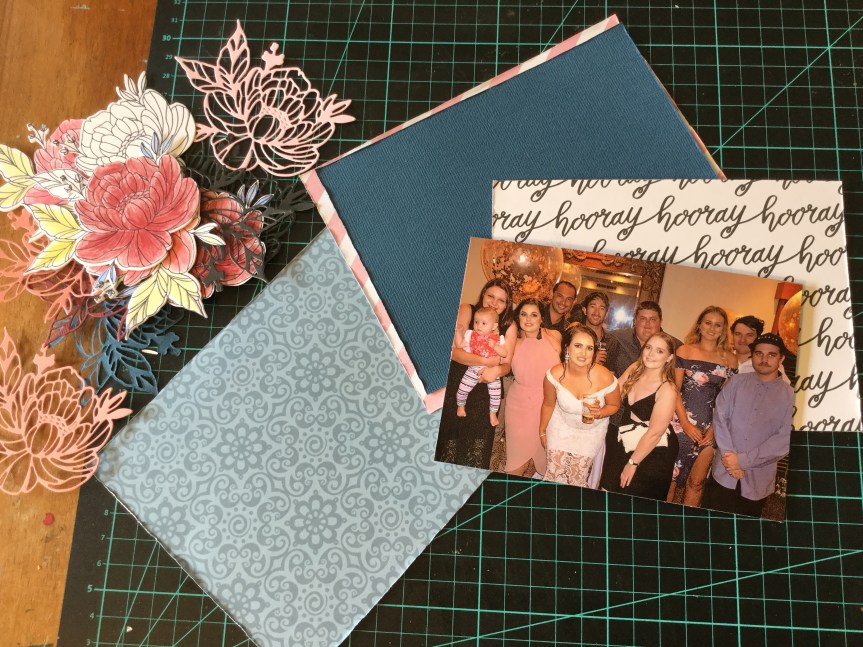
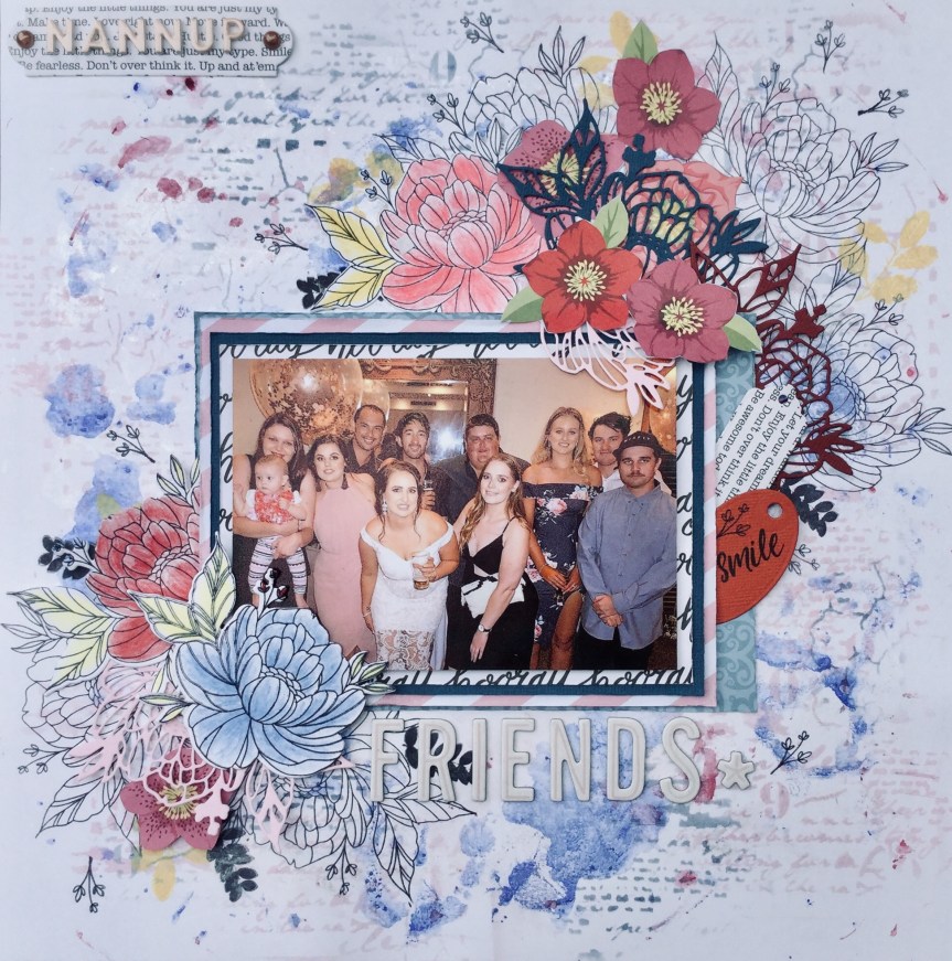
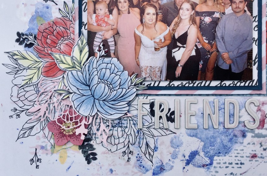
So, first up, I went with a photo of my daughter and her friends having a night out. The photo has several of the pinks, blues and burgundies found in the Felicity Jane ‘Hannah’ collection.

I decided to have a play with some mixed media, using my watercolour paints and the plastic bag technique I smooshed some paint around my white cardstock. The blue paint I used came out a lot stronger than I expected and I nearly started over but decided to keep going and find some way to tone it down.


I tried stencilling on some ink to create some texture and distract from the intense blue. I used Tim Holtz’s Spun Sugar and Stormy Sky distress inks, both work beautifully with the Felicity Jane colour theme.

Then, I began making some embellishments. I stamped out some flowers using the Uniquely Creative Mini Bloom Advent Stamp and coloured them using Polychromos coloured pencils. Then I die cut them out, love this matching die, it makes it so much quicker than fussy cutting them. I also cut some flowers out of coloured cardstock using the matching die.

Next, I stamped some flowers and foliage onto my background. I decided to fussy cut flowers from some papers I had put aside for making embellishments. The colours coordinated well with my pencils and inks.

I then mounted my photo using some patterned paper and coloured cardstock. I rough up the edges using my fingernail and layered the pieces using foam and double-sided tape.IMG_5222

I spent a lot of time fixing the flowers into place, I keep changing my mind and fiddling with the layers. I added a Thickers alpha title and some die cut tags. Overall, I think it has turned out quite well, but my colours are too strong and perhaps a little overpowering compared with the original kit. Moving on to layout number two, I hope you are enjoying participating in the CKC challenge.IMG_5227 (1)


IMG_5228 (1)IMG_5229 (1)IMG_5230 (1)IMG_5231 (1)

Jan. 2019 Counterfeit Kit Challenge

Good morning.

Well, I am off and racing with the new CKC. I put my kit together yesterday and surprisingly found it a little tricky. The papers in the Felicity Jane ‘Hannah’ kit are fairly Photo Dec 09, 6 32 13 PMsimple in pattern and design, but I fell short when rummaging through my supplies. I struggled to find just the right subtle blues, greens and pinks. I didn’t quite make it with the patterns, mine were either too heavy and thick in line or not geometric. Even though I knew I had previously had some fish scale/scallop paper, I could not find a scrap of it. So, here is what I ended up with…

For this month, I decided to keep it small and achievable. Often I go overboard and select an abundance of papers and embellishments which makes a mega kit. I am sticking to my word for the year, “Complete”, having a smaller kit will help me achieve this. To start with I chose papers by colour and/or pattern, a lot of the papers I selected in my initial rummage came from Christmas collections. Weird hey?


I didn’t have a floral paper with the right colours, so decided to go with a black and white floral which I can colour to match the collection. No fish scales/scallops meant that I needed a substitute, I went with a polka dot design in both black and white and blue and white. My check is smaller than the original and as you can see has the Three Wise Men featured. The men will get the chop and will not be featuring in my layouts. My text paper has a lot less white space than the original and reads ‘Hooray’. Overall, I have more colour than the original Felicity Jane kit but I think I can make it work.

I had a pile of papers left over once I sorted through to get to this point and decided to keep them on hand for creating embellishments. In the pile are two florals which I had picked out because of the blue patterned backgrounds, then I realised that the flowers had the same colourways as the Felicity Jane flowers, a strong burgundy and a soft pink. I might fussy cut these for embellishments.


Photo Dec 09, 6 32 20 PM
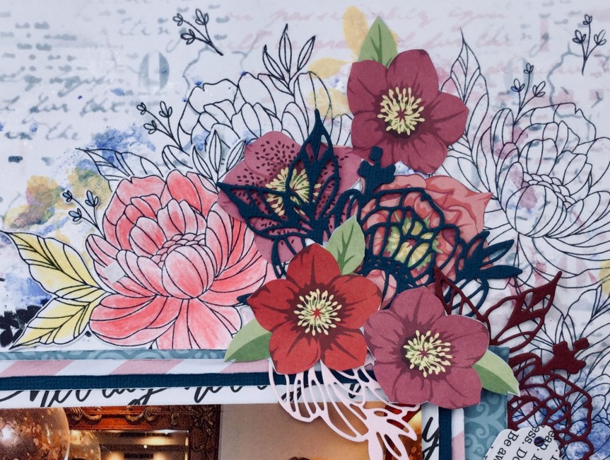
For my embellishments, I didn’t have a lot which matched with the original kit. Being a girl obsessed with colour, I don’t tend to buy scrapbook supplies with such a mild palette. I decided that I could forge many of them and make my own. So, I dug deep into my dies and stamps and found similarly themed ones which I could use with my papers/cardstock to make a range of embellishments.

I found that I owned a bicycle die, yes! I also have quite a few texts dies and tag dies. I do not have any heart stickers, so will use my heart die. As for the floral stamp, I just received a lovely floral stamp in my Uniquely Creative Advent Kit which I am looking forward to trying out. It came with two matching dies which means no fussy cutting, hurrah! My bows will be satin ribbon bows, as I’m not interested in purchasing any tulle, even though the tulle bows look very cute. I have included some inks and not being able to deny myself, may splash around some paints. You can see that I selected some cardstock to use for backgrounds, photo mounts and tags. The colours I selected to match the Felicity Jane colour theme, though they look darker in the photos. Hhmm…maybe they are too dark, I may have to swap some out. That’s what happens when you are selecting cardstock at night in poor lighting.


I still need to choose my alpha stickers, I may go with two different sizes in pink. I also need to sort through my 3×4 quote/journal cards and find ones with a suitable colour range. The kit also included a scallop washi tape, hmm, not sure what I use for this. I may just use strips of paper/cardstock or use a different patterned washi tape in the same colour.

If you would like more details and get a better idea about the Felicity Jane ‘Hannah’ kit there is a great unboxing video worth watching by the LindseyDecor channel.

Make sure that you keep up to date with the challenge by checking in often and following the CKC blog. I can’t wait to see what everyone creates. Here are the great CKC scrappers, design team and Master Forgers for you to enjoy

Happy New Year!

Happy New Year to all.

Well, down in Oz it is the second of January and our lovely guests are moving on today to visit other Western Australian family. When I say lovely I really mean it. They have been just gorgeous and we have had a lot of fun. You can not love guests who pitch in with the dishes and even cook us treats and meals. We explored parts of the South West region and made lots of memories (and took photos) doing a vast range of activities. We swam in different oceans, went caving, climbed a lighthouse (the tallest in Australia), swam in the Blackwood River, ate local chocolate, sampled and bought amazing olive oil, and enjoyed local wine and gourmet food. Sometimes we drank a little too much wine, New Year’s Eve being one of those occasions, and spent the next day relaxing in the pool, on the lounge reading or watching movies. At times we did old-fashioned things, we put

away our devices, and we played board games. I taught our new family how to play Canasta, something I later regretted when they started winning every game. We laughed a lot and loved the funny interactions between our grandson and our other young family members. We have truly had a happy holiday season spent with much-loved family and friends. I hope that the silly season also brought you moments of joy, love and surprise. Now, to get busy scrapping those moments…

First up, for me, it is to do a whole lot of catch up. I have not scrapped for 6 weeks!

Today I am kicking off with selecting my kit for the January Counterfeit Kit Challenge. Have you seen this beauty? It is a little bittersweet for me, I love this month’s selected kit, but I am

a little sad because I was invited to be the guest designer for this kit. I was so honoured to be asked and sadly had to turn down the offer due to my busy life commitments. I really hope I have a chance at a later date to participate as a guest designer, what a fun challenge that would be. How lovely is it that Meagan Johnson took up the challenge, and what a talented scrapper she is. I love her clean lines and contemporary style, Meagan is part of the Becky Higgins Creative Team, wow, impressive. Make sure you join in with the challenge to use up your stash and follow the CKC team members as they share what they create and set challenges.

Next, on the list is using my one and only subscription kits, from Uniquely Creative. I am way behind with using these up. I set myself a challenge that as each kit came in I would use it. Hhhmm, life got in the way. I have a few to use, the first being the September kit. This one is filled with yummy mixed media products but themed around winter snow/snowflakes which we don’t have here in Western Australia. I am going to have to be creative and come up with some snow-free layouts. I also have the November kit to complete, this one is very girly with flowers, butterflies, lace and heritage pastel papers. The other one to complete is the 2018 Advent Kit, which is also very girly with florals. I am thinking that I may finally finish off my baby daughters album with both these girly kits, my daughter is now 24! Last, the December kit which is sea themed and will be great for my recent holiday snaps. Oh no, the January kit ships in five days, I need to get busy.

So, that is what is on my agenda for the next few weeks. I will try and share what I create and use up. I am looking forward to playing with my new Tim Holtz Oxide inks which Santa gave me and incorporating some stamps and tools which have been sitting too long. Oh, and I have $100 to spend on craft/art supplies, my Christmas gift from my mother. What shall I buy? I also have a weeks holiday planned to join in with the Albany Summer School, I am looking forward to learning some new artistic skills and techniques and meeting like-minded people. My other catch up will be watching my favourite YouTube scrap blogger, Janet from RTS Scrapbooking, whilst I scrap and create. What will you be working on over the summer?


CKC – Sprinkle, Sparkle Layouts!

Morning, here are my two layouts which incorporate some sprinkles and sparkles for the Counterfeit Kit Challenge number one. The first layout features my cheeky grandson at 9 mths, the quality of the photos was not great. They are a little blurry but I used them anyway, as they captured his cheeky personality and a happy moment in time on an adventure. The layout itself was fairly quick, some smooshing of oxide inks for the background on a lovely indigo cardstock and a strip of star paper. Then I sprinkled on some gold watercolour paint and mounted the main photo on layered, distressed edged papers. Some fussy cut stars, Citrus Twist Kit cut apart embellishments, enamel crosses, a wood veneer painted star and it was finished!

IMG_4516

The next layout has sprinkles and sparkles, this one also features my grandson. One of our favourite things to do at the local park is play on the wizzy dizzy. We always laugh so much and there have been times when Nanny and Granddad fall off! In these photos, Master Four is trying to do it all himself which is no easy feat. My choice of layout design links to the shape and movement of the featured playground equipment. I liked the idea of building up circular layers and creating that sense of being dizzy by ‘seeing stars’.

The background was created by splashing on oxide distress ink mixed with water and then blotting it off with a tissue. Then I used the inky tissue to apply some soft, swirly, whispers of colour. I wet the inky tissue and rubbed it around the page in a circular motion. Next, I raided the kitchen, to add some wine glass circles of ink, a little forgery inspired by the Vicki Boutin patterned paper in the original Citrus Twist Kit. This was topped off with some splashes and sprinkles of watercolour paint.

Step two, another kitchen raid…use a bowl to guide my stamping. I wanted a circle of stars swirling around my background. I used my new Carabelle Studio art stamp which has a really delicate sprinkling of stars. I didn’t use a block with it, so I could bend and manipulate the stamp to fit the curvature of the bowl.

Third kitchen raid…crockery to cut my paper circles! I also dragged out my old Creative Memories cutting system to cut the smaller circles. Because I was layering the papers, I could use some of the papers which didn’t fit my theme/photos or any layout I was likely to do in the future. For example, the white swan paper, swans where I live are black!

I slotted my 4×4 photos in between the circle layers, intentionally making them topsy-turvy to match the theme. It would have looked better with smaller, 3×4 photos but I was too lazy to print any more photos. I mounted the main photo on another paper which didn’t fit the theme, the rain clouds, but the little pops of raindrop colour did match with the other papers.

Next, I added the title and got busy with my Sizzix cutting out sparkly, gold stars with glitter cardstock. I used my new Tim Holtz thinlit die which has a great range of star sizes. I attached the stars with foam tape and glue. Then, I popped on a few handmade text quotes. Finished!

I am pretty happy with this crazy, dizzy, topsy-turvey layout. It does achieve the feeling that I was going for and was fun to create. Happy scrapping everyone.

IMG_4515

CKC November Layouts #2 & #3

More mess with inks and watercolours…

Yes, I keep playing around splashing around the colour to make some gorgeous backgrounds. The funny thing is when we do this we often cover it up with our photos and embellishments. Sometimes, for me, I get a little regretful when I have to cover up all the pretty colours. Yesterday, was one of those days.

I was working on two more layouts using my Counterfeit Kit Challenge collection. The first is a layout of my grandson, I am still trying to complete his baby albums. Because the photo is very soft and pretty, I thought the colours in this kit would work well. I began by creating the background using oxide inks, layering the colours and adding a little stamping. The stamp arrived two days ago and my rule is when you purchase anything you must use it! The little stars helped soften the edges of the paper and fitted with the CKC embellishments.

Then, it was a simple process of mounting my photo with a range of patterned papers, each piece was distressed around the edges with my fingernail. Next, I decided to have a go making some thread bows to embellish the layout. I used the fork technique from here. It worked very well and was quick to do.IMG_4419

Adding the embellishments took very little time, I used some forged flowers, stars (wood and paper) and an old, chipboard heart. I think it pulled together well, the pop of pink softens it and draws in the skin tones in the photo. It is kinda girly for a boy, but you can get away with that with baby photos.

IMG_4421

Layout #3 is another grandson page when he is a little older and hanging out with his favourite person…Granddad.

More colour was splashed around, this is the one where I didn’t want to cover it up. I used some old heart stamps in this one. See, the yellowed acrylic block…yep, the stamp is so old, it fused to the block! Note to everyone: do not be slack and leave your cling stamps on any acrylic blocks for long periods of time! Pack away properly and use your stash, its been years since this stamp was used.

I used a whole heap of the FREE Citrus Twist Kit cut apart die cuts on this layout and a few of my forged pandas.

Overall, it came together well. I like the embellishment cluster and was pleased to find some way to incorporate the pandas. Thank goodness for cute kids.

IMG_4428

P.S. Sorry that the images look cream, the cardstock is a crisp white. I am struggling to get a decent photo, with white it (iPad) always seems to cast yellow or blue light whether I’m inside or out.


CKC Layout #1 – Ma

Good morning, yesterday I had a lovely time playing with my Counterfeit Kit. I got messy with some inks and watercolours and pulled some inspiration from this months focus website, Citrus Twist Kits. They have an amazing design team and I spent a little time pouring over the Creative Team Gallery. Wow, some beautiful work to inspire us CKC scrappers.

I really loved some of the page formats used in the October DT layouts. The work of  Nathalie Desousa with her flourish of diagonal flowers made me drool. I decided to see if I could use this inspiration on one of my layouts, using the forged flowers and my CKC papers.

I started off getting messy, building up a background on my white cardstock using some Tim Holtz Oxide Inks and some watercolour paints. In the first layer, I stamped some hearts using a very old, cheap, foam stamp. Then, I layered on the beautiful purples and added some splatters. I dried each layer before adding the next. Next, I pulled out my handmade foam branch stamp and used the beautiful, Dusty Concord oxide ink. I am in love with this colour, full strength you get a dark, dense plum image and activated with water, it creates a musty, dreamy lavender (see the lightest purple, layer 2).

Next, I selected papers to mount my photo. This image is of my mum from last summer (2017) at my grandson’s birthday party. I am one of those lucky daughters, whose mother is their best friend. She can be relied upon to listen to any vent, laugh and cry with me, share guidance and advice, and drink champagne! The photo is quite neutral, you could put any coloured papers with it. I decided to select a floral with some green tones and a bold hit of purple. IMG_4398

Then I spent time fussy cutting flowers form some patterned paper and trimming up some of my forged flowers (FREE cut files from Citrus Twist). I die cut some leaves to add a pop of yellow and jade. It all came together quite quickly after that, building up the layers of flowers, die-cuts and some wood veneer leaves. Then, a few enamel dots sprinkled around the edges of the flowers, title and date.

I love how it turned out and am surprised how the colours worked together so well. I would not have selected to use that colour range in my daily scrapping, the CK challenge is a great way to push you out of your comfort zone. Thank you, Nathalie Desousa, for your inspirational layout design. If you would like to see how Nathalie created her layout check out her video here.

IMG_4409

November CKC-Forgery on the Fourth

Here we go, a little early perhaps, but it is already the 4th of November down our neck of the woods. So, what did I forge? I decided to cheat a little and use someone else’s images which they had freely shared, to create some die cuts and puffy stickers.

Luckily for us participants in the November CKC, the inspiration company, Citrus Twist Kits often has FREE cut apart PDFs and cut files available to download. So, I went looking for some cut apart sheets which would match with my kit. There was a lot, including one designed for their October kit. I decided to print out a range of different ones onto white cardstock.

IMG_4381

Then, I had a look at the cut files available. These I thought are of no use to me…think again! They had quite a few florals which would work well as die cuts, so I downloaded the files. Now, how to use them? I tried printing out the images, this didn’t work for me because the images are large (I imagine they are 12 inches) and I only have an A4 printer. So, then I took a print screen of the image and pasted it into WORD. This allowed me to crop them and make them any size or colour I liked.

IMG_4375

Once printed, I tried a few different ways to colour them. I didn’t like the look of the Copics and decided to try watercolour paints. Duh…the Indigo Hills die cuts are in a PFRC500418_die_cuts_aac9bab1-0b17-406f-b268-d3b39322e601_1024x1024watercolour style! This worked well, I tried out both the black printed image and the light grey. What I found with both was that the paint did put an opaque film across the printed image. This was easily fixed by going over the images with a black permanent marker. It even enhanced it, giving them a more handmade look.

Then, I went in search of pandas online. There were quite a few FREE pandas to download, I went with some little panda heads which are similar to the original kit. I coated them with Ranger’s Glossy Accent glue to get that puffy look. The glue dries clear.IMG_4374

Before fussy cutting the printed cut apart sheets, I gave them a clear coating of Clear Gel Medium. You don’t need to do this but it gave them a little sheen (not super glossy), the easier way would be to print them on a better quality cardstock paper which already has a sheen.

I ended up with a huge pile of die cuts to use on layouts. I have a lot more flowers printed which I will colour and cut as needed. My next forgery may be the Vicki Boutin paper, who can resist dipping cups/glasses into the paint and making some mess?

IMG_4382