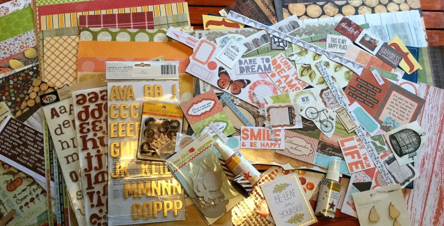
Here we go, a little early perhaps, but it is already the 4th of November down our neck of the woods. So, what did I forge? I decided to cheat a little and use someone else’s images which they had freely shared, to create some die cuts and puffy stickers.
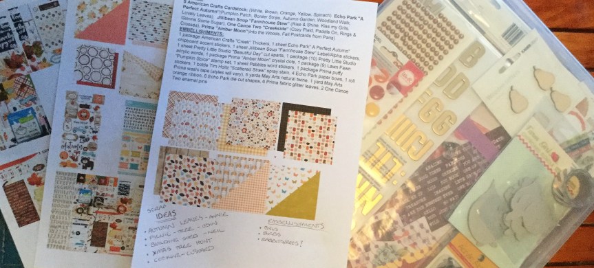
Luckily for us participants in the November CKC, the inspiration company, Citrus Twist Kits often has FREE cut apart PDFs and cut files available to download. So, I went looking for some cut apart sheets which would match with my kit. There was a lot, including one designed for their October kit. I decided to print out a range of different ones onto white cardstock.

Then, I had a look at the cut files available. These I thought are of no use to me…think again! They had quite a few florals which would work well as die cuts, so I downloaded the files. Now, how to use them? I tried printing out the images, this didn’t work for me because the images are large (I imagine they are 12 inches) and I only have an A4 printer. So, then I took a print screen of the image and pasted it into WORD. This allowed me to crop them and make them any size or colour I liked.

Once printed, I tried a few different ways to colour them. I didn’t like the look of the Copics and decided to try watercolour paints. Duh…the Indigo Hills die cuts are in a  watercolour style! This worked well, I tried out both the black printed image and the light grey. What I found with both was that the paint did put an opaque film across the printed image. This was easily fixed by going over the images with a black permanent marker. It even enhanced it, giving them a more handmade look.


Then, I went in search of pandas online. There were quite a few FREE pandas to download, I went with some little panda heads which are similar to the original kit. I coated them with Ranger’s Glossy Accent glue to get that puffy look. The glue dries clear.
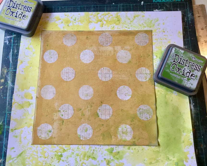
Before fussy cutting the printed cut apart sheets, I gave them a clear coating of Clear Gel Medium. You don’t need to do this but it gave them a little sheen (not super glossy), the easier way would be to print them on a better quality cardstock paper which already has a sheen.
I ended up with a huge pile of die cuts to use on layouts. I have a lot more flowers printed which I will colour and cut as needed. My next forgery may be the Vicki Boutin paper, who can resist dipping cups/glasses into the paint and making some mess?


 majority have been male. Also, remember that I had a go making
 and more pinks and greens. I have tried to base mine on picking up the colours and feel of this kit.
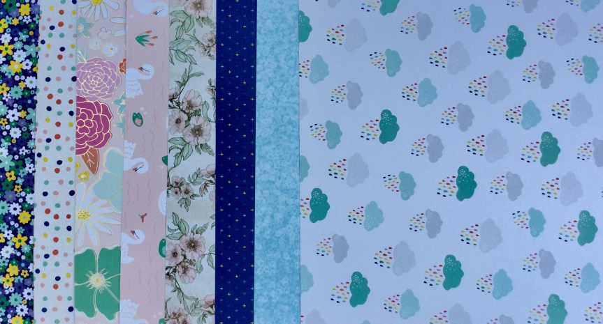


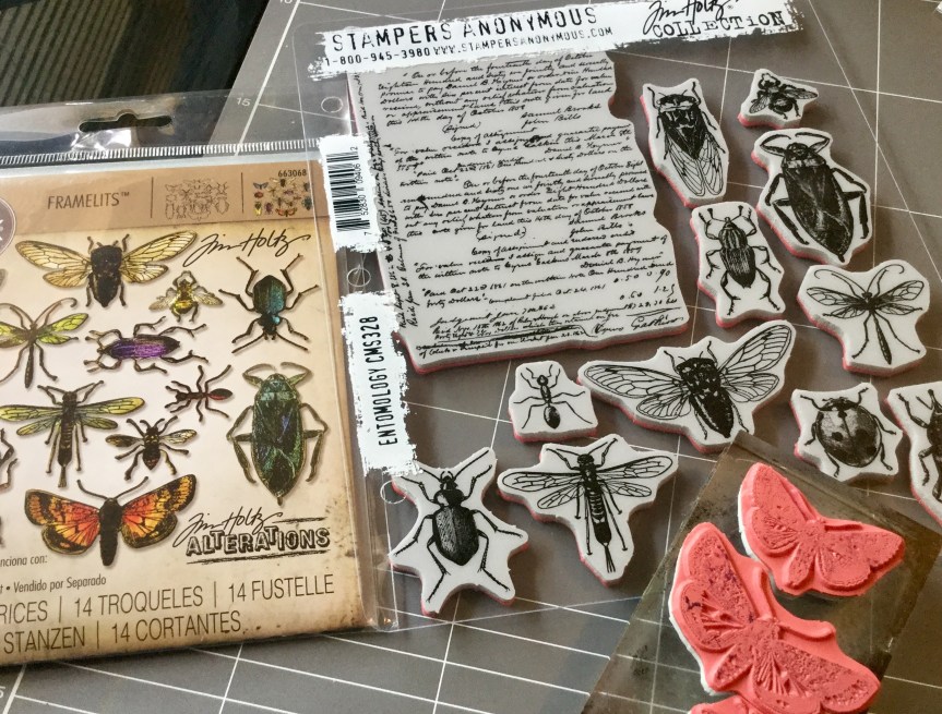 with the stamp set (released earlier in the year). I had been waiting for months for the release and then for it to arrive in Australia, it is amazing! The die is spot on, there is absolutely no white space around your stamped image, it cuts the thinnest and tiniest insect legs and antennae.


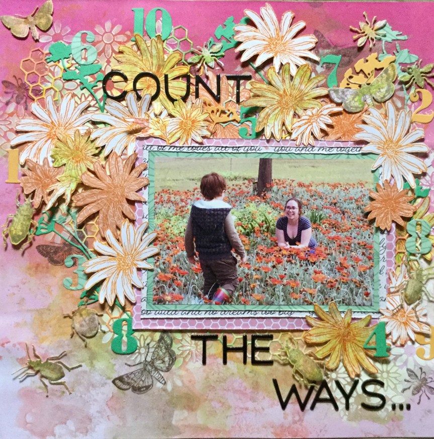


 Next, I put the layout together using a simple, linear, layered design, overlapping the papers and adding my embellishments. As I don’t have any puffy stickers, I used some wooden cherries which I coloured with Tim Holtz’s red Barn Door ink. It wasn’t the best choice but was sitting on my desk, it rubbed off on my fingers and I had to apply some Microglaze to try and seal it. I should have used a dye ink. I added some small text and alphas from my CKC kit. A fairly quick and simple layout, another one for the family album.
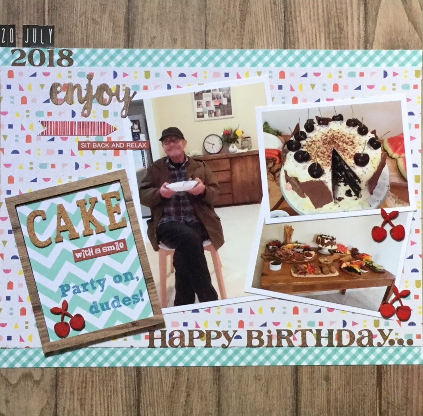

 Hello Scrappers, I am back joining in with the


 “What are we going to do now?”. He keeps us all on our toes, working and creating.
 Each layout was a quick and simple design with a little stamping and ink on number ten. Both layouts are inspired by the work of others, as I just wanted to get them done and move onto the October Counterfeit Kit Challenge.


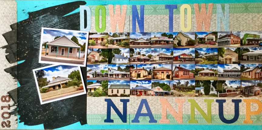
 the rural Great Southern region of our state. Three of my artist friends and I set off on Sunday to begin our road trip pursuing the

 Know idea what that is? We didn’t know either. It is a medium which you can use that gives the appearance of encaustic wax without all the mess and heating. You can create luscious layers of translucent colours, embed materials in your work and if using oil paint, it speeds up the drying process. You can get several different versions/brands, we managed to track down some Langridge Wax Paint Paste. I can’t wait to try it out and see if it works with a range of mixed media techniques.


 I am looking forward to seeing the October CKC kit, there have been sneak peaks on FB. I am loving those colours and the woodgrain. I can’t wait to see what everyone creates with their version of this month’s challenge kit. Keep creating and enjoy the last day of September. I will be trying to get a couple more layouts completed from my counterfeit kit.


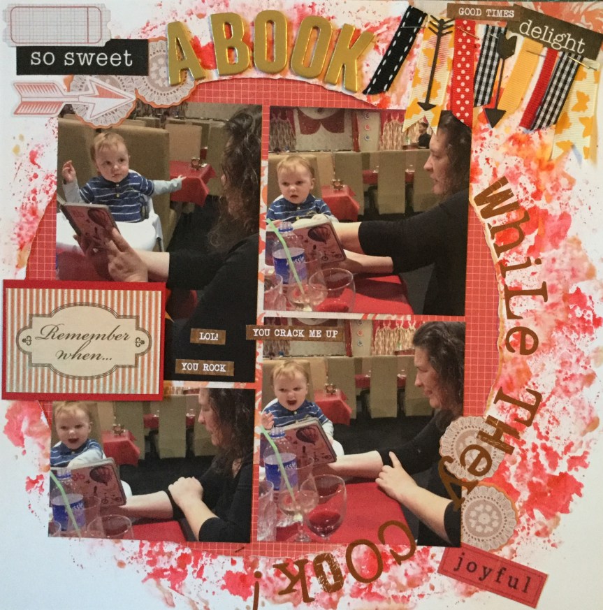
 lot of layouts featuring circle formats or circle embellishments. So, I delved back in time and was inspired by Julie Walton’s, Belly Laugh layout. Julie’s layout is pretty simple with clean lines, as usual, mine turned out very busy with lots of embellishments. Well, I am trying to use things up!


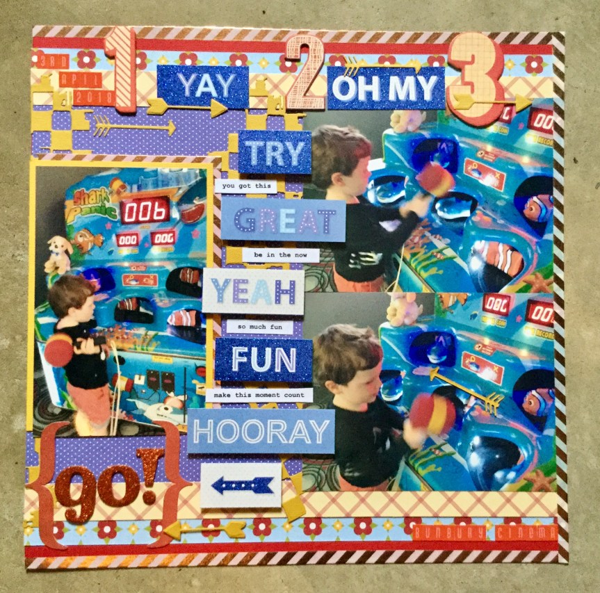

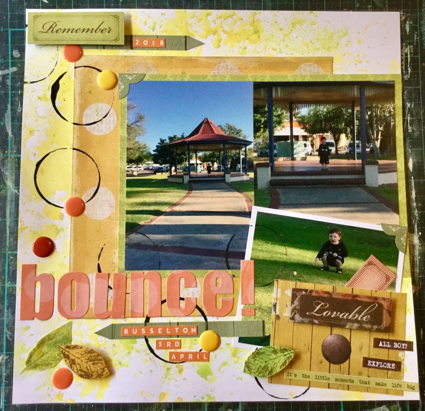
 Nanny duty looking after my grandson while his mum was at work. We had a great day doing lots of things and stopped along the way to buy a drink. The store had one of those giant gumball type machines filled with coloured bouncy balls. He was very excited to use his $2 coin and get a ball. We went across the road to this little park to try out the new ball and did it bounce….yeah, like crazy! Thirty minutes of fun and laughter.


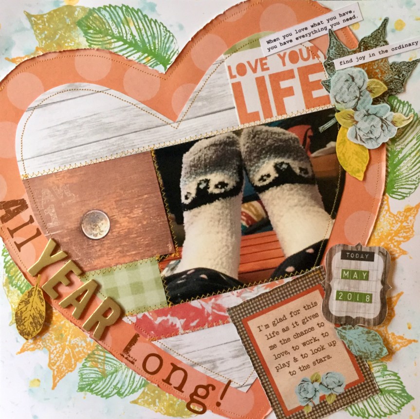
 coverings and partly because they are comfy. We have concrete floors and the socks keep my feet warm and create a sense of relaxation. If I have socks on inside it means me time, a little Netflix, some painting, some crafting, some wine (not every day) and maybe a little chocolate or cheese. Who would think a pair of 99c socks could create such luxury. It’s the simple things in life.
 scrapbook magazines. Like most scrappers now I use the internet for inspiration. The half I have kept I have to use for scrap lifts or if there is nothing useful in the mag they get passed on to my Mum who also scraps. Today’s inspiration came from an old 2007 Canadian magazine, with a layout called Family by Summer Fullerton. I think this may be her


 original Crisp Apple Classic kit designed by Noel Mignon.


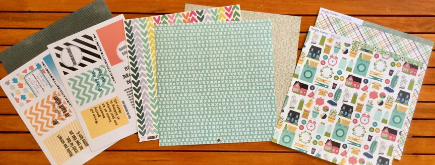
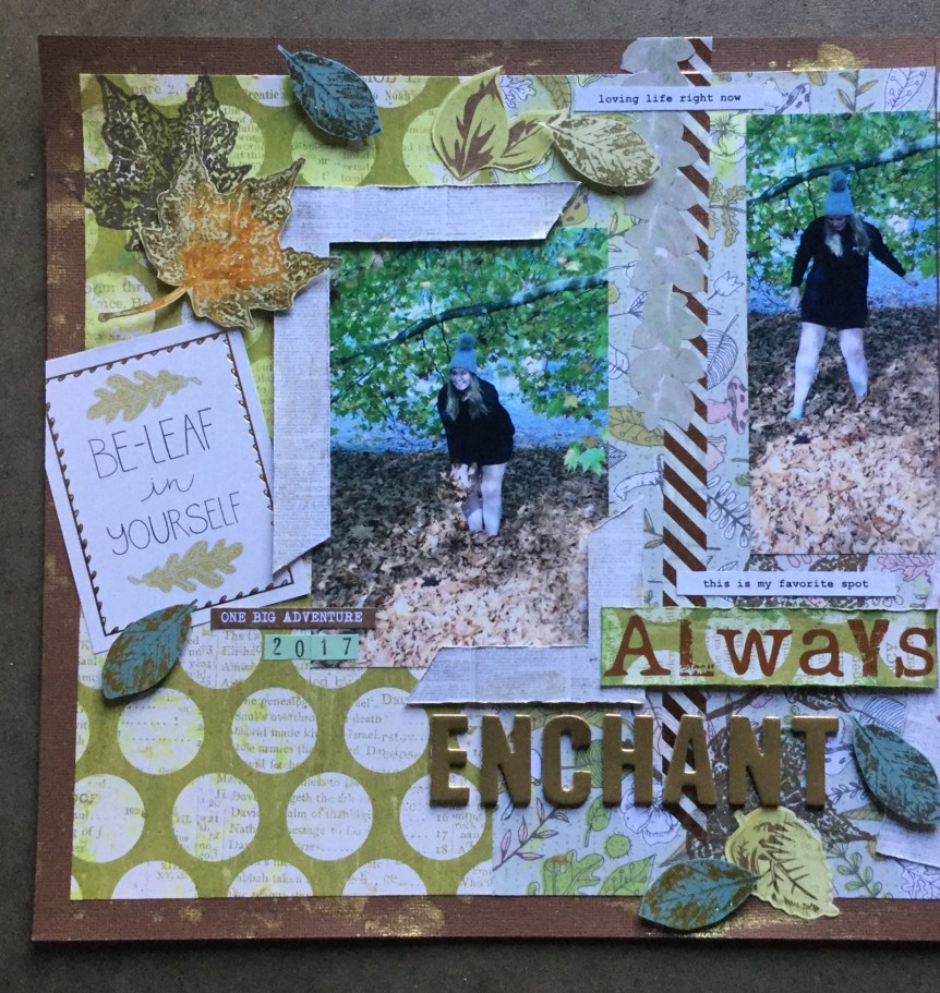
 My substitute for the Tim Holtz distress stain is two Heidi Swapp shines in gold and mustard. I haven’t decided on which stamps to use but will most likely use some leaf and foliage stamps. The bows I will make out of scraps from the kit and I will turn some of my embellishment die-cuts into chipboard elements. My choice in washi tape is a lovely metallic and white diagonal stripe for some added bling. I may also add some wood veneers and some ribbon.