Hello again,
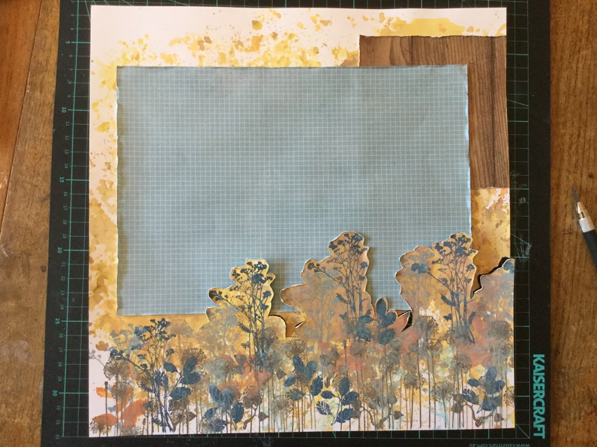
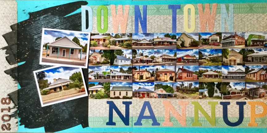
I am sharing my fourth CKC Jan. kit layout, this one is a double page spread. It’s been a while since I’ve done a double page layout, with this one I wanted a vast page to mimic the outdoors. The photos I am using are from last year when I met up with my Dad and we got to spend some time together. This doesn’t happen very often, as he lives 400km away and he is often travelling/prospecting which can easily stretch the distance to 4000km or more! On this day we decided to do a little exploring together and went to check out one of the South West regions caves. Because we went underground I started the layout off by creating an earthy coloured background.


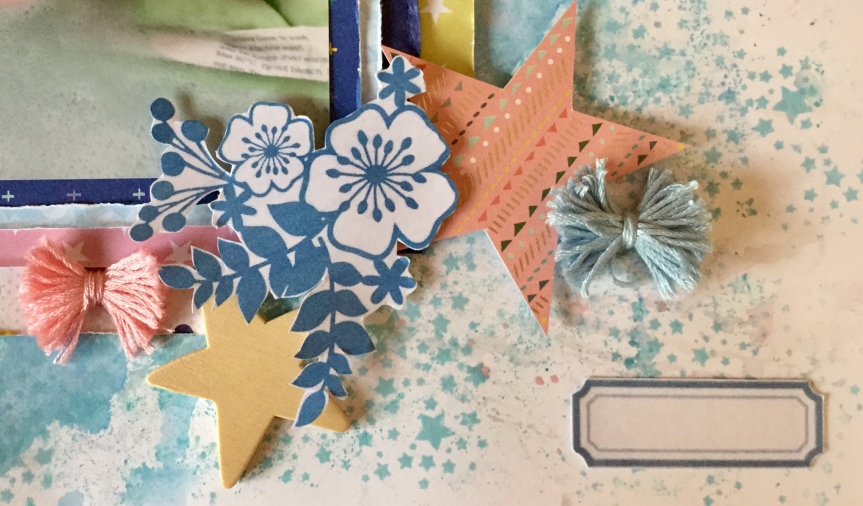
On top of my earthy background, I built up layers of stamped foliage using some colours which I pulled from the Felicity Jane kit. Some smokey blues and teals. You can see that my cardstock had become quite warped from the mixed media/water application. I just press it, between two pieces of white paper, with an iron to reduce the warping. It usually results in a smooth surface, though sometimes you may need to dampen the back of the cardstock with a spritzer.


Then, I mounted the main photo with several layers of paper. I tried to use up the last of that Christmas paper.


I added some papers to the background. This is where things got interesting, after  looking at my photos I wanted to emphasise the sense of going down into the earth. I decided to cut around the stamped foliage with a scalpel and slip some of the photos behind the cuts. Dah, Dah… walking down into the cave.


I roughed up the edges of the cuts to add a bit of texture. Then, I got busy adding embellishments and sticking down my photos. I cut some foliage and text dies using my Big Shot Sizzix and added some enamel dots.


I felt some areas were lacking something and looked a little unfinished, so I stamped on some more leaves to fill the gaps. Then, I added the location and date using some foam alphas. I am pretty happy with the end result, though it is quite busy and somewhat over embellished in my usual style.


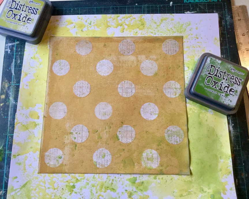
 posing for the photo, so the quality is not great. It is a little blurry but does capture his cheekiness. Let me just say that the playdough man is magnificent, a work of art! Well, I may be biased, it does have all the important elements of a human which is the goal when you are four. It was the playdough figure which triggered my idea for the forged paper. The playdough feet are rough circles, much like the black and white circle paper featured in the Felicity Jane ‘Hannah’ kit.


 decided to substitute this with a strip of polka dot paper trimmed down to create a scalloped edge. I attached this to the edge of the woodgrain background.


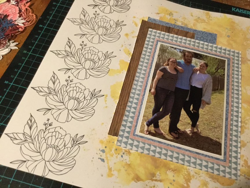
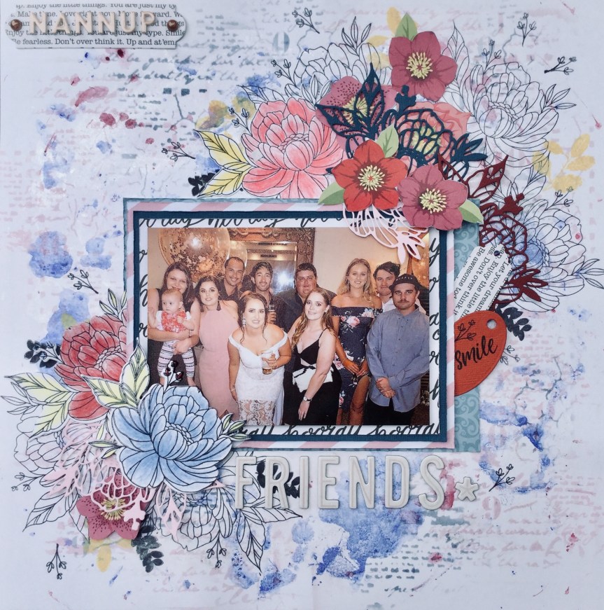
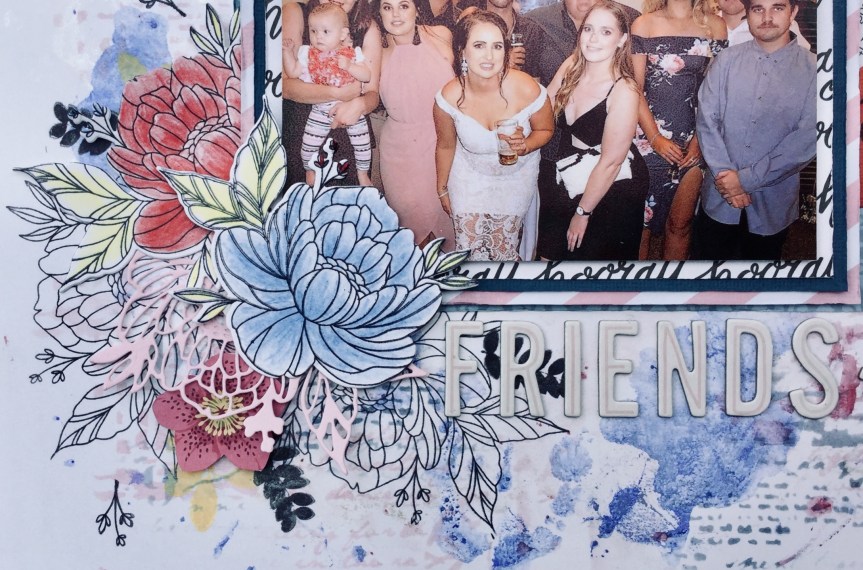
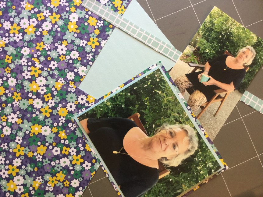
 So, first up, I went with a photo of my daughter and her friends having a night out. The photo has several of the pinks, blues and burgundies found in the Felicity Jane ‘Hannah’ collection.


")

")


 simple in pattern and design, but I fell short when rummaging through my supplies. I struggled to find just the right subtle blues, greens and pinks. I didn’t quite make it with the patterns, mine were either too heavy and thick in line or not geometric. Even though I knew I had previously had some fish scale/scallop paper, I could not find a scrap of it. So, here is what I ended up with…


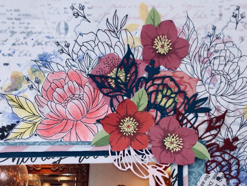
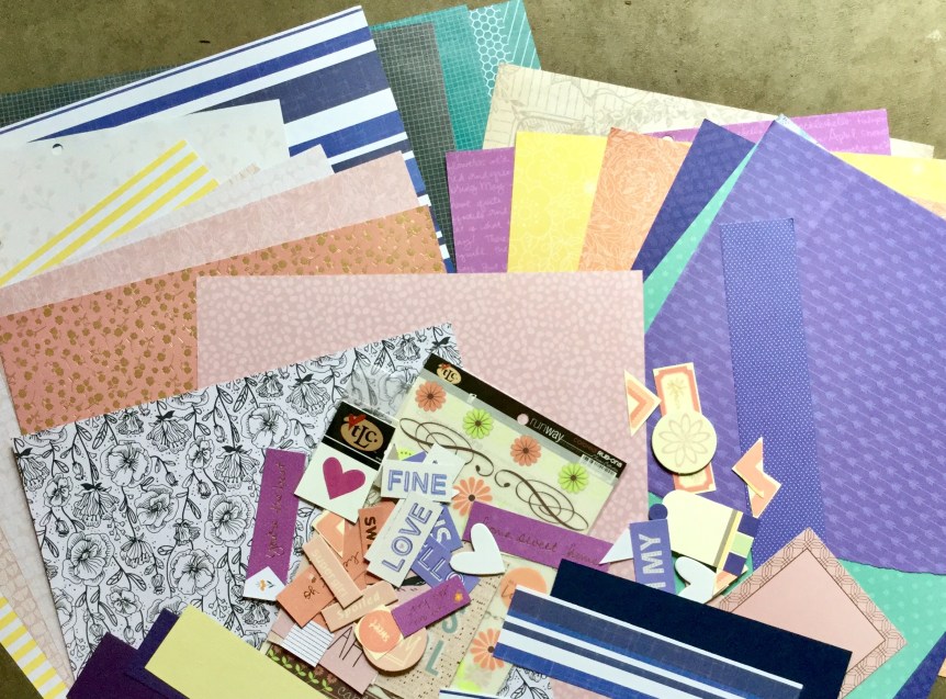
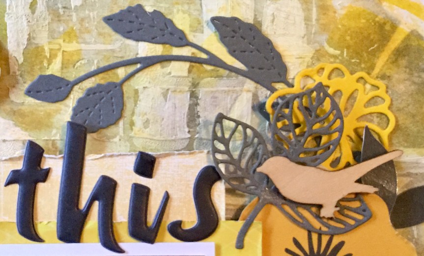
 For my embellishments, I didn’t have a lot which matched with the original kit. Being a girl obsessed with colour, I don’t tend to buy scrapbook supplies with such a mild palette. I decided that I could forge many of them and make my own. So, I dug deep into my dies and stamps and found similarly themed ones which I could use with my papers/cardstock to make a range of embellishments.


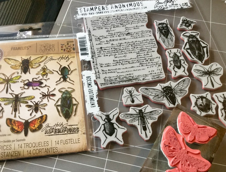 with the stamp set (released earlier in the year). I had been waiting for months for the release and then for it to arrive in Australia, it is amazing! The die is spot on, there is absolutely no white space around your stamped image, it cuts the thinnest and tiniest insect legs and antennae.


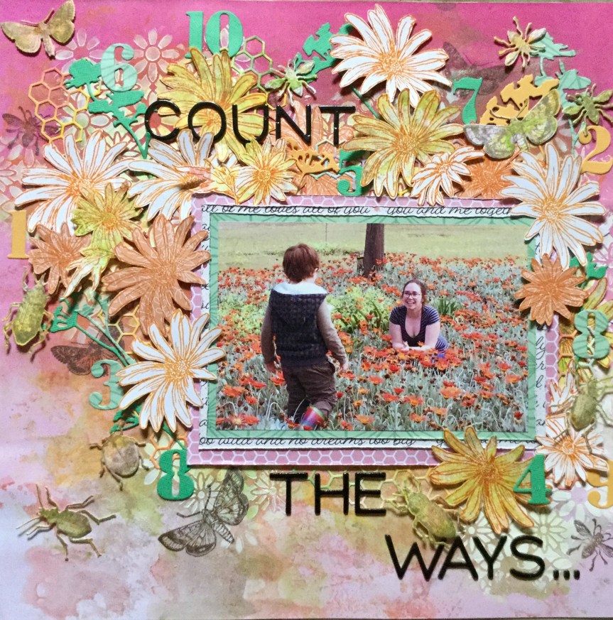


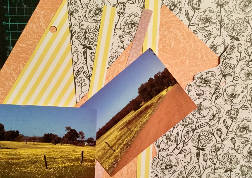
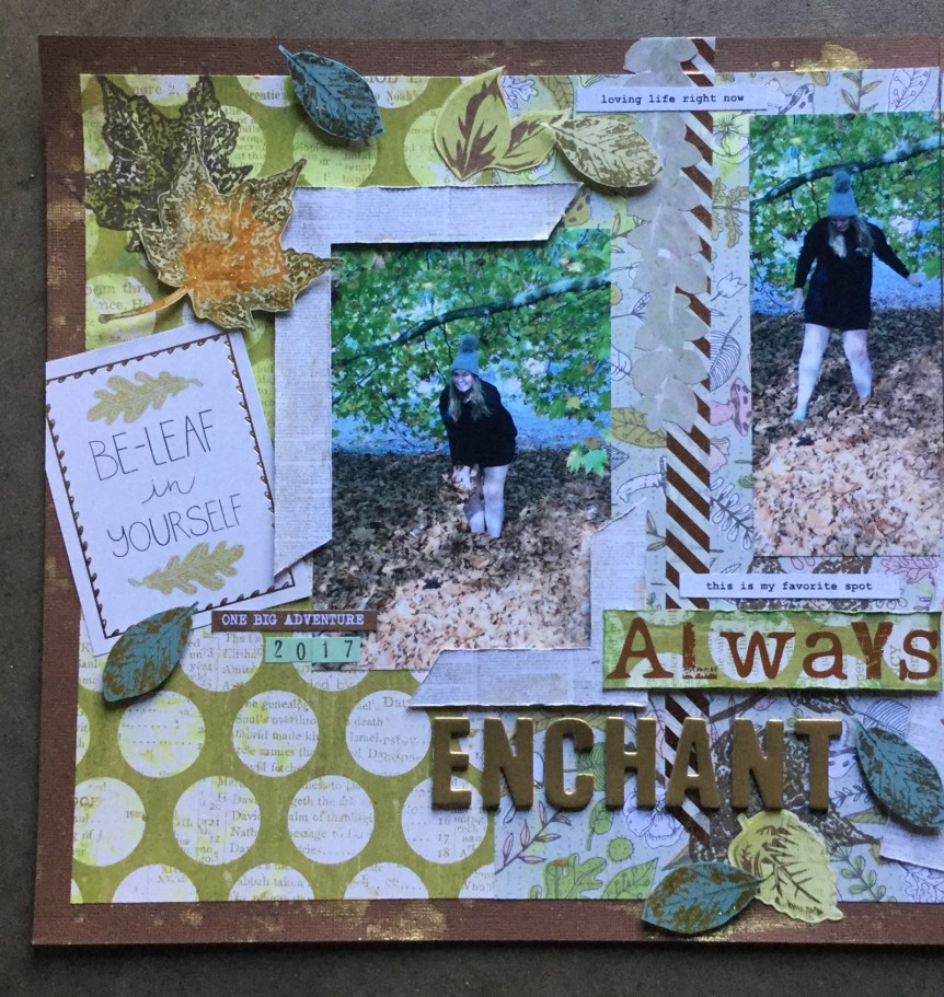
 It is Spring here and all the flowers are blooming, being rural this also means the paddocks are being swamped with colour. Yellow fields of daisies are popping up everywhere.


 Next, I put the layout together using a simple, linear, layered design, overlapping the papers and adding my embellishments. As I don’t have any puffy stickers, I used some wooden cherries which I coloured with Tim Holtz’s red Barn Door ink. It wasn’t the best choice but was sitting on my desk, it rubbed off on my fingers and I had to apply some Microglaze to try and seal it. I should have used a dye ink. I added some small text and alphas from my CKC kit. A fairly quick and simple layout, another one for the family album.
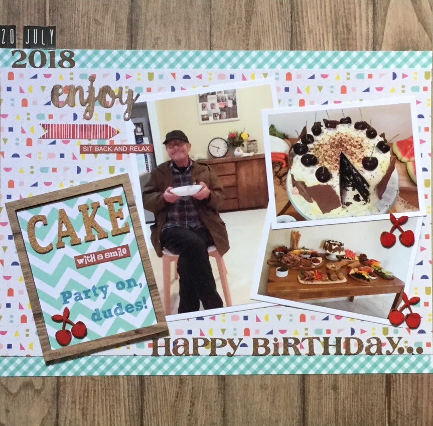


 “What are we going to do now?”. He keeps us all on our toes, working and creating.
 Each layout was a quick and simple design with a little stamping and ink on number ten. Both layouts are inspired by the work of others, as I just wanted to get them done and move onto the October Counterfeit Kit Challenge.


 lot of layouts featuring circle formats or circle embellishments. So, I delved back in time and was inspired by Julie Walton’s, Belly Laugh layout. Julie’s layout is pretty simple with clean lines, as usual, mine turned out very busy with lots of embellishments. Well, I am trying to use things up!


 challenge was designed by Rachael Funnell. It is quite an unusual choice of colours this month and it has taken me a while to actually start my layout. I selected my papers but then battled with photos, several times I waded through my sorted photos to find something suitable. Finally, I came across some old photos of myself and my youngest daughter from 23 yrs ago!
 jumper inspired my choices. The roses on the jumper were stitched on by myself all those years ago after my jumper got scorched when drying near our wood fire.


 Hello again, I am just popping in with a layout I created for a September colour layout challenge on the


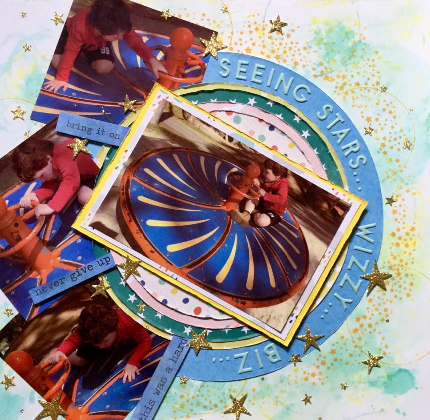
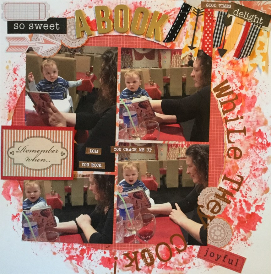
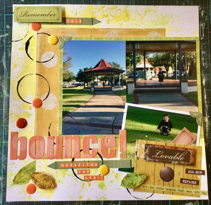
 Nanny duty looking after my grandson while his mum was at work. We had a great day doing lots of things and stopped along the way to buy a drink. The store had one of those giant gumball type machines filled with coloured bouncy balls. He was very excited to use his $2 coin and get a ball. We went across the road to this little park to try out the new ball and did it bounce….yeah, like crazy! Thirty minutes of fun and laughter.


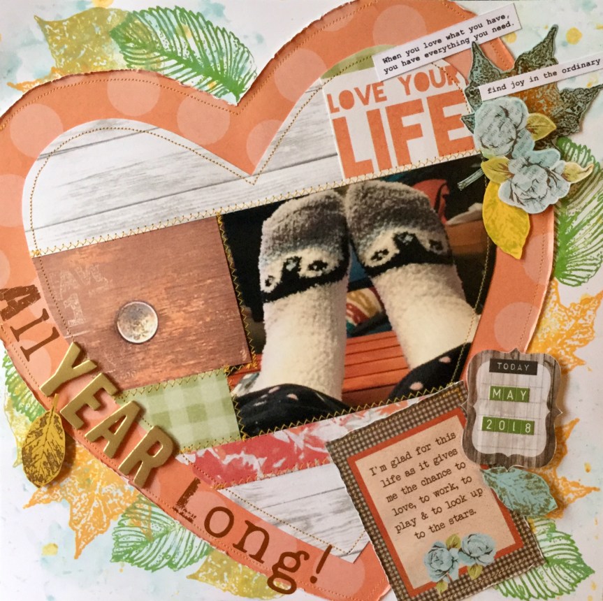
 coverings and partly because they are comfy. We have concrete floors and the socks keep my feet warm and create a sense of relaxation. If I have socks on inside it means me time, a little Netflix, some painting, some crafting, some wine (not every day) and maybe a little chocolate or cheese. Who would think a pair of 99c socks could create such luxury. It’s the simple things in life.
 scrapbook magazines. Like most scrappers now I use the internet for inspiration. The half I have kept I have to use for scrap lifts or if there is nothing useful in the mag they get passed on to my Mum who also scraps. Today’s inspiration came from an old 2007 Canadian magazine, with a layout called Family by Summer Fullerton. I think this may be her