Good morning,
Back in November, Janet from RTS Scrapbooking released her 4for4 Series – Heritage Round. It is a great series with many tips and tricks for creating heritage layouts. Now, I’m not a fan of making heritage layouts and I think generally this is because most people use very dull coloured papers with old fashioned flowery/object prints. I’m more a bright colour girl and so, I thought I would challenge myself and have a go. Around the same time, in the Love RTS FB group, there was a post suggesting you sort and collect up papers which challenged you, the ugly, the old, dated and ‘the untouchables’ and make them into kits. Now, I have a stack of papers that don’t appeal to my tastes, so these were the papers I decided to use for my heritage layouts. Some Love RTS members loved the papers which I detested, we all have different tastes and for me, purple is yucky, as are flower prints which remind me of my Nanna’s wallpaper!
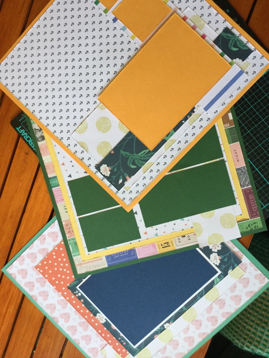
Here are my ‘untouchables’, papers I don’t like…


I started off with the pink and green patterned and floral papers, using a photo of my grandfather. Now, flowers and men usually don’t mix but the story behind the photo is quite romantic and I thought I would get away using these girly papers. This is the photo that my grandfather had taken to send to his sweetheart, my Nanna, during the war. On the bottom right corner, you can see the sweet message he scribed to her.


Janet’s layout features a diagonal patterned paper format and I followed the same process. You can watch Janet’s video here. As my grandfather was in his motorcycle uniform I found some images related to his job in the war and printed them out to use as embellishments. A tip when using home-printed embellishments, they can sometimes look a little flat in colour, but you can achieve a more polished finish  by rubbing each image with a little Tim Holtz Distress Micro Glaze. It just makes the colour pop a little more and looks like a bought die cut. I also printed a heritage document from the website recommended on RTS, https://olddesignshop.com/.
The finished layout turned out quite dashing with just a touch of floral.

My next layout is of my Nanna, the photo she had taken to send to my grandfather. I used one of the purple ‘untouchable’ papers for the background. For this layout, I wanted to use some embossing folders which I had recently purchased secondhand on FB Marketplace, they had come with a whole heap of steel dies I got cheap. I have hardly used embossing folders in my craft life, they fall into my old fashioned, untouchable category. So, this was the perfect time to try them out. I made embossed papers to use for mounts and layering behind the photo.
It is a simple process of inking one side of the plate before adding your paper/cardstock and running it through my Sizzix Bigshot.


The results are quite stunning and really did remind me of the old embossed wallpaper and brocade furniture in my Nanna’s house.

The next photo, I believe to be of them both on their wedding day. It was wartime, so times were tough and for them, there was no white wedding. For this layout, I used the rest of the green and pink untouchable papers. Amongst these papers was a rose floral which was just calling to be fussy cut, fussy cut I did! I also used more printable embellishments from the Old Design website, and it gave me an opportunity to use up some ribbon bows.


It was a fun experience creating heritage layouts and I didn’t mind the end results, however, I did lose interest and moved on to other challenges. One day, I will have another go and finish scrapping the small pile of heritage family photos that I have.
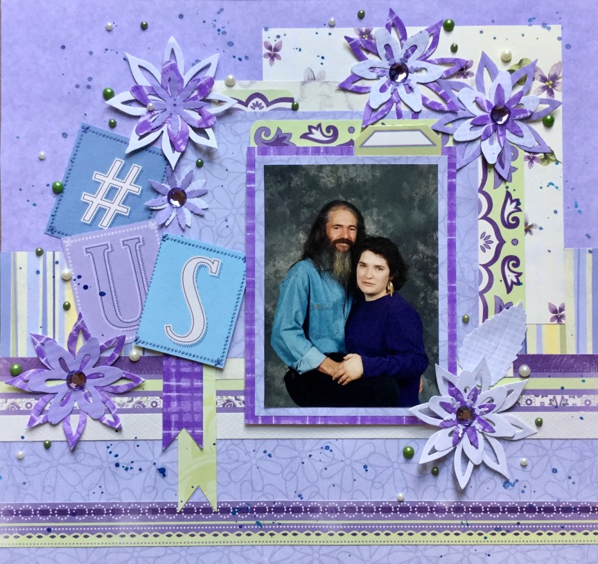
What I did have a go at was getting rid of some more of the purple ‘untouchable’ papers and scrapping some old family photos from the ’90s. I’m not sure I pulled it off, the papers were pretty ugly and gaudy, but I gave it my best shot. Anyway, more layouts in albums…the ultimate goal.


Keep on scrapping! 🙂
Don’t forget to post a comment or share with other creatives, remember you need to open the post by clicking on the title to access the comment box if you are on the home page.


 loved. The colours were perfect for my photo. There was a slight hint of blue in the background of the photo and some lovely creams and golds from my daughters, hair, skin and jewellery. I used three different Tim Holtz oxide inks to grunge up the background using the plastic bag technique, a very simple technique using just ink and water to create amazing layers of colour.


")
")
")


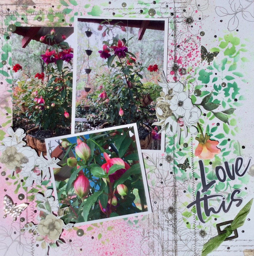
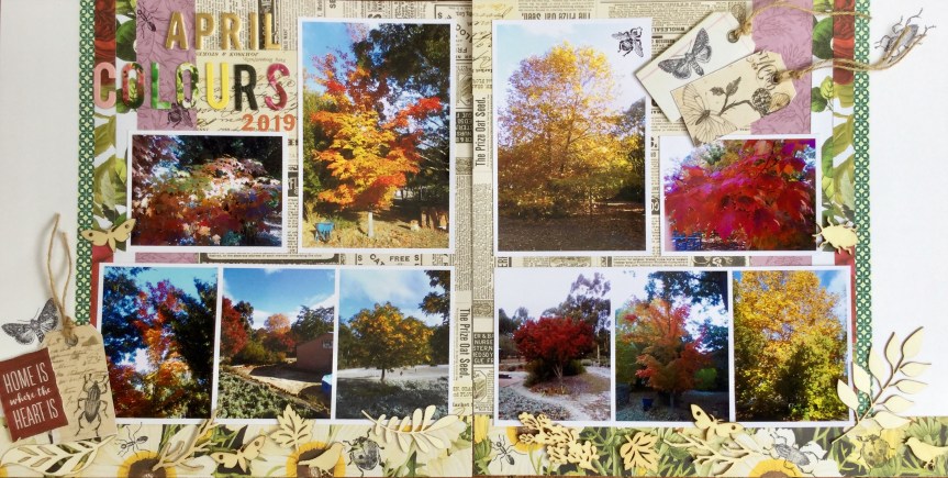
 and flowers, creating some texture and depth. I also added some tags cut from the Botanical Beauty, DCWV paper pad and a few Kaisercraft butterflies. Some sprinkles and splatters of watercolour paint in magenta, navy and green finished off the layout.


 stories and slip them behind the journal mount.


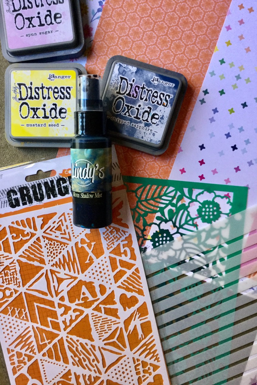
 kit had been sitting on my desk, under a pile of supplies and when having a clean up I found the kit and broke it down, separating and sorting all the components. Now I don’t make cards but I loved the stamps and stencils in the kit, which is why I purchased it. The design of both is very Australian, using patterns similar to indigenous art. The booklet which came with the kit had a picture of a wonderful layout made by


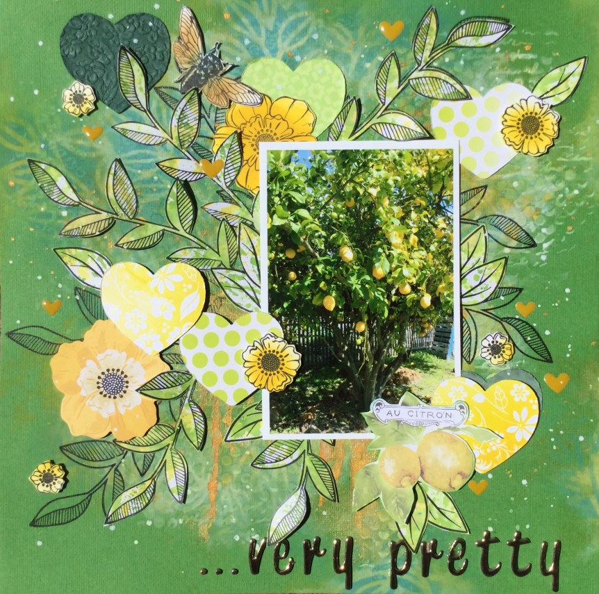
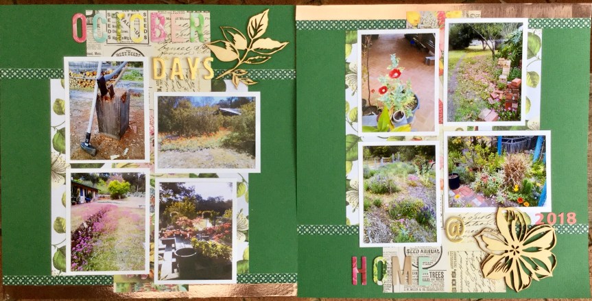
 papers, and if I get the chance to buy a second pad I will snatch it up, it’s amazing. I ended up using very little of the cardstock or supplement papers, and just focused on using my main four papers and white cardstock. Mainly because I wanted to include some stamped images, some lovely insects from the Tim Holtz Entomology stamp set.


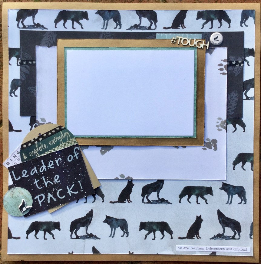
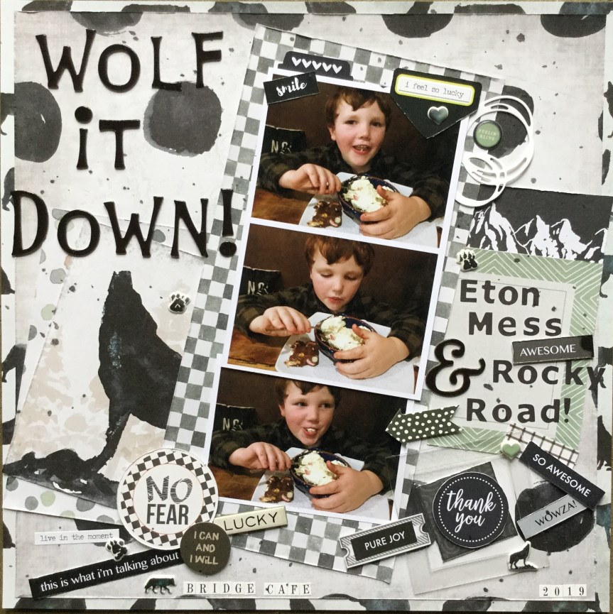
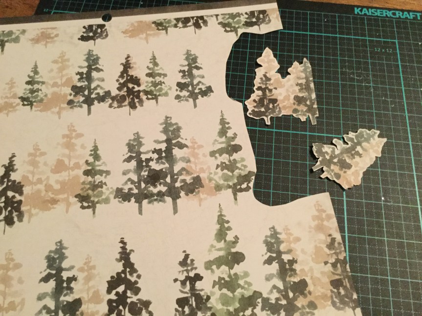
 you have had sitting around for a few years, untouched! I did not have any untouched paper pads, only brand new ones (birthday/Mother’s Day gifts) which is why I decided to use this paper pad. I am doing well, getting through the pad with 14 papers left out of 36. The ones left are mostly pine trees, wolves and bear papers, given that I live in a country with no wolves and bears it is a challenge.


 and added some colour across the page using the plastic bag smooshing technique. The Tim Holtz ‘Tumbled Glass’ oxide ink created a soft blue surface to work on, I then splattered some watercolour paint across the page in browns and blue.


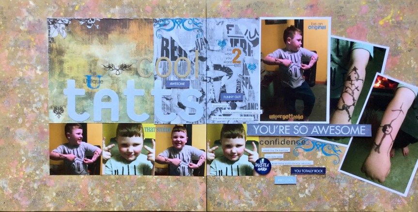
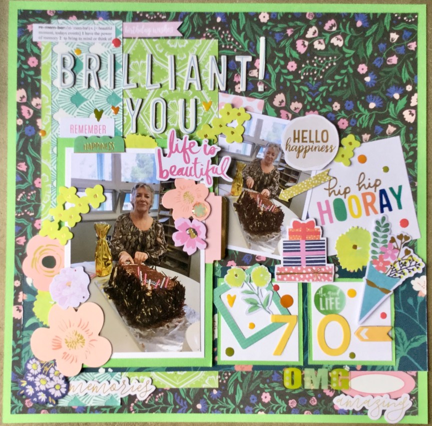
 in the collection and finally come up with an idea when I came across some photos of my grandson eating some dessert.


 big fan of the HipKit Club team and their amazing creativity, so was excited to pull my own similar kit together. I did already have a few of the papers in their kit and some similar ones from other collections which I had only just purchased, which made putting this kit together much easier.
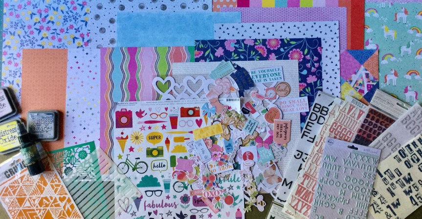


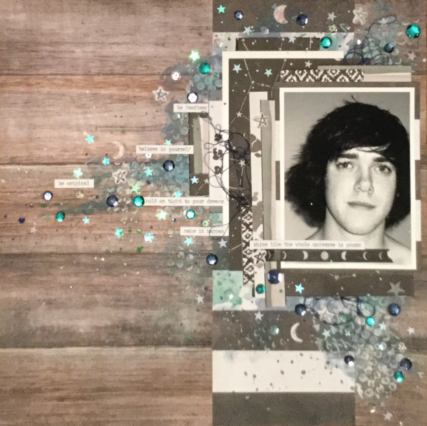
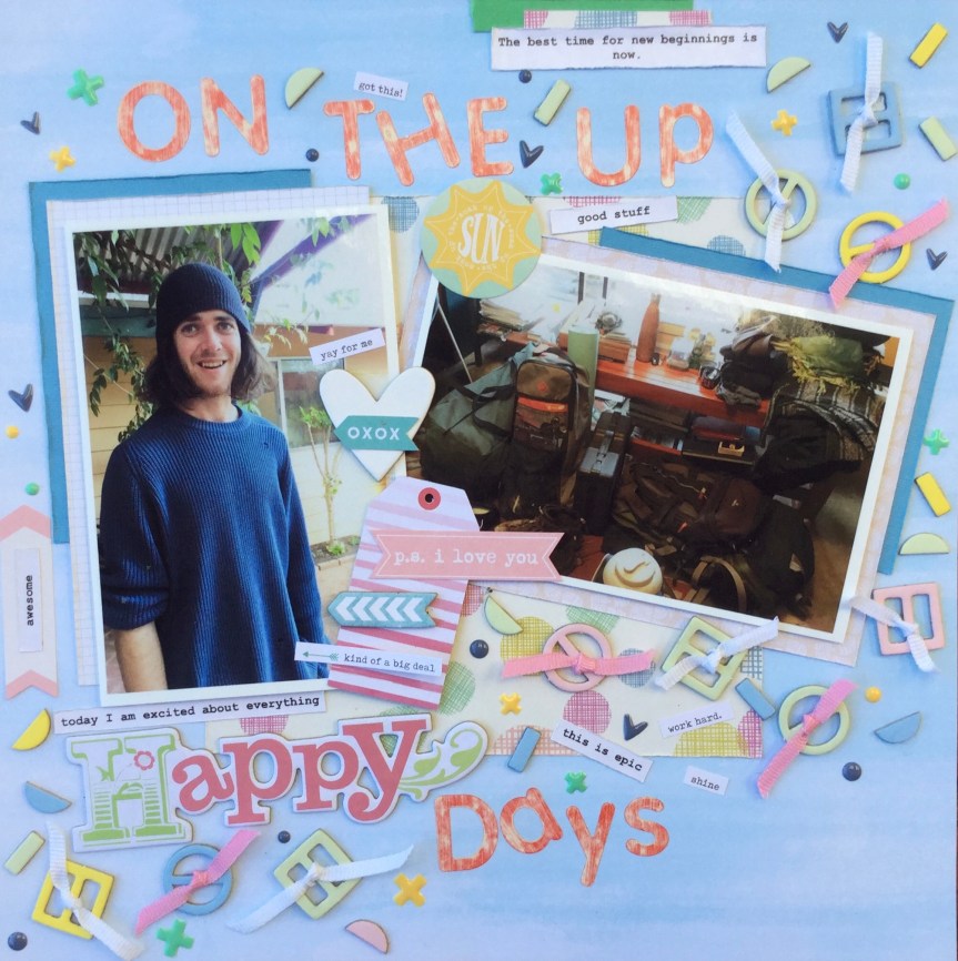
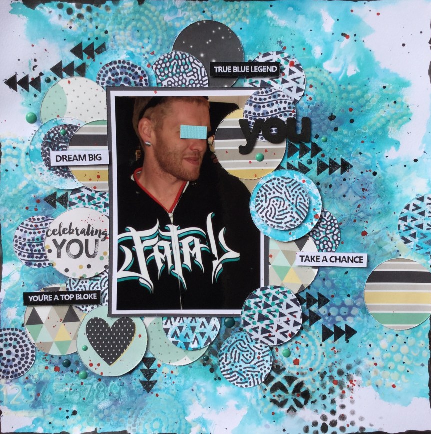
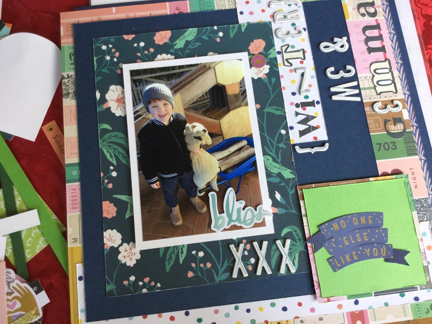
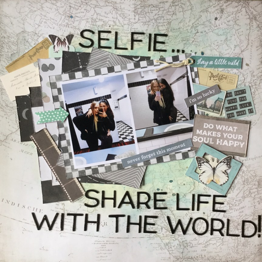
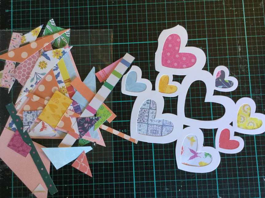
 have used was originally a photo of all four of my children together which I have scrapped several times, so they each have one. This time I cropped the photo down to try and just get my youngest son in the image, as I don’t have many teen photos of him to use in layouts. The problem I encountered, as you can see, is that part of my eldest daughter was still in the image. As gorgeous as she is, she had to go for this layout! Here’s how I erased my daughter from the image by hand, the old fashioned way and then, put the layout together.


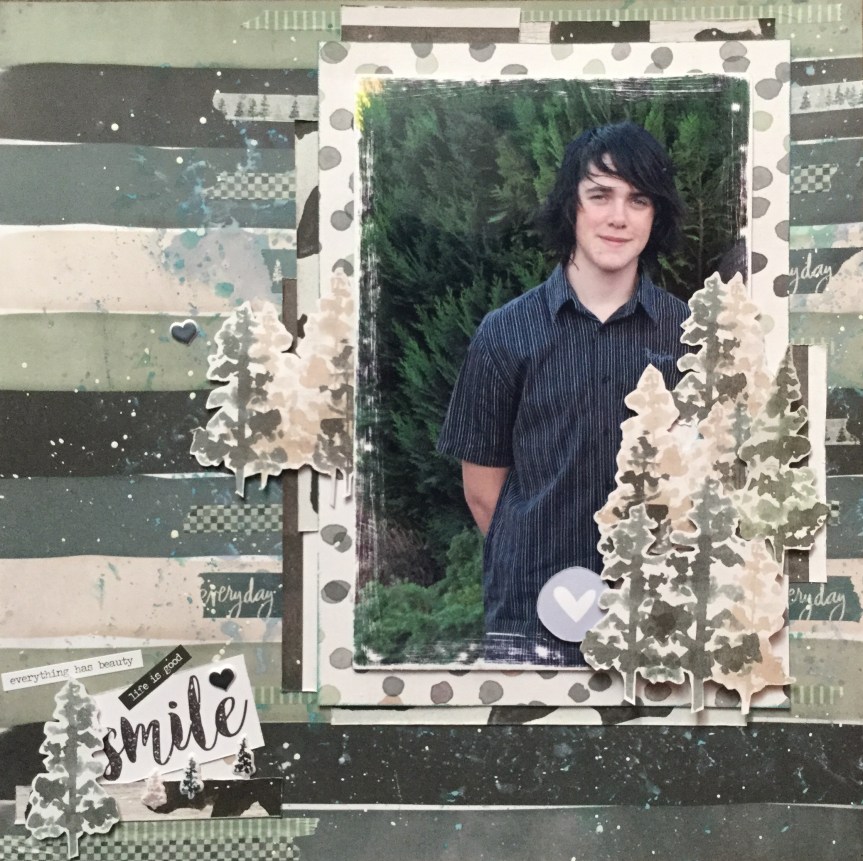


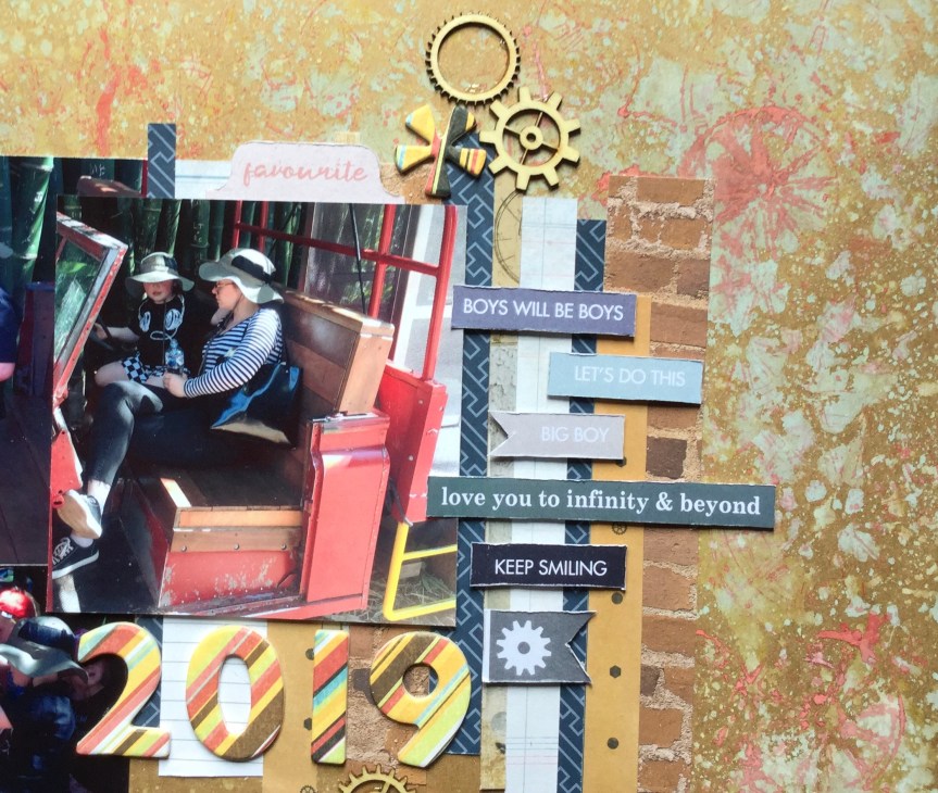
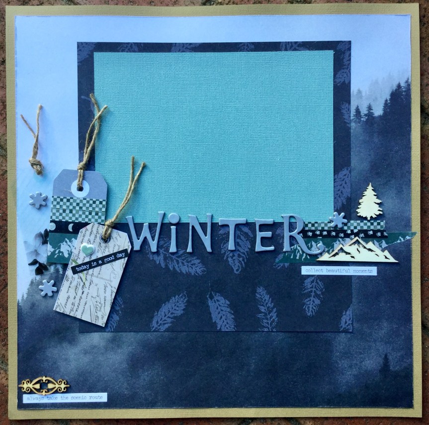
 being able to create layouts about my sons, daughters, grandson and Christmas. The lovely outdoor pine forest, mountains and starry nights would work well for our traditional, annual, Christmas tree hunt. The other papers, a mix of contemporary and cultural patterns in black, white and shades of greens, and the wood grain can be used for recording many special events or moments.


 though the papers are quite masculine and I am using a photo of my teenage son, I couldn’t stop myself from adding some sparkle and shine to the layout. The Zodiac paper features the night sky and astrology motifs and I wanted to highlight this in my design. I used a variety of sequins in crystal, navy, aqua and green to decorate and enhance the layout. Then, I splattered on some watercolour paint in white, green, dark blue and brown.